Description
Some 40 km north of Helsinki, surrounded by meadows and a serene Finnish lake, lies Ainola, the former home and now museum of composer Jean Sibelius (1865–1957). I know the place quite well, since it is only a stone’s throw away from the art school where I began my graphic design studies. We sometimes went there after classes—a beautiful walk, especially in spring, when the days were getting longer, the snow melting in the sun and the ice cracking on the lake.
The composer often professed his love for this landscape and found constant inspiration in its moods, sounds and scents during different seasons. For many people, Sibelius and his music, most notably his famous symphonic poem Finlandia, are a symbol of Finland.
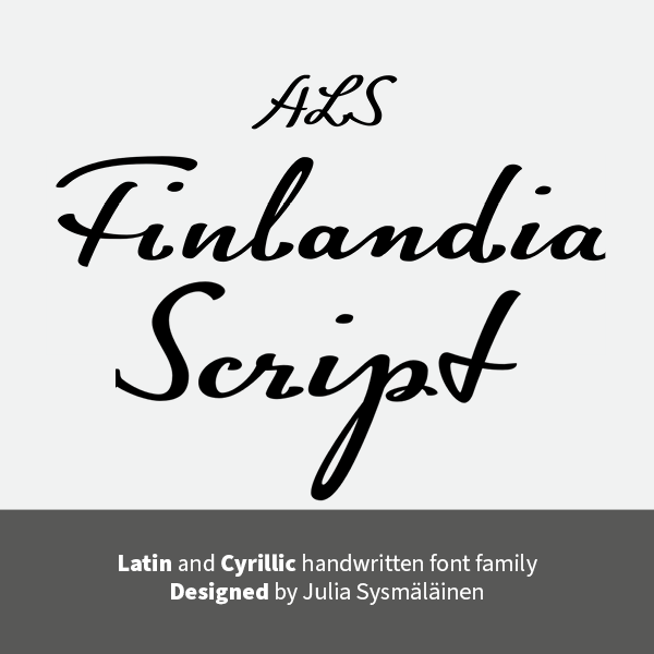
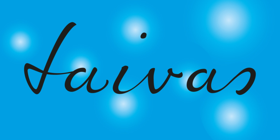
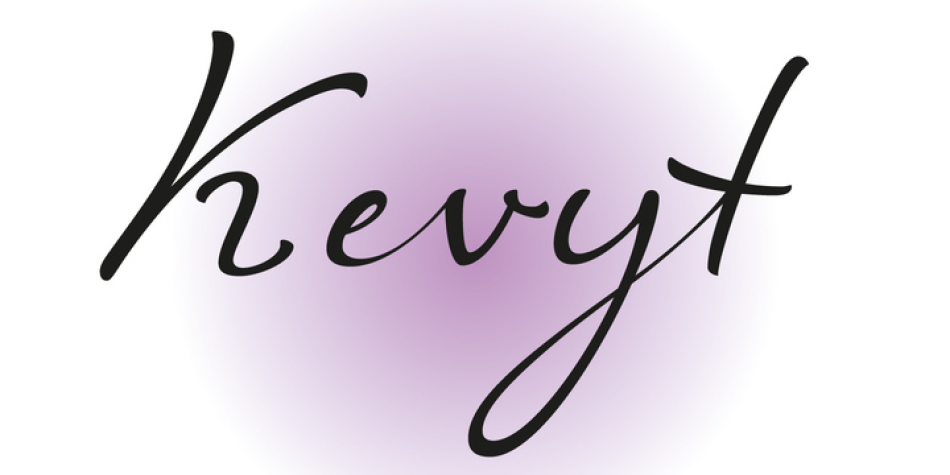
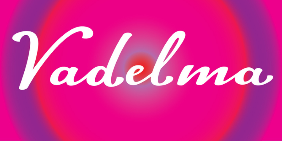
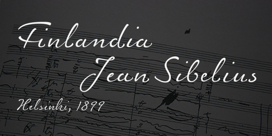
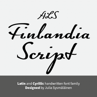
I decided to name the typeface family I’m presenting here FinlandiaScript, because it owes its influence to both Sibelius’ manuscripts and the Finnish landscape around Ainola. The shape of letters, their poise and the rhythm they create resemble Sibelius’ handwriting without copying it. The letters form gently flowing lines of text which is legible without giving up individuality.
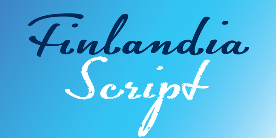
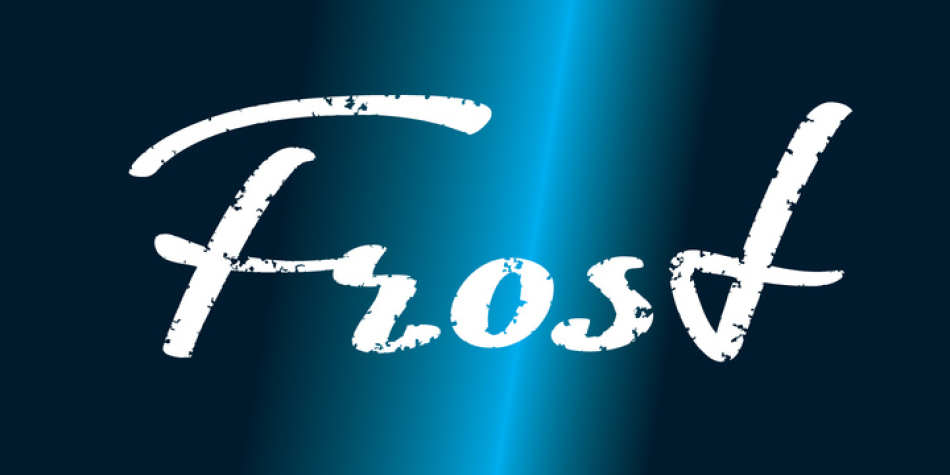
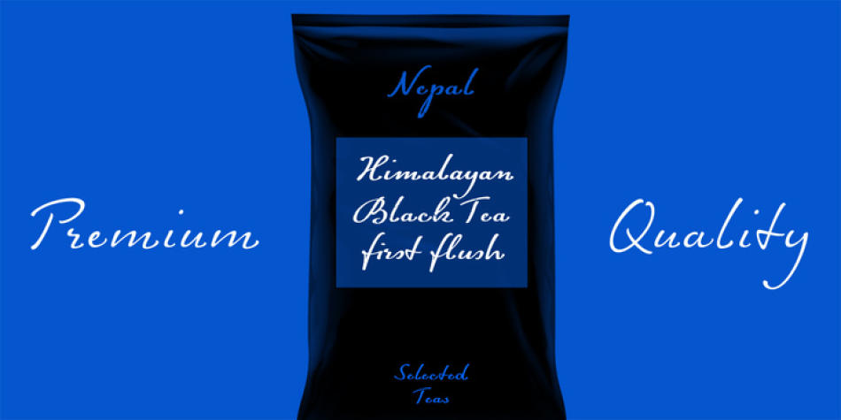
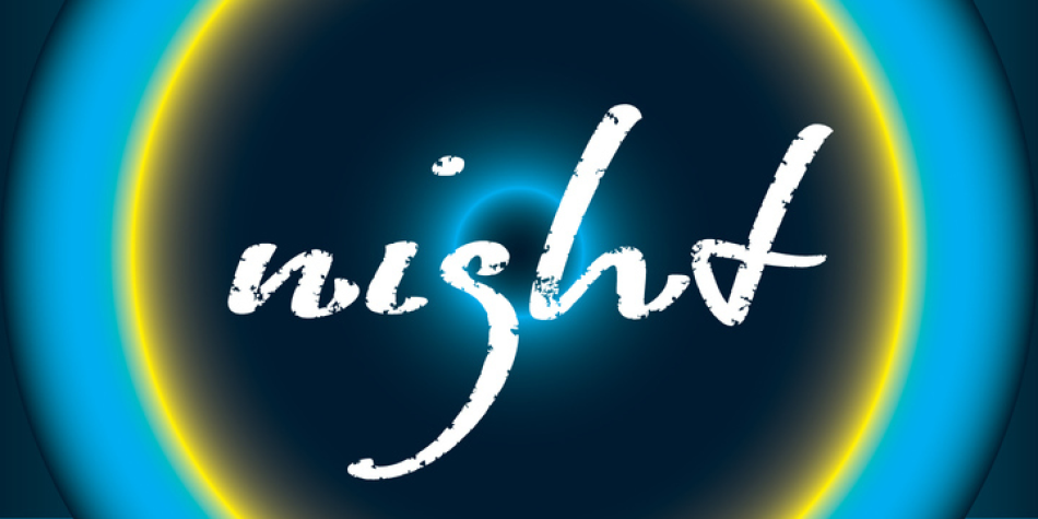
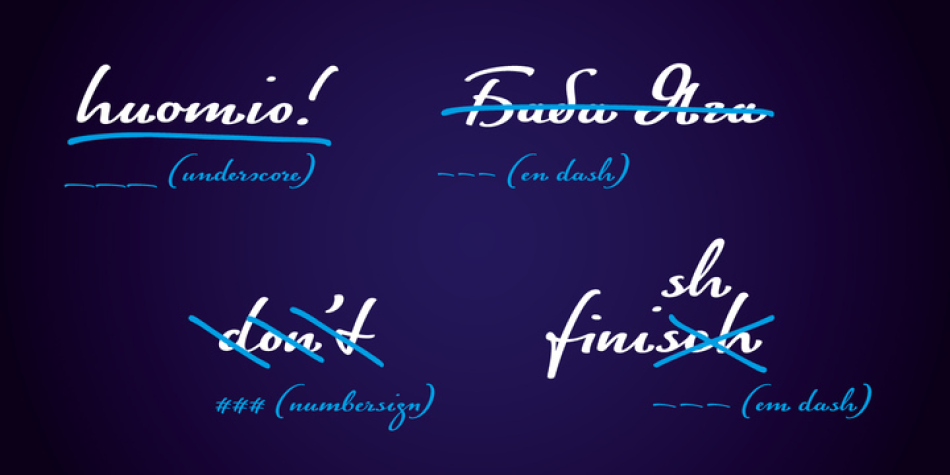
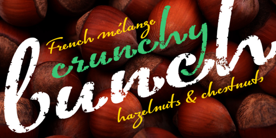
The font family comes in three styles: FinlandiaScript, FinlandiaScript Bold and FinlandiaScript Frost. Together they are perfect for magazines, websites and brands aiming to create a personal and sincere image. While the fine details of FinlandiaScript Frost are best suitable for display sizes, FinlandiaScript and FinlandiaScript Bold work well in both headlines and texts of smaller sizes. Hundreds of ligatures give them an especially flexible appearance.
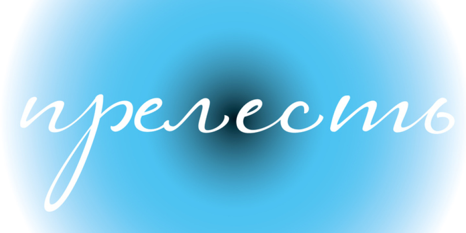
The FinlandiaScript family contains Western, Central European and Extended Cyrillic character sets and supports almost 100 languages. It is best suited for Opentype savvy programs with the “standard ligatures” and “contextual alternates” features turned on.
Design, Publisher, Copyright, License
Design: Julia Sysmäläinen
Publisher: Art. Lebedev Studio
Copyright 2015 by Art. Lebedev Studio. All rights reserved.
License: COMMERCIAL
Julia Sysmäläinen
Julia Sysmäläinen Carelian (Juliasys) is a Finnish type designer, who studied at Pekka Halosen Akatemia in Tuusula. She runs her own type foundry, Juliasys. Julia presently lives in Berlin, where she works for Edenspiekermann Berlin.
Web:
Typefaces: ALS FinlandiaScript, ALS Scripticus, ALS SyysScript, Josef K Paneuropean, Mister K, Optimisti, MIR Next
More… TYPE DESIGN INFORMATION | Julia Sysmäläinen













Reviews
There are no reviews yet.