Description
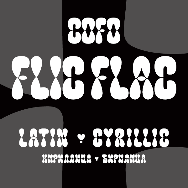
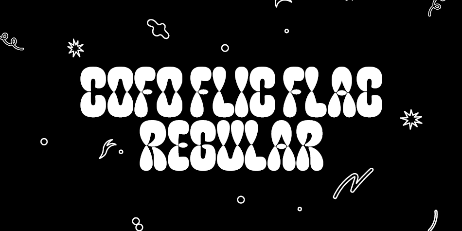
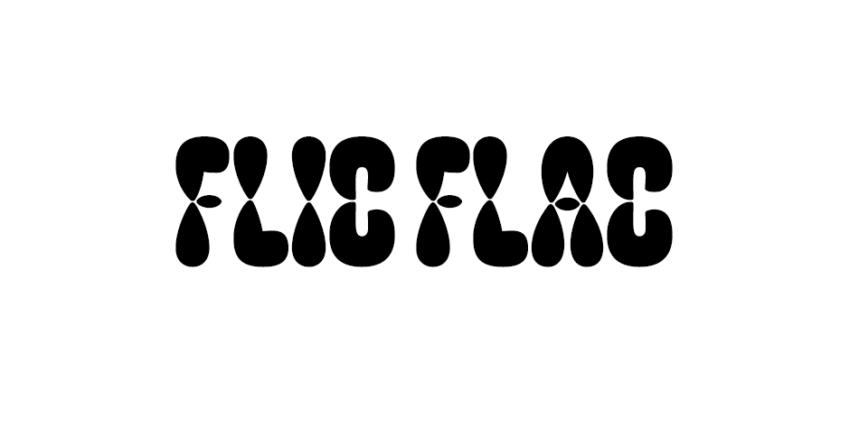
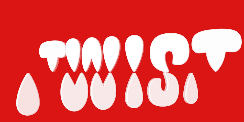
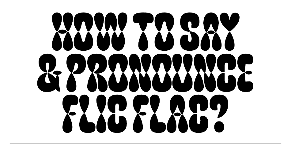
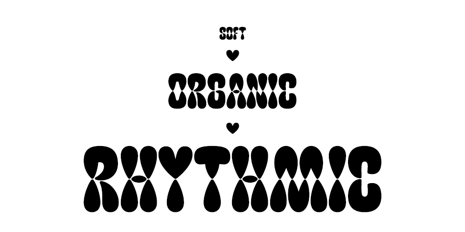
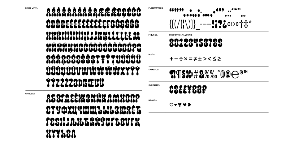
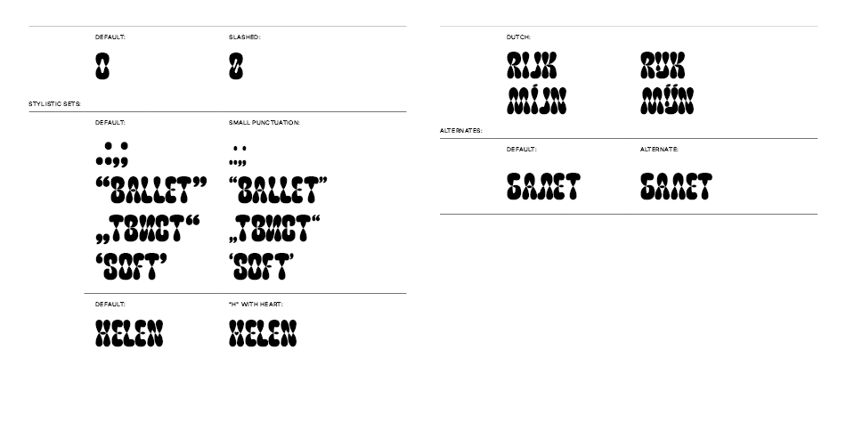
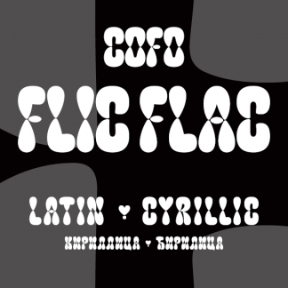
FlicFlac is an organic, soft and rhythmic typeface. It explores the idea of repetition, without following the strict rules of traditional stencil and modular designs. The harmonious shape that words create might deceive you into thinking all letters are made with the same building blocks, but hardly any element is repeated. It’s all about balancing the construction of each letterform with the overall plump and natural character.
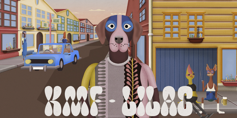
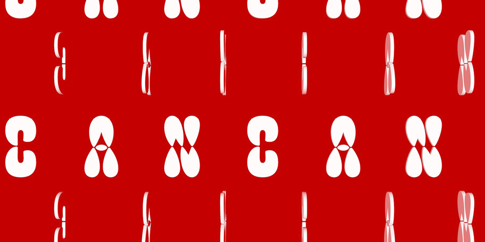
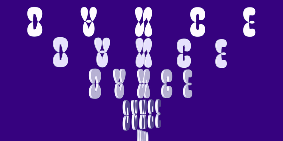
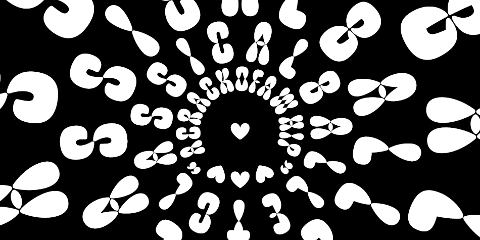
FlicFlac works perfectly as a statement font, within a word or a phrase that needs to grab the attention. But it’s rhythmic structure also creates extremely ornamental text textures worth experimenting with. On top of that its building blocks are ready to move and invite you to make them dance in animation.
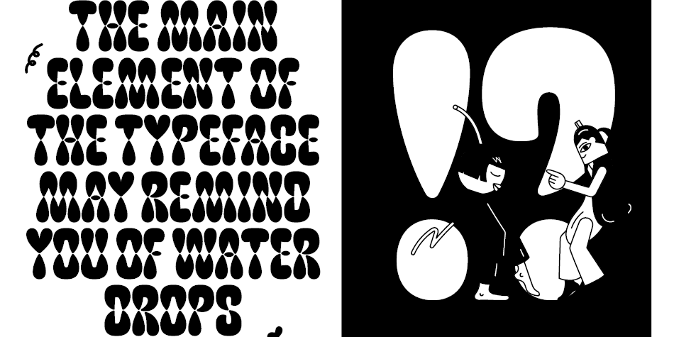
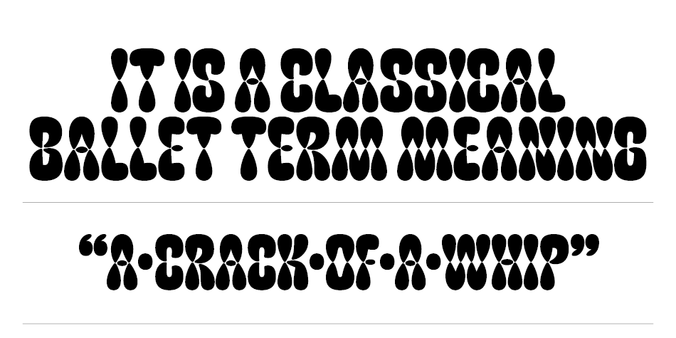
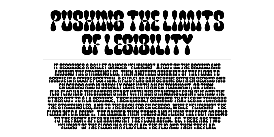
The main element of the typeface may remind you of water drops and it performs in the same organic way as water naturally flows. The elements tighten and come together in the middle of each letterform, without touching. In more complex characters these drops merge, creating new forms. Maintaining FlicFlac’s character throughout means pushing the limits of legibility. Maybe sometimes you would have to guess a letter from the context, but that is a sacrifice you can make, right? Because this typeface will always make you notice and make you listen to what it has to say.
Design, Publisher, Copyright, License
Design: Maria Doreuli
Copyright 2020 by LLC Contrast Foundry (LLC CoFo). All rights reserved.
Specimen: CoFo FlicFlac
Maria Doreuli
My name is Maria. I was born in Moscow and I have spent most of my life there. My passion for drawing as well as collecting printed ephemera lead me to study graphic design at the Moscow State University of Printing, which is where I earned a Masters Degree. During my time there I explored different subjects within the art and design field, before discovering that the right place for me was the Type Design Workshop. At the workshop I worked on my graduation project, William Typeface, under the head of Alexander Tarbeev, whose influence encouraged me to pursue my love for letters. As a result William received Letter.2, Granshan and NewCyrillic awards. I was also selected for ‘Young designer of the year’ by Akzia newspaper in 2011.
Commercial License
Where to buy: Contrast Foundry



Reviews
There are no reviews yet.