Description
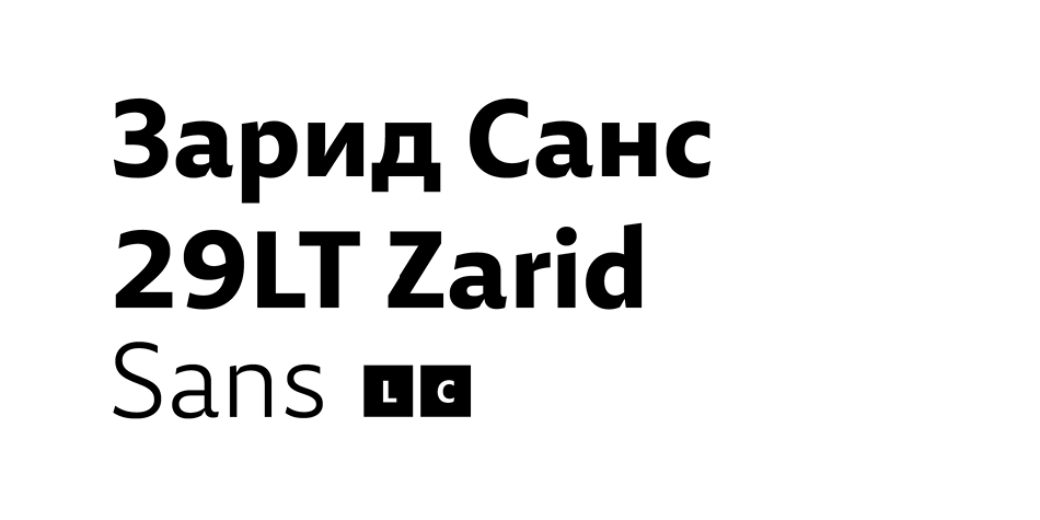
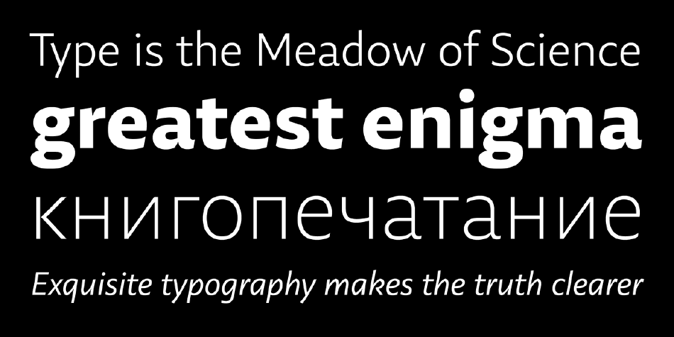
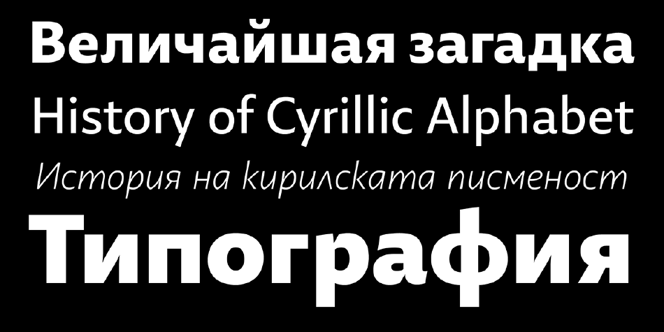
29LT Zarid Sans is fresh, it compromises clean outlines that stem from calligraphic structures and rendered in a humanistic aspect. The equilibrium between the main body structure of the letters and their corresponding ascenders and descenders is carefully studied to give the typeface a contemporary composition without affecting legibly. It’s suitable for both display and text purposes. In the Arabic script, the design drifts away from the traditional calligraphic Naskh proportions while keeping the letterforms well-structured and composed. It respects and inspires from the Arabic calligraphic writing systems while drawn with modern features and graphical qualities. It is a Neo Naskh typeface designed and tested to be legible in content text in print and screen mediums. Additionally, its unique characteristics and design details make it suitable for display text. In the Latin script, the letterforms are built with moderate open x-height and relatively long ascenders and descenders in comparison to other sans serifs. It is a humanist sans serif typeface with a neutral design approach while keeping some calligraphic aspects in the outlines. It has roots in calligraphy and evokes a feeling of warmth and personality, in contrast to other geometric and neo-grotesque sans serif fonts, which can feel cold and sterile. Both the Arabic and Latin are designed to be clear and legible in small sizes, but this doesn’t remove the fact that they look elegant and unique when used in large display type.
It retains a balance between calligraphic angular cuts and unadorned construction. The contrast in the letters was coupled with strong cuts and edges to give the font its vigorous attitude. The letterforms are inspired by calligraphic makeup but drawn in a modern-day feel. The Arabic ligatures and elongated stylistic sets give the typeface more calligraphic characteristics. These were meant to provide the script’s robustness, and robust is, after all, what Zarid means.
The design approach, with open counters, the terminals, and finials, and the weight and contrast, are all elements that bring the Arabic and Latin scripts together. Which is no surprise as both scripts were created in synergy and were inspired by each other simultaneously.
Design, Publisher, Copyright, License
Design: Jan Fromm, Krista Radoeva
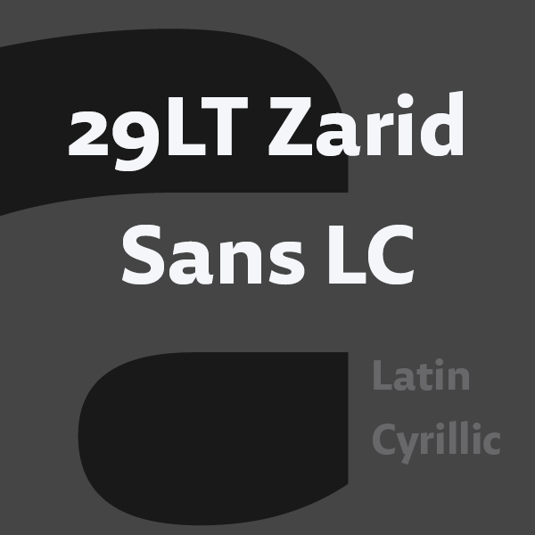
Publisher: 29Letters
Copyright 2018-2020 by 29Letters. All rights reserved.
Jan Fromm
![]()
Jan Fromm (b. 1976, Berlin) is a freelance graphic designer who has studied graphic design at the University of Applied Science in Potsdam. He works in the fields of illustration, web, corporate and type design for several firms in Berlin. Since 2004 he has worked for Luc(as) de Groot at FontFabrik.
Krista Radoeva
![]()
Krista Radoeva (b. Bulgaria) studied graphic design at Central Saint Martins College of Art & Design in London and type design at the KABK in Den Haag, class of 2013.


Reviews
There are no reviews yet.