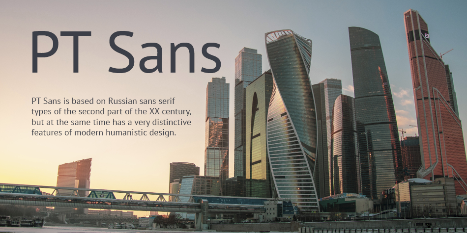
PT Sans is based on Russian sans serif types of the second part of the XX century, but at the same time has a very distinctive features of modern humanistic design. The family consists of 8 styles: 4 basic styles; 2 captions styles for small sizes and 2 narrows styles for economic setting.
Structure, composition, and purpose of PT Sans
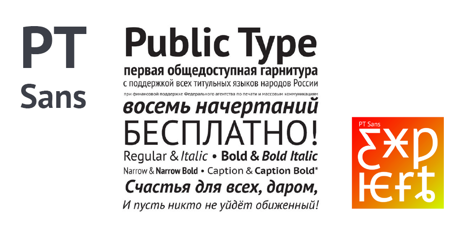
PT Sans type family consists of eight styles. A typical type family includes four basic styles of classical proportions in regular and bold weights and both upright and italic: PT Sans Regular, PT Sans Bold, PT Sans Italic, and PT Sans Bold Italic. These basic styles are designed for typography of various documents, both in hard and soft copies.
These styles apply to formal and business correspondence, normative and technical documentation, general-purpose periodicals, etc. Two special styles of extended proportions of PT Sans Caption Regular and PT Sans Caption Bold are designed for using small-size text, i.e., for footnotes, boxes, and notes for the main text. Also, these styles will look very professional on websites, especially when creating lists where a large number of short lines are required. These styles will be used, probably above all, on road signs, general signage, hoardings, and other communication design objects in the urban environment. Owing to the extended typeface area, these styles have increased readability when viewed from an acute angle or from a long distance, in low-light conditions, in fog, on luminescent and reflective signs, with backlighting, etc. Two auxiliary condensed styles, PT Sans Narrow Regular and PT Sans Narrow Bold, are intended first and foremost for economy of typesetting, i.e., when it is needed to fit a large amount of text into the limited space of a printed page. Relatively low condensing (by about 20%) significantly saves space without greatly reducing legibility, and holds the promise of ingredients on food packaging, leaflets for medical products, and the small print in insurance contracts, where narrow types are traditionally used, still being legible.
Released 2009–2011, PT Sans type family turned out to be so popular that it was decided that several expert fonts should be created, and their character sets expanded. The first one in the list is PT Sans Expert, which is based on the regular PT Sans font (version 2.005) with an expanded character set. The following Unicode pages are completed in the first version of PT Sans Expert:
— Basic Latin
— Latin-1 Supplement
— Latin Extended-A
— Latin Extended-B
— Latin Extended Additional
— Cyrillic
— Greek (in Greek Monotonic part)
Design, Publisher, Copyright, License
Design: A. Korolkova, O. Umpeleva, V. Yefimov
Copyright 2010 by ParaType Ltd. All rights reserved.
License: SIL OPEN FONT LICENSE
Alexandra Korolkova
![]()
Alexandra Korolkova (born 1984) is a Russian typeface designer. She was awarded the infrequently presented Prix Charles Peignot in 2013 by the Association Typographique Internationale, becoming the first Russian prizewinner. Korolkova’s best-known work is probably the PT Fonts project, a partly open-source project commissioned by the Russian Ministry of Communications as a single family able to support all the common variations of the Cyrillic script. Korolkova works for the company ParaType and studied at the Moscow State University of Printing Arts. She is the author of the book Living Typography (Russian: Живая типографика) and has also given lectures on Cyrillic letter structure. She has also designed the typeface FF Carina for FontShop.
Web:
Typefaces: Leksa, Leksa Sans, Golos, PT Astra Serif, PT Astra Sans, PT Sans, PT Serif, PT Mono, Kiddy Kitty, Circe, Circe Slab, Circe Rounded, Fact, PT Sans Pro, PT Serif Pro, Yefimov Sans, Yefimov Serif, Stem, Stem Text, Aphrosine, Airy, Bowman
More… WIKIPEDIA | Alexandra Korolkova
Free License
Download v.2.005: PT Sans | Google Drive
Get permission to open a file on a Google Drive
• Open the file.
• On the “You need permission” page, click “Request access”.
• The owner of the file will get an email asking for approval.
• After they approve your request, you’ll get an email.


