Description
The original Avenir typeface was designed by Adrian Frutiger in 1988, after years of having an interest in sans serif typefaces. The word Avenir means “future” in French and hints that the typeface owes some of its interpretation to Futura. But unlike Futura, Avenir is not purely geometric; it has vertical strokes that are thicker than the horizontals, an “o” that is not a perfect circle, and shortened ascenders. These nuances aid in legibility and give Avenir a harmonious and sensible appearance for both texts and headlines.
In 2012, Akira Kobayashi worked alongside Avenir’s esteemed creator Adrian Frutiger to bring Avenir Next to life, as a new take on the classic Avenir. The goal of the project was to take a beautifully designed sans and update it so that its technical standards surpass the status quo, leaving us with a truly superior sans family.
Since then, Monotype expanded the typeface to accommodate more languages. Akira’s deep familiarity with existing iterations of the Frutiger designs, along with his understanding of the design philosophy of the man himself, made him uniquely suited to lead the creation of different language fonts.
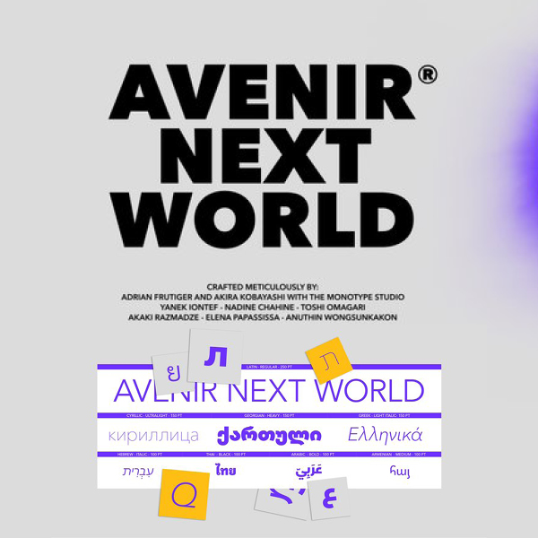
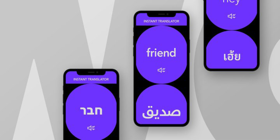
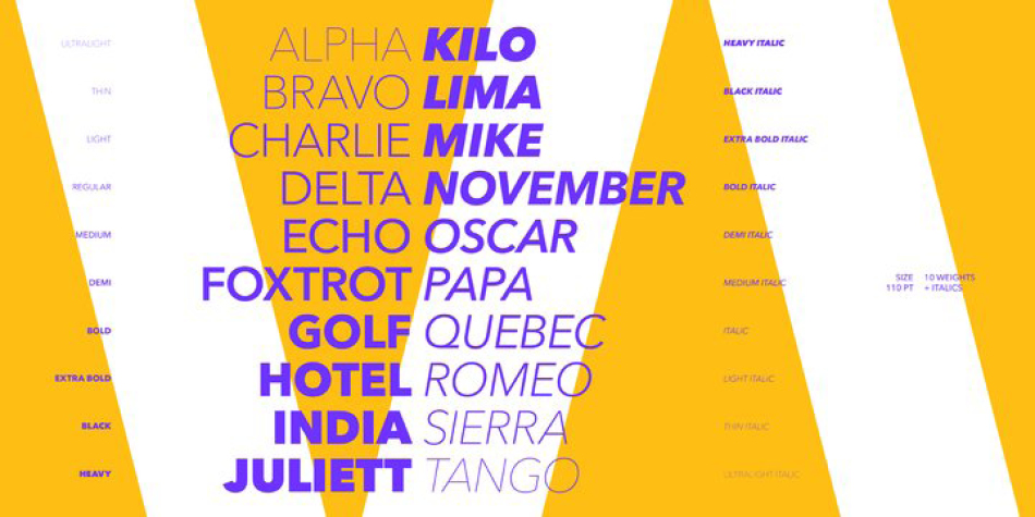
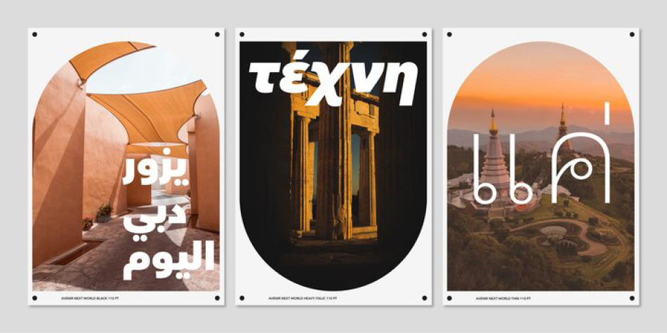
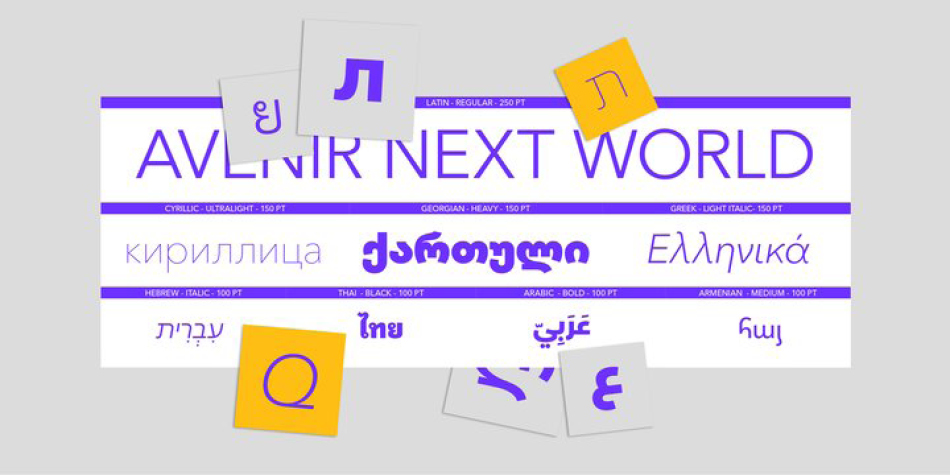
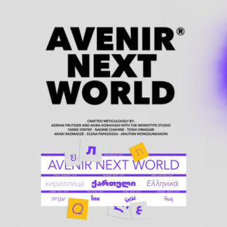
Avenir Next World family, the most recent release from Monotype, is an expansive family of fonts that offers support for more than 150 languages and scripts that include Latin, Cyrillic, Greek, Hebrew, Arabic, Georgian, Armenian and Thai. Avenir Next World contains 10 weights, from UltraLight to Heavy.
The respective 10 Italic styles do not support Arabic, Georgian and Thai, since Italic styles are unfamiliar in these scripts/languages. Separate Non-Latin products to support just the Arabic, Cyrillic, Georgian, Hebrew and Thai script are also available for those who do not need the full language support.
Design, Publisher, Copyright, License
Design: Adrian Frutiger, Akira Kobayashi, Anuthin Wongsunkakon, Yanek Iontef, Akaki Razmadze, Nadine Chahine, Monotype Studio, Toshi Omagari, Elena Papassissa
Publisher: Linotype
Copyright 2021 by Linotype. All rights reserved.
Adrian Frutiger
Adrian Johann Frutiger (24 May 1928 – 10 September 2015) was a Swiss typeface designer who influenced the direction of type design in the second half of the 20th century. His career spanned the hot metal, phototypesetting and digital typesetting eras. Until his death, he lived in Bremgarten bei Bern.
Frutiger’s most famous designs, Univers, Frutiger and Avenir, are landmark sans-serif families spanning the three main genres of sans-serif typefaces: neogrotesque, humanist and geometric. Univers was notable for being one of the first sans-serif faces to form a consistent but wide-ranging family, across a range of widths and weights. Frutiger described creating sans-serif types as his “main life’s work,” partially due to the difficulty in designing them compared to serif fonts.Typefaces: Neue Frutiger World, Avenir Next Cyrillic, Avenir Next World
More… WIKIPEDIA | Adrian Frutiger
Akira Kobayashi
With an extensive background in Japanese typeface design and a deep understanding of calligraphy, type director of Monotype Akira Kobayashi has three decades of experience. In that time he’s collaborated with some of the biggest names in type design, including Adrian Frutiger and Hermann Zapf.
After studying at Musashino Art University in Tokyo for four years, Akira Kobayashi accepted his first job at phototypesetting manufacturer Sha-Ken Co., where he was involved in the lengthy and intricate process of designing Japanese fonts. After leaving this role he studied calligraphy at the London College of Printing, worked as a freelance type designer, and has been a type director since 2001. In 2002 Kobayashi released Optima Nova – a modernization of Hermann Zapf’s Optima design – and in 2009 he partnered with Adrian Frutiger to update his eponymous typeface family. More recently Kobayashi directed the development of Tazugane, Monotype’s first original Japanese typeface. Responsible for the design over 50 font families including DIN Next, Akko Pro and Neue Frutiger. Closely collaborated with Hermann Zapf to release Zapfino Extra and Palatino Nova – expanded and updated versions of of the original families. Developed typefaces for major brands including Sony, UBS and Panasonic.Typefaces: Neue Frutiger World, Avenir Next Cyrillic, Avenir Next World
More… Monotype | Akira Kobayashi
Toshi Omagari
With a focus on multilingual typography, type designer Toshi Omagari has created fonts for several major brands and worked on some of Monotype’s most recent major type releases. He is a regular speaker at events like ATypI, sharing his experience and insights on multilingual type design.
Toshi Omagari joined Monotype in 2012, after studying typography at Musashino Art University in Tokyo, and completing an MA in typeface design at the University of Reading. With a keen interest in font development, Omagari has worked on several major type projects for Monotype including resurrecting a ‘lost’ typeface to create Neue Haas Unica and updating the hand of WA Dwiggins to create Metro Nova. He’s also designed a fashion-led branding typeface for H&M, and created a font for Sir Quentin Blake that borrowed on the illustrator’s own idiosyncratic handwriting.
- Specializes in multilingual scripts including Latin, Greek, Cyrillic and Mongolian
- Designed the Tibetan script for the Google Noto family, covering more than 800 languages
- Enjoys writing scripts and plugins for type design and sharing them on Github
Web:
Typefaces on Localfonts: Marco Cyrillic, Albertus® Nova, Neue Haas Unica, Avenir Next World
Typefaces on MyFonts: Avenir® Next Arabic, Belinsky, Belinsky Text, Codelia, Comic Code, Cowhand, Dossier, Liberty, Marco, Metro Nova®, Neue Haas Unica Paneuropean, Neue Plak™, Neue Plak™ Variable, Palatino eText®, Sachsenwald™, Tabulamore Script, Aeonis™, Wolpe Fanfare™, Wolpe Pegasus™, Wolpe Tempest™
More… Toshi Omagari




Reviews
There are no reviews yet.