Description
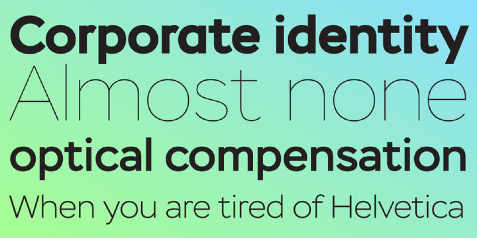
The thing is that many sans-serif typefaces are usually intended for universal usage. But sometimes faces that work fine in body text look not so good in large point sizes for display purposes when all the contrast in non-contrast sans-serif, or ink traps, become visible to the naked eye.
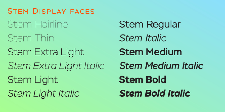
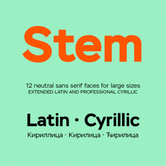
Every designer solves this problem in his own way. We offer a drastic solution in our Stem: a sans-serif with optical sizing. The first part of the type family, Stem Display, is for use in largest point sizes, from 36 pt indefinitely. Stem Display consists of 12 faces of widths from Hairline to Bold, and it has true italics. The development of Stem type family will include Stem Text for body text and “traditional”, universal use, and Stem Caption for small point sizes.
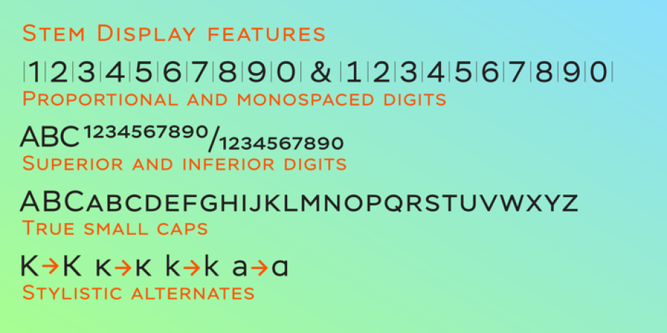
Stem is a geometric sans-serif with semi-closed aperture, large x-height and modern proportions of uppercase letters, like in famous Avenir and Gotham. Its important feature is a professionally designed and carefully tested Cyrillic glyph set.
Design, Publisher, Copyright, License
Design: Isabella Chaeva, Alexandra Korolkova, Maria Selezeneva
Publisher: ParaType
Copyright 2014 by ParaType. All rights reserved.
Isabella Chaeva
Isabella Chaeva is a Russian type designer. She graduated from Moscow Academy of Print (former Moscow Printing Institute, now Moscow State University of Printing).
Typefaces: Roundhand, Engravers Gothic, Stem, Stem Text, Reed
More… TYPE DESIGN INFORMATION | Isabella Chaeva
Alexandra Korolkova
Alexandra Korolkova (born 1984) is a Russian typeface designer. She was awarded the infrequently presented Prix Charles Peignot in 2013 by the Association Typographique Internationale, becoming the first Russian prizewinner. Korolkova’s best-known work is probably the PT Fonts project, a partly open-source project commissioned by the Russian Ministry of Communications as a single family able to support all the common variations of the Cyrillic script. Korolkova works for the company ParaType and studied at the Moscow State University of Printing Arts. She is the author of the book Living Typography (Russian: Живая типографика) and has also given lectures on Cyrillic letter structure. She has also designed the typeface FF Carina for FontShop.
Web:
Typefaces: Leksa, Leksa Sans, Golos, PT Astra Serif, PT Astra Sans, PT Sans, PT Serif, PT Mono, Kiddy Kitty, Circe, Circe Slab, Circe Rounded, Fact, PT Sans Pro, PT Serif Pro, Yefimov Sans, Yefimov Serif, Stem, Stem Text, Aphrosine, Airy, Bowman
More… WIKIPEDIA | Alexandra Korolkova
Maria Selezeneva
Moscow-based type designer, known first as Maria Selezeneva, and then as Maria Kharlamova. In 2014, she cooperated with Alexandra Korolkova on a revamped Journal Sans typeface at Paratype, called Journal Sans New (Latin and Cyrillic).
Typefaces: Yefimov Sans, Yefimov Serif, Stem, Stem Text
More… TYPE DESIGN INFORMATION | Maria Selezeneva



Reviews
There are no reviews yet.