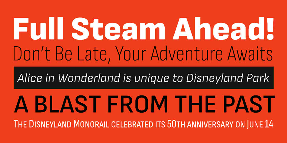
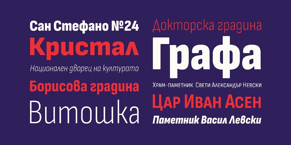
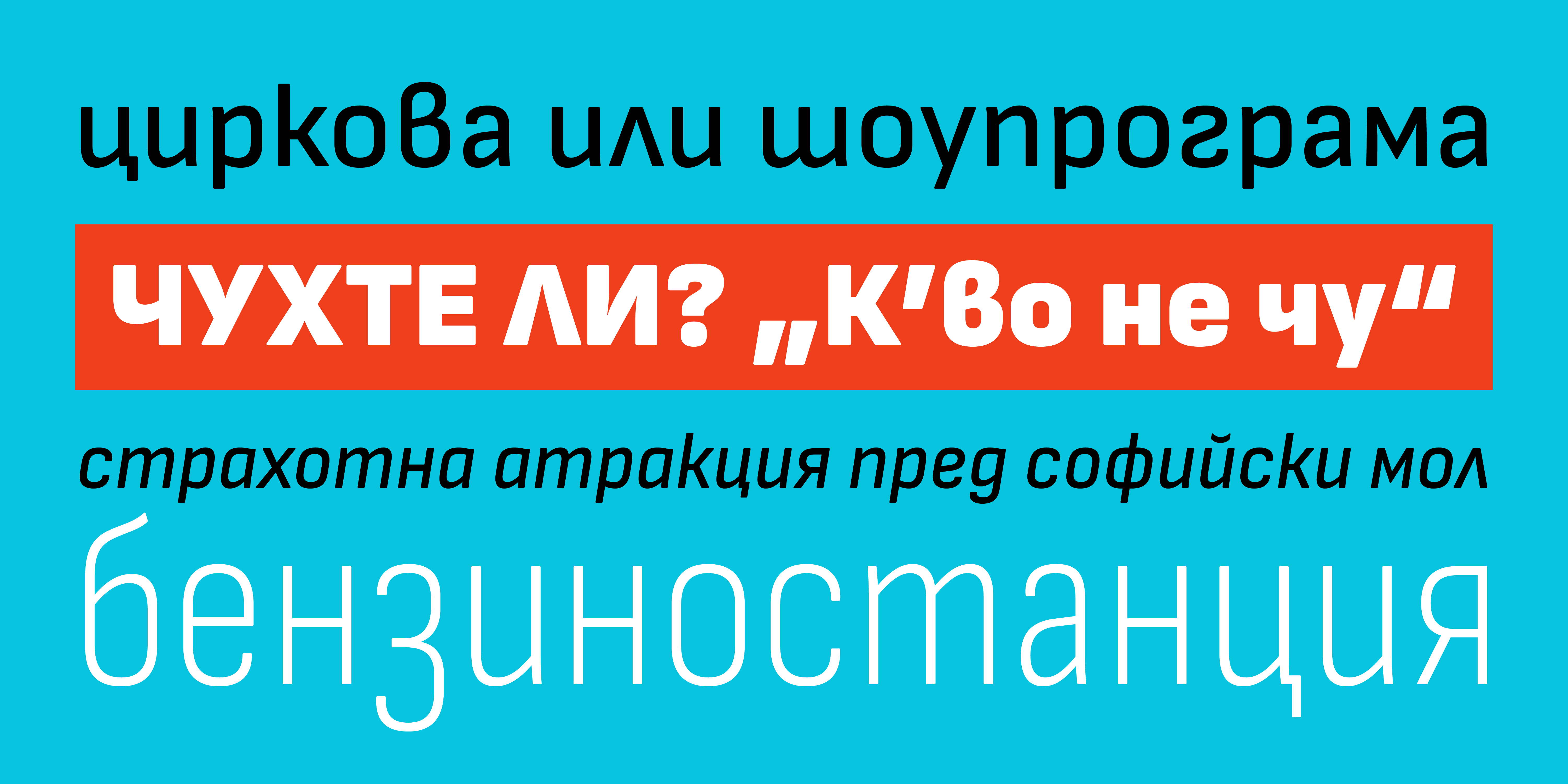
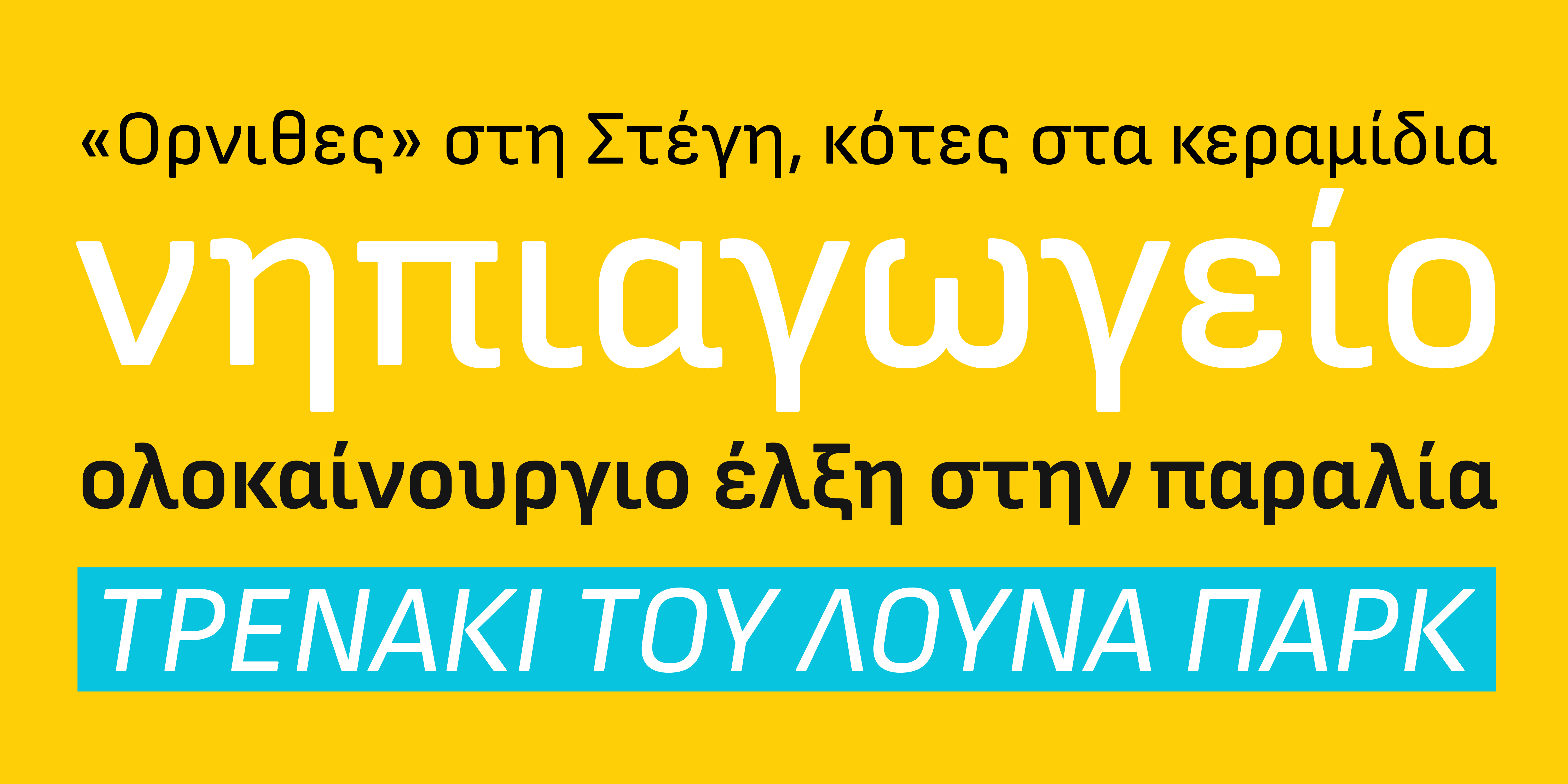
Nexa Script

Nexa Script
Description

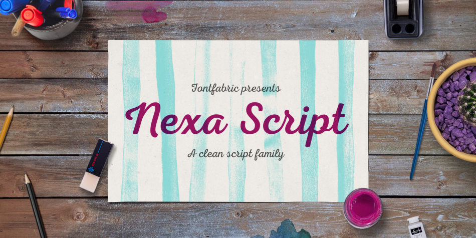
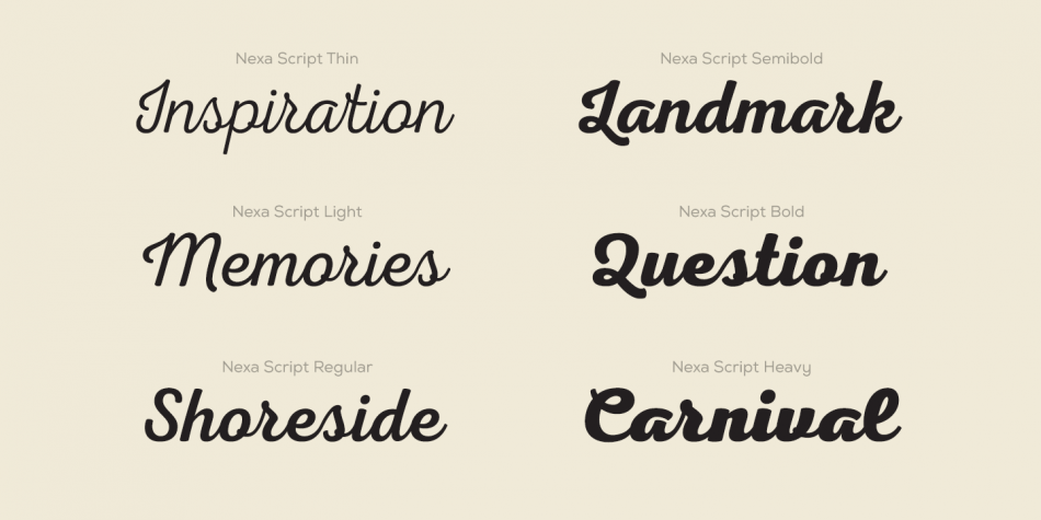
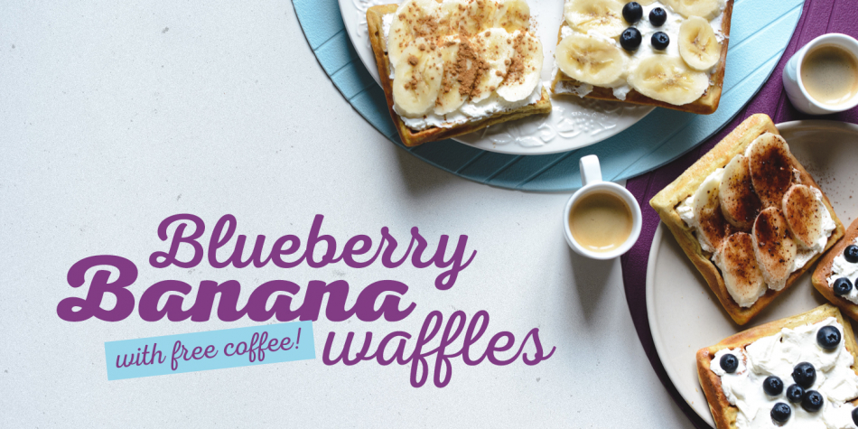
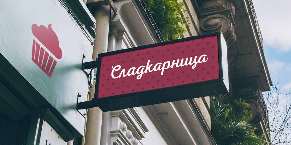
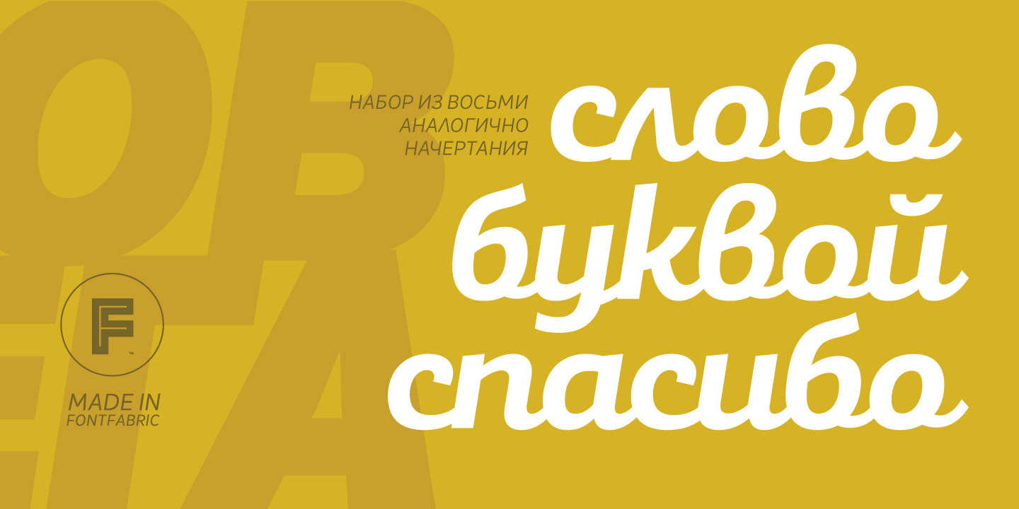
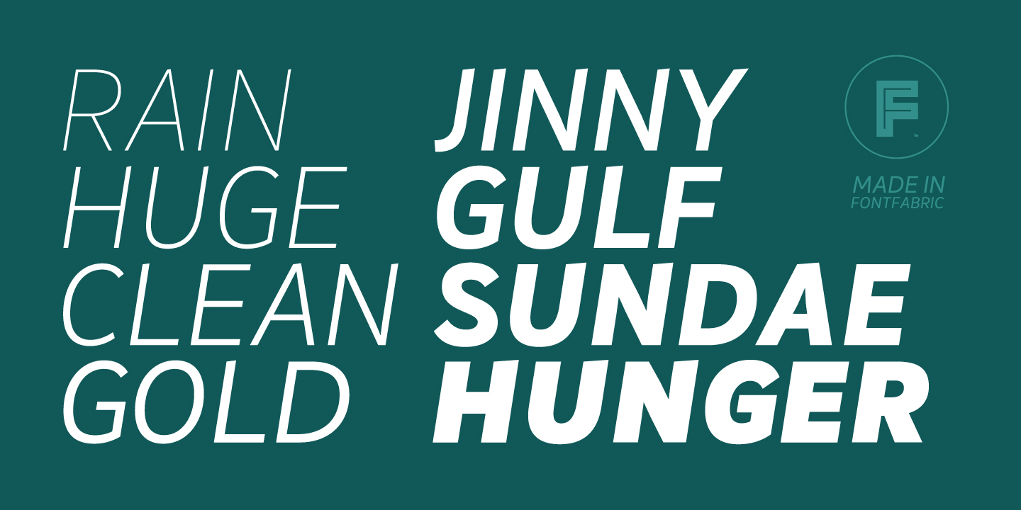
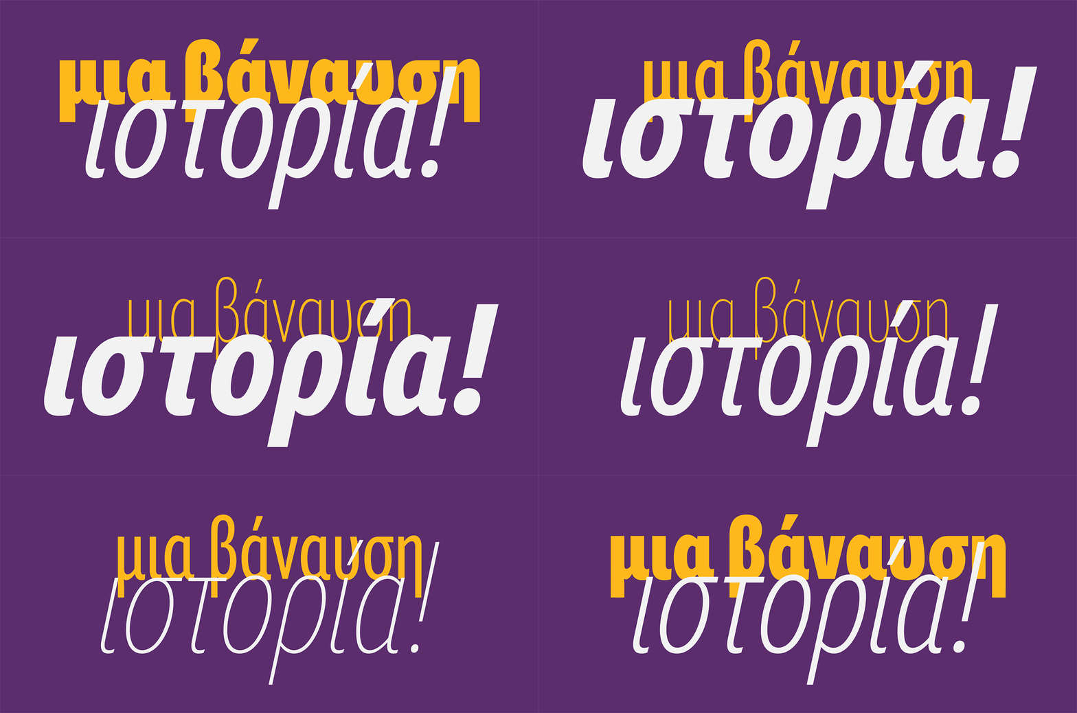
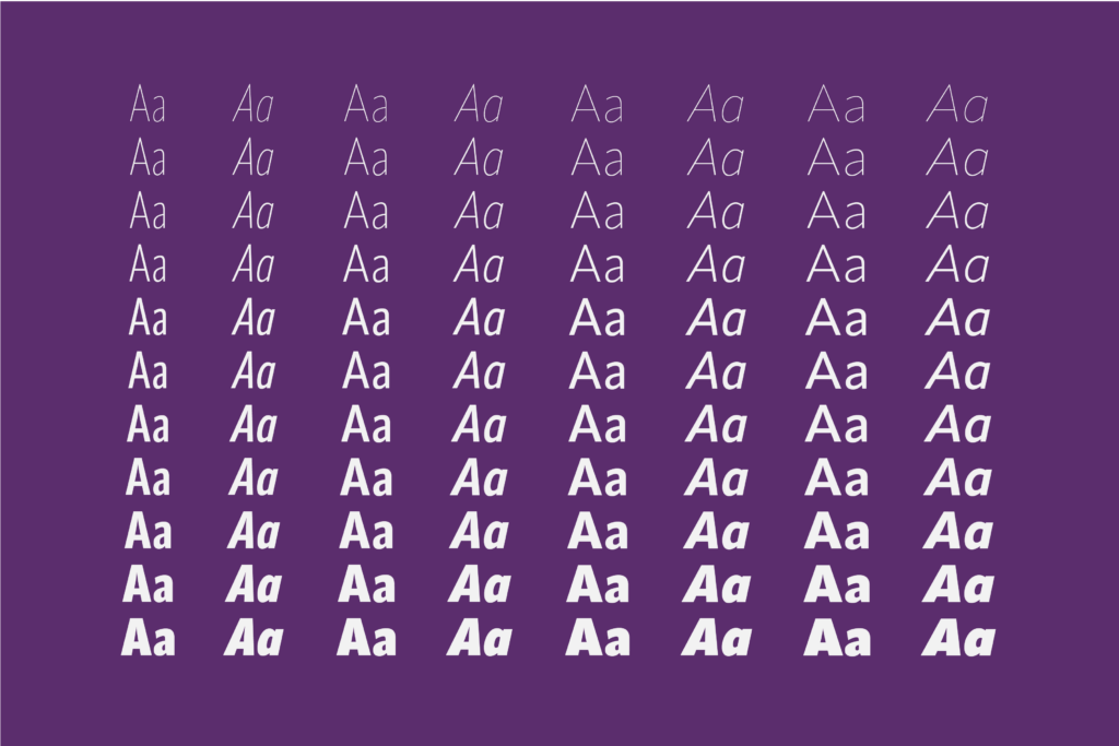
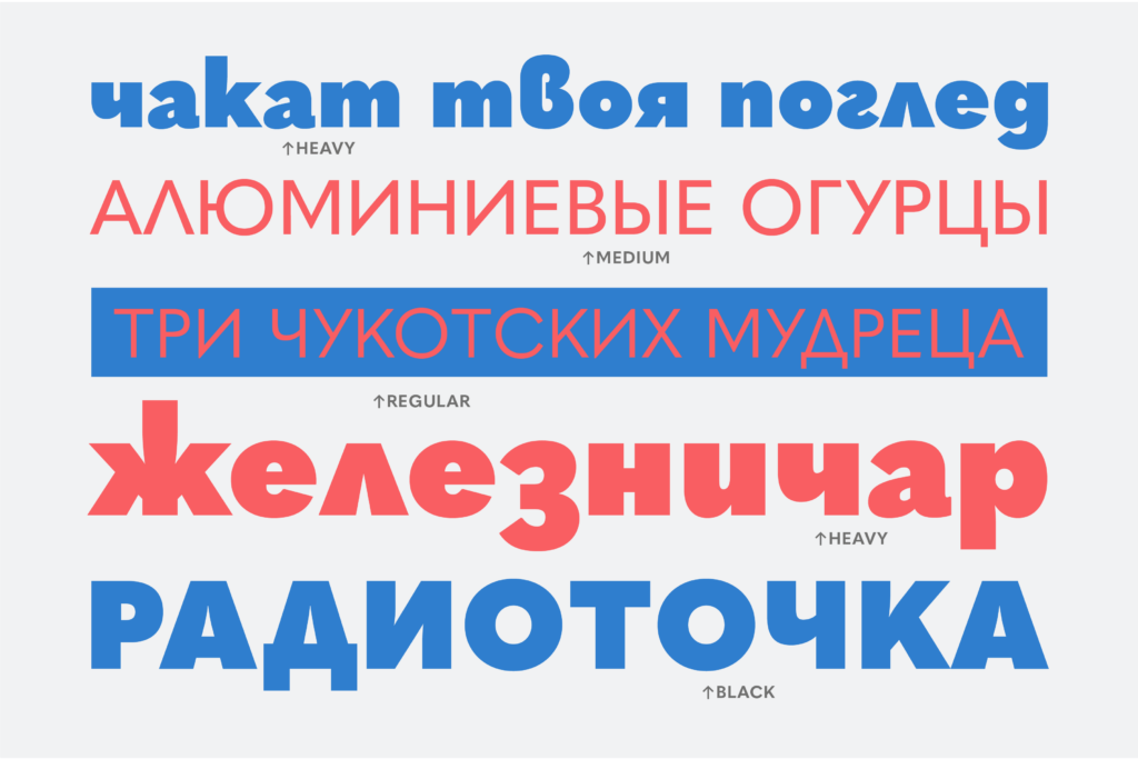
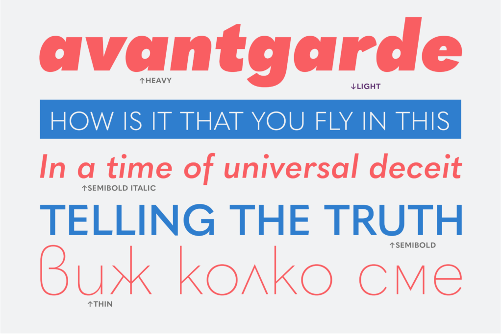
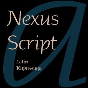
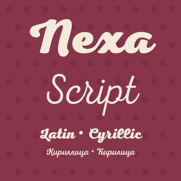
Nexa Script is a clean version of the famous multifaceted font system Nexa Rust. All fonts from the family was successfully designed to match perfect to the other two members of this huge font system – Nexa and Nexa Slab.

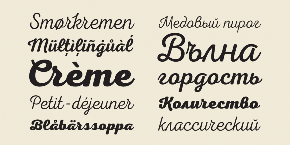
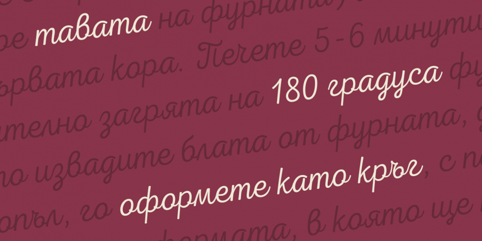
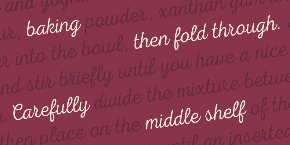
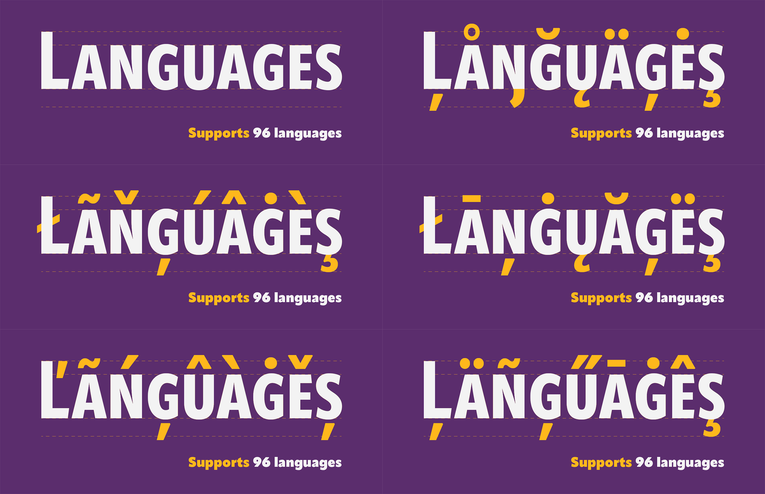
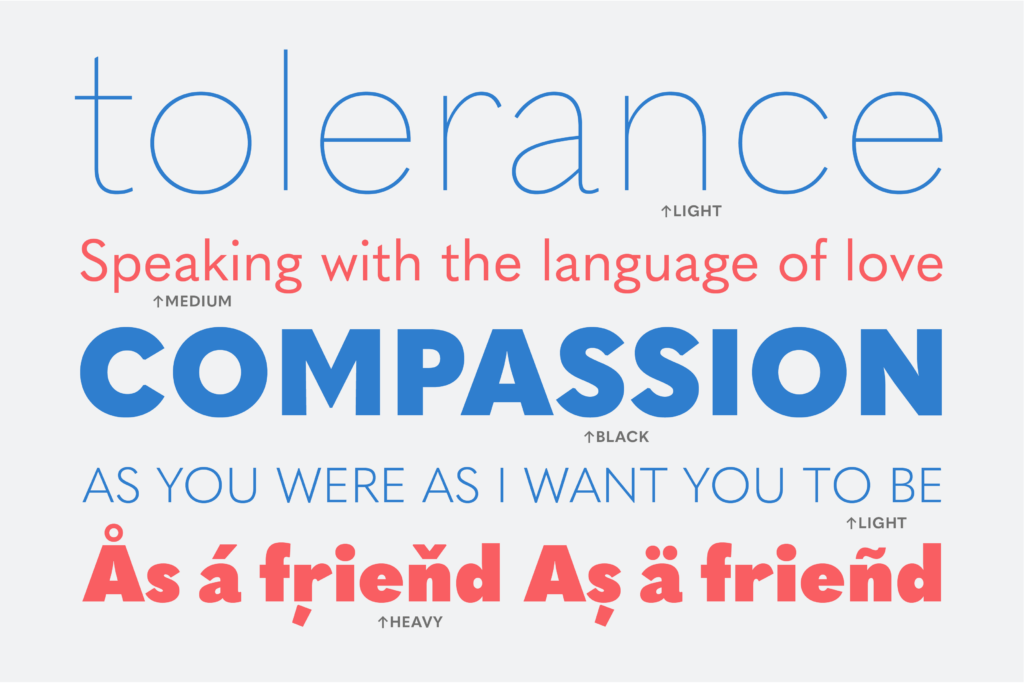
You can be sure that Nexa Script is equipped with the most advanced typographic Open Type features such as extended sets of ligatures, fractions, alternate characters, superscripts and subscripts, etc.

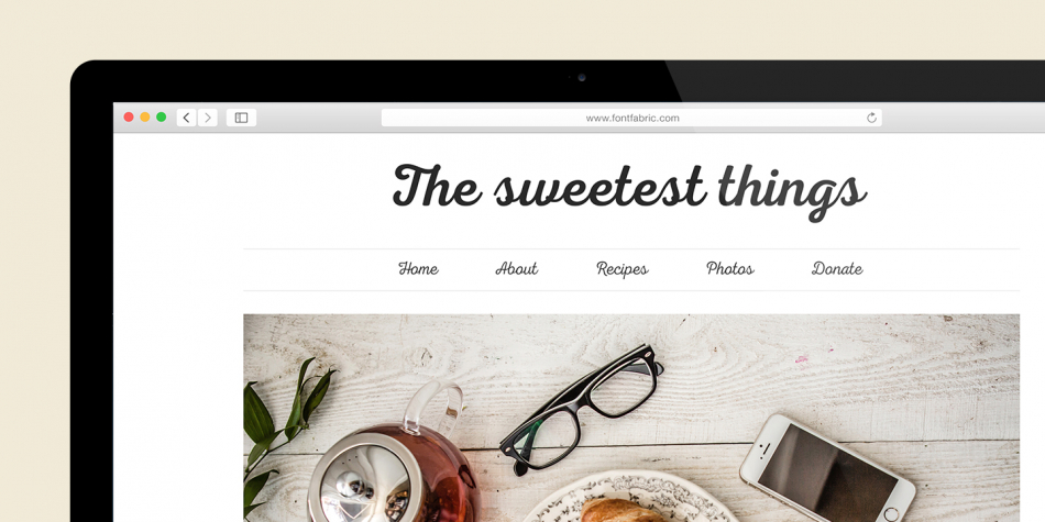
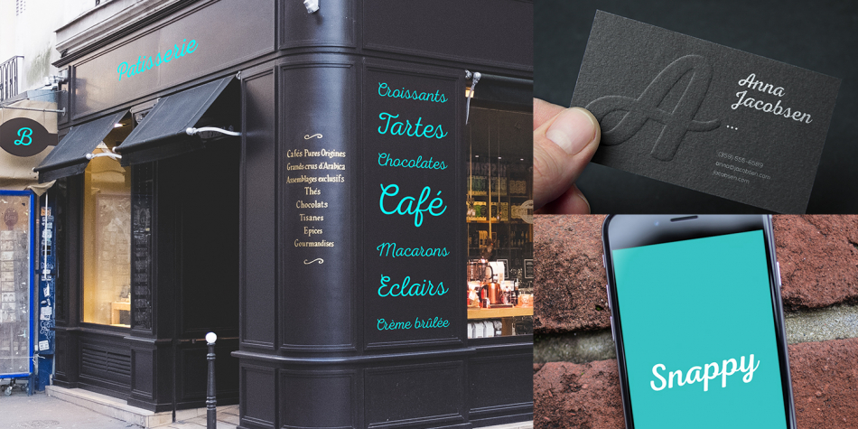
The font family is most suitable for headlines of all sizes, as well as for text blocks that come in both maximum and minimum variations. Nexa Script font styles are applicable for any type of graphic design in web, print, motion graphics etc and perfect for t-shirts and other items like posters and logos.

Design, Publisher, Copyright, License

Design: Ani Petrova

Publisher: Fontfabric

Copyright 2015 by Fontfabric. All rights reserved.

License: COMMERCIAL

Ani Petrova

Ani Petrova

Type designer, b. 1988, Sofia, Bulgaria, who works at Fontfabric, Svetoslav Simov’s typefoundry. She completed her Bachelor’s degree at The National Academy of Art in Sofia. In 2014 she obtained a Master’s degree in type design.

Commercial license

Buy at: Fontspring

Uni Sans

Uni Sans

 Font Sampler

(EN) The quick brown fox jumps over the lazy dog. (NL) Op brute wijze ving de schooljuf de quasi-kalme lynx. (CS) Nechť již hříšné saxofony ďáblů rozezvučí síň úděsnými tóny waltzu, tanga a quickstepu. (HU) Jó foxim és don Quijote húszwattos lámpánál ülve egy pár bűvös cipőt készít. (RO) Înjurând pițigăiat, zoofobul comandă vexat whisky și tequila. (RU) Разъяренный чтец эгоистично бьёт пятью жердями шустрого фехтовальщика. (BG) Огньове изгаряха с блуждаещи пламъци любовта човешка на Орфей. (SR) Фијуче ветар у шибљу, леди пасаже и куће иза њих и гунђа у оџацима. (EL) Ταχίστη αλώπηξ βαφής ψημένη γη, δρασκελίζει υπέρ νωθρού κυνός. Type your own text to test the font!
 Description

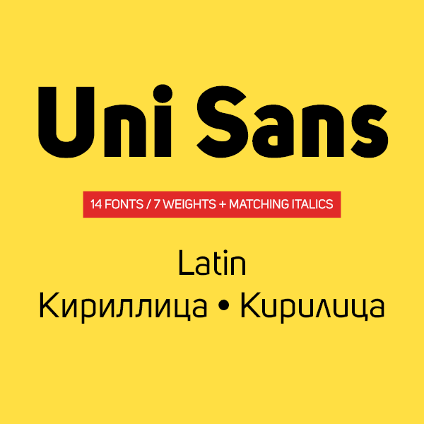
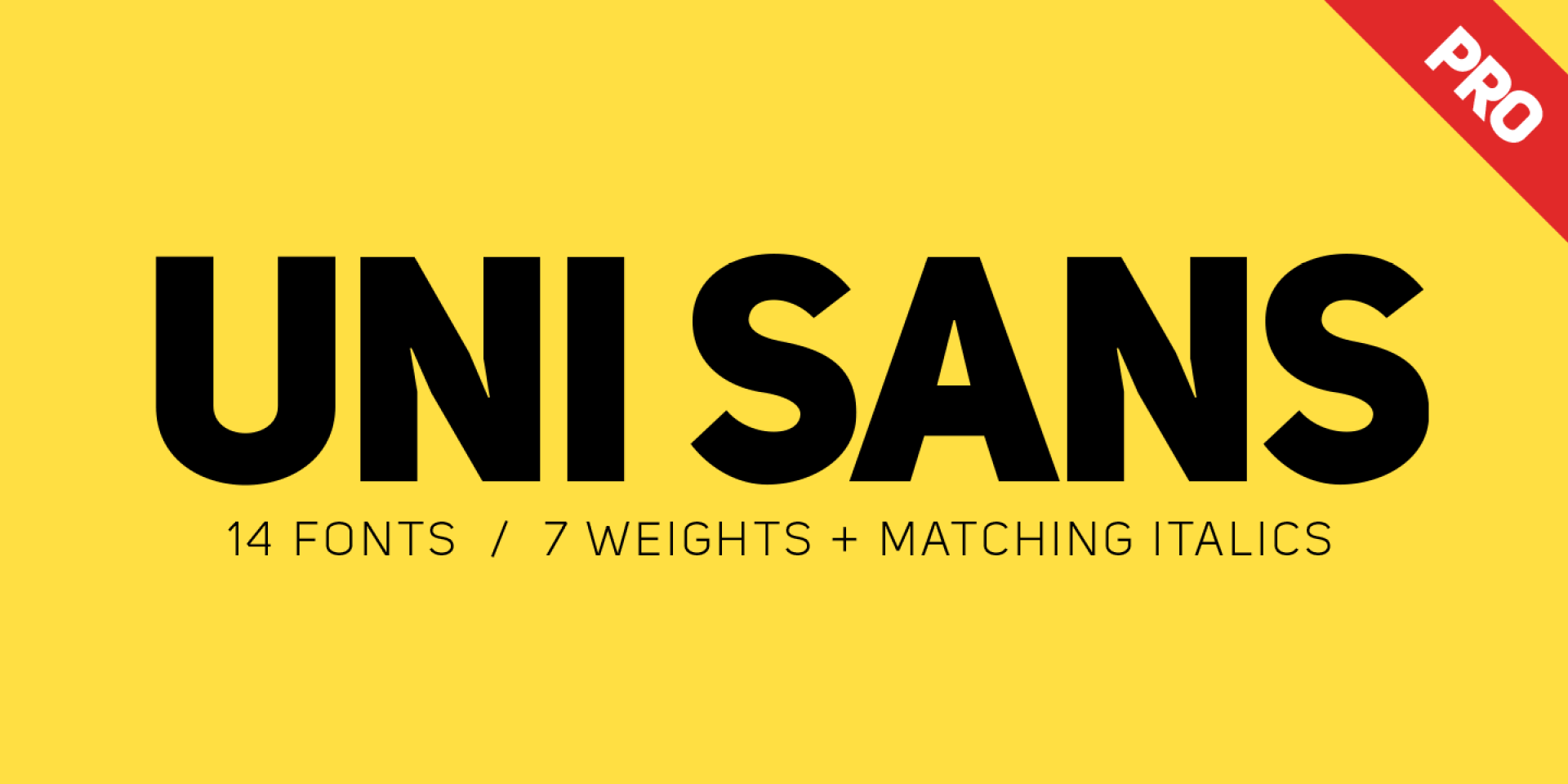
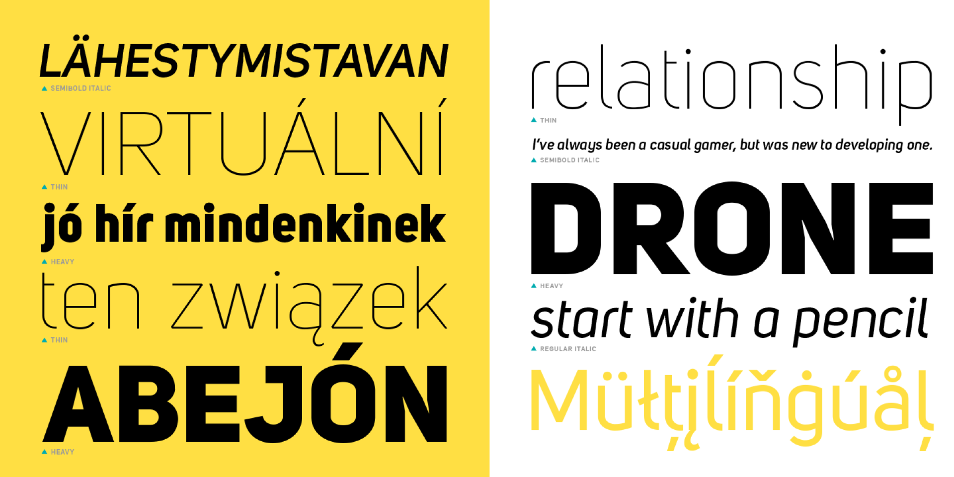
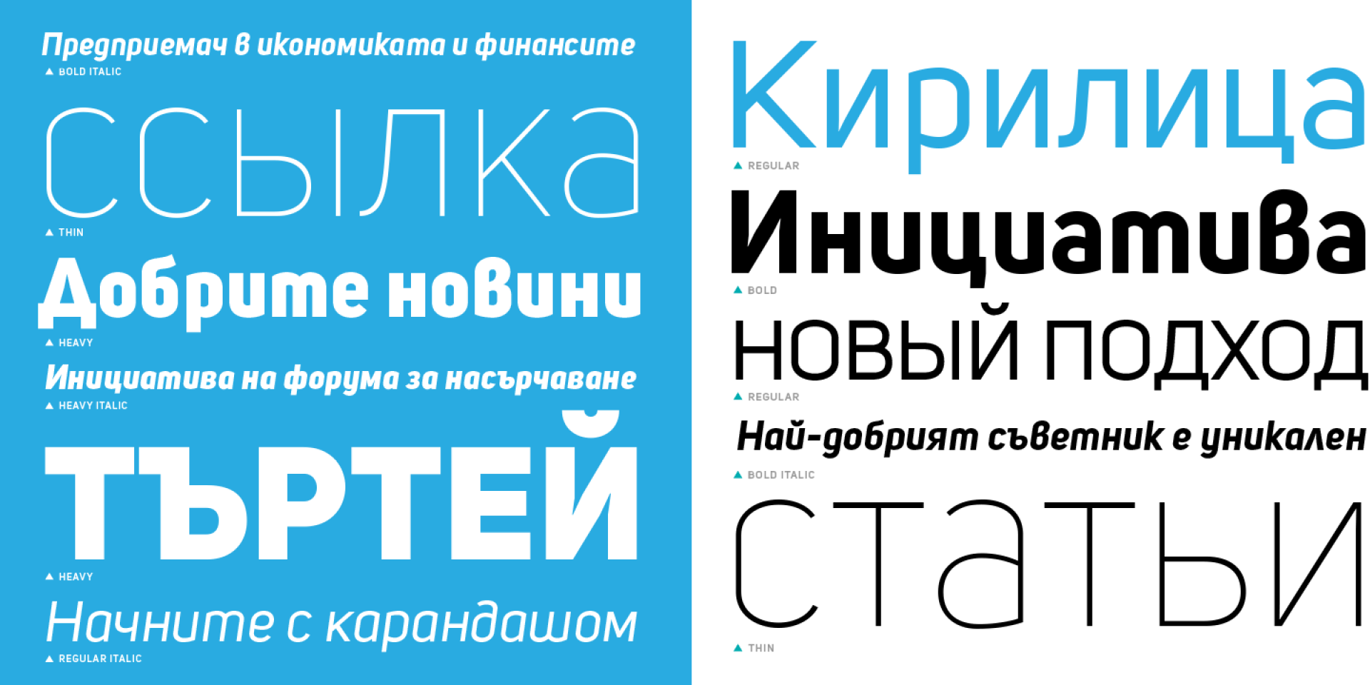
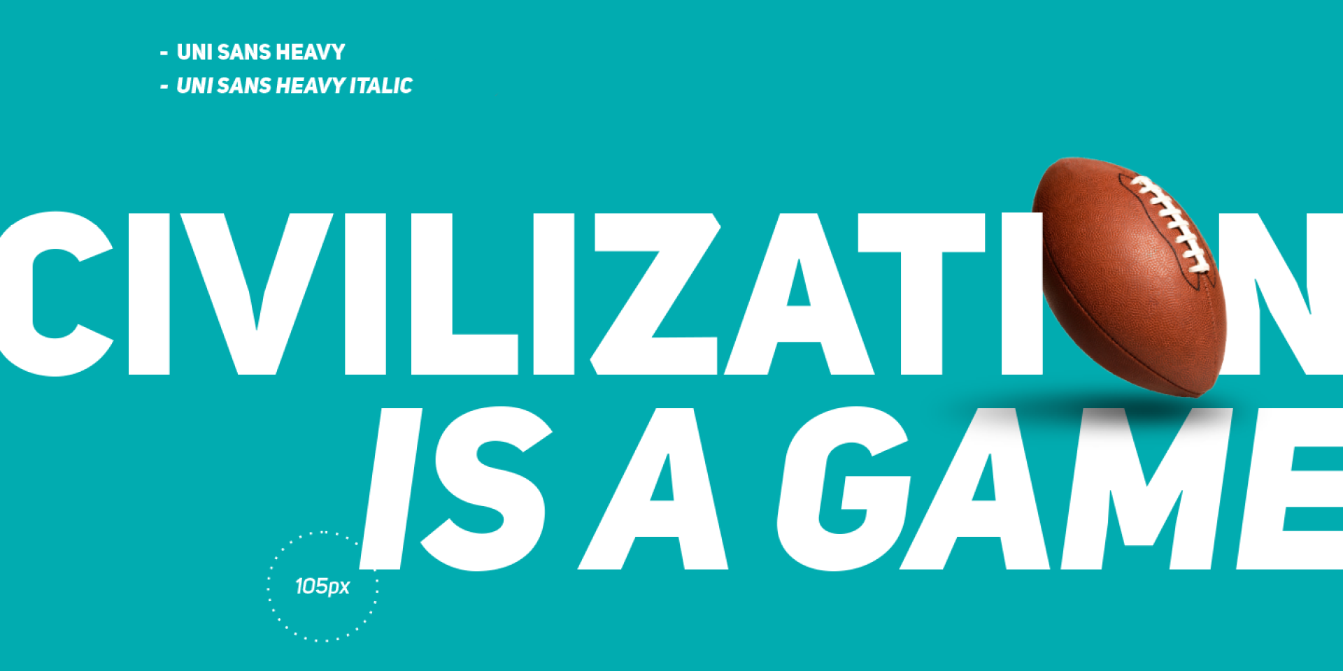
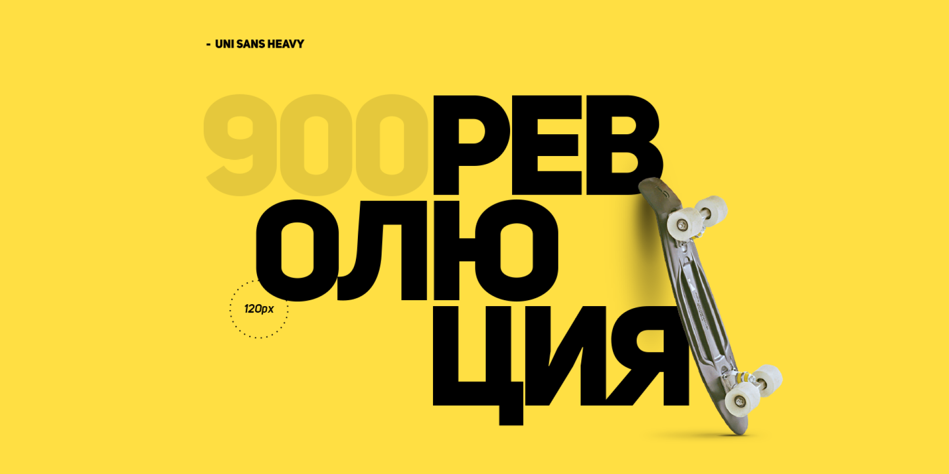
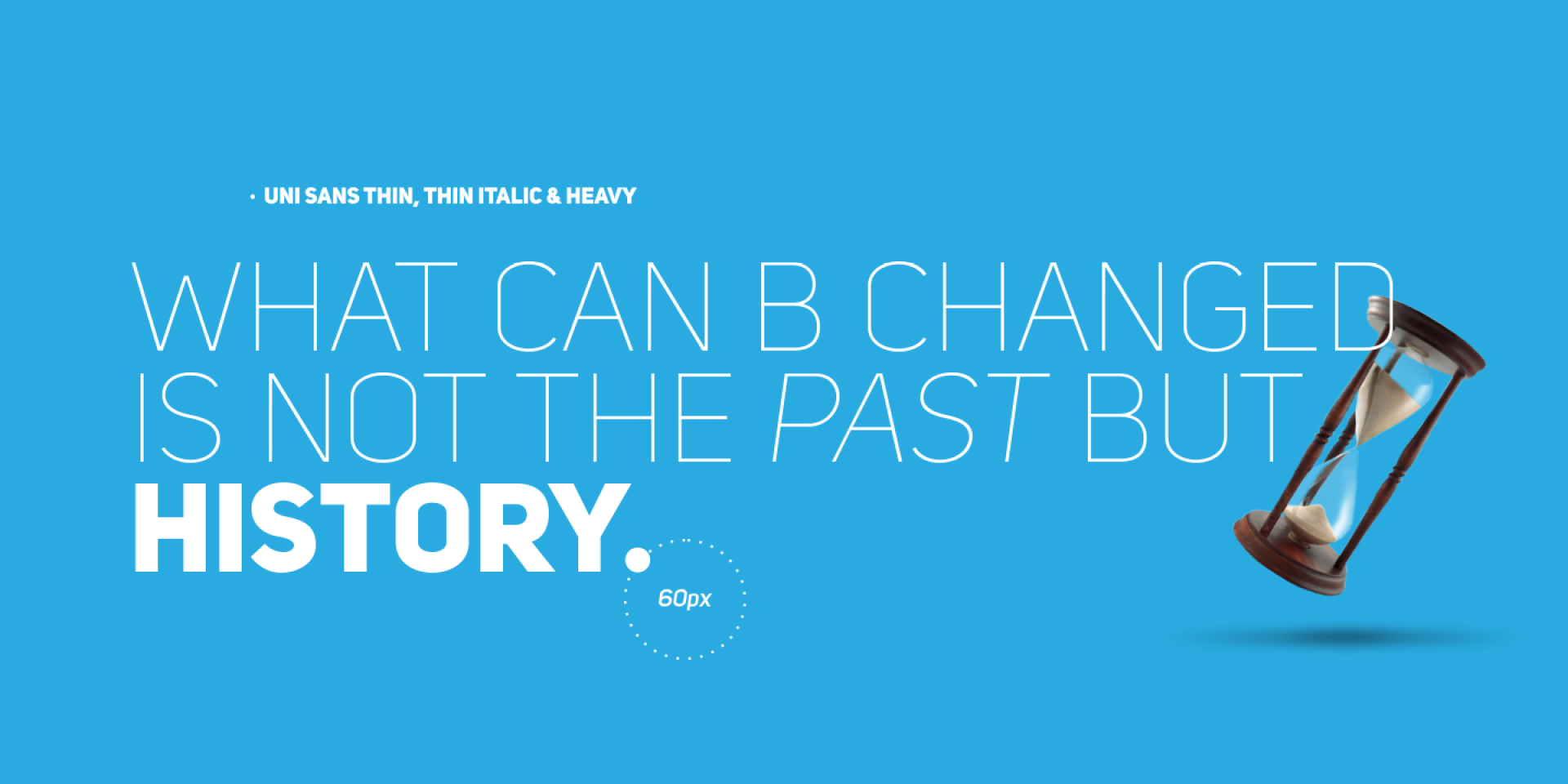
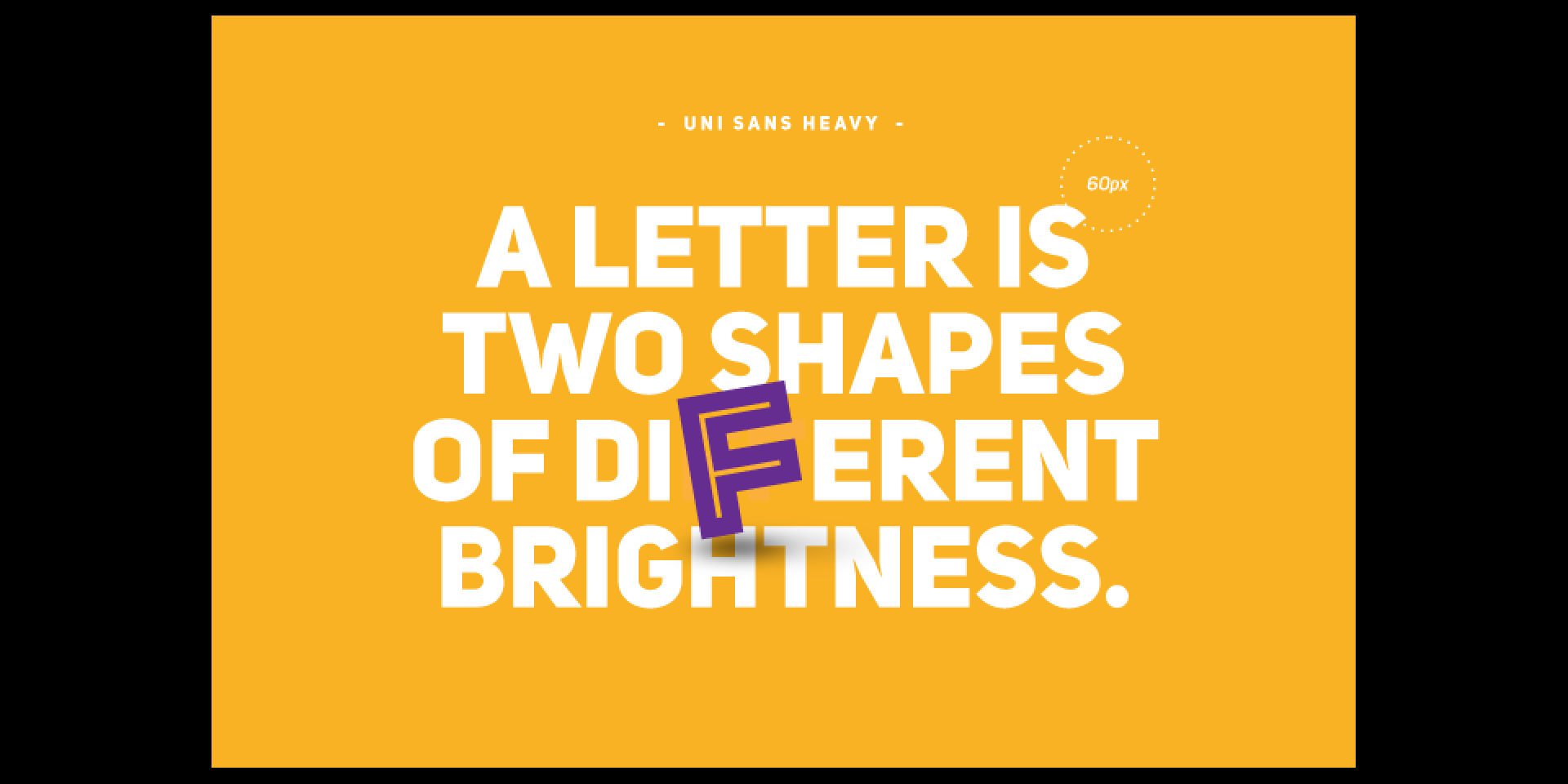
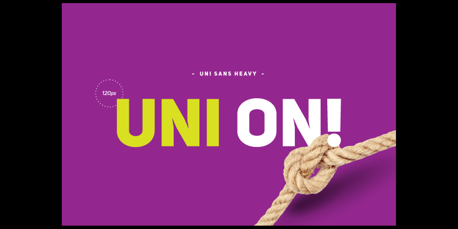
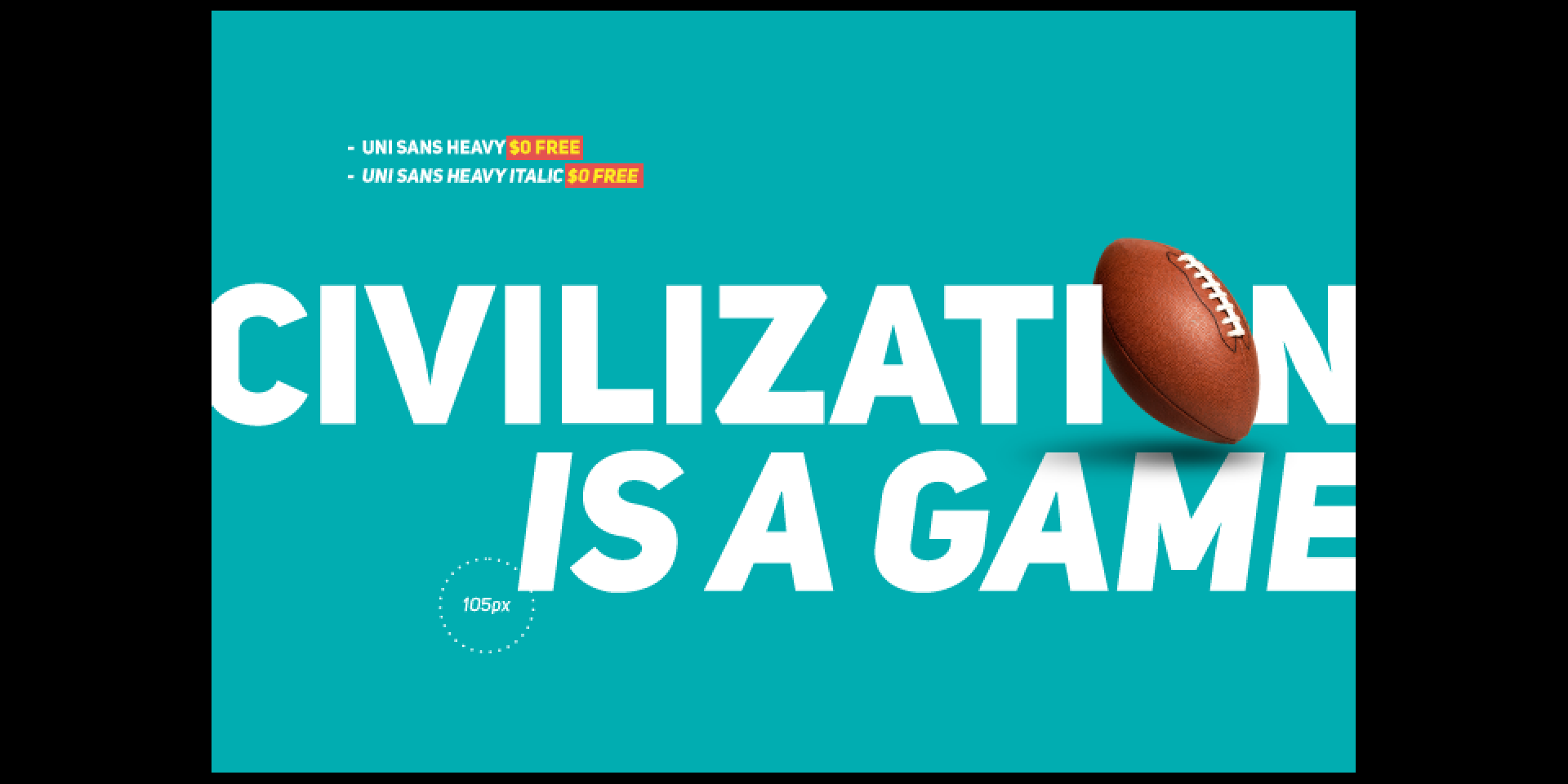
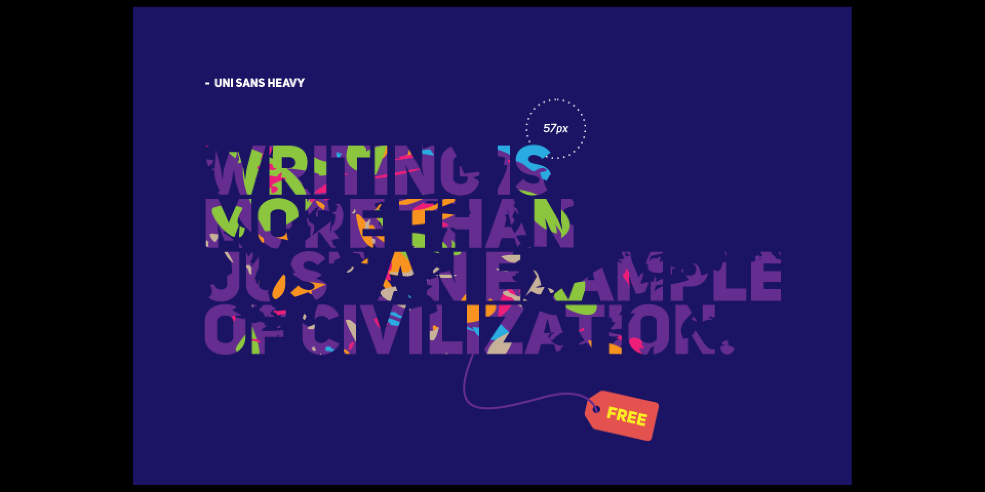
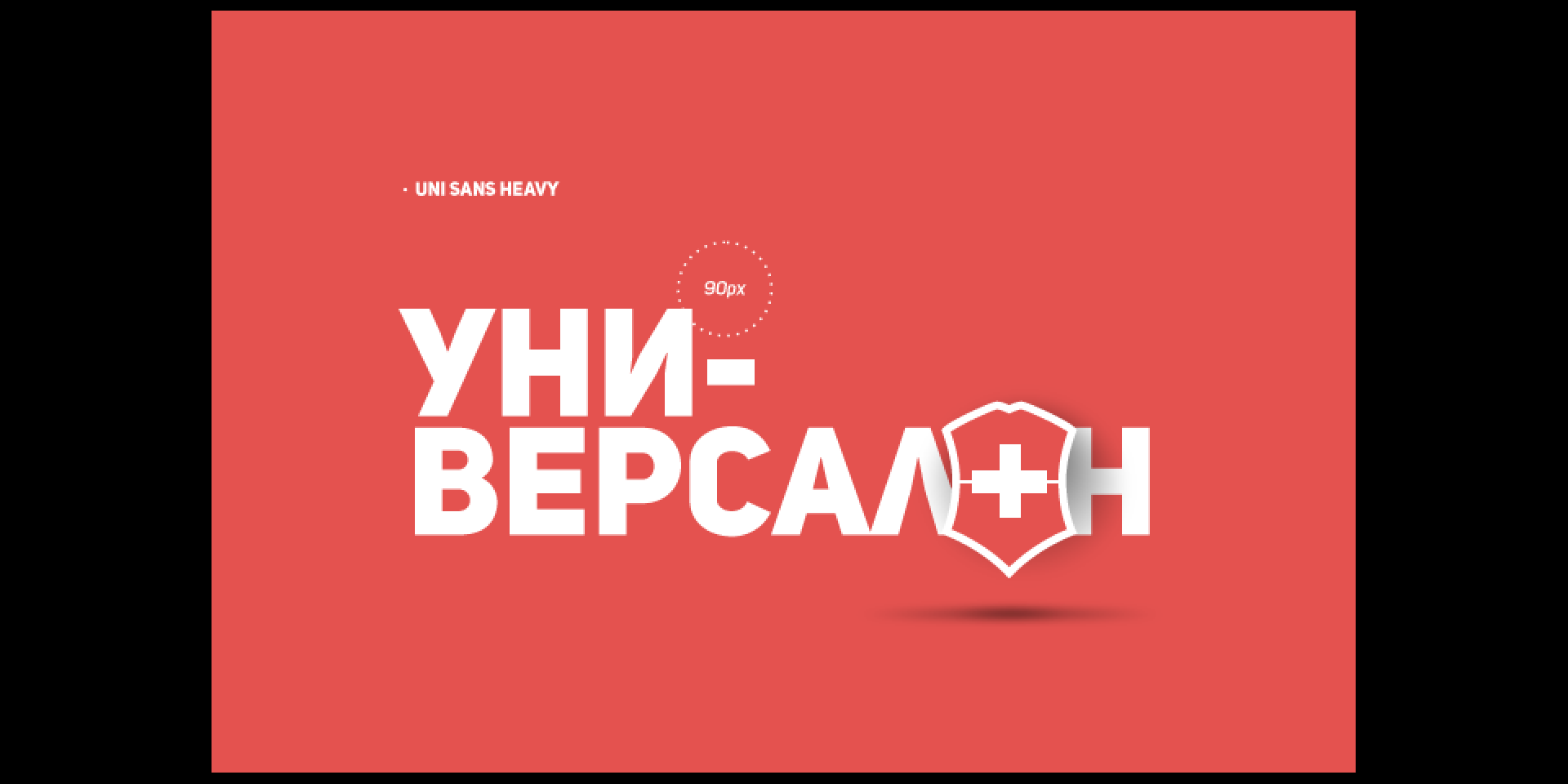
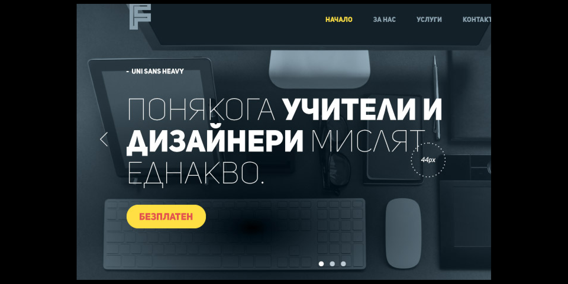
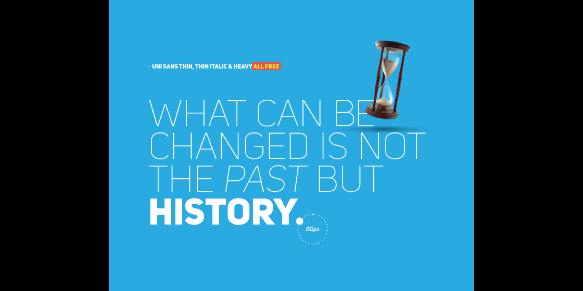
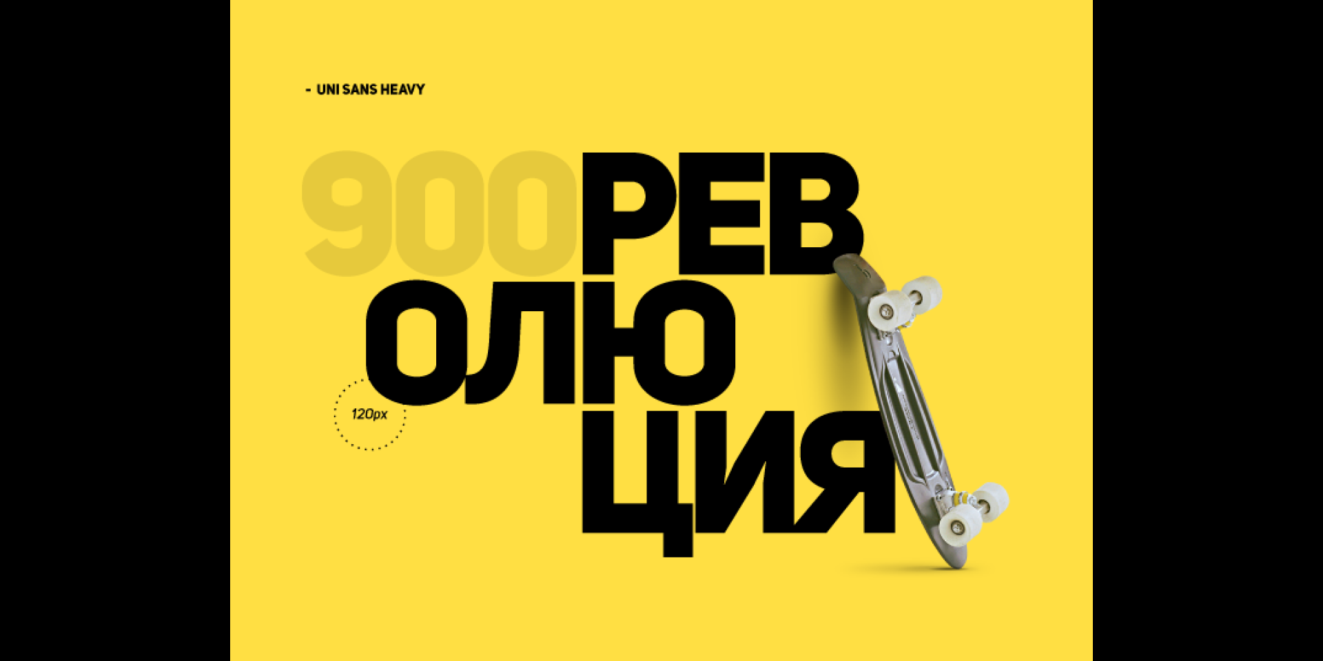
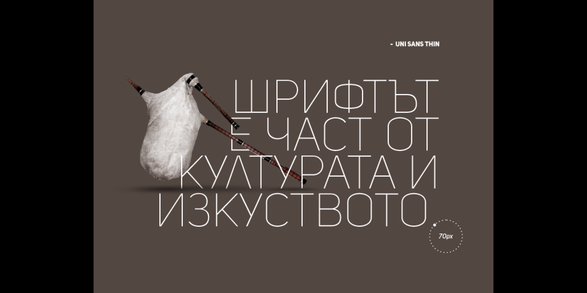
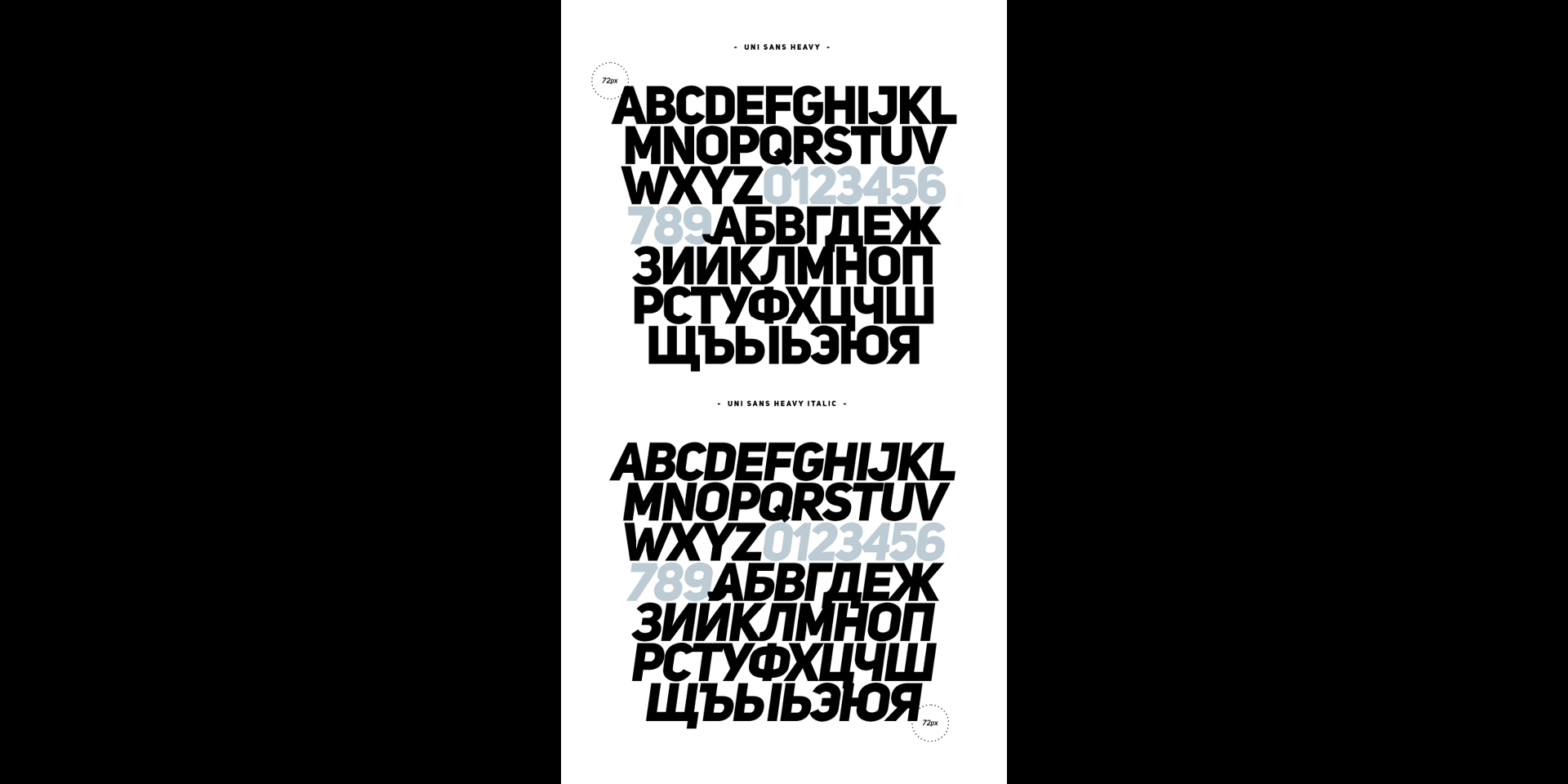
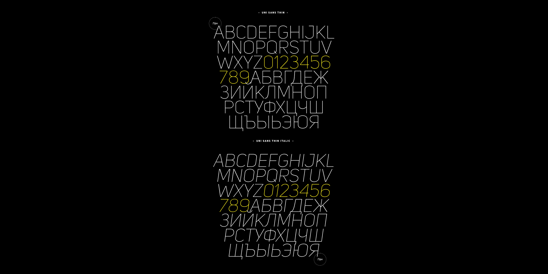
The Uni Sans font family includes 14 weights – seven uprights with seven italics.

It is characterized by excellent legibility in both – web & print design areas, well-finished geometric designs, optimized kerning, excellent web-font performance and legibility etc.

Inspired by the classic grotesque strong typefaces like DIN and Dax – Uni Sans has his own unique style in expressed perfect softened geometric forms.

The font family is most suitable for headlines of all sizes, as well as for text blocks that come in both maximum and minimum variations.

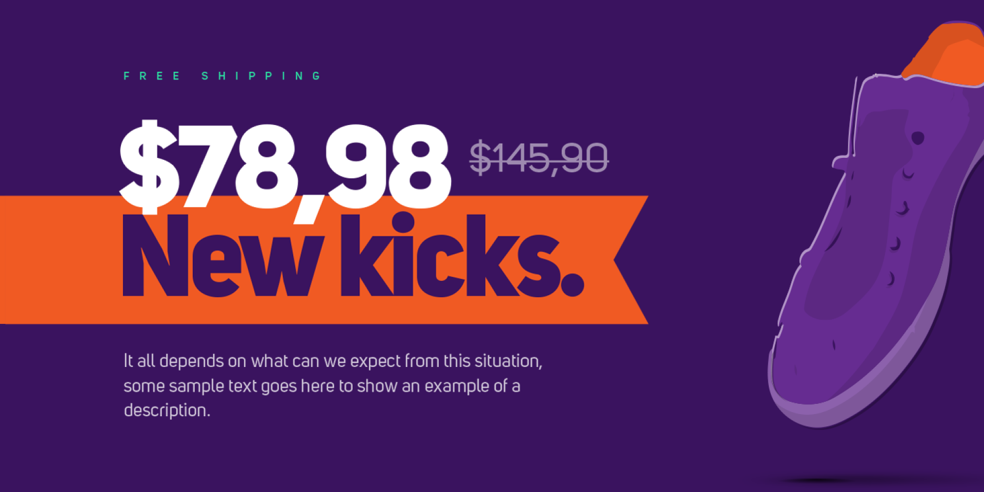
Uni Sans font styles are applicable for any type of graphic design in web, print, motion graphics etc and perfect for t-shirts and other items like posters, logos.

Design, Publisher, Copyright, License

Design: Svet Simov, Ani Petrova, Vasil Stanev (font development)

Publisher: Fontfabric

Copyright 2009 by Fontfabric. All rights reserved.

License: Fontfabric EULA Free Font License

Fonts in Use:

Svet Simov

Svet Simov

Fontfabric is the foundry of Svetoslav Simov, a visual designer who is located in Sofia, Bulgaria, b. 1984. Highly innovative designer whose creations have lots of style and flair. Many fonts are for both Latin and Cyrillic.

Ani Petrova

Ani Petrova

Type designer, b. 1988, Sofia, Bulgaria, who works at Fontfabric, Svetoslav Simov’s typefoundry. She completed her Bachelor’s degree at The National Academy of Art in Sofia. In 2014 she obtained a Master’s degree in type design.

Vasil Stanev

Vasil Stanev

Typographer and type designer in Sofia, Bulgaria, b. 1982, Sofia, who worked mostly for Svetoslav Simov’s typefoundry, Fontfabric, before setting up his own shop, VSF (Vasil Stanev Foundry).

Free License

Download: Uni Sans | Fontfabric

Commercial License

Buy at: Fontspring

Uni Sans in Use

WEB:Интер Експо Център (BG) (EN)

Mozer

Mozer

Font Sampler

(EN) The quick brown fox jumps over the lazy dog. (NL) Op brute wijze ving de schooljuf de quasi-kalme lynx. (CS) Nechť již hříšné saxofony ďáblů rozezvučí síň úděsnými tóny waltzu, tanga a quickstepu. (HU) Jó foxim és don Quijote húszwattos lámpánál ülve egy pár bűvös cipőt készít. (RO) Înjurând pițigăiat, zoofobul comandă vexat whisky și tequila. (RU) Разъяренный чтец эгоистично бьёт пятью жердями шустрого фехтовальщика. (BG) Огньове изгаряха с блуждаещи пламъци любовта човешка на Орфей. (SR) Фијуче ветар у шибљу, леди пасаже и куће иза њих и гунђа у оџацима. (EL) Ταχίστη αλώπηξ βαφής ψημένη γη, δρασκελίζει υπέρ νωθρού κυνός. Type your own text to test the font!
Description

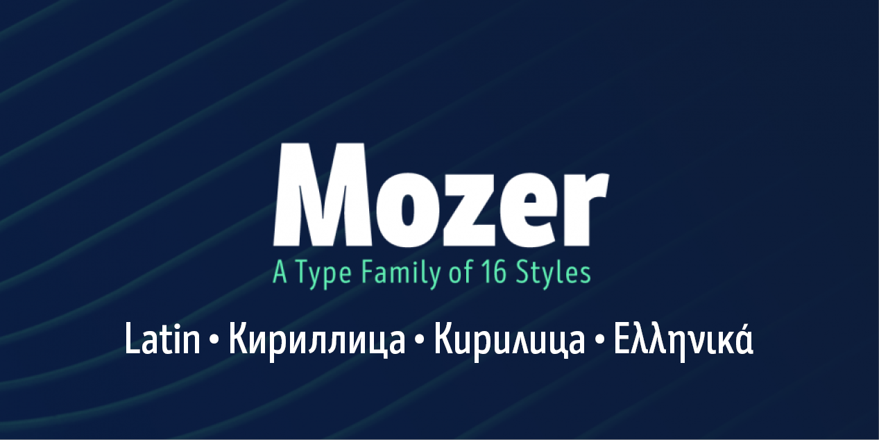
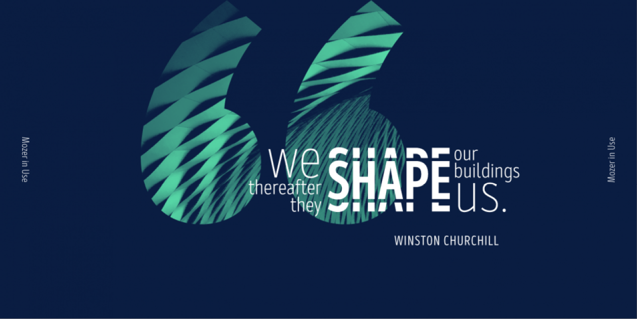
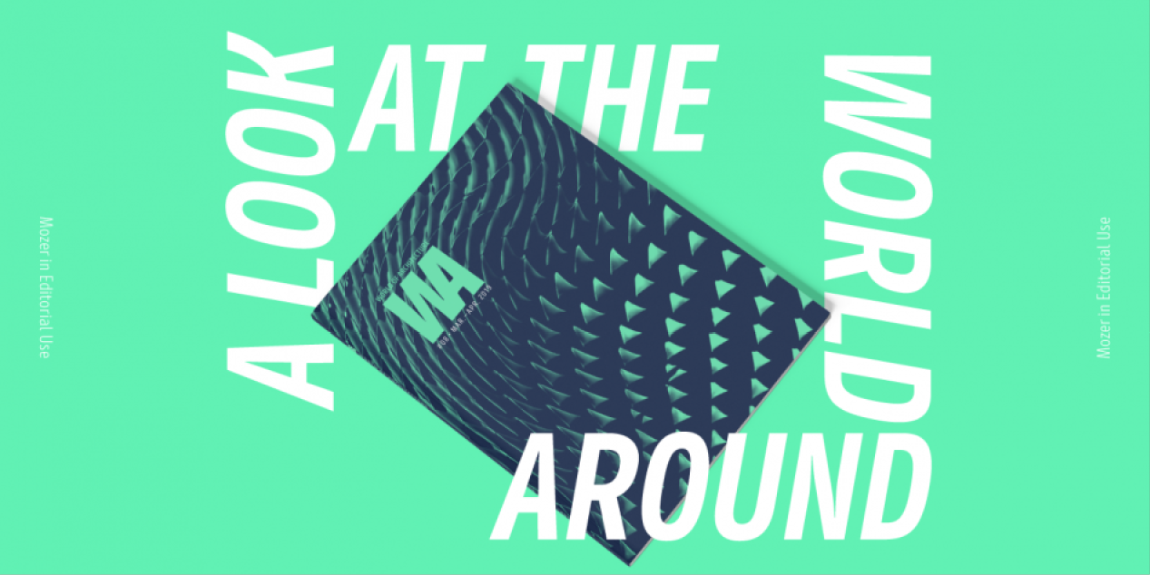
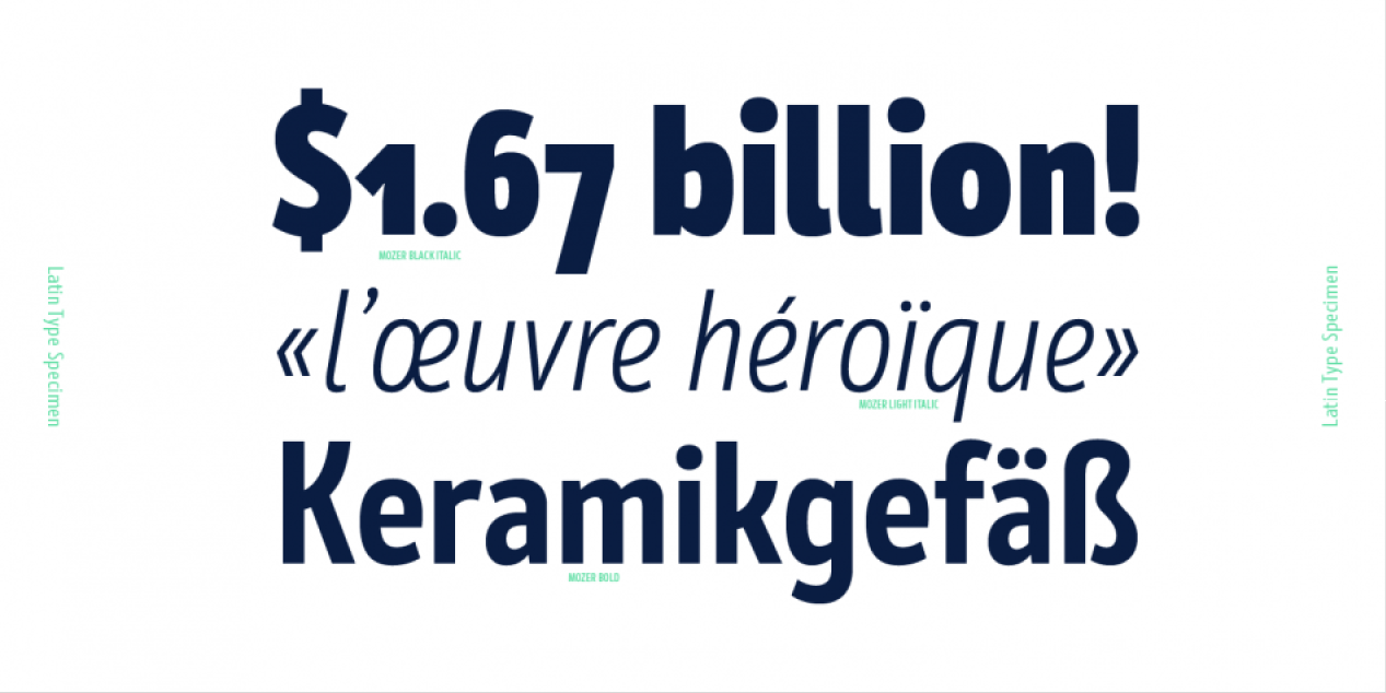
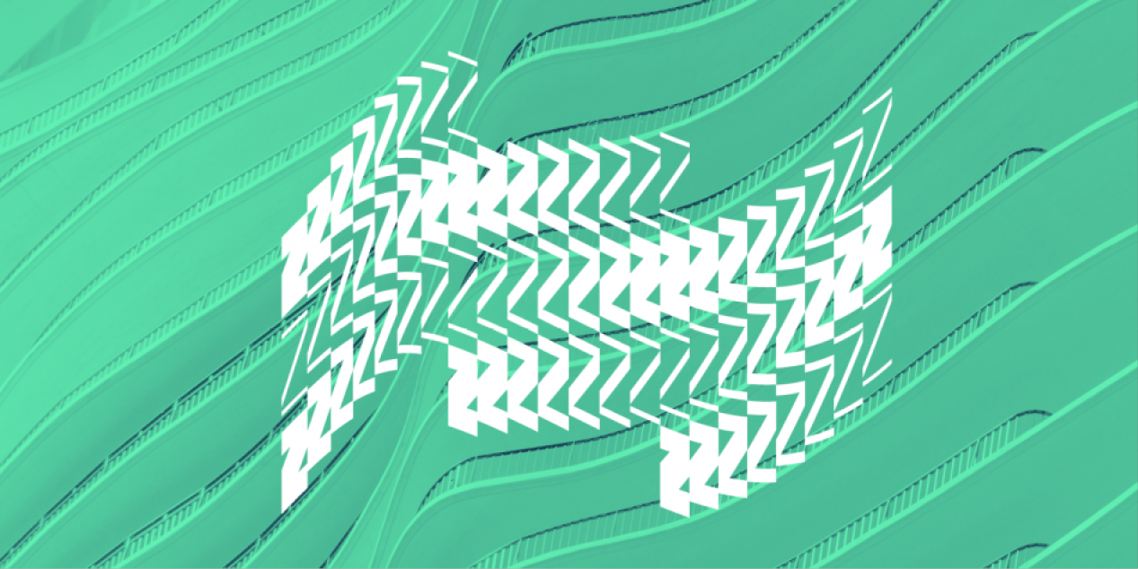
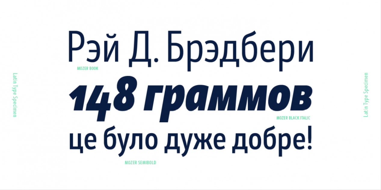
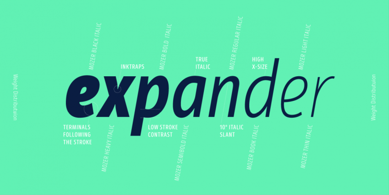
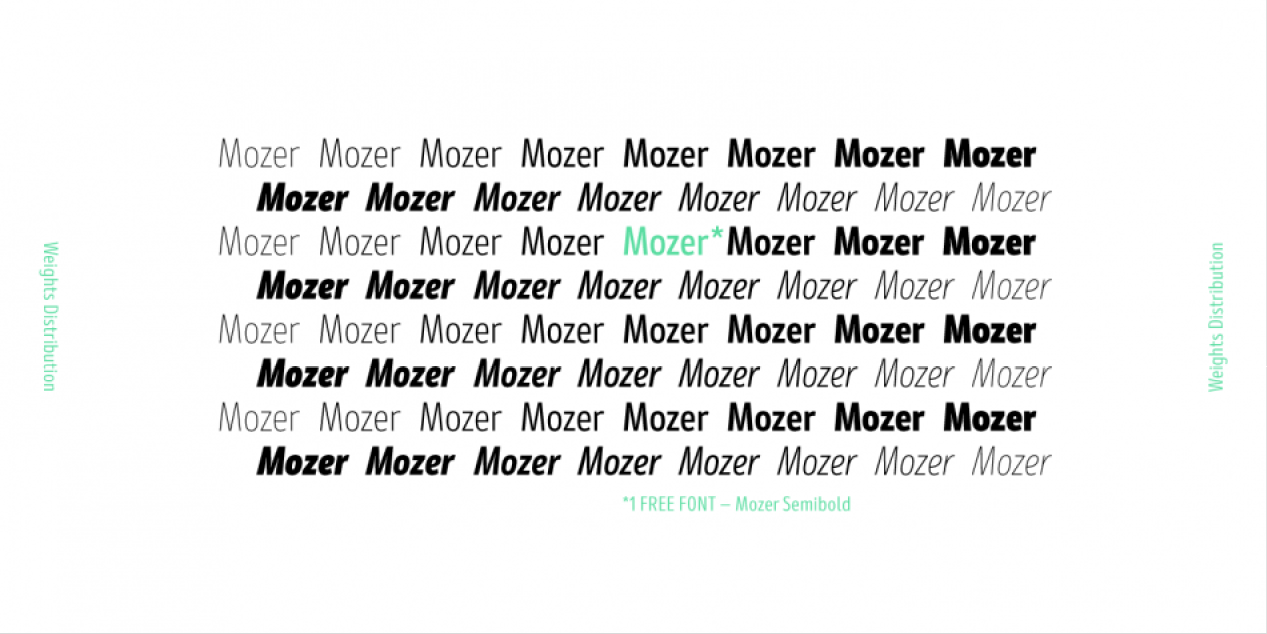
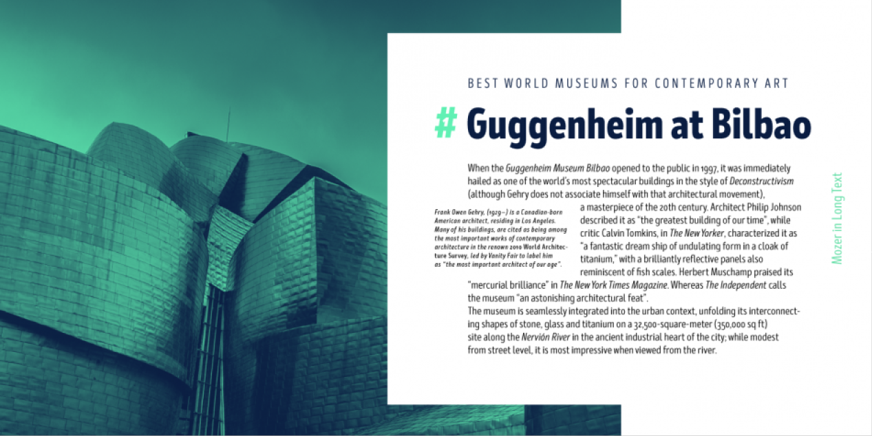
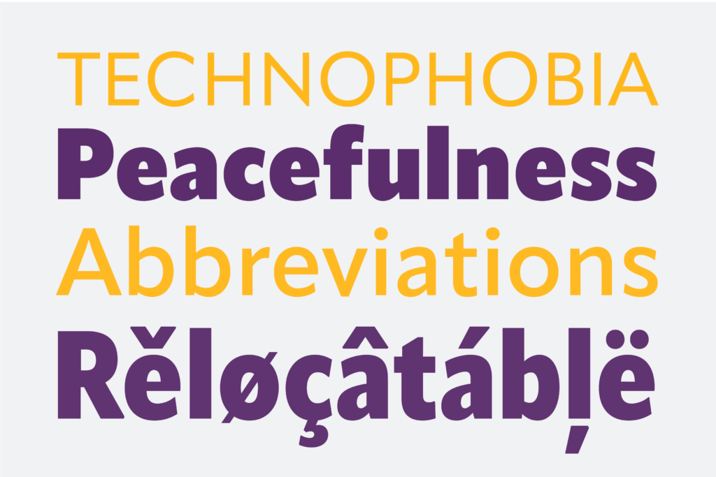
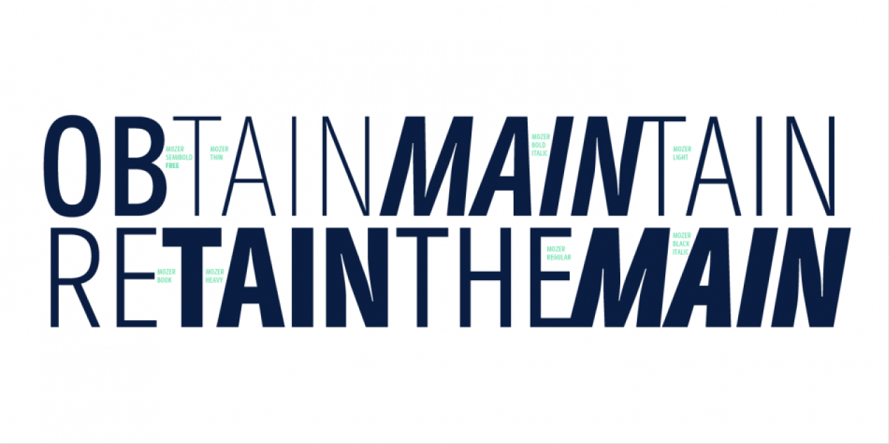
Mozer is a semi-condensed neo-grotesque type family of 16 styles, ranging from Thin to Black and matched with true italics. With a generous x-height, economical width, moderate contrast and an all-around solid appearance, this typeface lends itself well to headlines. Uncompromising legibility meets a distinct contemporary spirit, visible even in small details like the discrete ink traps.
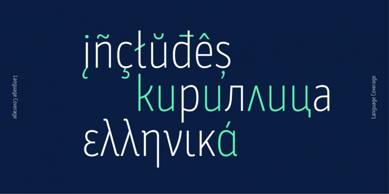
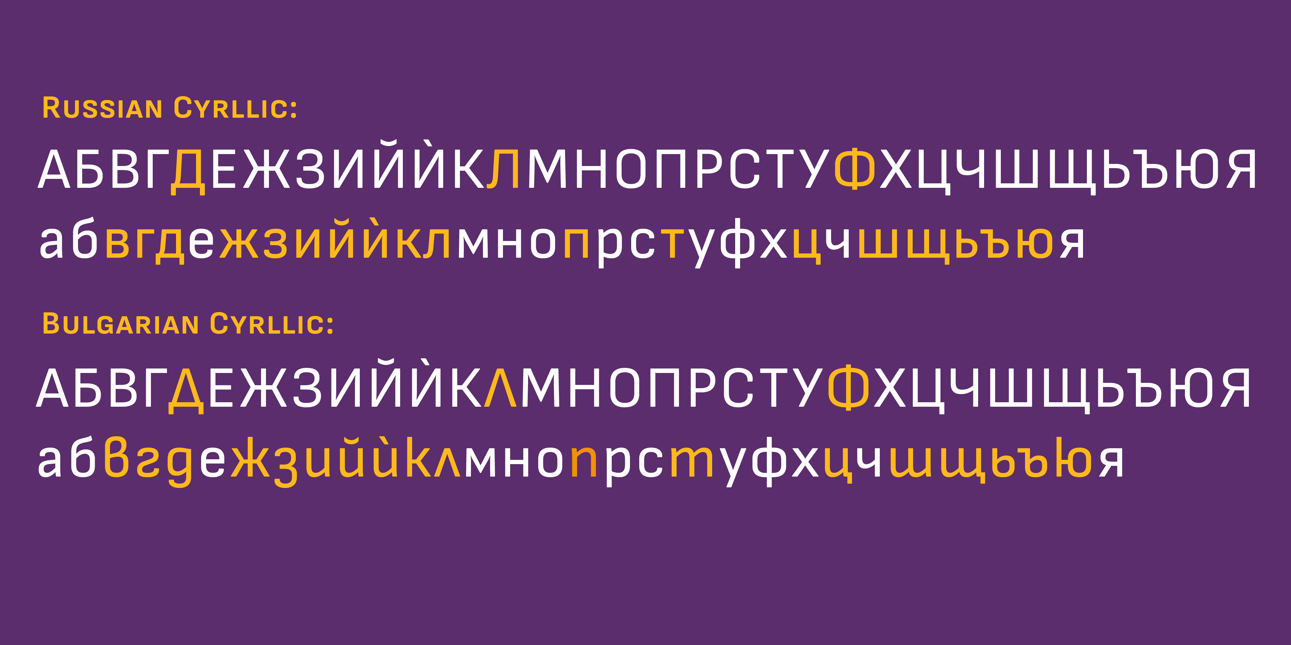
Mozer covers Extended Latin, Cyrillic and Greek and is suited with plenty of OpenType features, such as localizations, ligatures; four types of numerals including figures and tabular; case-sensitive forms; alternatives, and more. 1 Mozer FREE font available.

OpenType Features

• Stylistic Alternates;
• Common Ligatures;
• Discretionary Ligatures;
• Contextual alternates;
• Localised Forms;
• Tabular Figures;
• Proportional Figures;
• Diagonal Fractions;
• Denominator;
• Numerator;
• Subscript;
• Superscripts;
• Case Sensitive Forms;
• Ordinals;

Design, Publisher, Copyright, License

Design: Svet Simov, Ani Petrova, Mirela Belova, Nikolay Petrousenko

Publisher: Fontfabric

Copyright 2019 by Fontfabric. All rights reserved.

Svet Simov

Svet Simov

Fontfabric is the foundry of Svetoslav Simov, a visual designer who is located in Sofia, Bulgaria, b. 1984. Highly innovative designer whose creations have lots of style and flair. Many fonts are for both Latin and Cyrillic.

Ani Petrova

Ani Petrova

Type designer, b. 1988, Sofia, Bulgaria, who works at Fontfabric, Svetoslav Simov’s typefoundry. She completed her Bachelor’s degree at The National Academy of Art in Sofia. In 2014 she obtained a Master’s degree in type design.

Mirela Belova

Mirela Belova

Type designer in Sofia, Bulgaria, who first studied mathematics and then graphic design (at New Bulgarian University). During her studies, Mirela Belova created the Latin / Cyrillic blackboard bold typeface Cheque (2017), which is free at Fontfabric. She was part of the Fontfabric team that designed the 521-font family Zing Rust, Zing Sans Rust and Zing Script Rust in 2017. In 2018, Mirela Belova and Svetoslav Simov co-designed the 20-style geometric sans typeface family Mont.

Nikolay Petrousenko

Nikolay Petroussenko

Nikolay Petroussenko is a type designer and artist based in Sofia, Bulgaria. He graduated from the National Academy of Art, Sofia. He worked in Poststudio, a studio for visual communication and later at DecoType in Amsterdam. Currently he is part of Fontfabric in Sofia. Designer of the transitional text typeface Sapienza (2016). He was part of the Fontfabric team that designed the 521-font family Zing Rust, Zing Sans Rust and Zing Script Rust in 2017. In 2018, Jacklina Jekova and Nikolay Petroussenko co-designed Singel at Fontfabric. Singel is a neoclassical serif with semi-condensed proportions for Latin and Cyrillic. Its ten roman weights are complemented with ten quite different italic weights. Codesigner of Mozer (2019, by Svetoslav Simov, Ani Petrova, Mirela Belova and Nikolay Petrousenko: a condensed headline sans family that covers Latin, Greek and Cyrillic; Mozer SemiBold is free).

Free Mozer SemiBold

Download: Mozer SemiBold Fontspring

Commercial License

Buy at: Fontspring

Milka

Milka
Milka
Milka
Milka
Milka
Milka
Milka
Milka
Milka
Milka
Milka

Font Sampler

(EN) The quick brown fox jumps over the lazy dog. (NL) Op brute wijze ving de schooljuf de quasi-kalme lynx. (CS) Nechť již hříšné saxofony ďáblů rozezvučí síň úděsnými tóny waltzu, tanga a quickstepu. (HU) Jó foxim és don Quijote húszwattos lámpánál ülve egy pár bűvös cipőt készít. (RO) Înjurând pițigăiat, zoofobul comandă vexat whisky și tequila. (RU) Разъяренный чтец эгоистично бьёт пятью жердями шустрого фехтовальщика. (BG) Огньове изгаряха с блуждаещи пламъци любовта човешка на Орфей. (SR) Фијуче ветар у шибљу, леди пасаже и куће иза њих и гунђа у оџацима. (EL) Ταχίστη αλώπηξ βαφής ψημένη γη, δρασκελίζει υπέρ νωθρού κυνός. Type your own text to test the font!
Description

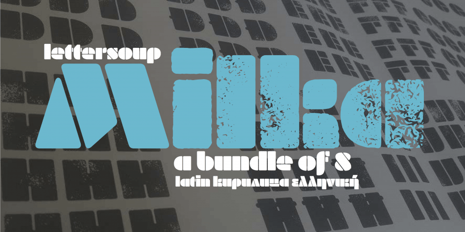
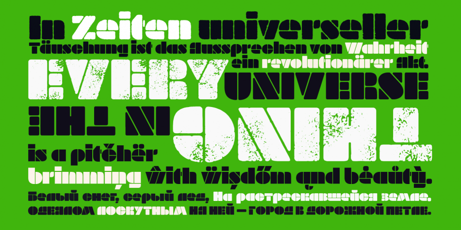
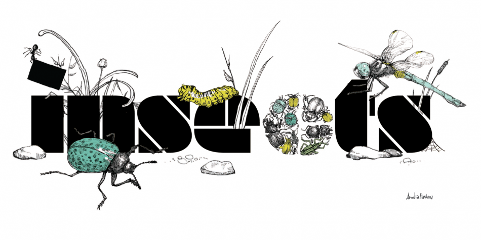
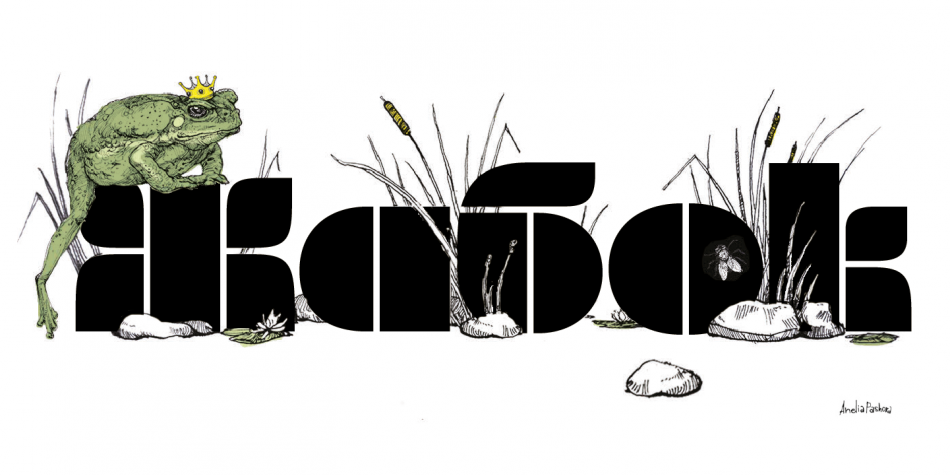
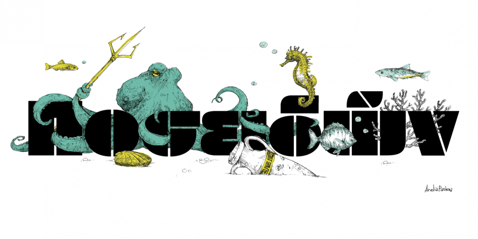
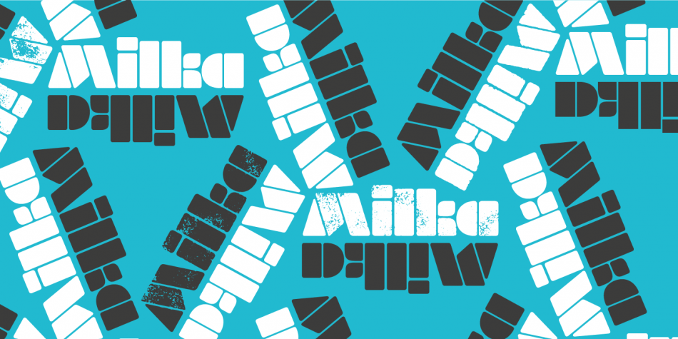
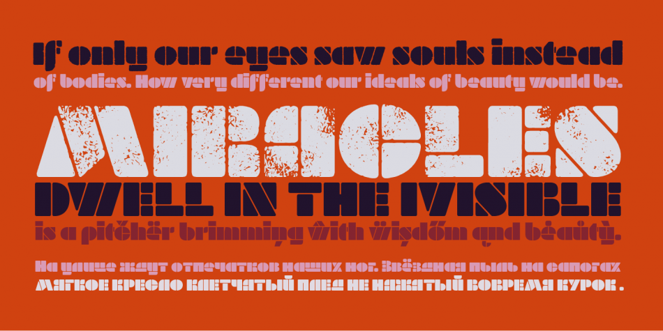
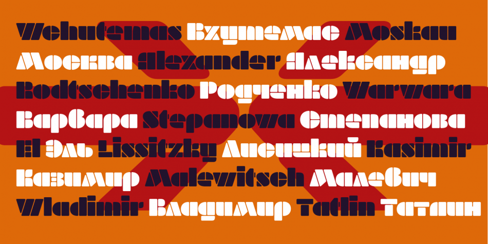
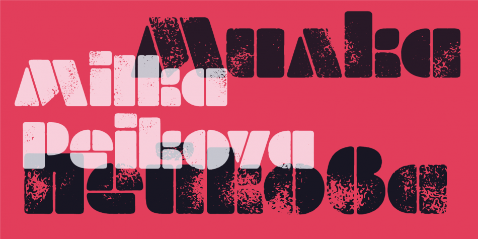
Milka is an 8-style stencil font family created by a team of designers born within the span of almost 70 years. It is a digital expansion on an alphabet designed in 1979 by the famous Bulgarian artist Milka Peikova.

The basic Milka font is a clean stencil design, while the Aged, Baked, Brittle, Crunchy, Dry and Soft styles are inspired by stencil and letterpress techniques and expand the usefulness by adding various degrees of warmth or roughness. The Milka font family has extensive Latin, Cyrillic and Greek character set support including localized forms for Russian and Bulgarian as well as numerous OpenType features.

Since 2014, Berlin-based Bulgarian type designer Botio Nikoltchev has been working with three Bulgarian female designers (the original designer Milka Peikova, who passed away in 2016 at the age of 96, and with Ani Petrova and Anelia Pashova, both from a young generation), as well as with Berlin-based Adam Twardoch and Andreas Eigendorf to create a modern revival of Ms Peikova’s inspiring stencil alphabet. Milka Peikova (1919-2016) was one of Bulgaria’s most famous female artists whose work has influenced several generations of Bulgarian designers. During her impressive career spanning almost seven decades, she created paintings, posters, book covers, textile designs and alphabets, both individually and together with her husband Georgi Kovachev-Grishata (1920–2012).

To try Milka in your project, download the Milka Free (uppercase-only) version!

Design, Publisher, Copyright, License

Design: Milka Peikova, Botio Nikoltchev, Ani Petrova, Adam Twardoch, Andreas Eigendorf

Publisher: Lettersoup

Copyright 2016 by Botio Nikoltchev. All rights reserved.

Specimen: Milka

Milka Peikova

Milka Peikova

Milka Peikova (b. 1919, Pavel, Bulgaria, d. 2016, Sofia, Bulgaria) was a famous Bulgarian artist. She created paintings, posters, book covers, portraits of famous Bulgarians, textile designs and alphabets, both individually and together with her husband Georgi Kovachev-Grishata (1920-2012). She is a graduate of the Bulgarian National Art Academy, class of 1948. She founded Cosmos magazine and designed for the Women Today and Problems of Art magazines.
In 1979, she designed an alphabet that was extended to an 8-style Latin / Greek / Cyrillic stencil typeface—Milka (2016)—by a team of designers at Lettersoup that includes Ani Petrova, Botio Nikoltchev, Adam Twardoch and Andreas Eigendorf. The basic Milka font is a clean stencil design, while the Aged, Baked, Brittle, Crunchy, Dry and Soft styles are inspired by stencil and letterpress techniques and expand the usefulness by adding various degrees of warmth or roughness.
Milka Peikova also designed the first Bulgarian typeface for phototypesetting called Grilimil with her husband Georgi Kovachev-Grishata. She is the recipient of the first prize for a typeface at the Bulgarian National Book Exhibition and Illustration.

Botio Nikoltchev

Botio Nikoltchev

Botjo Nikoltchev, b. 1978, Sofia, Bulgaria. Botio studied graphic and type design in Potsdam. He is living and working as a freelance designer in Berlin. He studied communication design at the University of Applied Science Potsdam and took type design classes with Luc(as) de Groot. After his studies Botio worked with Ole Schäfer (Primetype) on the Cyrillic characters of PTL Manual, PTL Manual Mono and PTL Notes. Since 2010 he has been collaborating with Ralph du Carrois and Erik Spiekermann as type designer and art director at Carrois Type Design, focusing on Cyrillic, Greek and Arabic language extensions and CI projects. In 2014, he set up the commercial typefoundry Lettersoup.

Ani Petrova

Ani Petrova

Type designer, b. 1988, Sofia, Bulgaria, who works at Fontfabric, Svetoslav Simov’s typefoundry. She completed her Bachelor’s degree at The National Academy of Art in Sofia. In 2014 she obtained a Master’s degree in type design.

Adam Twardoch

Adam Twardoch

Adam Twardoch (b. 1975) was raised in Tychy, Poland, and graduated from the University of Frankfurt/Oder, Germany. He worked at for Agentur GmbH, a Frankfurt/Oder-based design firm. Since 1991, Adam has advised numerous type designers on Central European extensions of their typefaces and has created localized versions of over fifty fonts. He frequently writes on type-related matters, and is the founder of Font.org, a (now defunct) website featuring articles about typography in English and Polish. Adam Twardoch is Director of Products of FontLab (since 2004), and is typographic consultant at Linotype (since 2002) and Tiro Typeworks (since 2001), and general font specialist at MyFonts (2000-2012). Since 2012 he is based in Berlin. Adam Twardoch is working in the field of font technology, multilingual typography, CSS webfonts, Unicode and OpenType.

Andreas Eigendorf

Andreas Eigendorf

Berlin, Germany-based font engineer. Designer of several CE versions of FontFont fonts, such as the CE versions of Ole Schaefer’s Fago: FF Fago Office Sans CE, Fago Office Serif CE (2000).

Free font

Milka Free: Lettersoup

Commercial License

Buy at: Lettersoup

Buy at: Fontspring

Intro Rust

Intro Rust Complete
Intro Rust Complete

Font Sampler

(EN) The quick brown fox jumps over the lazy dog. (NL) Op brute wijze ving de schooljuf de quasi-kalme lynx. (CS) Nechť již hříšné saxofony ďáblů rozezvučí síň úděsnými tóny waltzu, tanga a quickstepu. (HU) Jó foxim és don Quijote húszwattos lámpánál ülve egy pár bűvös cipőt készít. (RO) Înjurând pițigăiat, zoofobul comandă vexat whisky și tequila. (RU) Разъяренный чтец эгоистично бьёт пятью жердями шустрого фехтовальщика. (BG) Огньове изгаряха с блуждаещи пламъци любовта човешка на Орфей. (SR) Фијуче ветар у шибљу, леди пасаже и куће иза њих и гунђа у оџацима. (EL) Ταχίστη αλώπηξ βαφής ψημένη γη, δρασκελίζει υπέρ νωθρού κυνός. Type your own text to test the font!
Description

Intro Rust family is one of the biggest packages on the market, including 214 fonts. The font family is a rough version of the famous Intro and includes 4 sub-families Intro Rust, Intro Script, Intro Head and Intro Goodies. For all types of design projects like print materials and web design, with just a little imagination you can watch them come alive. Intro Rust fonts will make them more vivid than ever. You want to make a greeting card, a package design, or even a brand identity? Feel free to play with all the patterns and shapes, scripts or those cool fonts with the dots to clinch your next successful project.

Design, Publisher, Copyright, License

Design: Ani Petrova, Svet Simov, Radomir Tinkov

Publisher: Fontfabric

Svet Simov

Svet Simov

Fontfabric is the foundry of Svetoslav Simov, a visual designer who is located in Sofia, Bulgaria, b. 1984. Highly innovative designer whose creations have lots of style and flair. Many fonts are for both Latin and Cyrillic.

Ani Petrova

Ani Petrova

Type designer, b. 1988, Sofia, Bulgaria, who works at Fontfabric, Svetoslav Simov’s typefoundry. She completed her Bachelor’s degree at The National Academy of Art in Sofia. In 2014 she obtained a Master’s degree in type design.

Radomir Tinkov

Radomir Tinkov

Based in Sofia, Bulgaria, Radomir Tinkov began his career as a graphic and web designer. “Typography is an essential part of almost every aspect of life and design in particular,” he says, “so it got me curious and little by little I started to create fonts on the side.” His earliest designs were limited to mainly display faces, but he knew that he wanted to create a deeper type library filled with more versatile and useful designs. “As time passed, I learned more and more and began to create custom typefaces to solve real problems in other design projects I was working on and just like that, my first marketable font was created.”

Mixa

Mixa
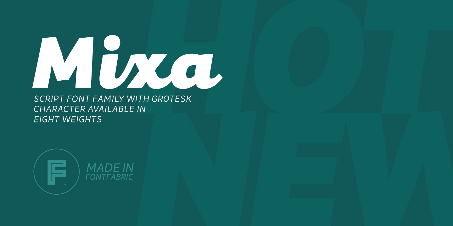
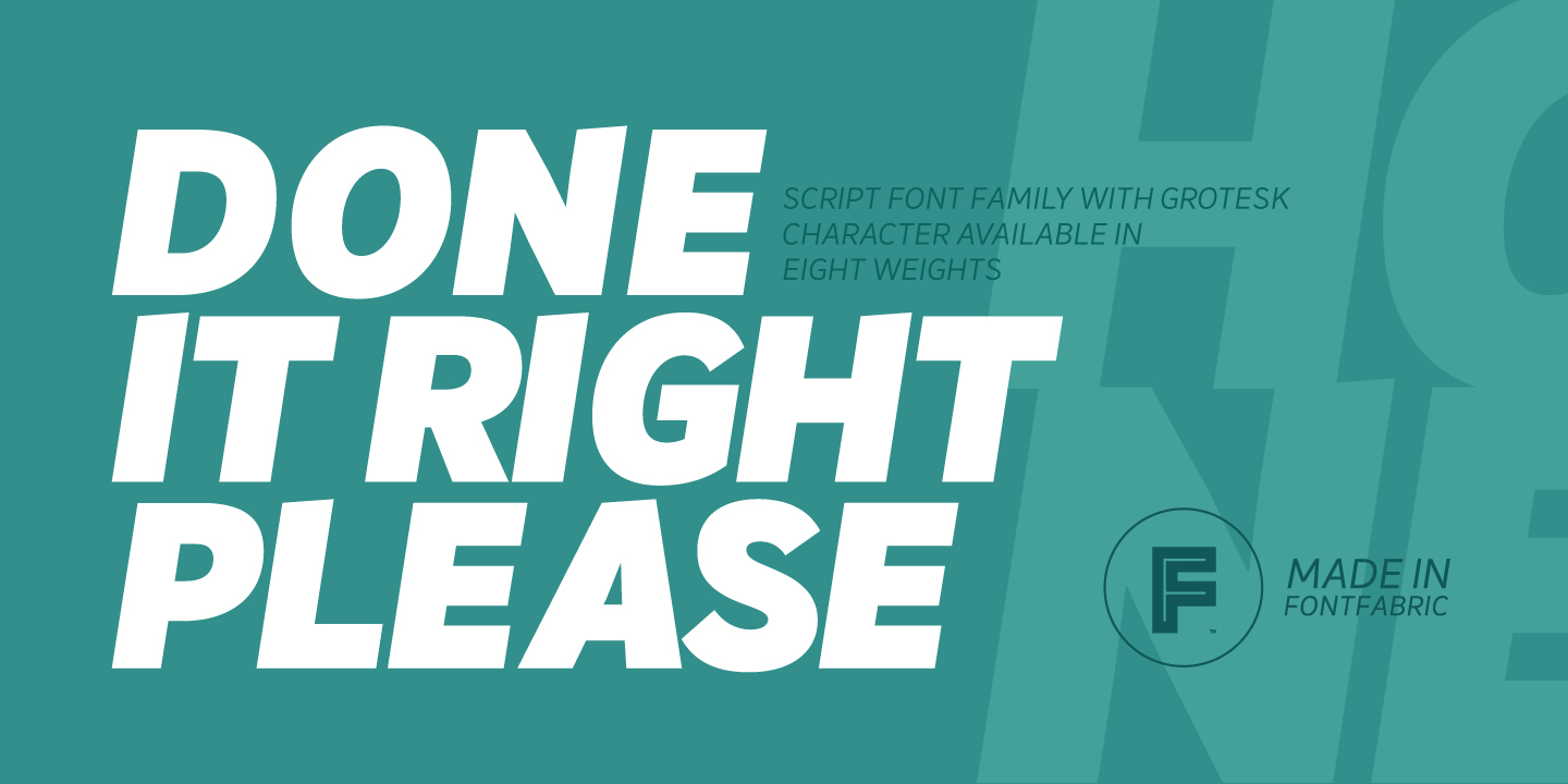
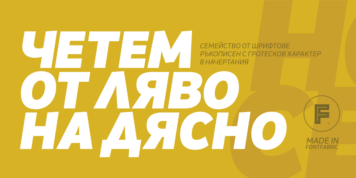
Neo-grotesque Sans Serif mixed with the classical handwritten Script in slanted geometric shapes – that’s the way Mixa was born. Those two faces of the new font family make it as much as unique and recognizable. When you’re using the Capitals only nobody will suspect that there is script hidden in the lowercase. That’s why all eight weights can be combined perfectly with wide list of classical Sans Serif, Slab Serif and Serif typefaces. The font offers wide range of ligatures to ensure smooth readability and beautiful letter combinations. The decorative swashes in some of the Capitals presented as a stylistic sets give unique touch in any design. Mixa has it’s own style and personality, but without lacking of legibility.

Type is a cultural heritage, it is one of the ways to recreate the surrounding world

By Szandra Peev • 25 January 2021
INTERVIEW with Botio Nikoltchev | LETTERSOUP
PHOTOS: © Lettersoup, © Boryana Pandova, © Svoboda Tzekova
BG
EN
Lettersoup founder: Botio Nikoltchev, photo by Boryana Pandova | LETTERSOUP
Lettersoup founder: Botio Nikoltchev, photo by Boryana Pandova

In this exclusive interview Botio Nikoltchev speaks about his professional development. He was a student of Lucas de Groot and after graduating he had the chance to work with such famous type designers as Akira Kobayashi and Erik Spiekermann. Botio also shares his views on the diversity of Cyrillic letterform models in the different Cyrillic alphabets. He tells us about the project Sofia Sans, which is now the typeface of Sofia – the capital of Bulgaria. Botio also describes his newest release Apparat and reveals his future plans.

Let’s talk about your professional and creative journey. Where did it start – in Sofia or Berlin? Which colleagues and professors have left a mark on your work?

Botio Nikoltchev (BN): I don’t see myself as an artist but more as an addict. Type design is actually an endless way of improvement, an endless search of harmony and rhythm, an endless desire of beauty and ugliness.

It was a long way until I started designing typefaces. But yes, it was in Berlin, I started my studies as an industrial designer. My love for type came by taking typography classes with Prof. Betina Müller and type-design classes with Prof. Lucas de Groot.

Lucas de Groot and Botio Nikoltchev
Pepa Karaivanova, Lucas de Groot, Sonja Knecht, Botio Nikoltchev in Sofia on 24th May, photo Sv. Tzekova

I was lucky to have the opportunity to work with some leading type designers. There were moments I thought Akira Kobayashi doesn’t have eyes, but microscopes. His ability to see the smallest details is really incredible.

Erik Spiekermann –– what a literate and entertaining man. Оnce we talked about Bulgarian history and his knowledge truly impressed me. He is not just able to recognize problems on a daily life basis, and solve them through design, but he is also excellent in finding the right people at the right time for the job.

You are part of many font projects in which you are also responsible for the development of the Cyrillic script. What are the main challenges which a modern type designer needs to overcome when working on Cyrillic font projects?

Apparat
Font family: Apparat; Release 2020; Copyright: Botio Nikoltchev

BN: The challenges are quite similar to the Latin and there are no particular ones. It always depends on the project, the client etc.

Of course there are decisions to be made e.g. how to handle characters like “K”. They could have the same grapheme but they also could look different in Latin, Cyrillic and Greek.

What is your personal and professional view on the local forms of the Cyrillic like Bulgarian, Serbian, North Macedonain, Ukrainian and the Cyrillic used by Mongolians, Bashkirs etc.?

BN: Although as a type designer I work mostly with a black and white colors, I enjoy very much the colorful aspects of life. I like the diverseness of the Cyrillic world and the character variations.

When you think in terms of evolution, it never moves in a straight direction and it never ends at one particular point. So to me these variations are the epitome of the continuously flowing and changing Cyrillic world.

A while ago, together with Vassil Kateliev we launched a research on the handwritten forms of these languages. The idea was and still is to prove if Buglarian Cyrillic can serve the entire Cyrillic character set.

What motivates you to support the Bulgarian Cyrillic form (you call it Rounded Cyrillic)? In your opinion, what is the future of the Cyrillic script?

Apparat
Font family: Apparat; Release 2020; Copyright: Botio Nikoltchev

BN: I believe Bulgarians need the Bulgarian Cyrillic. Type is a cultural heritage, it is one of the ways to recreate the surrounding world. Thus type expresses our worldview, our philosophy of life. By not having the Bulgarian Cyrillic we’ll also lack our worldview.

“Type is a cultural heritage, it is one of the ways to recreate the surrounding world.”

Yes, I prefer to call the Bulgarian forms Rounded Cyrillic and the Russian forms Square Cyrillic. It describes the designs and it does not have political touch. Back in 2017, my friend Adam Twardoch came up with the idea about the name. It was based on the rounded- and square Glagolitic.

I worked several years, of course together with a number of colleagues and friends, on “the future” and now there is a standard which characters should be designed for Bulgarian Cyrillic, as well as implemented Bulgarian character set (encodings) in the font editors, there is a technical guideline on how to set the Open Type features in order to perform properly local forms in all browsers and apps. Monotype and Google fonts are including and producing the Rounded Cyillic in nearly all new releases and an increasing number of western designers are creating Bugarian Cyrillic for their typefaces. When you look back, several years ago the fonts with Bulgarian Cyrillic were scarce goods.

.loclBGR for Grotesque Typefaces
What shall be done for Bulgarian Cyrillic .loclBGR
Font family: Sofia Sans; Release 2019; Copyright: Botio Nikoltchev, Ani Petrova

Тhe next step for me is to see the Rounded and Squared Cyrillic as equals. By now, the Russian forms are in default position in the fonts and Bulgarian forms on local feature or stylistic set. Soon, I’m about to release quite a big font family where the Bulgarian forms are in default position.

But I would like to see the next years in “the past”. We do have so many artefacts, books, manuscripts that are quite unexplored. We don’t really know much about the history. In fact, we don’t even have a reasonable answer to questions like why the Cyriliic was developed and why we switched to it instead of the Glagolitic.

How many Bulgarian books about typedesign do you know… four! And how many of them are translated into English – none!

In 2019, the chief architect of Sofia Zdravko Zdravkov announced that he will suggest all the labels on the streets and official documents of Sofia municipality to use a unified font standard. This font is called Sofia Sans – a co-project of Ani Petrova and Botio Nikoltchev. Did Sofia Sans become the typeface of the capital?

BN: I’m truly happy this project happened. More than 30 years after so many efforts, there is a political understanding for the need of better visual language in our cities. But this transformation happens quite slowly.

This project is also made in a large team – it started with Ani Petrova, Filip Bojadjiev and me. Then Andreas Eigendorf, Eli Hoyer and Viviana Monsalve did the mastering and produced Variable Fonts. Mario Evstatiev and I made several pixel versions of Sofia Sans for the public transport. But yes, I think meanwhile it is the typeface of the bulgarian capital city. You can see it on the tourist wayfinding system, on the street signs, on the public transport. Аlso the Bulgarian State Railways use it, I saw it also on one of the private TV channels. It seems people like it a lot.

It is worth mentioning that we published the typeface with an Open Font License, as I think such projects should be Open Source. Sofia Sans will be soon released on Google Fonts as well, and the latest versions will be always published on our Github account.

With this project I also managed to achieve a goal of mine. Bulgarian Cyrillic is in default position in the fonts.

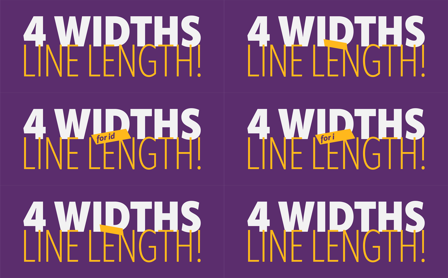
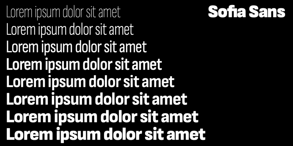
I think with a typeface of such a largе scale – 4 widths and 11 weights and also on Google Fonts, where there is a huge amount of users, it is quite a statement.

At the beginning of 2021 you published your latest font – Apparat. How does Apparat fit in the modern visual communication – as a reinterpretation of the past or as a search for classic clean and modern drawing?

Font family: Apparat; Release 2020; Copyright: Botio Nikoltchev
Font family: Quasimoda; Release 2016; Copyright: Botio Nikoltchev

BN: It is clearly an interpretation of the past, actually I´m exploring Dwiggins approach to “humanise” geometric sans forms. Apparat’s design is the result of both historical research and experience gained during the design of custom fonts.

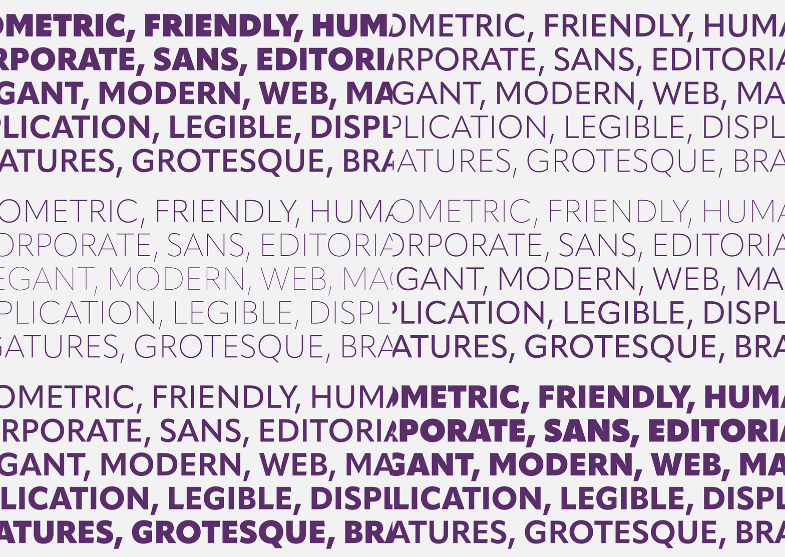
The idea was to create a large contemporary type family in four widths—Standard, Semi Condensed, Condensed, and Extra Condensed, a geometric sans serif with subtle humanistic design traits that has a well-rounded personality that stands out when used in display applications; however, the characteristic design details recede to the background not to attract unnecessary attention when using the typeface in small sizes for body copy.

Creating such a wide range has become more accessible in contemporary typeface development thanks to interpolation, which facilitates calculating intermediary steps between two extremes. But typefaces that are clearly interpolated run the risk of looking mechanic and soulless and often lack character. Having the technology available doesn’t mean it necessarily needs to be used. Apparat avoids these pitfalls by having no perfect harmony between the different weights and widths. These intentional variations lend each type style its specific personality that complements the others.

Apparat
Font family: Apparat; Release 2020; Copyright: Botio Nikoltchev

Peter Bilak once said that modern fonts are a result of teamwork between many professionals. What is the future of typedesign and where is the thin line between individual and teamwork?

BN: Typedesign is and was a very consrvative field. I don’t think we will see any big revolutions in type soon.

I absolutely agree with Peter Bil’ak that modern typefaces are teamwork in a design aspect but also because they are complex products. It is not just the idea or the design. There are many script systems, there is quality assurance, there is mastering of the fonts, there are marketing materials like specimens, websites, social media communication.

So yes, for a big multilingual typefaces you need a large team of professionals in all these fields. But I also love to discuss my basic designs with friends and colleagues, to exchange ideas, to hear different points of view.

What are your plans for 2021 and beyond?

BN: I hope 2021 is more favorable to all of us! This year together with Viktor Nübel I will resume a big custom project for Cornelsen publishing house. Cornelsen are one of the main schoolbook publishers in Germany. I´m very proud that we won this design pitch and very thankful for this opportunity. We are creating a huge type sistem with sans and serif typeface, also with different widths, optical size designs etc.

It is quite interesting to work for such a big company with all the different departments like print, web, app developer who all have their own requirements on a very high quality level.

In the next few weeks, there will be a long awaited Sofia Sans variable font release on Google Fonts with OFL license.

I’m working on several new typefaces simultaneously, but I don’t want to reveal so much.

Apparat
Font family: Apparat; Release 2020; Copyright: Botio Nikoltchev
Botio Nikoltchev is a typographer, CEO and “chef” of the lettersoup fonts. Born in Sofia, he graduated in communication design in Potsdam, Germany. He lives and works in Berlin.
Explore LETTERSOUP and its activities:

LETTERSOUP Behance Facebook Instagram Adobe Fonts

Editor
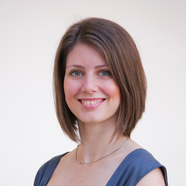
Stefan Peev

Szandra Peev

Szandra Peev has been working in the field of communications and marketing for almost a decade now. Her curiosity to explore new cultures and destinations took her to Asia where for five years she worked with some of the biggest multinational companies globally. Currently, Szandra is back in Europe, leading the communications and marketing efforts for localfonts.eu and contributing as a writer in print and online media outlets.

If you like this site and find it useful, help us to make it better by giving feedback, suggesting improvements or by donation.

Donate

Sofia Sans

Font Sampler

(EN) The quick brown fox jumps over the lazy dog. (NL) Op brute wijze ving de schooljuf de quasi-kalme lynx. (CS) Nechť již hříšné saxofony ďáblů rozezvučí síň úděsnými tóny waltzu, tanga a quickstepu. (HU) Jó foxim és don Quijote húszwattos lámpánál ülve egy pár bűvös cipőt készít. (RO) Înjurând pițigăiat, zoofobul comandă vexat whisky și tequila. (RU) Разъяренный чтец эгоистично бьёт пятью жердями шустрого фехтовальщика. (BG) Огньове изгаряха с блуждаещи пламъци любовта човешка на Орфей. (SR) Фијуче ветар у шибљу, леди пасаже и куће иза њих и гунђа у оџацима. (EL) Ταχίστη αλώπηξ βαφής ψημένη γη, δρασκελίζει υπέρ νωθρού κυνός. Type your own text to test the font!
Description

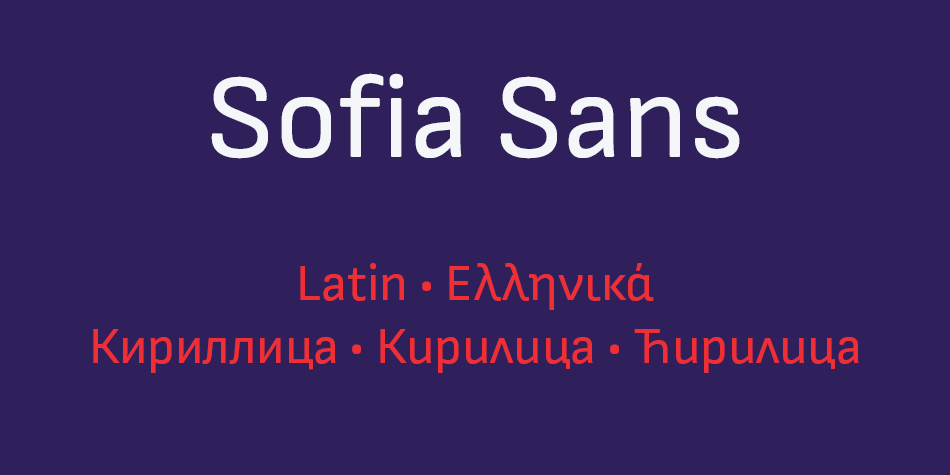
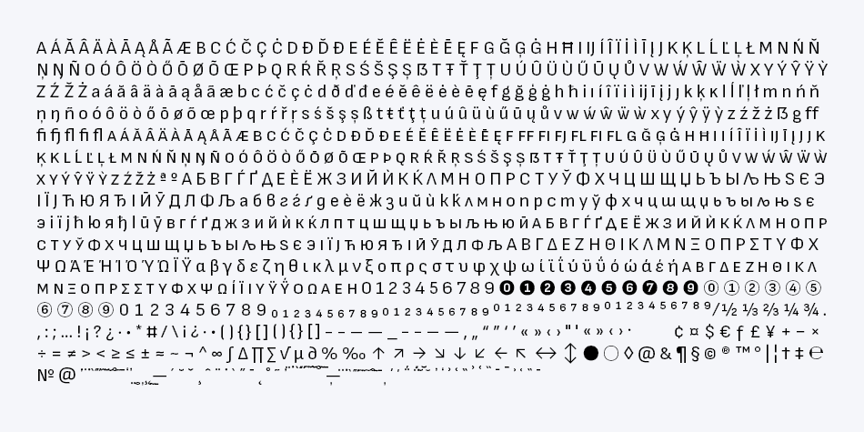
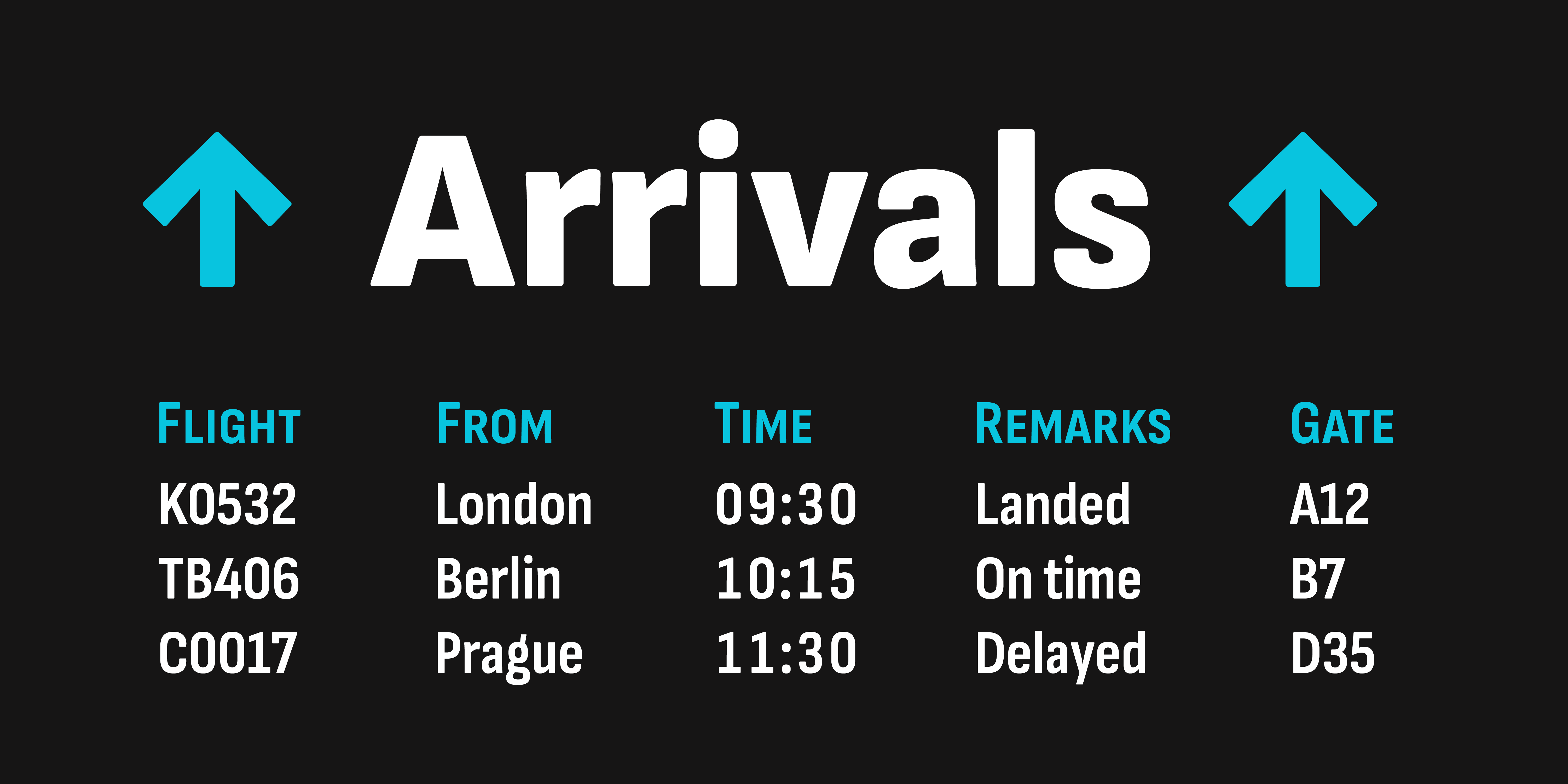
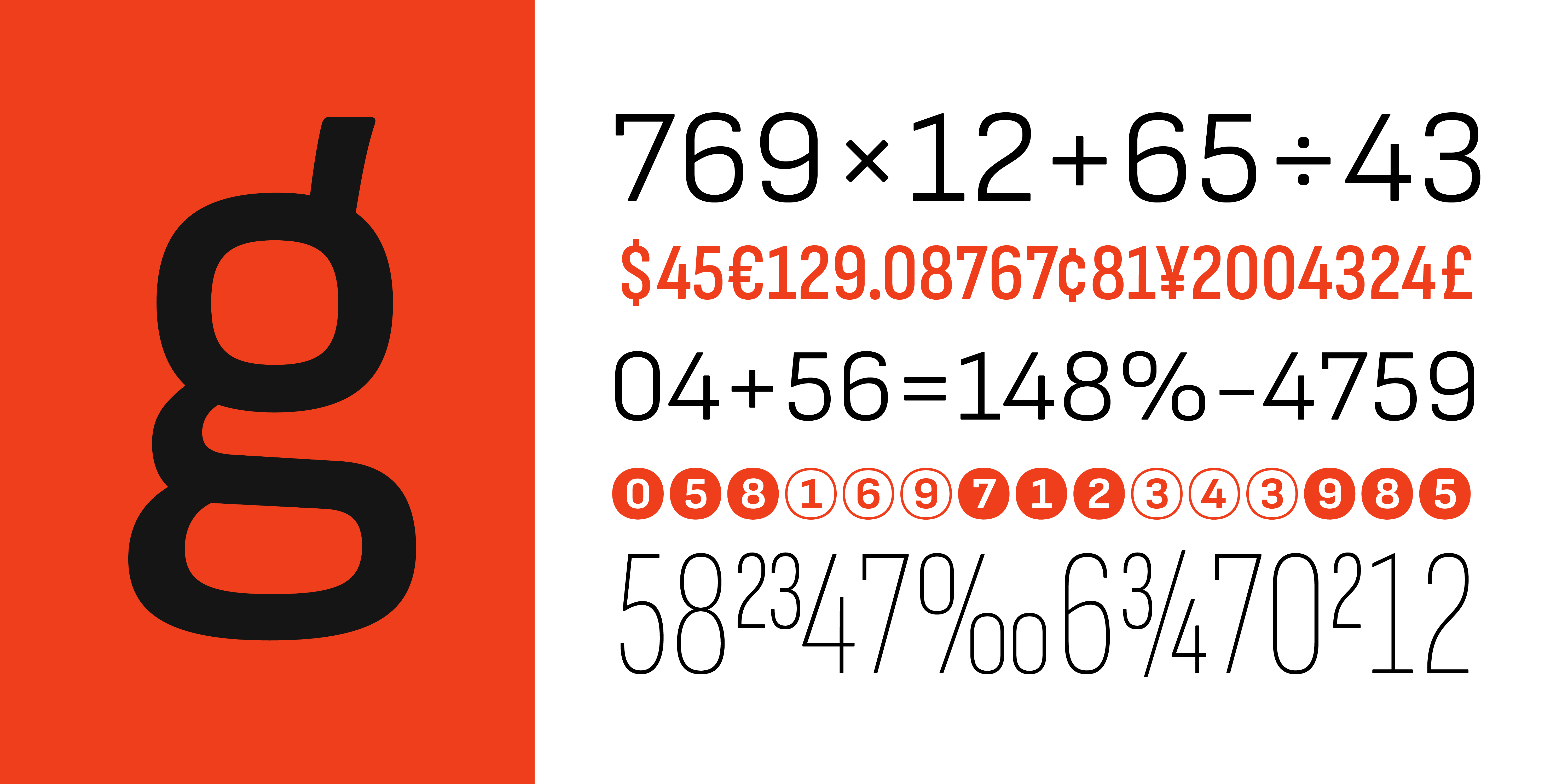
The story of Sofia Sans started with a phone call from Filip Boyadjiev, a colleague of ours and Ani Petrova’s former fellow student at the National Academy of Art Sofia. At the tail end of 2017, Boyadjiev informed us that his studio Fullmasters had been hired to develop a wayfinding system for helping visitors navigate Sofia’s tourist sights and attractions. That year, the Bulgarian capital had reached second place in tourism growth among European cities. The wayfinding system required a feature-rich OpenType family with a large character set including small caps, several figure styles, arrows, numerals in circles, etc. Most importantly, the fonts needed to offer support for Bulgarian Cyrillic, as all text was to be set in both Latin and Cyrillic.

Because of the modest budget and short deadline, creating a new type family from scratch for this purpose was not feasible. Fortunately, we had a viable candidate that we could expand to meet the project’s requirements: Attractive. The story of this humble font began with another phone call and a simple question. Earlier in 2017, my Bulgarian colleague Ani had asked me: “Why don’t we make a free font? A nice one, not a quick and dirty one! And let’s share it with the world.” A tiny seed was planted, but little did we know how big the project eventually would grow.
First, we needed to decide which kind of typeface to create. Going through potential type styles, we settled on a straight-sided sans. The inspiration for our design came from early-twentieth-century so-called technical sans serifs—typefaces with confident letterforms, a pronounced vertical impetus, and tense curves. We aimed to create a universally useful font family. With narrow proportions and a generous x-height, we drew a space-saving workhorse that would work well in very diverse environments: from large to small, for display and immersive reading, on-screen and in print. When looking for a name, we went back to that original question and christened our typeface Attractive.

Back to Sofia’s wayfinding system—Attractive only existed in two styles—one single weight in upright and italic—and had a limited character set. Still, it provided an excellent jumping-off point for developing an extensive type family. Fullmasters’ concept consisted of three types of elements: large and small totems containing text, directions, and map information, and signboards when only a minimum of information was necessary. We soon concluded that the typeface needed to have condensed widths too, to accommodate the different sizes of the two totems and the signboards. We also had to take into consideration the varying lengths of the names of streets, squares, parks, buildings, monuments, and other tourist sights featured on the signage. Eventually, we ended up planning a comprehensive type system in four widths with extended language support. It needed to cover Extended Latin as well as the Greek and Cyrillic alphabet because we wanted the fonts to support all three scripts used in the European Union.

Read the full story of the Sofia Sans at author’s web site LETTERSOUP

Design, Publisher, Copyright, License

Design: Botio Nikoltchev, Ani Petrova

Publisher: Lettersoup

Copyright 2019 by The Sofia Sans Project Authors. All rights reserved.

License: SIL OPEN FONT LICENSE

Botio Nikoltchev

Botio Nikoltchev

Botjo Nikoltchev, b. 1978, Sofia, Bulgaria. Botio studied graphic and type design in Potsdam. He is living and working as a freelance designer in Berlin. He studied communication design at the University of Applied Science Potsdam and took type design classes with Luc(as) de Groot. After his studies Botio worked with Ole Schäfer (Primetype) on the Cyrillic characters of PTL Manual, PTL Manual Mono and PTL Notes. Since 2010 he has been collaborating with Ralph du Carrois and Erik Spiekermann as type designer and art director at Carrois Type Design, focusing on Cyrillic, Greek and Arabic language extensions and CI projects. In 2014, he set up the commercial typefoundry Lettersoup.

Ani Petrova

Ani Petrova

Type designer, b. 1988, Sofia, Bulgaria, who works at Fontfabric, Svetoslav Simov’s typefoundry. She completed her Bachelor’s degree at The National Academy of Art in Sofia. In 2014 she obtained a Master’s degree in type design.

Free License

Download v.4.000: Sofia Sans | Google Drive

Get permission to open a file on Google Drive

• Open the file.
• On the “You need permission” page, click “Request access”.
• The admins of the site will receive your request to access the file you want to download.
• After they approve your request, you’ll be notified by email.

Where to look for the latest version: GitHub

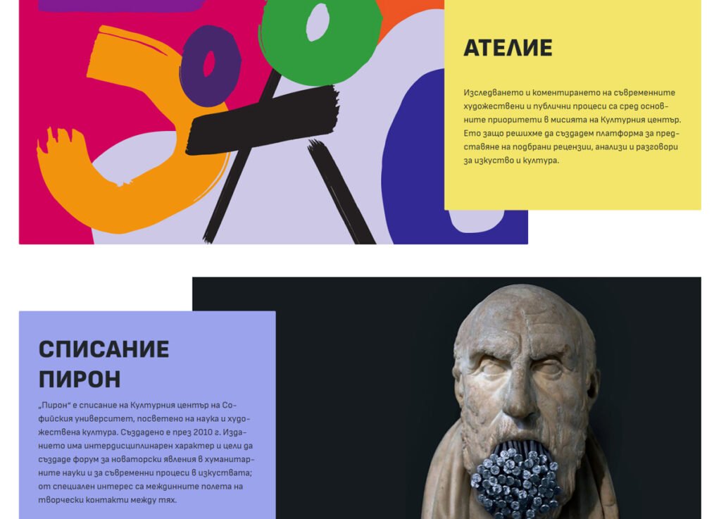
Sofia Sans in Use
WEB: Културен център
СУ „Св. Климент Охридски“
WEB: Вестник „Телеграф“
WEB: БТА (BG)
WEB: Bulgarian News Agency (EN)
If you like this site and find it useful, help us to make it better by giving feedback, suggesting improvements or by donation.
Donate

Milka Peikova

Milka Peikova

Milka Peikova

Milka Peikova (b. 1919, Pavel, Bulgaria, d. 2016, Sofia, Bulgaria) was a famous Bulgarian artist. She created paintings, posters, book covers, portraits of famous Bulgarians, textile designs and alphabets, both individually and together with her husband Georgi Kovachev-Grishata (1920-2012). She is a graduate of the Bulgarian National Art Academy, class of 1948. She founded Cosmos magazine and designed for the Women Today and Problems of Art magazines.
In 1979, she designed an alphabet that was extended to an 8-style Latin / Greek / Cyrillic stencil typeface—Milka (2016)—by a team of designers at Lettersoup that includes Ani Petrova, Botio Nikoltchev, Adam Twardoch and Andreas Eigendorf. The basic Milka font is a clean stencil design, while the Aged, Baked, Brittle, Crunchy, Dry and Soft styles are inspired by stencil and letterpress techniques and expand the usefulness by adding various degrees of warmth or roughness.
Milka Peikova also designed the first Bulgarian typeface for phototypesetting called Grilimil with her husband Georgi Kovachev-Grishata. She is the recipient of the first prize for a typeface at the Bulgarian National Book Exhibition and Illustration.