15 октомври 2020
ИНТЕРВЮ със Светослав Симов и Пламен Мотев | ФОНТФАБРИК
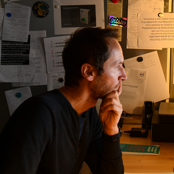
ВЪПРОСИ: Стефан Пеев
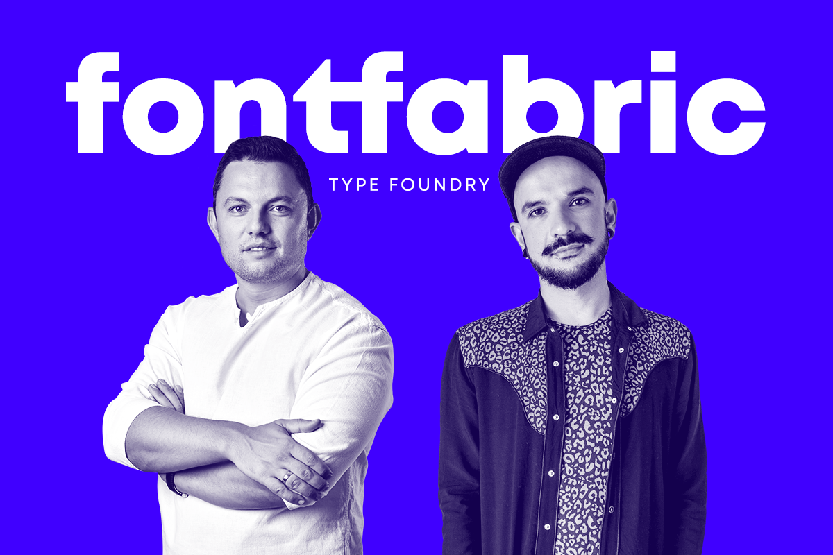
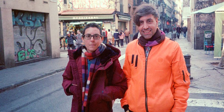
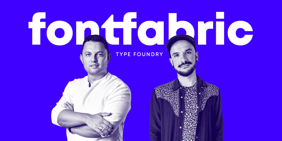
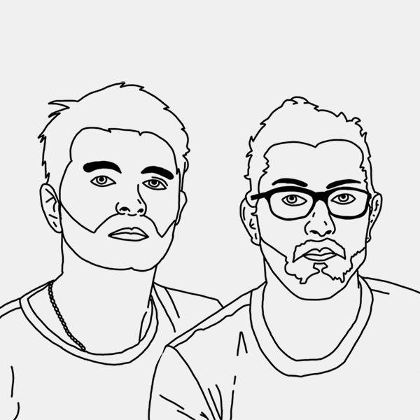
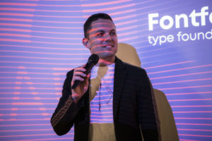
Светослав Симов (директор и основател, вляво) и Пламен Мотев (шрифт директор, вдясно) от българското типографско студио Fontfabric говорят за ролята на българската кирилица и значението на родното типографско изкуство на глобално ниво.
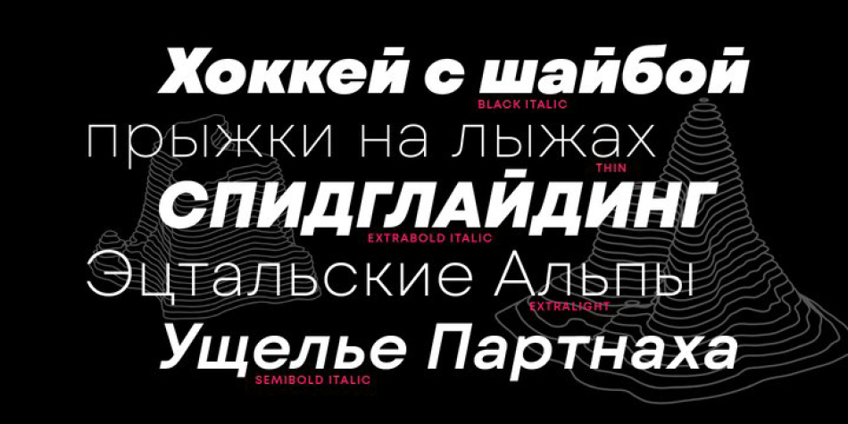
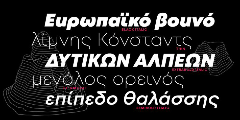
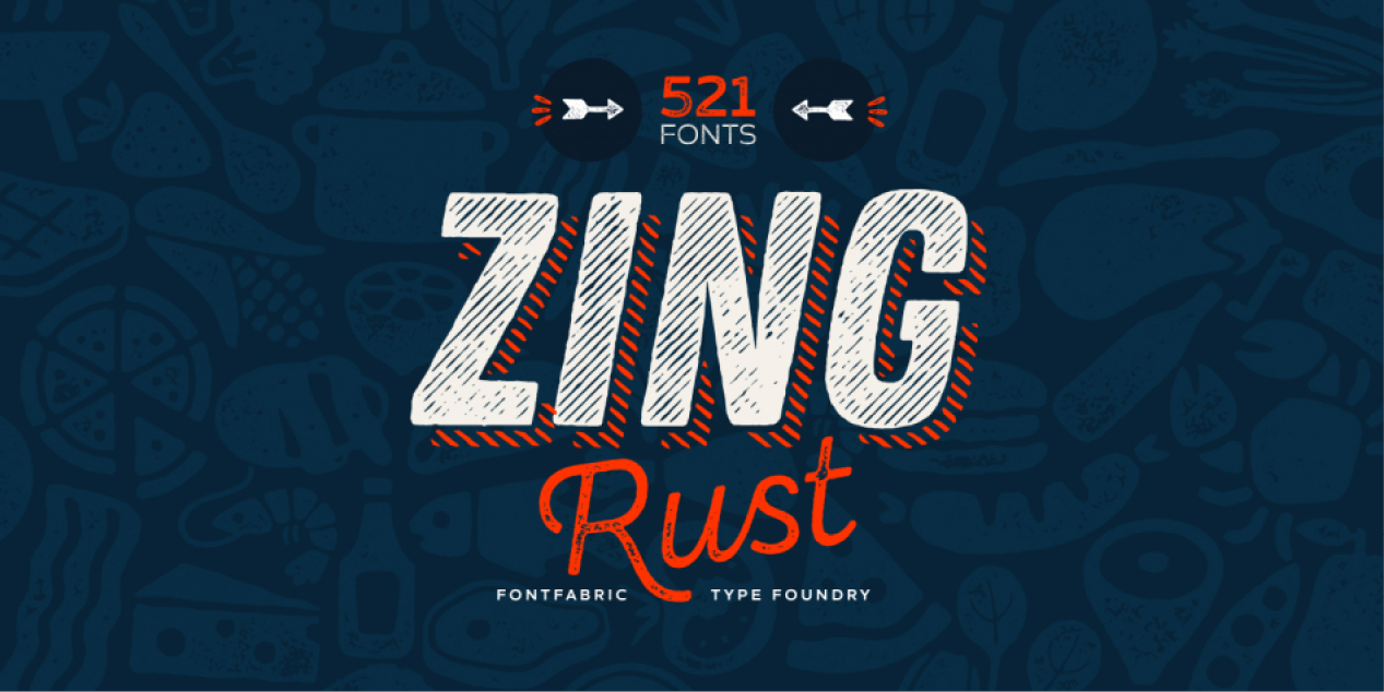
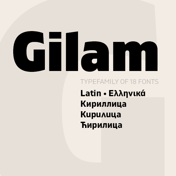
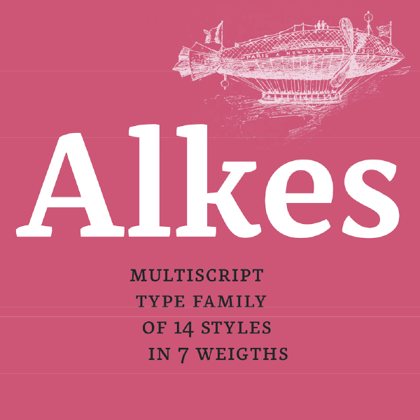
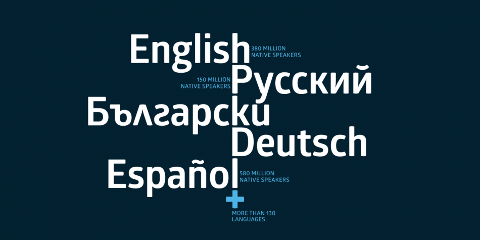
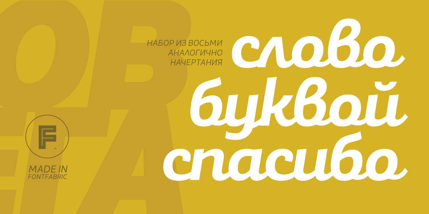
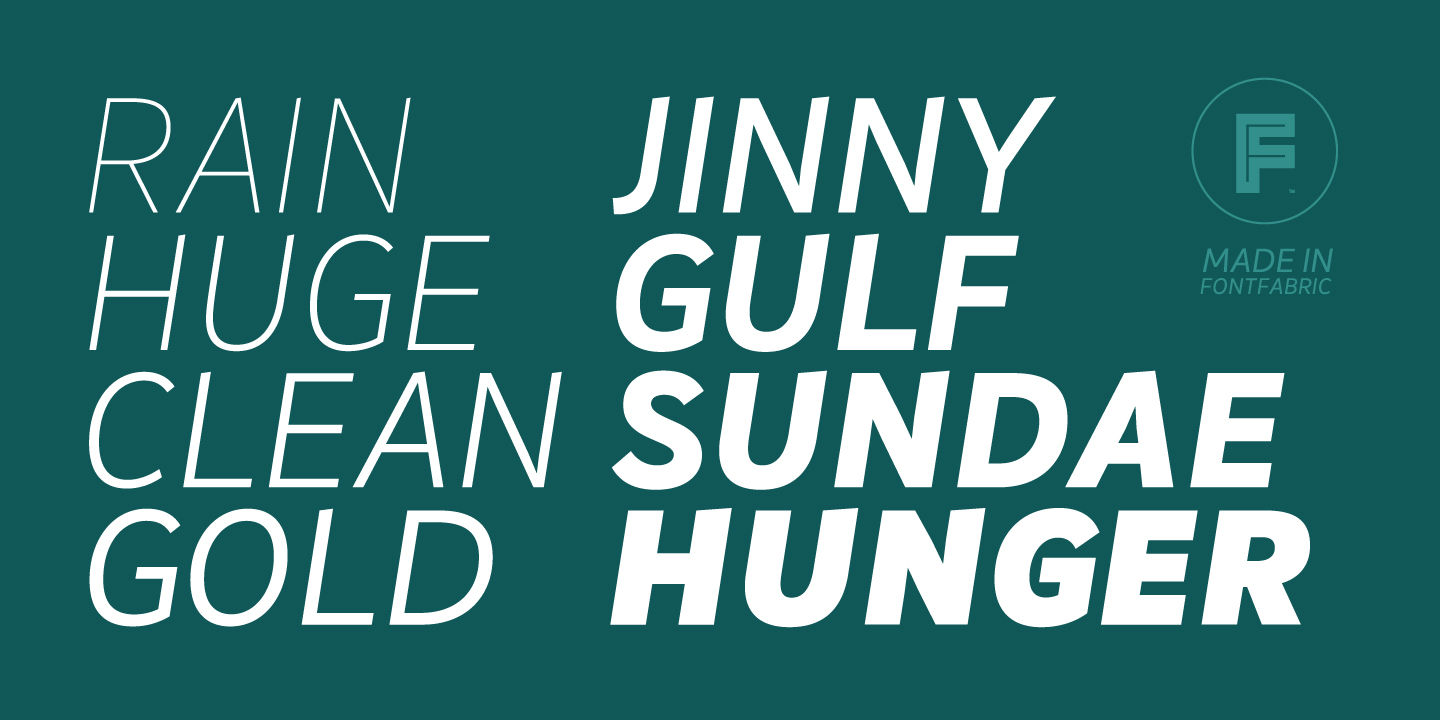
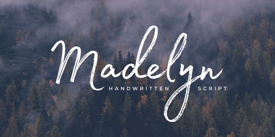
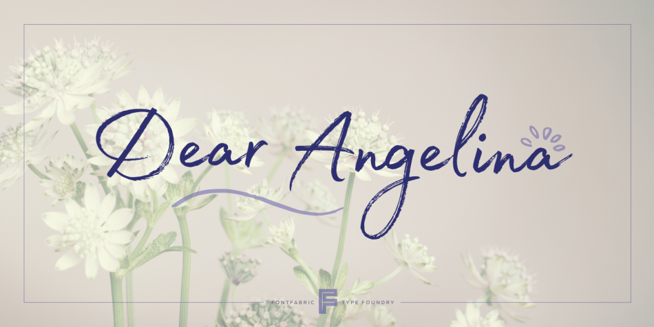
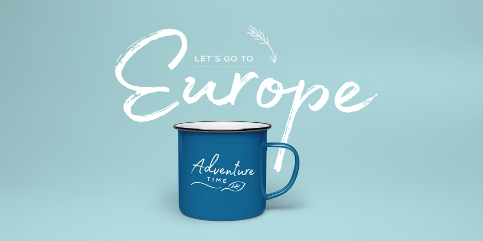
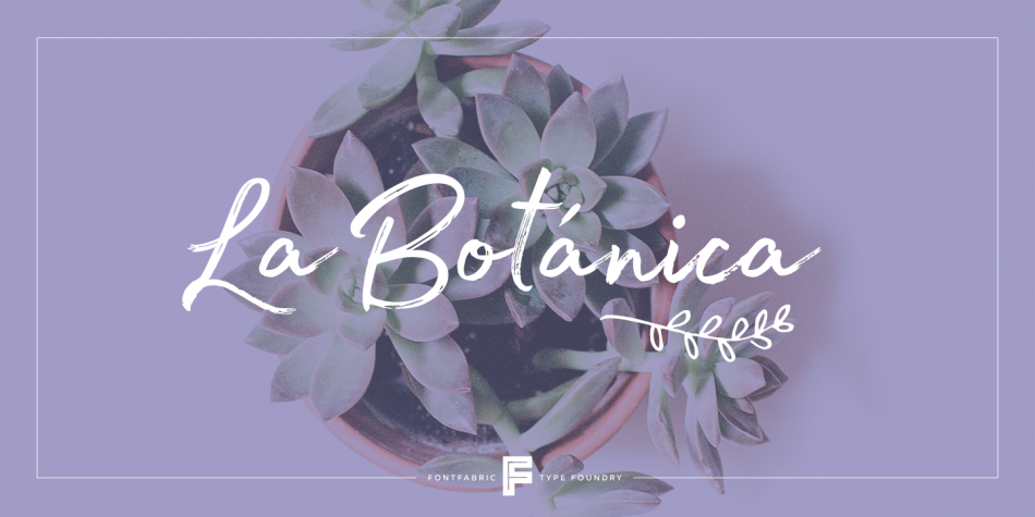
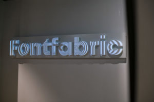
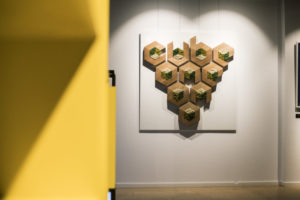
Fontfabric процъфтява като независимo шрифтово студио в България, посветено на изработването на световни шрифтове вече повече от 12 години. Черпейки вдъхновение както от аналоговите, така и от цифровите типографски практики, компактен екип от талантливи дизайнери има за цел да създава устойчиви иновативни шрифтове за водещи проекти. Българската кирилица е наследството, което студиото се надява да популяризира и остави за бъдещите поколения у нас и на световната сцена.
Fontfabric започва своята история през 2008 г. – една година, след като България е приета в ЕС и след като опитите за утвърждаването на българската форма на кирилица като национална идентичност на България в ЕС се провалят. Защо според вас този опит е неуспешен? Какво недостига на българската форма на кирилица да бъде окончателно утвърдена в България и в международен план?
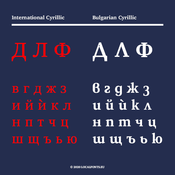
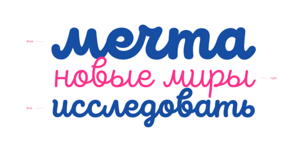
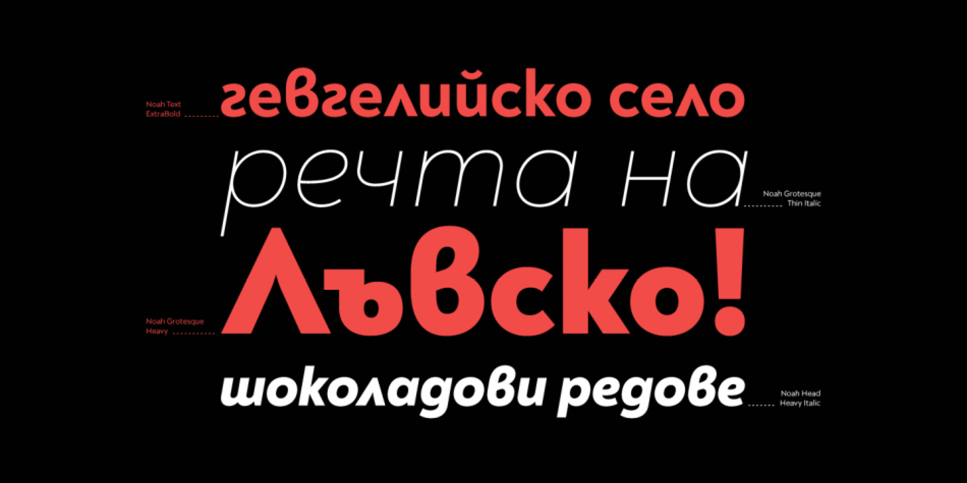
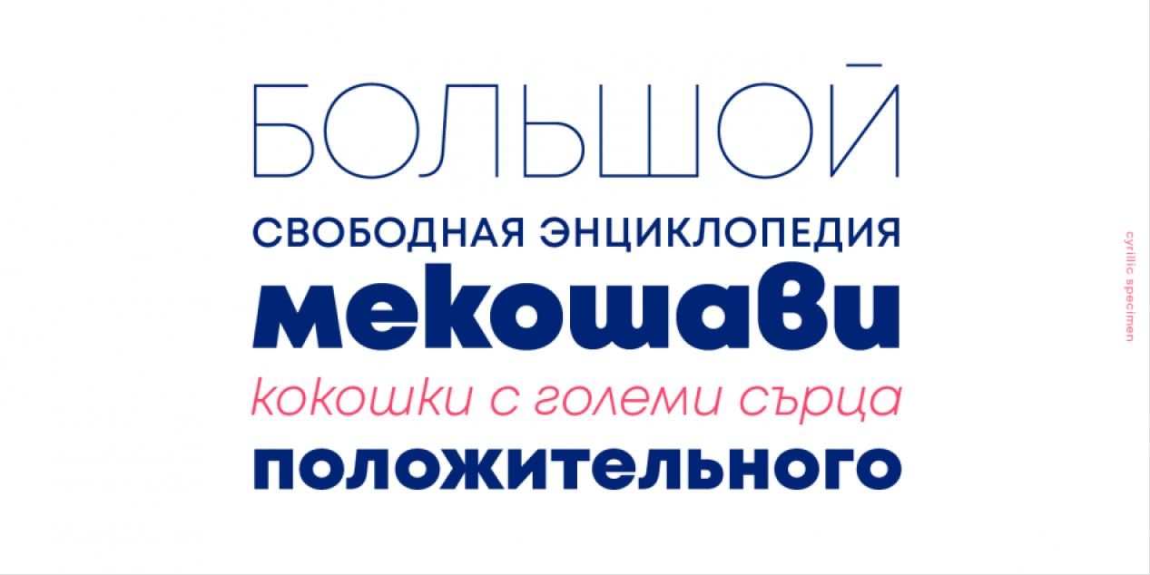
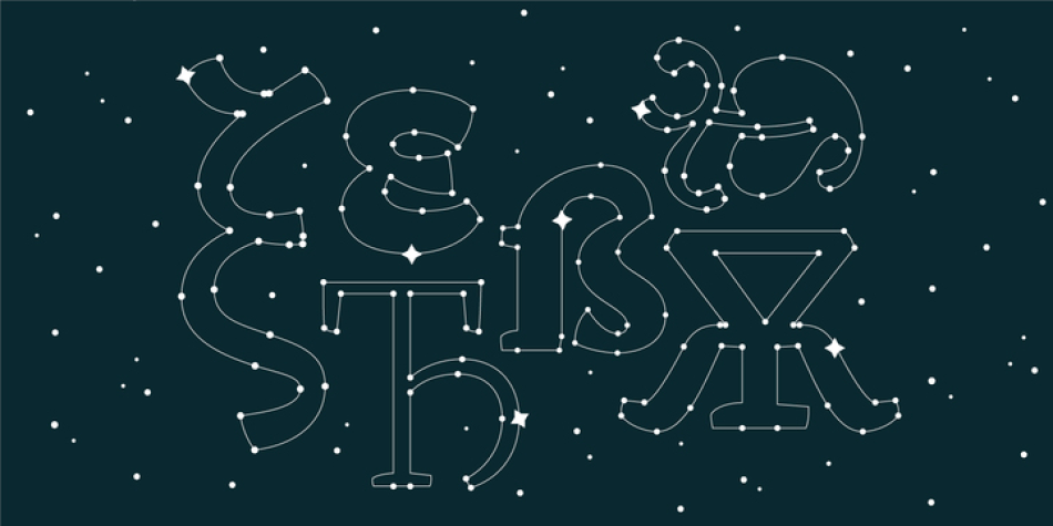
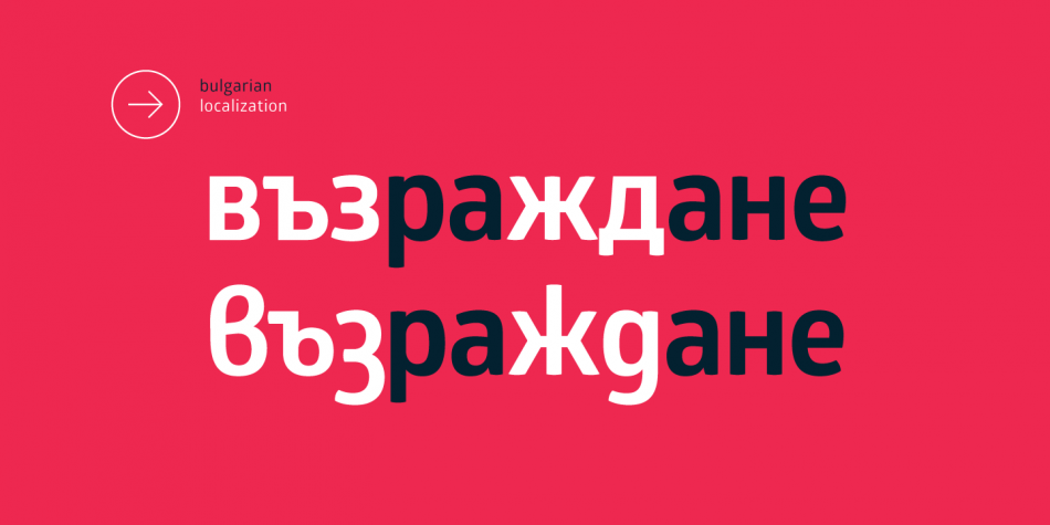
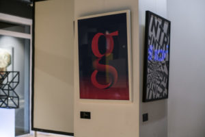
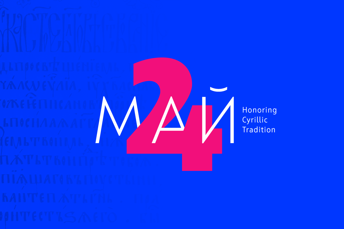
ПМ: Може би липсва културна и икономическа тежест, която да засвидетелства легитимността на нашите намерения. Нашата цел е да възродим и продължим делото на Васил Йончев, Васил Бараков, Стефан Кънчев, Борис Ангелушев, Кирил Гогов — творци, дали изключително много, за да стигнем до развитието си днес. Бихме искали да наложим овалната кирилица като трайна и устойчива форма на националната ни идентичност.
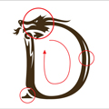
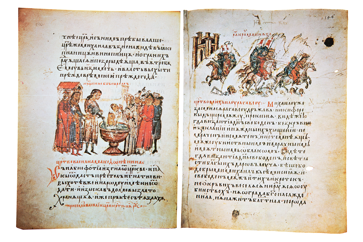
ПМ: България има богата история и ключова роля във възникването и развитието на кирилицата, редно е нашият принос да продължава. Нека не забравяме, че именно Наум и Климент (двамата изявени ученици на светите братя Кирил и Методий) работят усилено по новата писменост с благословението на тогавашния български владетел цар Борис I.
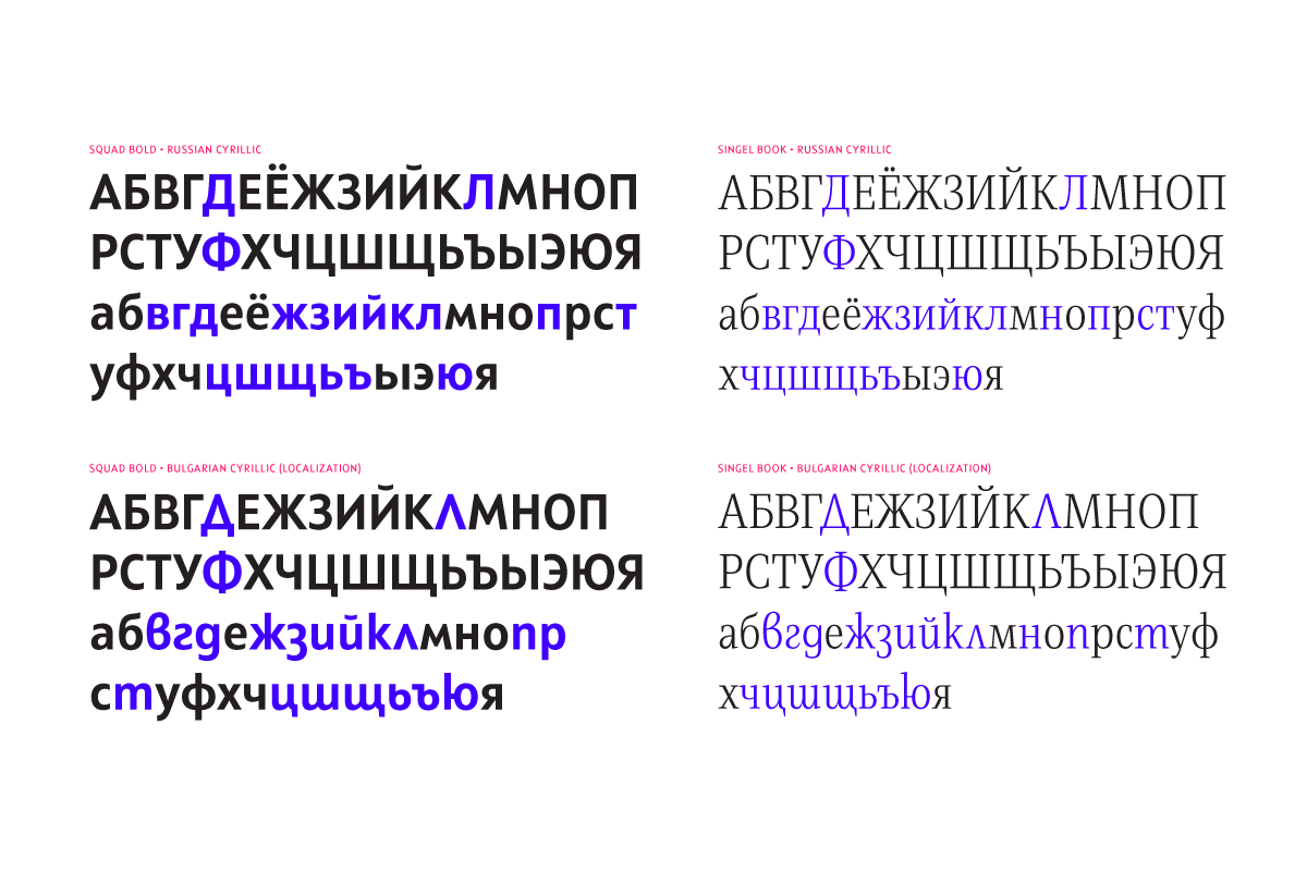
ПМ: За съжаление, правителството не заявява категоричната си подкрепа към това начинание. Политическата воля отсъства. Няма как да очакваме международните кабинети да обръщат внимание на българската култура, ако самите ние не заставаме зад тези идеи. Посетете уеб сайта на Министерството на културата и вижте как е организиран и проектиран. Излишно е да споменавам, че използваната форма на кирилица е традиционната руска, а не българската.
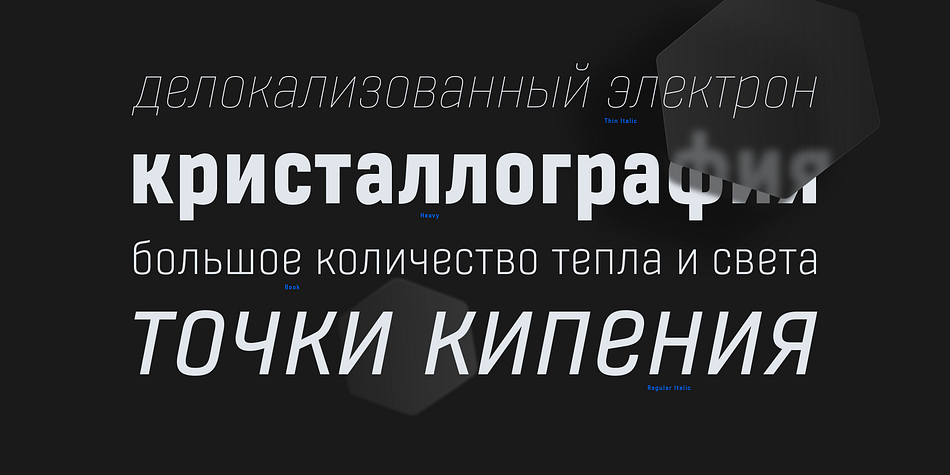
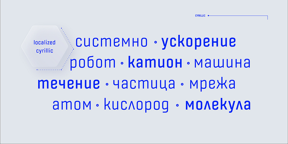
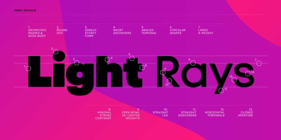
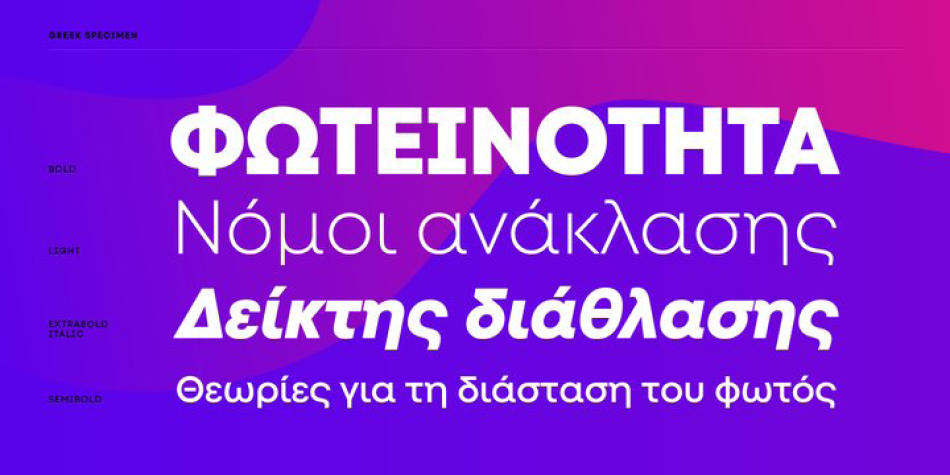
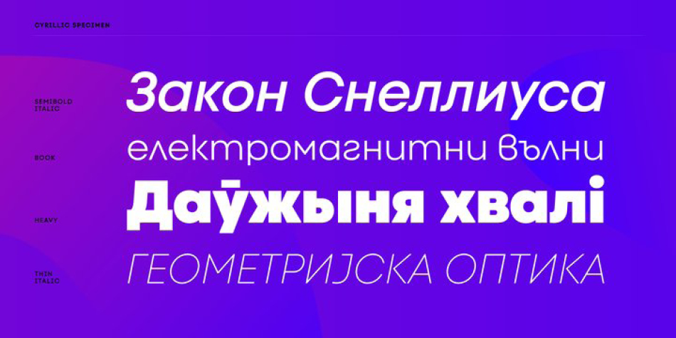
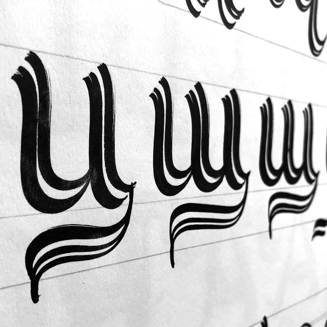
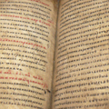
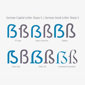
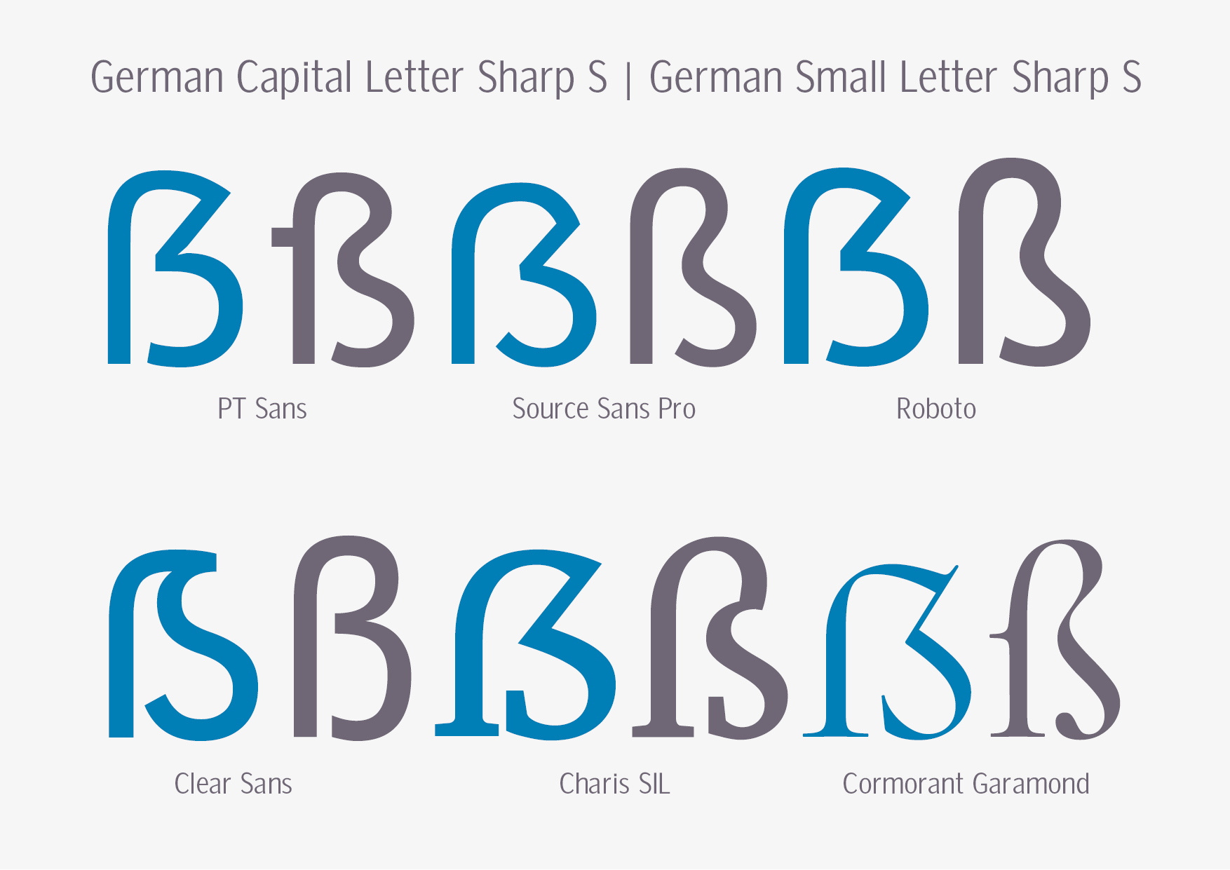
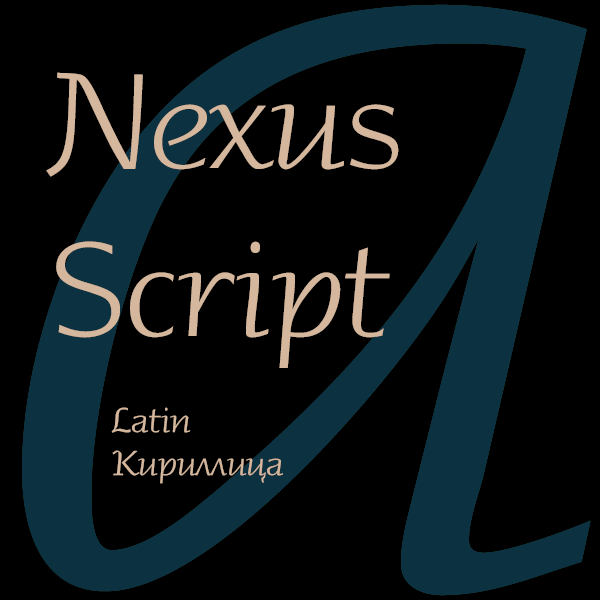
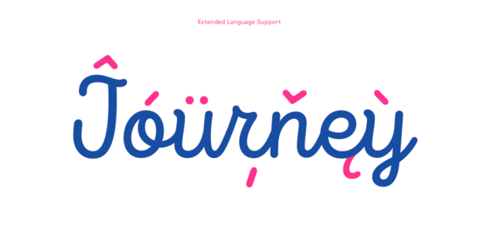
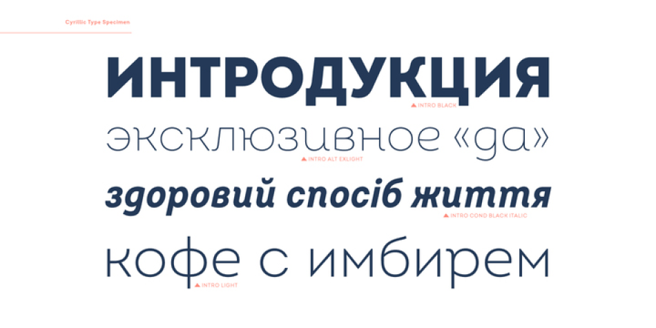
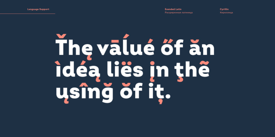
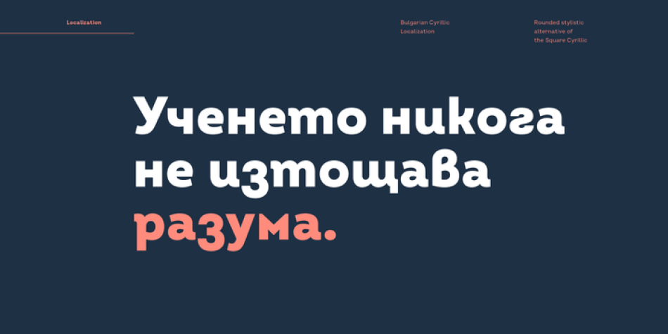
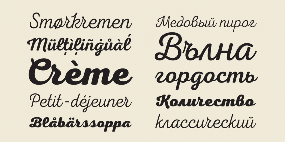
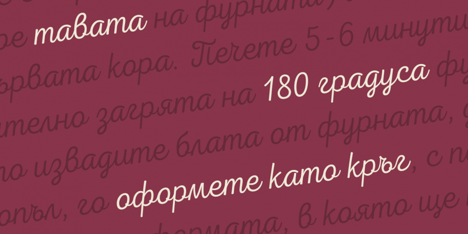
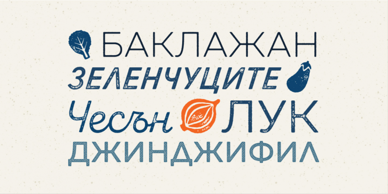
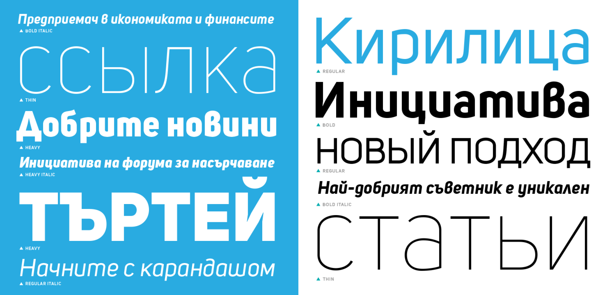
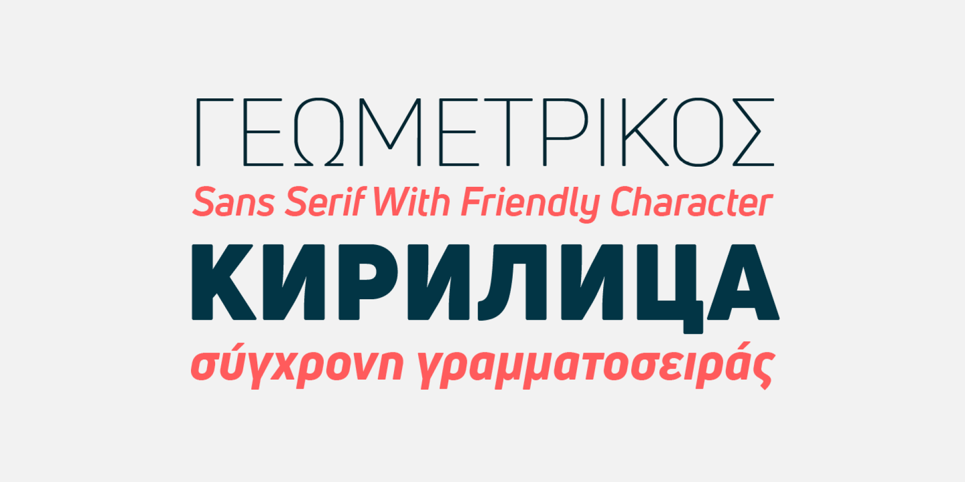
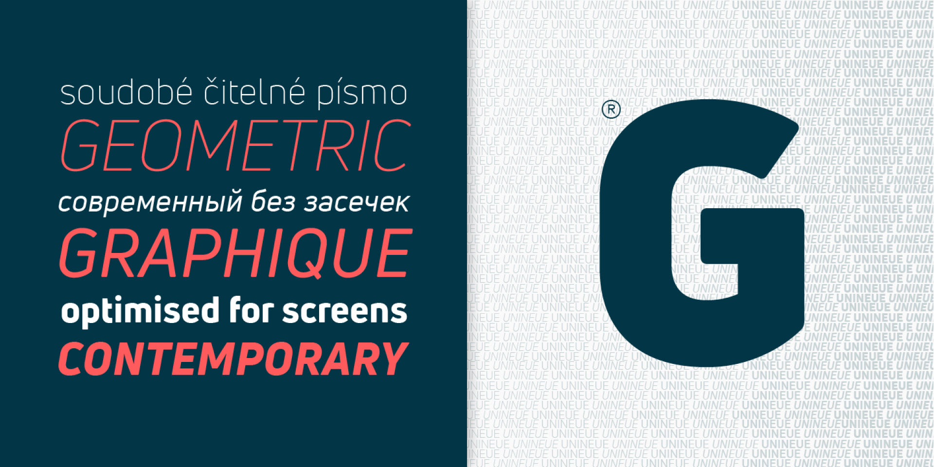
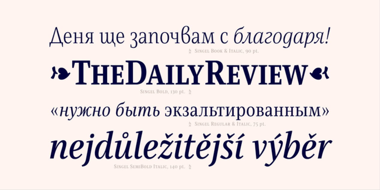
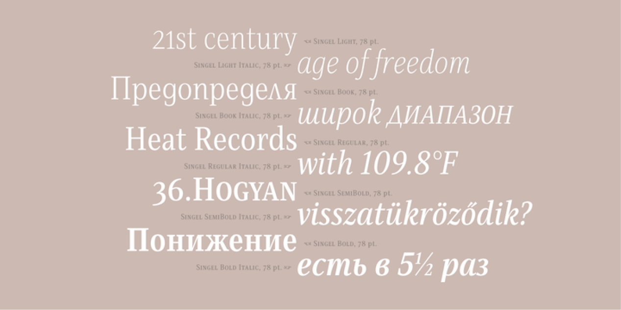
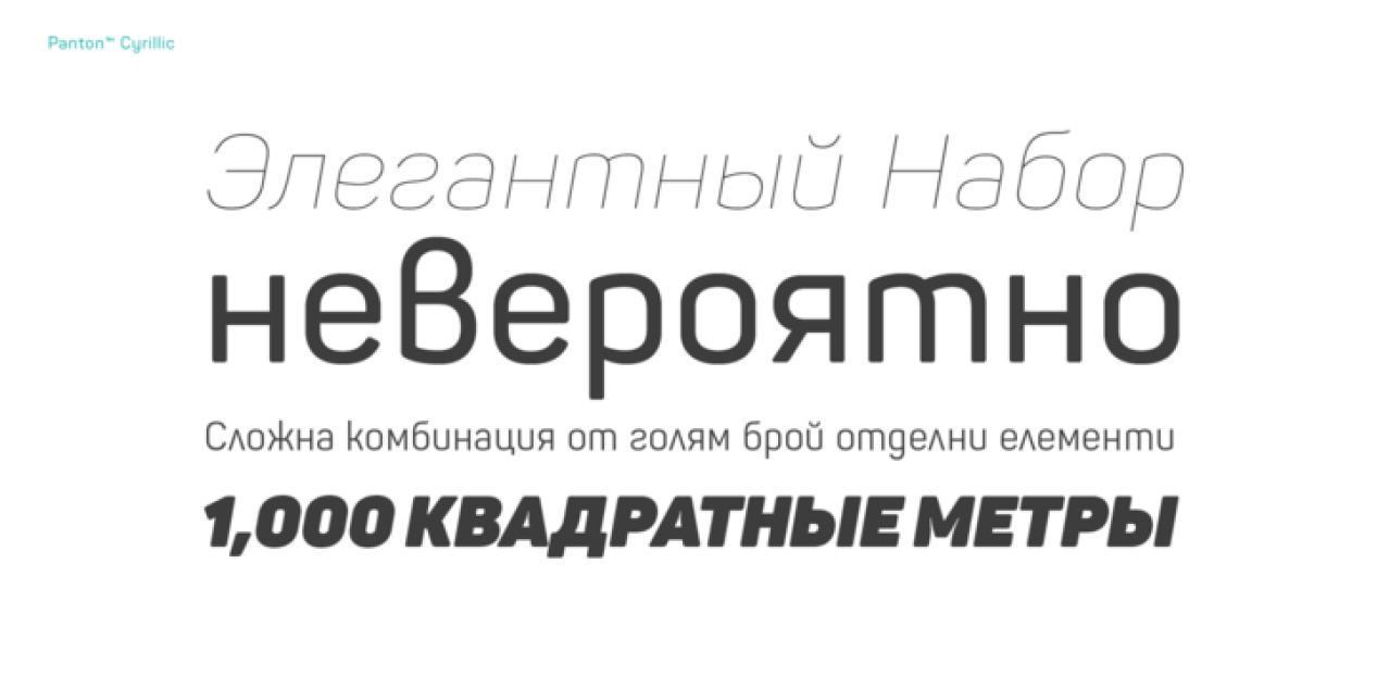
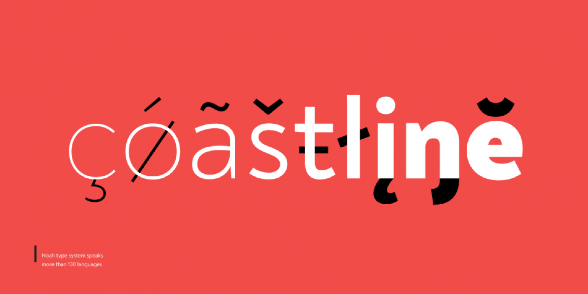
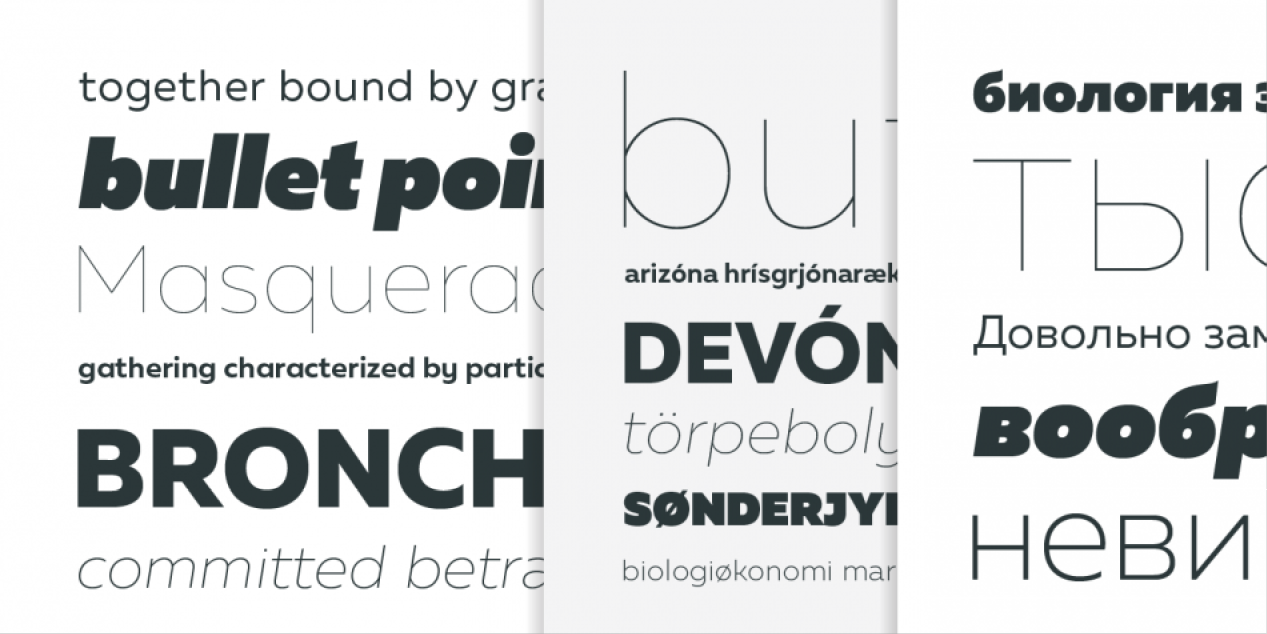
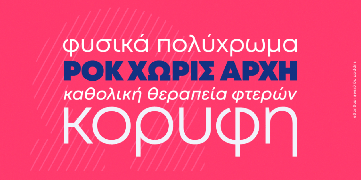
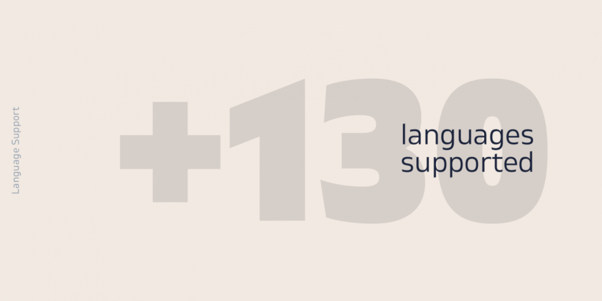
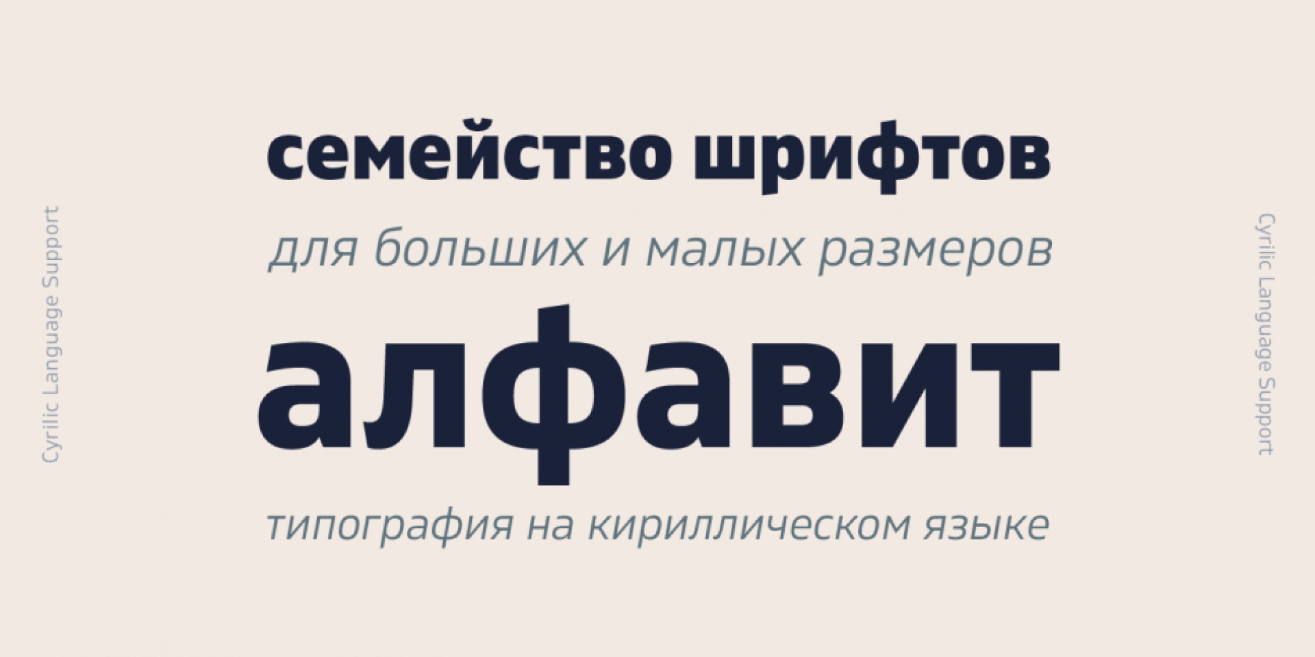
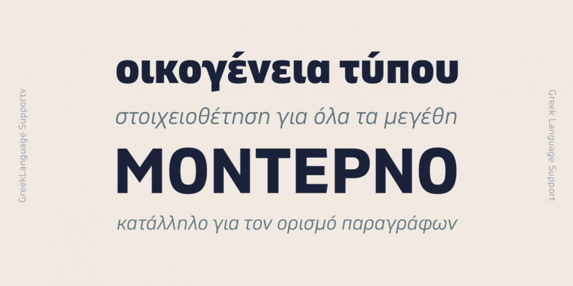
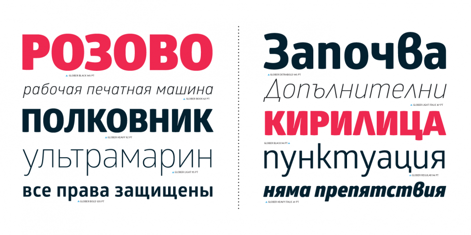
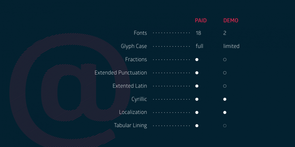
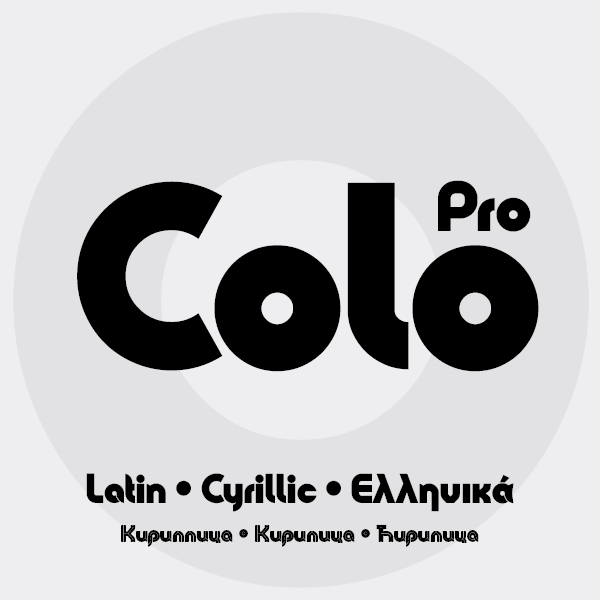
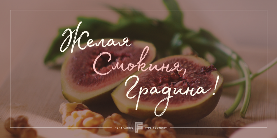
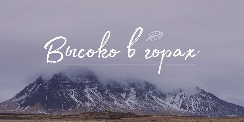
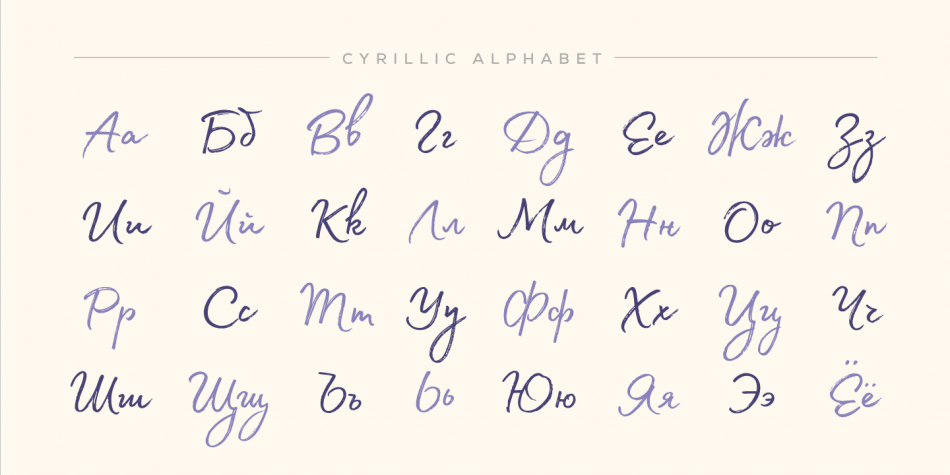
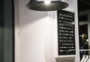
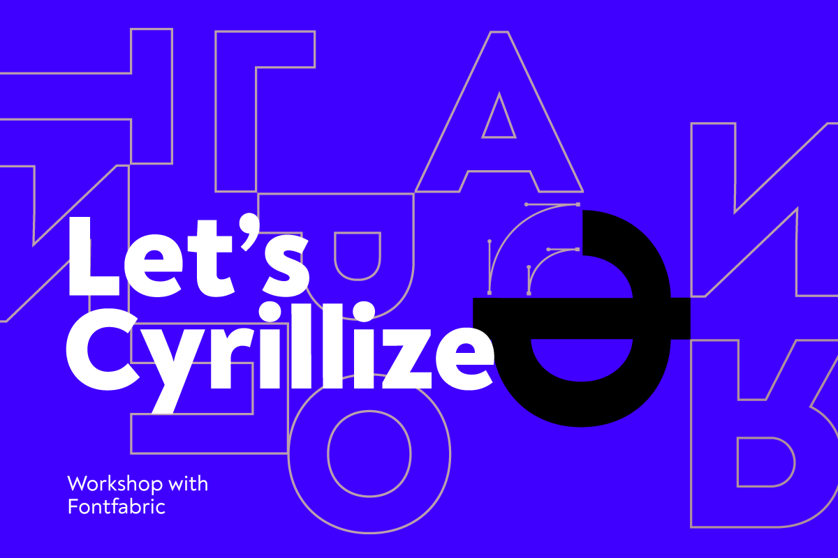
Въпреки това овалната форма на кирилицата се радва на популярност в средите на дизайнери и разработчици. Все повече печатни издания и уеб сайтове ползват българска форма на кирилица. Редовно получаваме въпроси за формата и нейните конструктивни особености.
Ние правим всичко по силите си за нейното популяризиране. Може да погледнете и кратката ни историческа справка, посветена на кирилицата.
СС: Мисля, че нещата изначално винаги тръгват отвътре навън. Просто трябва да погледнем къде е нашата страна спрямо Европа и останалия свят в геополитическо измерение и ще си отговорим на въпроса.
Имаме ли смелостта да се изправим с позиция и самочувствие на република със славна история и голям потенциал, то тогава ще можем спокойно да запечатаме тази си идентичност с облата и естетически издържана наша кирилица. Да започнем да ценим себе си, за да ни уважават и зачитат и навън. Запазването и цененето на културното ни наследство, изградено от имената, изредени по-горе – това значи национално самосъзнание и самочувствие. Продължителното неглижиране и нехайство към въпроса за утвърждаването на кирилицата ни само ще ни връща назад – там, откъдето другите идват.
Коя вълна в историята на шрифтовото изкуство в България е Fontfabric? Как ситуирате Fontfabric в контекста на историята на шрифтовото изкуство в България?
ПМ: Fontfabric е активен участник в дигиталната революция, повлияла включително и шрифт индустрията. Достъпността до софтуер и пазарни посредници като MyFonts направиха шрифтовото изкуство достъпно за глобален кръг от хора.
Паралелно с това невероятната скорост и свързаност, която имаме в днешно време, извади на показ шрифтовото изкуство и даде пряка връзка до него на дизайнери, които доскоро са го считали за елитарно и недостъпно.
СС: Спокойно мога да кажа, че Fontfabric даде тон, вдъхновение и начало на новата вълна от шрифт дизайнери и студиа по времето на т. нар. преход за България (периодът, започнал след 1989 г.) или дигиталната ера, погледнато в световен мащаб.
Ситуирам Fontfabric като носител на новото, актуалното и на моменти нестандартното. Всички виждат и знаят в колко динамично развиващ се свят живеем. Нуждите и търсенето на хората и бизнеса се променят само за няколко години. Нашият фокус винаги е бил, и ще продължава да бъде, да превръщаме въпросителните в отговори, които работят по най-добрия начин – естетика и функционалност.
Fontfabric се превърна в своеобразен инкубатор на кадри. Как си обяснявате това? Защо завършващите университетски специалности с изучаване на шрифт у нас не търсят начин да се реализират като шрифтови дизайнери непосредствено след дипломирането си?
ПМ: Като човек, минал неотдавна през тази система, мога да споделя личния си опит. До преди 5 години не се предлагаха много възможности на човек да се занимава с шрифтов дизайн. Дори да е завършил магистратура в Академията, пътят към индустрията оставаше по-скоро затворен за общността.
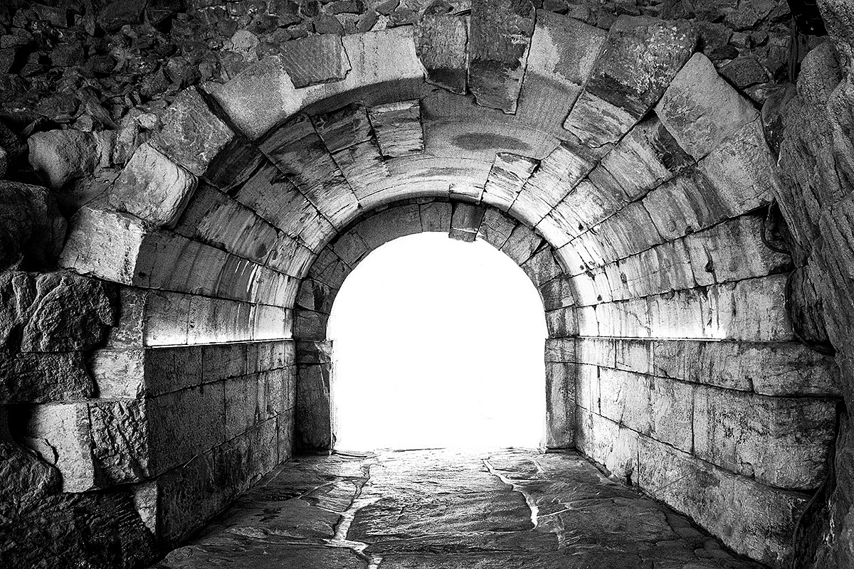
Fontfabric разкрива един успешен бизнес модел на българска компания, наложена на международната сцена. Това дава амбиция и надежда на все повече хора да опитат късмета си. Мнозина не отдават значение на това, че за да е устойчива и да се развива, една компания трябва да подреди действията и приоритетите си, така че да може да генерира средства, да работи с клиенти, да печели доверието им, да се налага на пазара и т.н. Това е изключително трудно начинание, но Fontfabric е пример, че е възможно – светлината в тунела вече е налице.
СС: Самият факт, че имаме марка в типографията, чиито граници и влияние се простират толкова широко в световен мащаб, може съвсем естествено да е повод за национална гордост и самочувствие. Аз поне, поглеждайки нещата по-отстрани сега, го усещам по този начин. Още по-висшето от тук нататък са нашата визия е цели, които се разклоняват в две главни направления – да проповядваме кирилицата в българската ѝ форма и да палим искрата у бъдещото поколение дизайнери на шрифтове. Знам, че много хора гледат към нас и това трябва да разпалва още по-силно този огън в нас и около нас.
Проблемът е, че знанието и умението да изграждаш шрифт само по себе си не е достатъчно условие да си успешен и да продаваш добре. Всички знаем, че едно добро ястие се готви с усърдие и идва в резултат на последователно следване на рецептата и прилагането на множество техники с прецизност. Е… Нека кажем, че във Fontfabric сме се научили да готвим добре 🙂
Имате ли свои препоръки към българското образование в областта на графичния и шрифтовия дизайн?
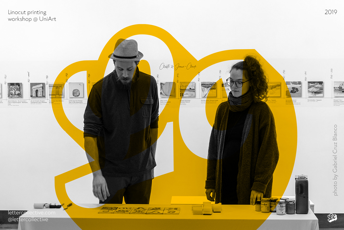
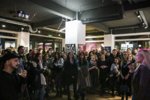
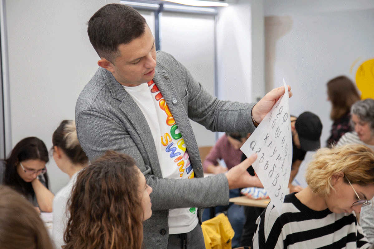
ПМ: Някои от настоящите и бивши колеги преподават в Академията. Определено считам, че това е място, в което човек може да се развива, стига да има устрема и волята. Добри знания в областта на типографията могат да бъдат придобити и в университети като НБУ, SoftUni. Ние често сме гост лектори в редица от българските вузове. Държа да подчертая, че мисията е възможна дори и ако човек се самообучава, чете книги, блогове, ресурси и ходи на различни работилници като тези, които организираме ние самите. Планираме все по-разширени програми, свързани с обучение и шрифтов дизайн, така че следете дейностите на Fontfabric.
СС: Съветът ми е, наред с изучаването и следването на класиката и основите на типографията, да се дава повече свобода на твореца, който се намира у всеки. Нека се предоставят повече шансове на студентите да намират път към по-нестандартни и уникални форми на буквата. Всеки нов шрифт носи свой собствен дух и персоналност. Има много и най-разнообразни форми на буквите, които могат да стъпват като основа и принципи на стандартните санс и серифни класически начертания, но да изглеждат достатъчно различно, интересно и нетипично. Съветът ми е, ако има пет или десет студента по шрифт, то нека всеки започне дипломен проект в различна стилистика. Така те самите взаимно ще се обогатят накрая – всеки един от преживяването и пътя на другия.
Шрифтът е бизнес продукт, но и културен модел, олицетворение на културните и естетическите търсения на времето. Как гледате на тази сложна взаимовръзка между двата аспекта на шрифта? Не прекаляваме ли днес в усилията да създаваме шрифтове, ориентирани към бизнеса? Какво липсва в калейдоскопа от шрифтове в България?
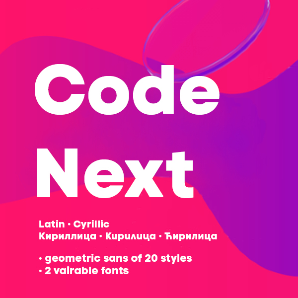
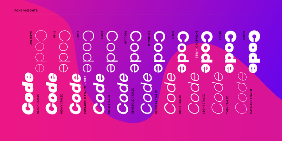
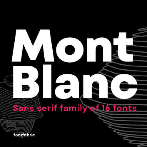
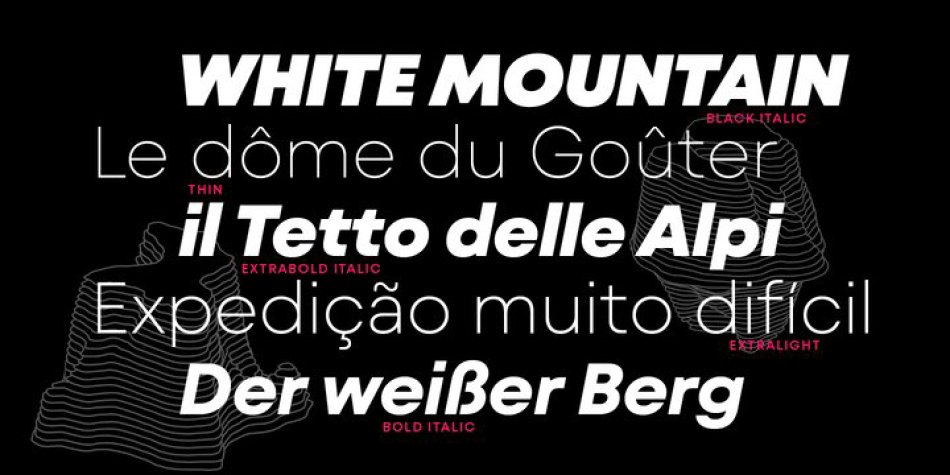
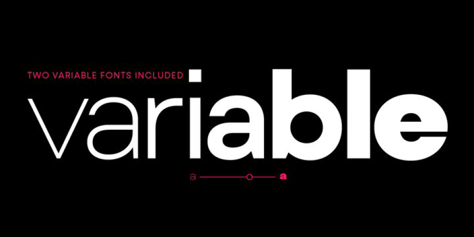
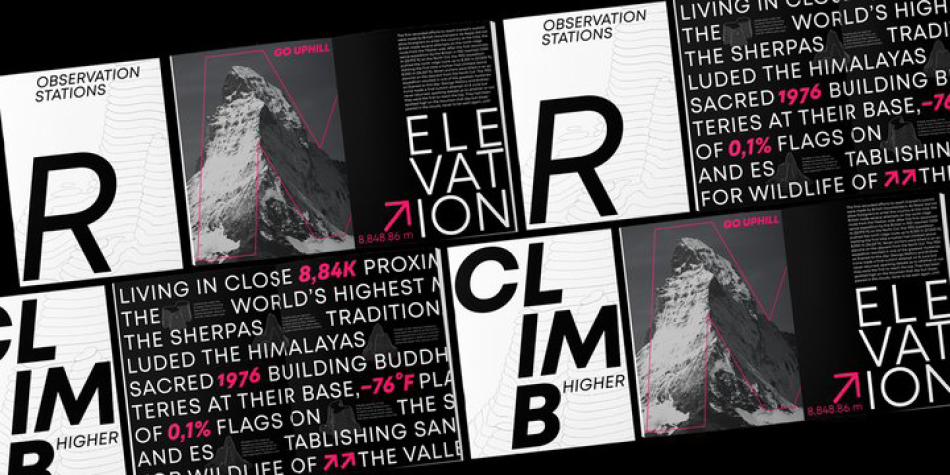
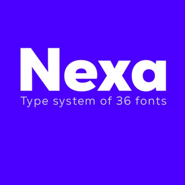
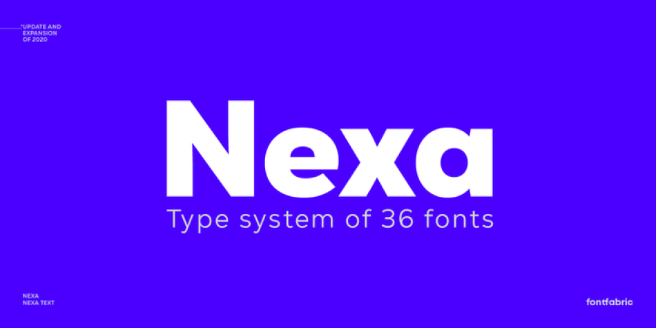
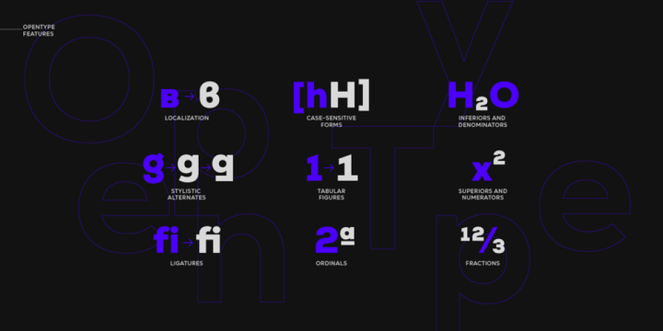
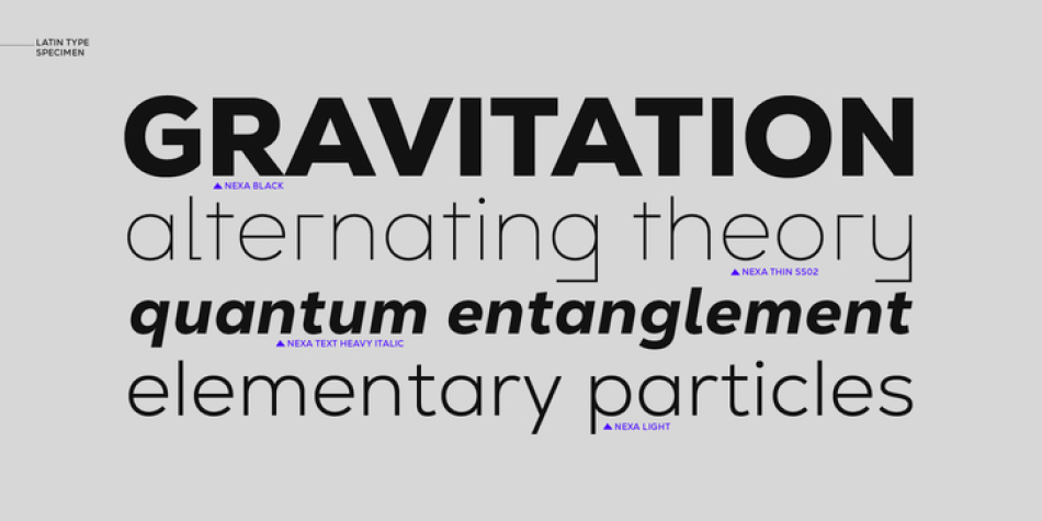
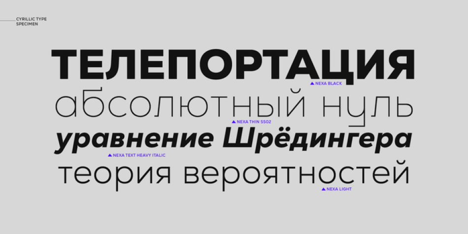
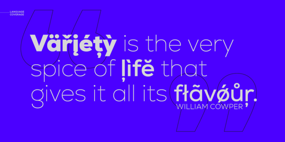
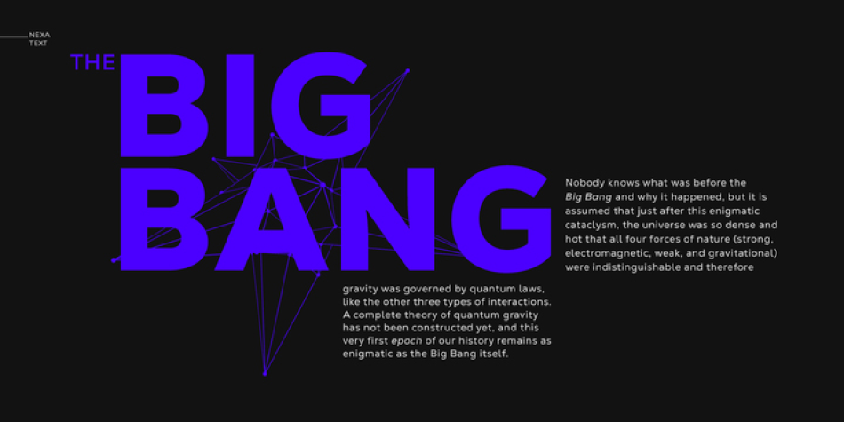
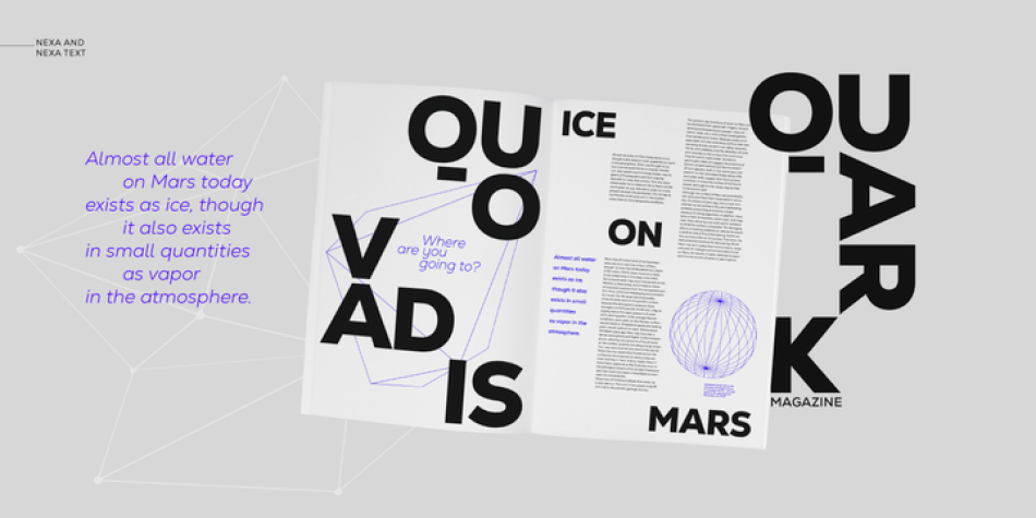
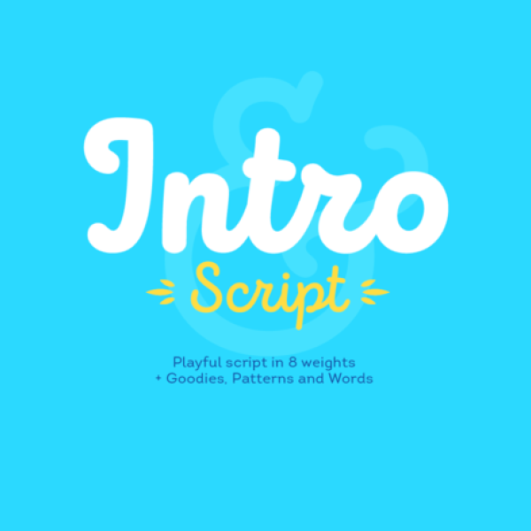
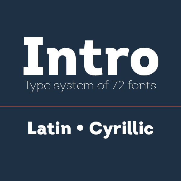
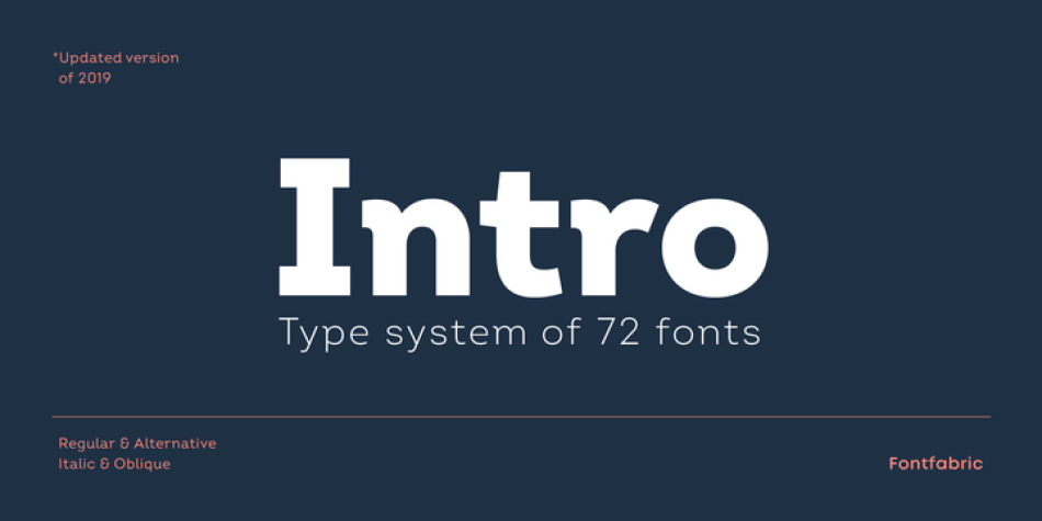
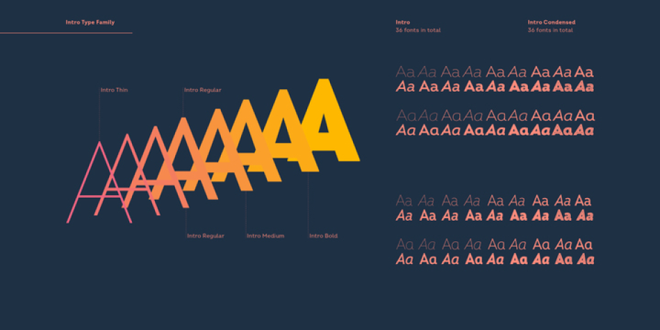
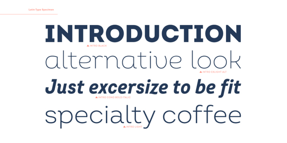
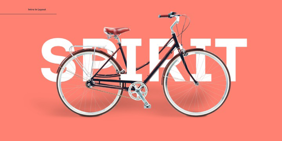
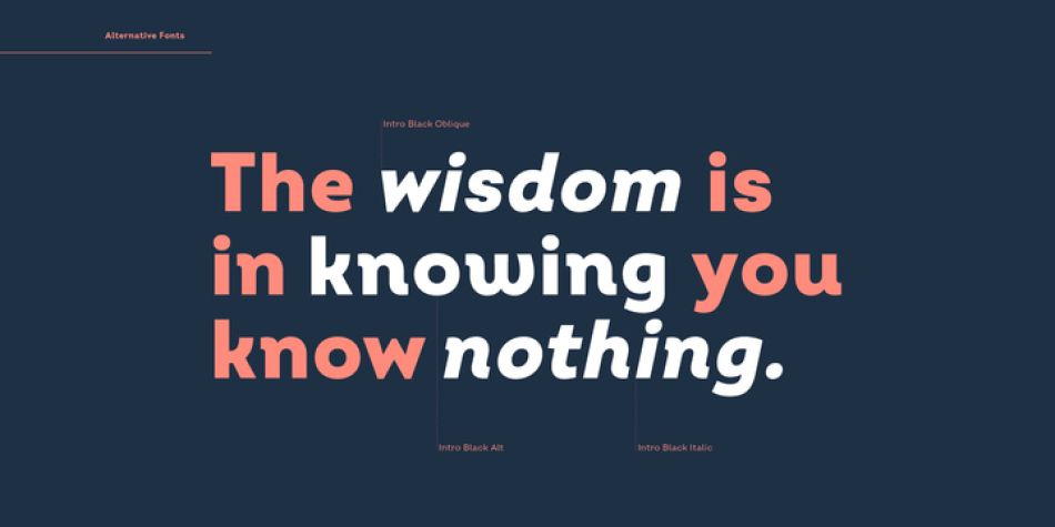
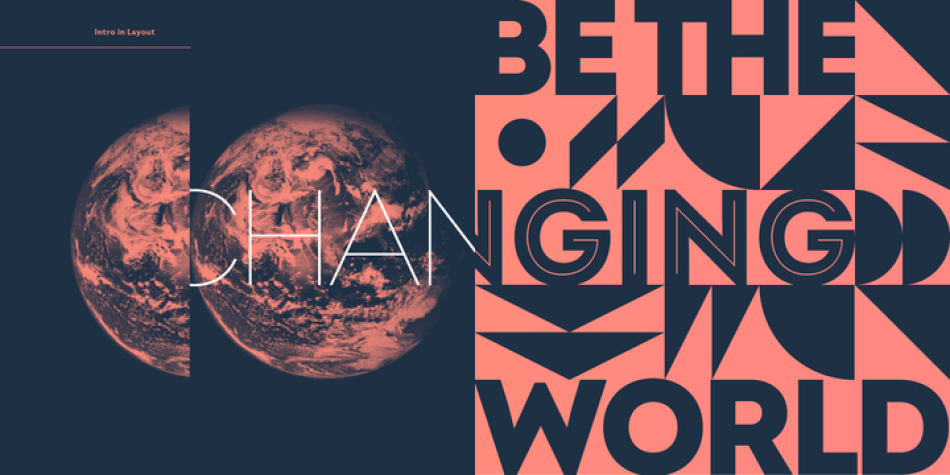
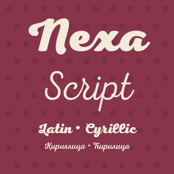
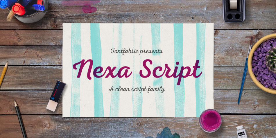
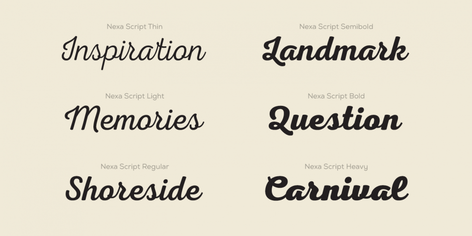
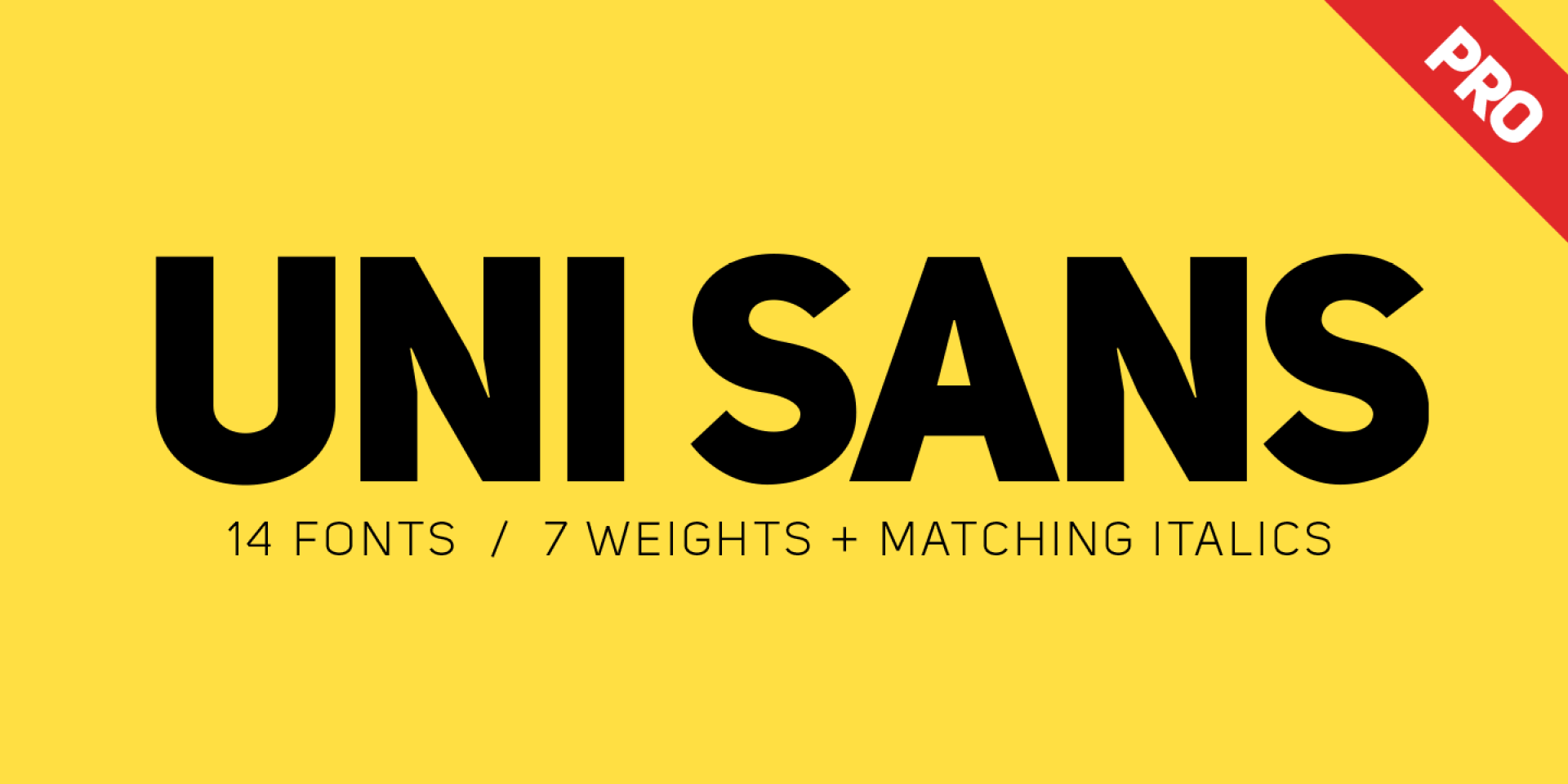
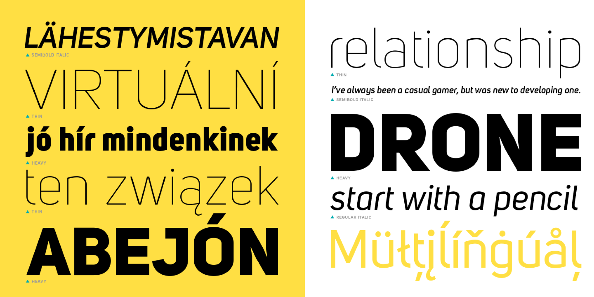
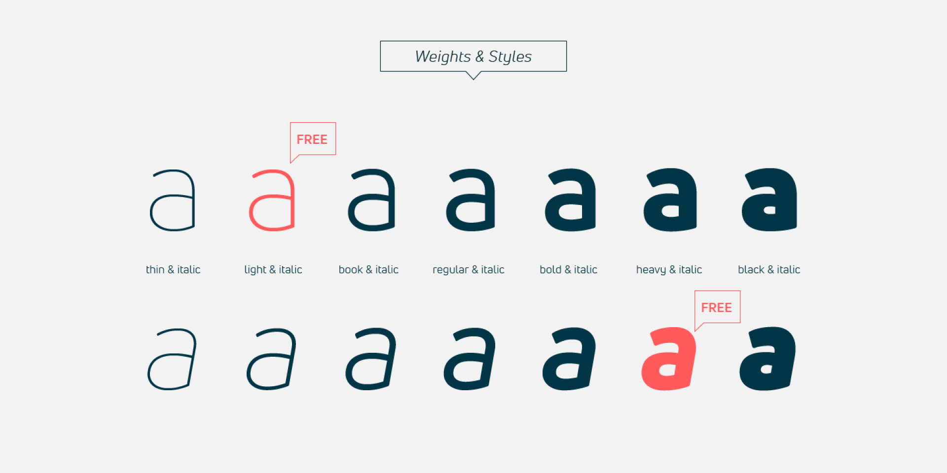
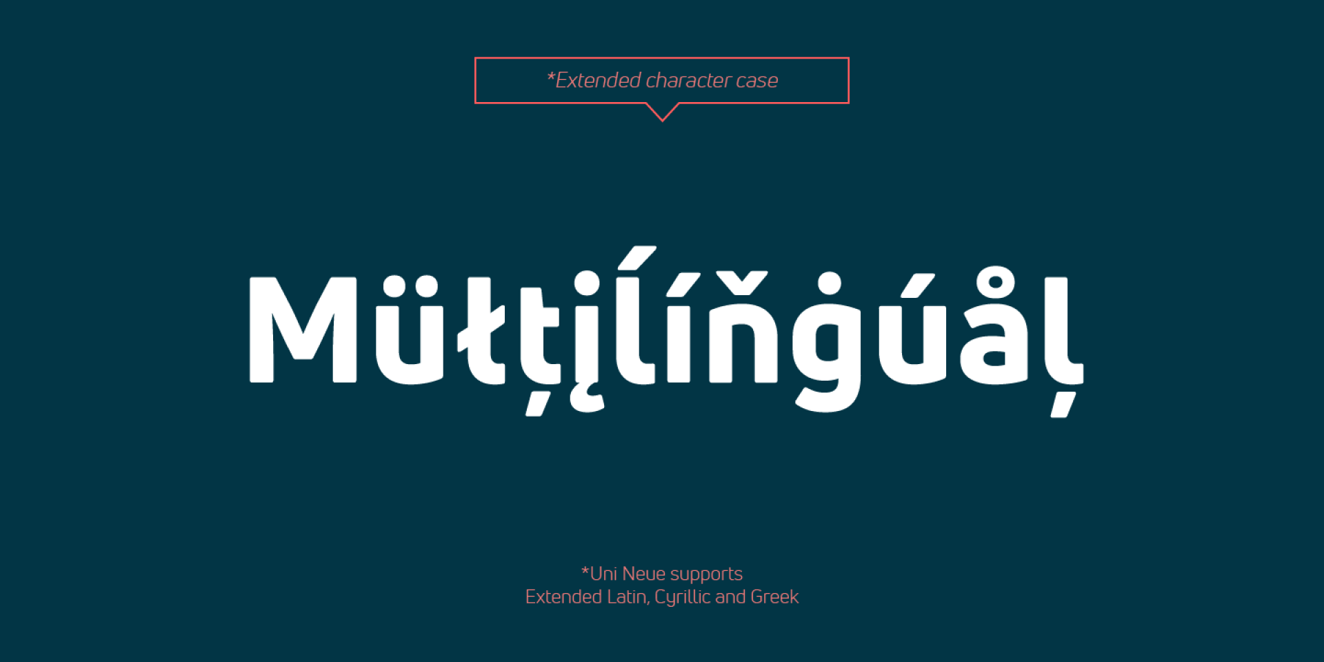
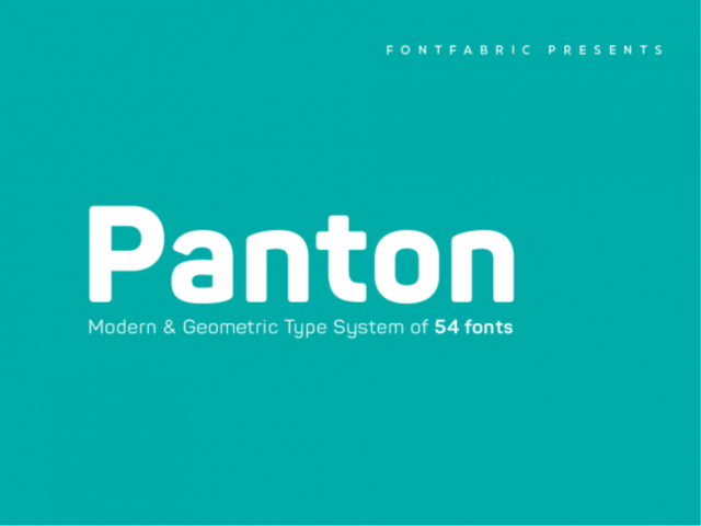
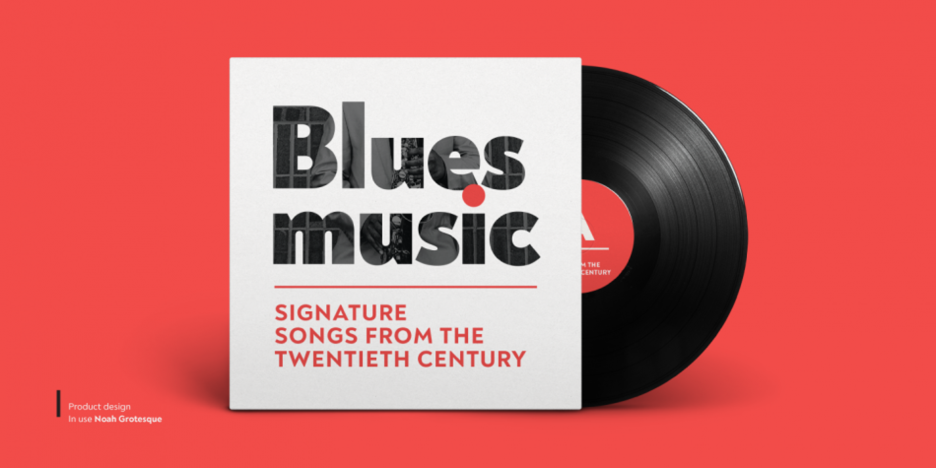
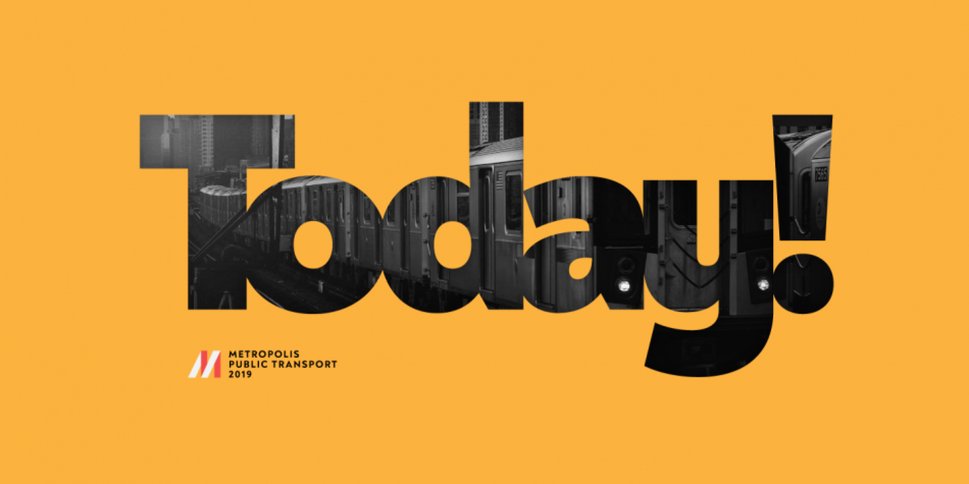
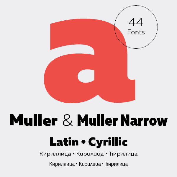
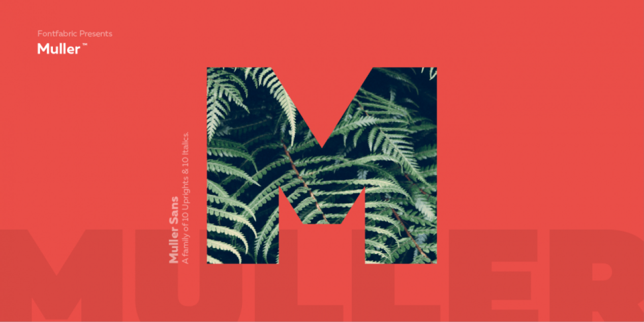
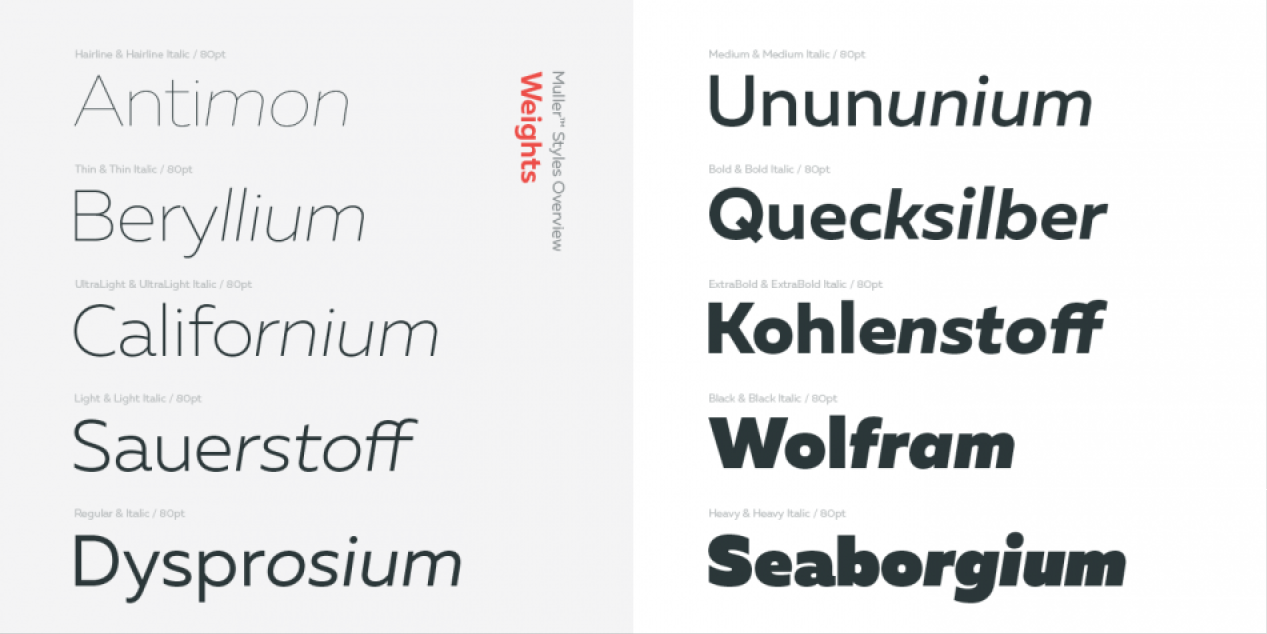
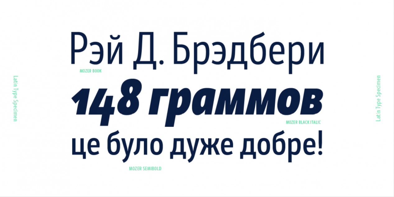
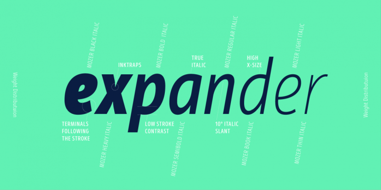
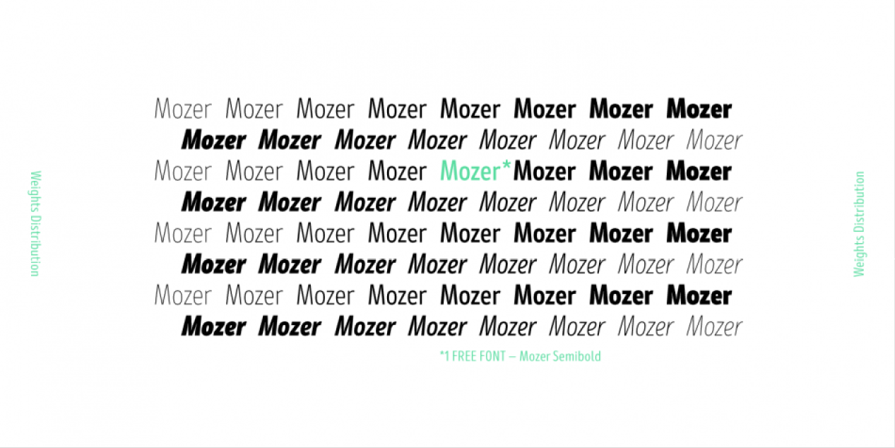
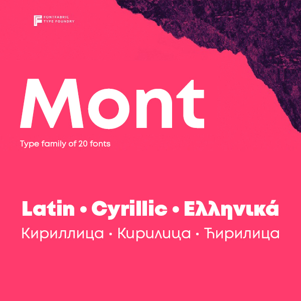
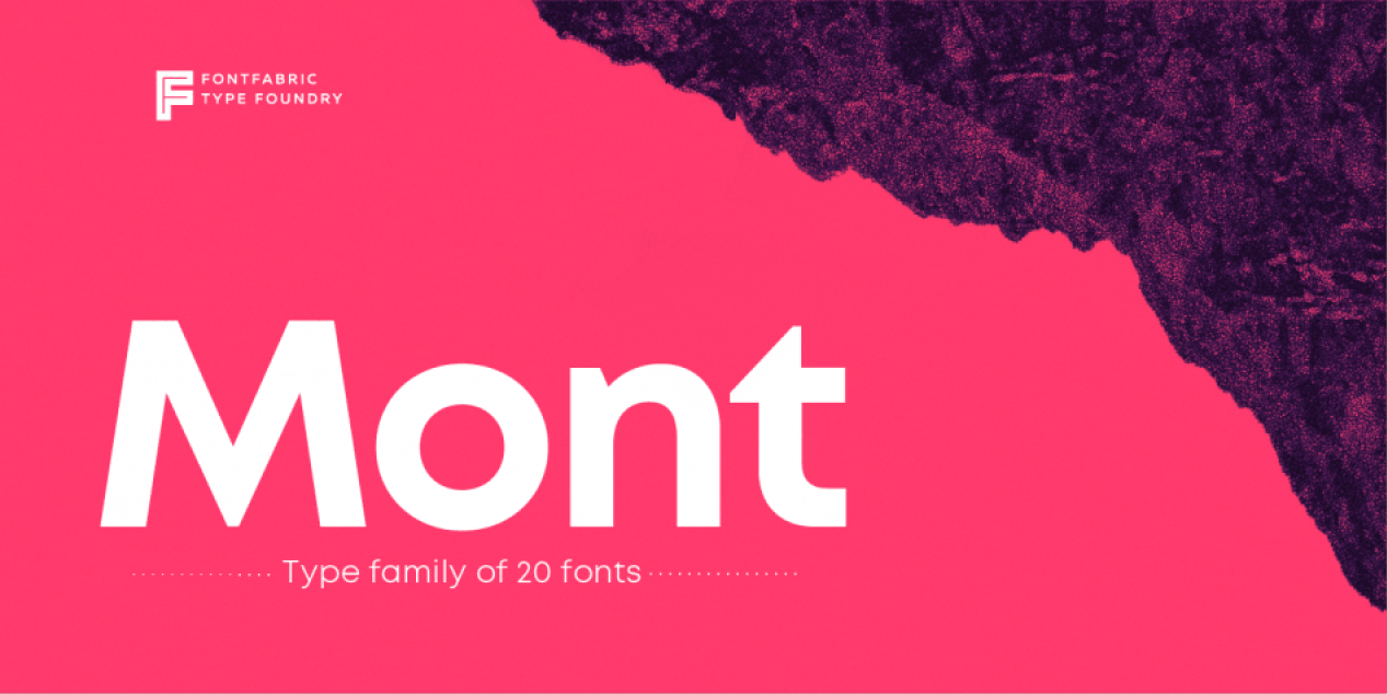
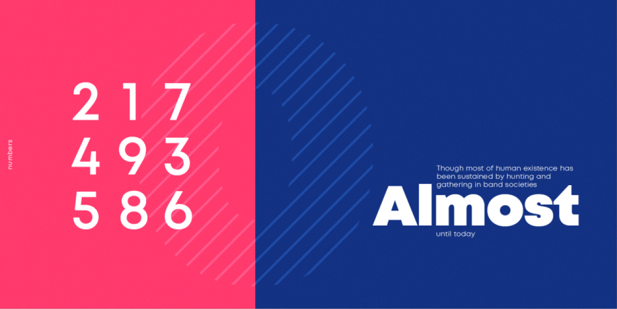
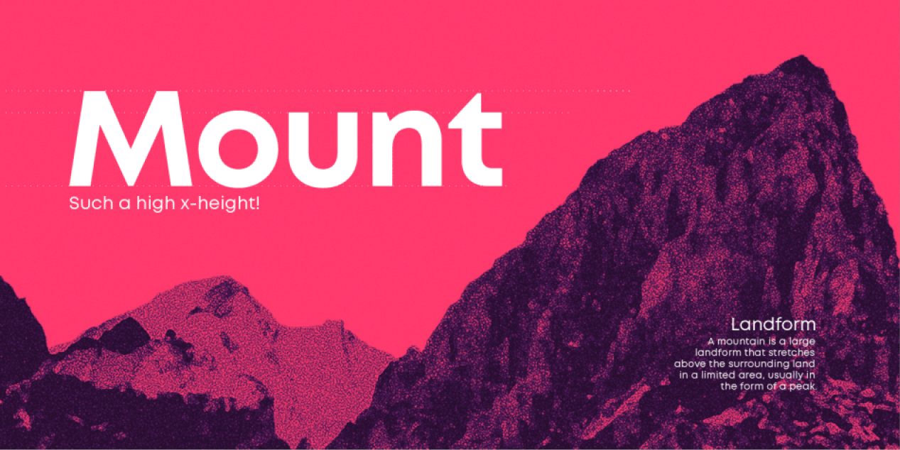
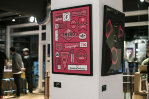
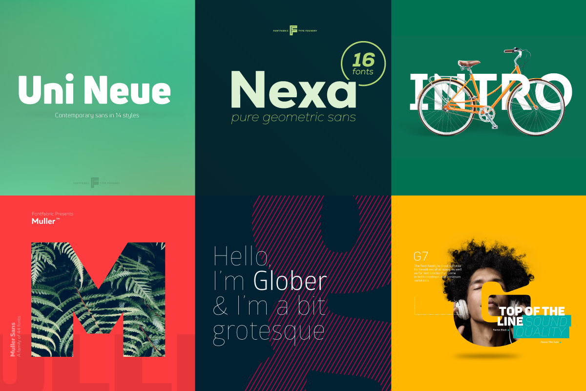
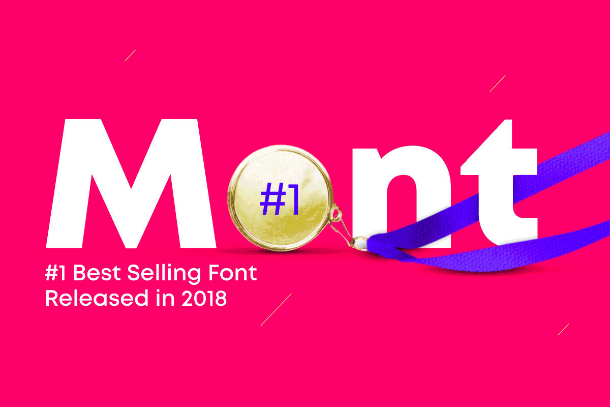
ПМ: Балансът между бизнес проекти и такива с не толкова изявена комерсиална цел е същината на това да си релевантен към настоящата дата. Ние правим както успешни “най-продавани шрифтове” като Nexa, Intro, Mont, така и безплатни RND проекти като 36 Days of Type, Colus или Slovic, който беше един от първите “variable” шрифтове за времето си.
Много са посоките и възможностите за развитие на шрифтовете у нас. Съществува една творческа безтегловност от около 30-на години между края на ХХ в. и началото на XXI в. Липсват възстановки на оригинални български разработки. Бих окуражил всеки, който има желание за колаборация, да се свърже с нас.
СС: Основен закон, по който винаги ще се води и движи бизнесът – търсенето определя предлагането. Поглеждайки назад към линията на времето и пътят, който лично аз съм извървял като творец и дизайнер, при мен нещата са преминали от неконвенционално и уникално по само себе си творчество към все по-комерсиални, функционални и ползваеми шрифтове, които се продават добре. И в това няма нищо лошо, ако човек е избрал това начинание за свое поприще и иска да изгради солиден екип от професионалисти във времето. Всичко това изисква стабилен бизнес модел и добри доходи, няма как да е инак.
Та, една от основните ми цели и стремежи сега е да правим и продуцираме по-нестандартна и уникално изглеждаща, въздействаща типография. Нещо, което да ползва силата и възможностите на еволюиралата технология, като съчетава и трансформира традиция, наследство, история по модерен и новаторски начин.
Какви са бъдещите планове на Fontfabric? Какво предстои да бъде постигнато в средносрочен и дългосрочен аспект?
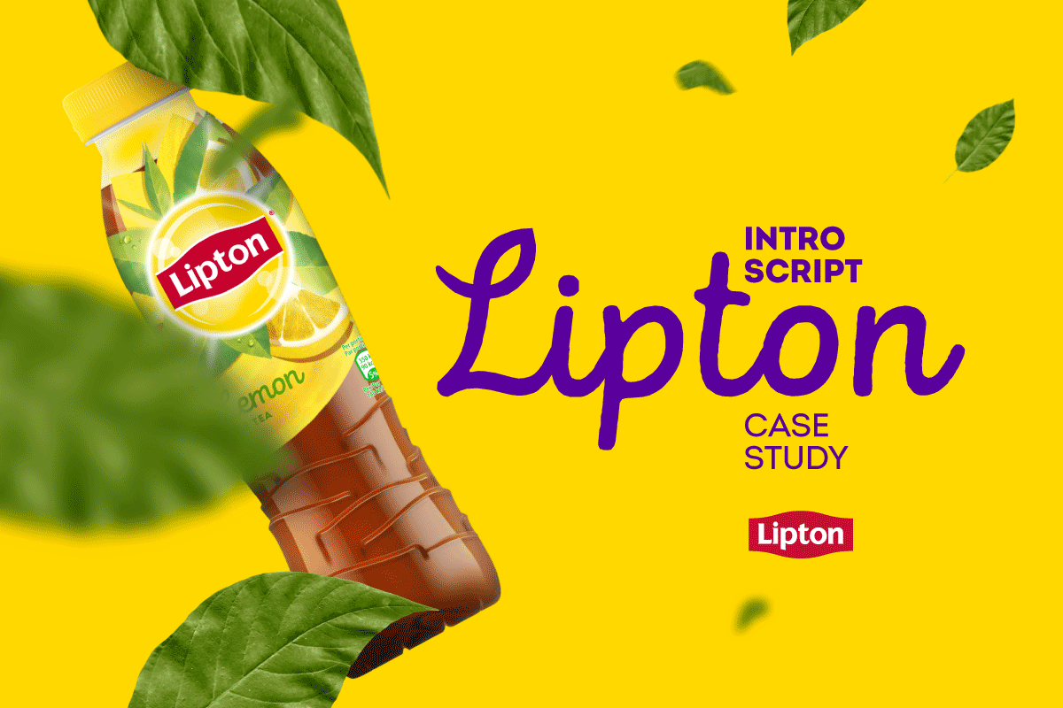
ПМ: Fontfabric се превръща от студио, правещо и разпространяващо шрифтове в такова, което консултира и работи в тясна връзка със своите клиенти. Партнираме си успешно с бизнеси, студия и агенции от българия и чужбина. От корпорации като Telenor, Lipton, Polpharma, Axel Springer до културни институции като Музей „Дом на хумора и сатирата” в Габрово.
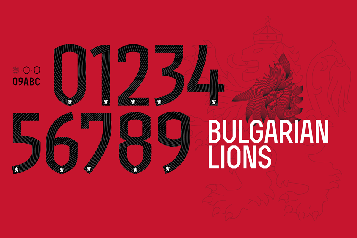
Нaскоро имахме и възможност да направим шрифт за българския национален отбор по футбол. Много благодарим на маркетинг екипа на Cauza.bg и на БФС за оказаното доверие.
В още по-широк аспект компанията се превръща все повече в обучителна платформа. Целим да предоставяме качествено съдържание на блога си, както и в социалните ни мрежи.
Провеждаме и обучителни работилници, които се радват на изключителен интерес и успех. Определено ще развиваме все повече тази наша дейност.
СС: Малко или много отговорът се крие отчасти в предходните ми изложения.
Израстваме и се развиваме с всеки изминал ден. Мечтата ми е един ден, като погледна към Fontfabric, да виждам олицетворение на всичко, което винаги сме търсили, мислили и сме си представяли, че може да направим някога – реалност. Колкото по-голяма и реализирана е тази мечта, толкова повече причини за вътрешно задоволство от добре свършената работа и хубавото чувство, че целият този труд и време са си заслужавали. Нещо, което се е зародило тук в България, живее, ползва се и се преоткрива от стотици хиляди, милиони хора всеки Божи ден в целия свят, и което да оставим като завет на идващите поколения.
Разберете повече за дейността на Fontfabric:
FONTFABRIC BEHANCE LINKEDIN FACEBOOK INSTAGRAM
РЕДАКТОР
Стефан Пеев
издател, графичен и шрифтов дизайнер
If you like this site and find it useful, help us to make it better by giving feedback, suggesting improvements or by donation.