Improved kerning of the Updated Version of 2020
New Features
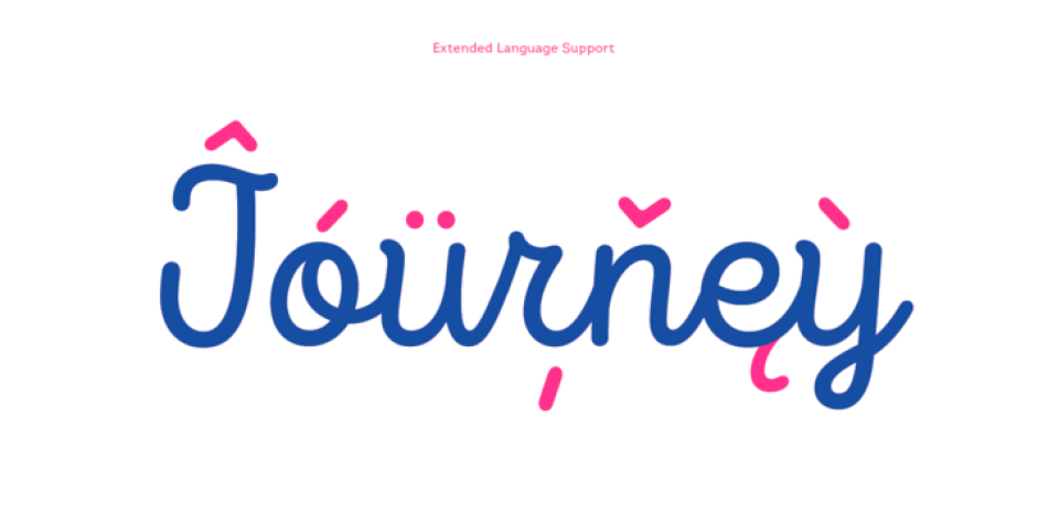
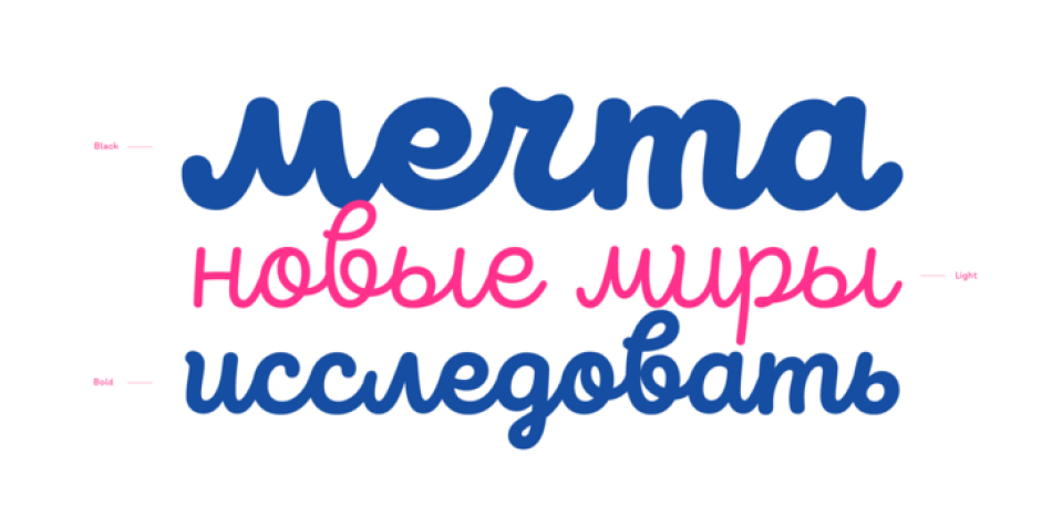
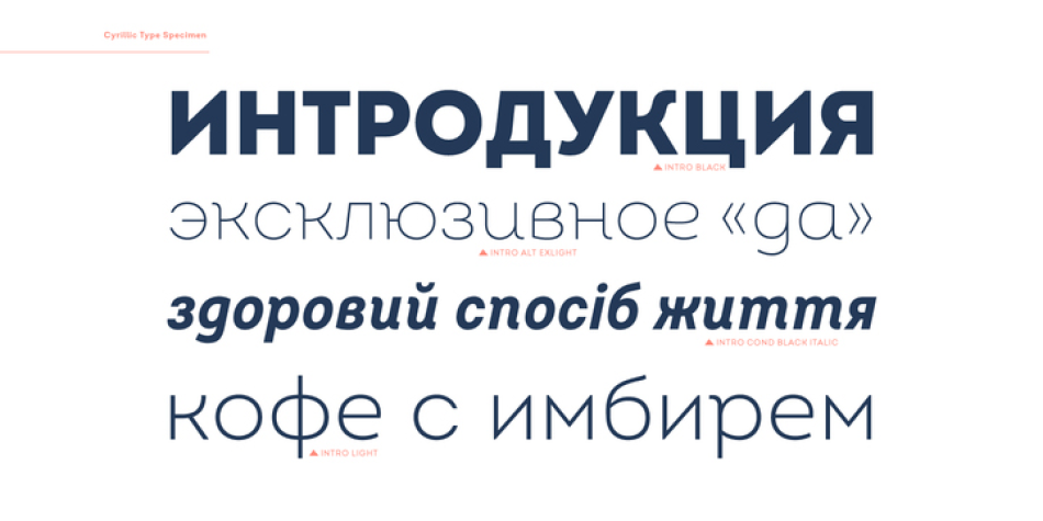
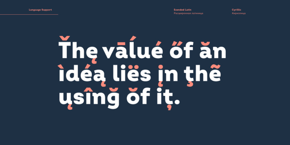
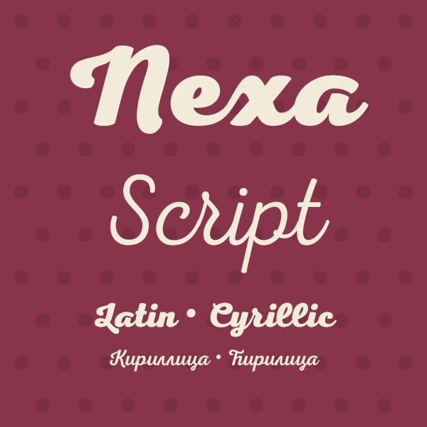
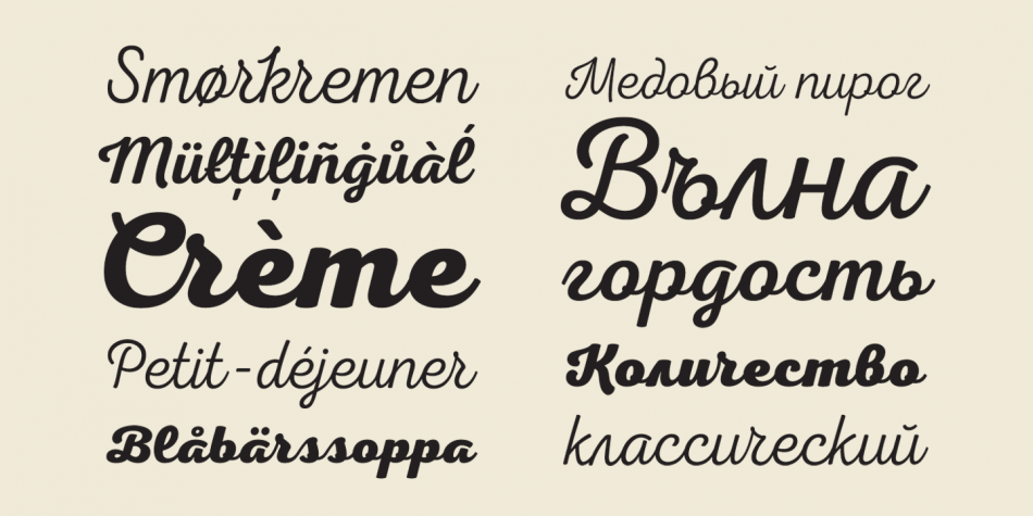
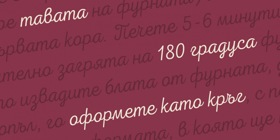
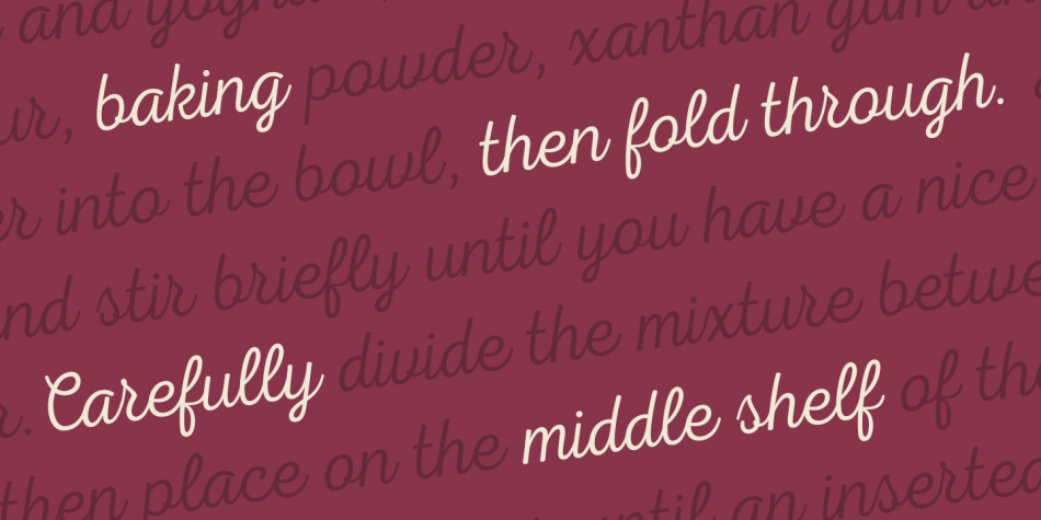
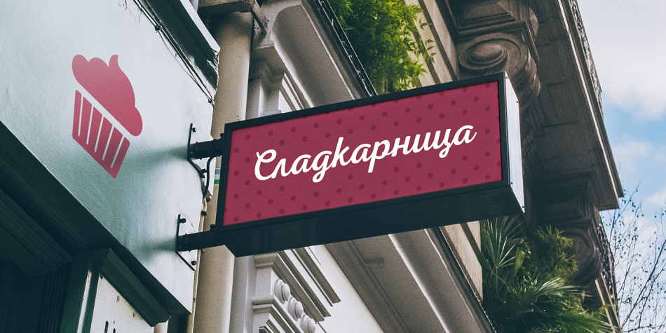
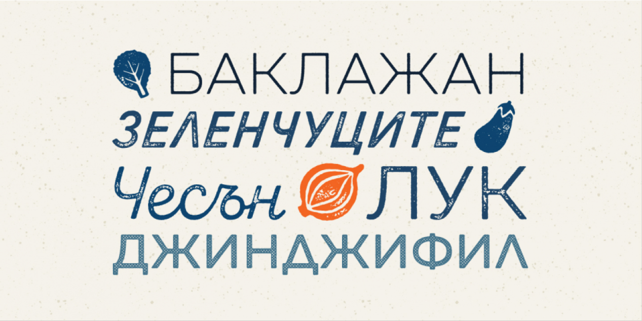
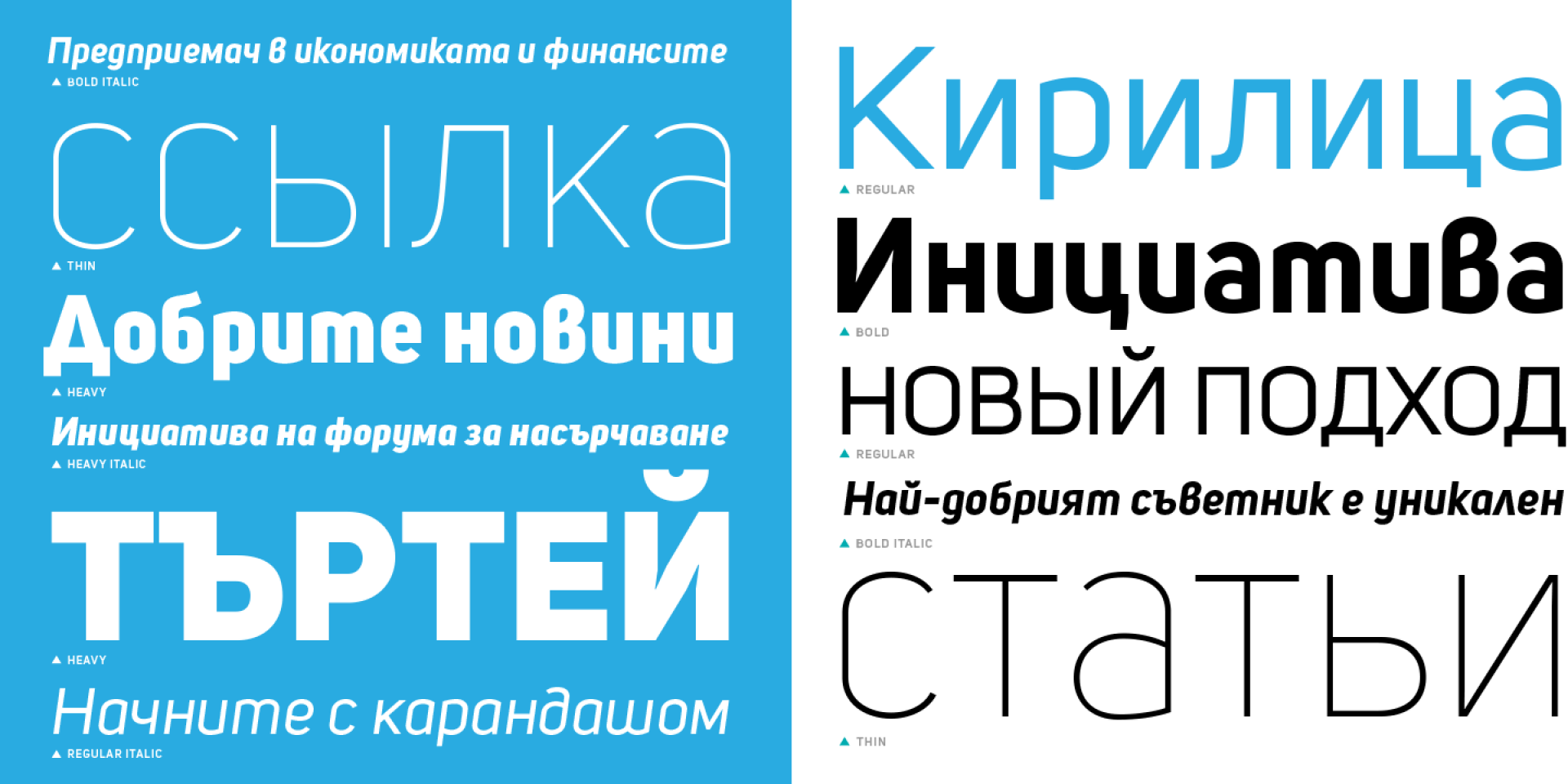
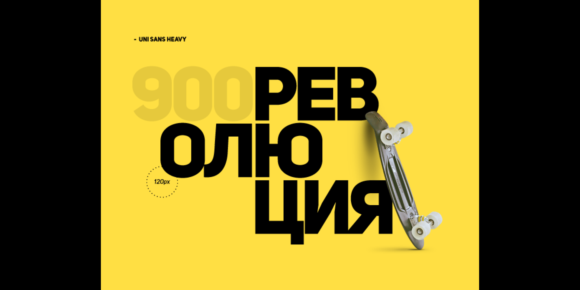
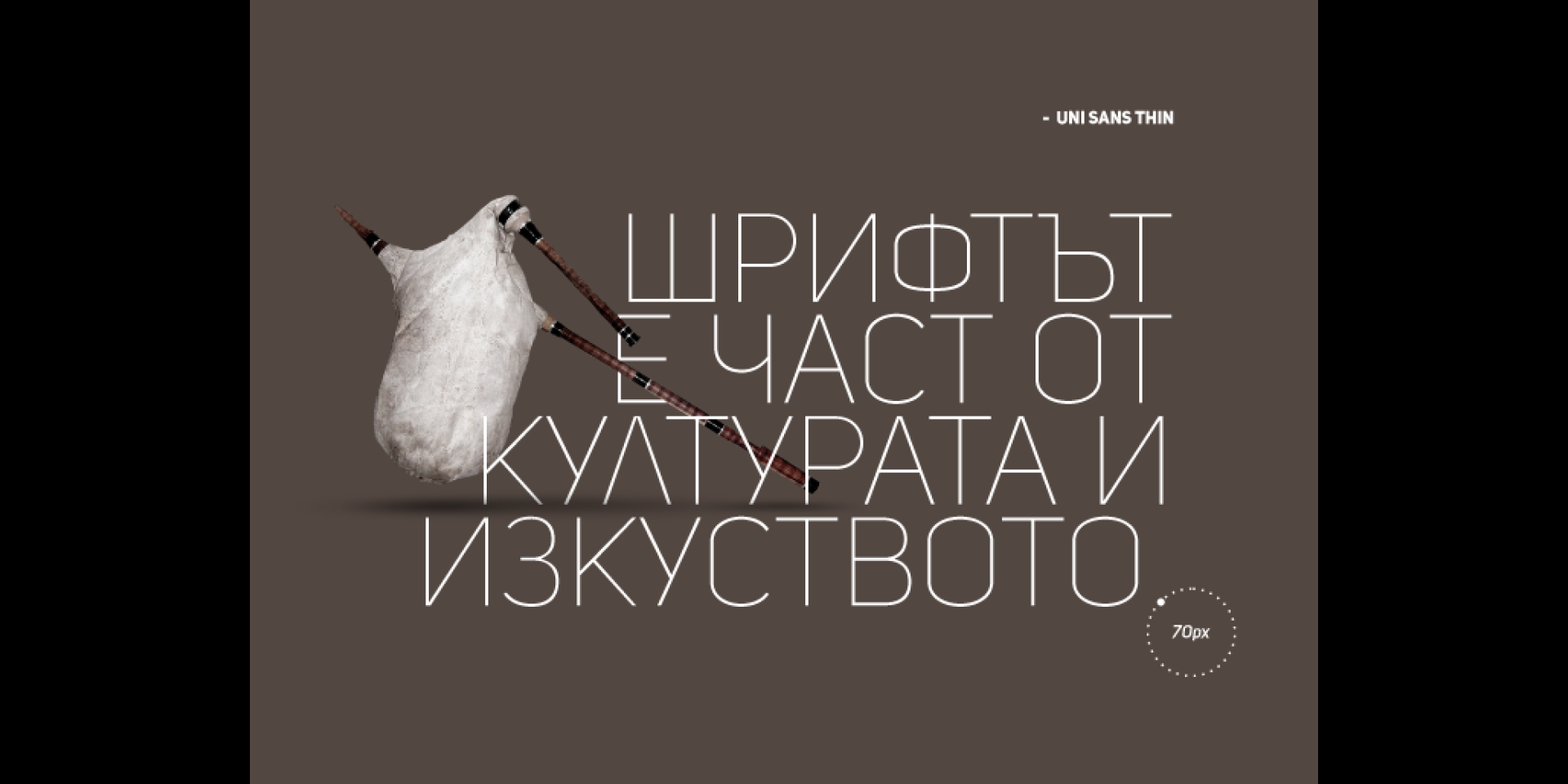
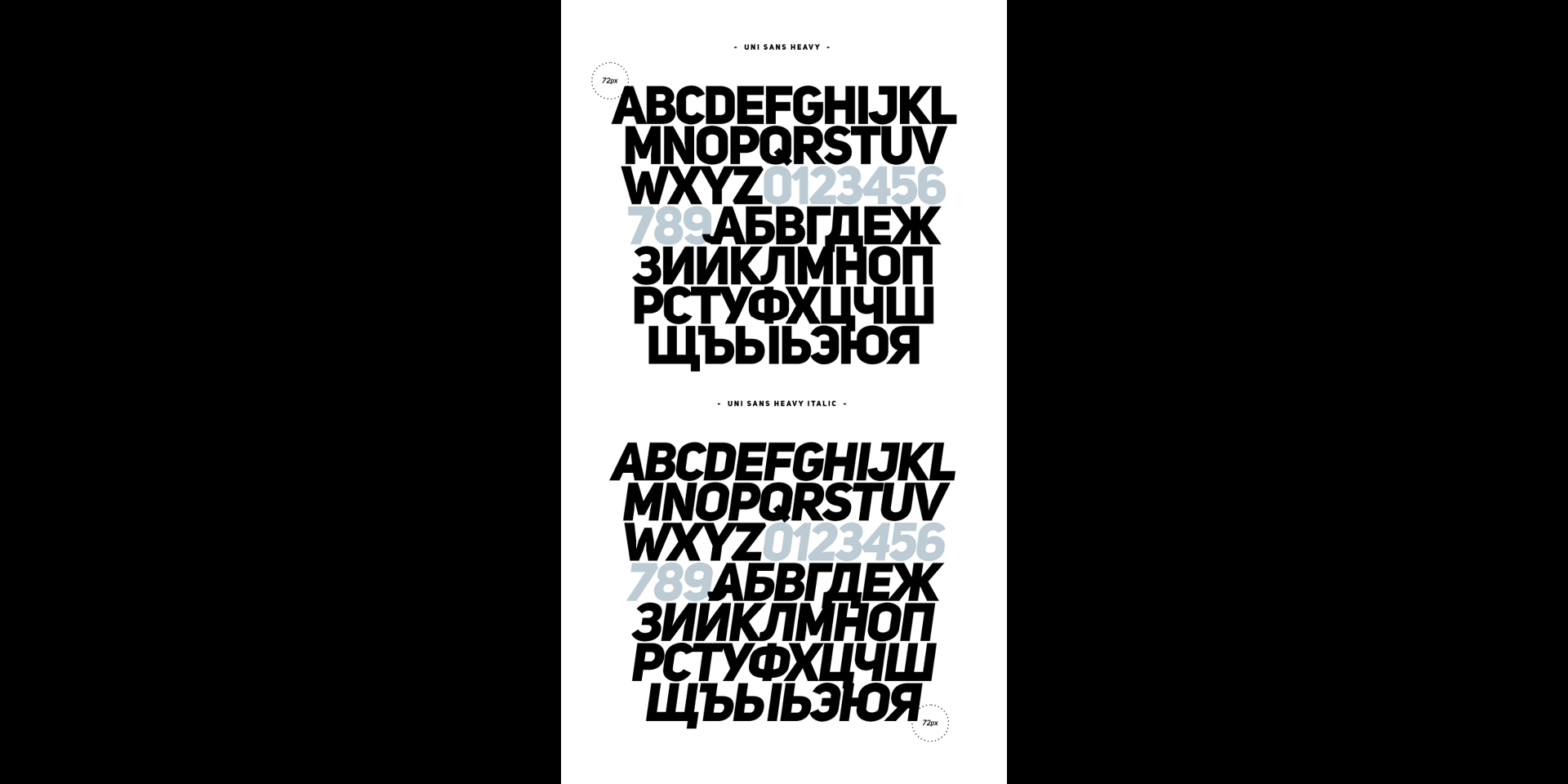
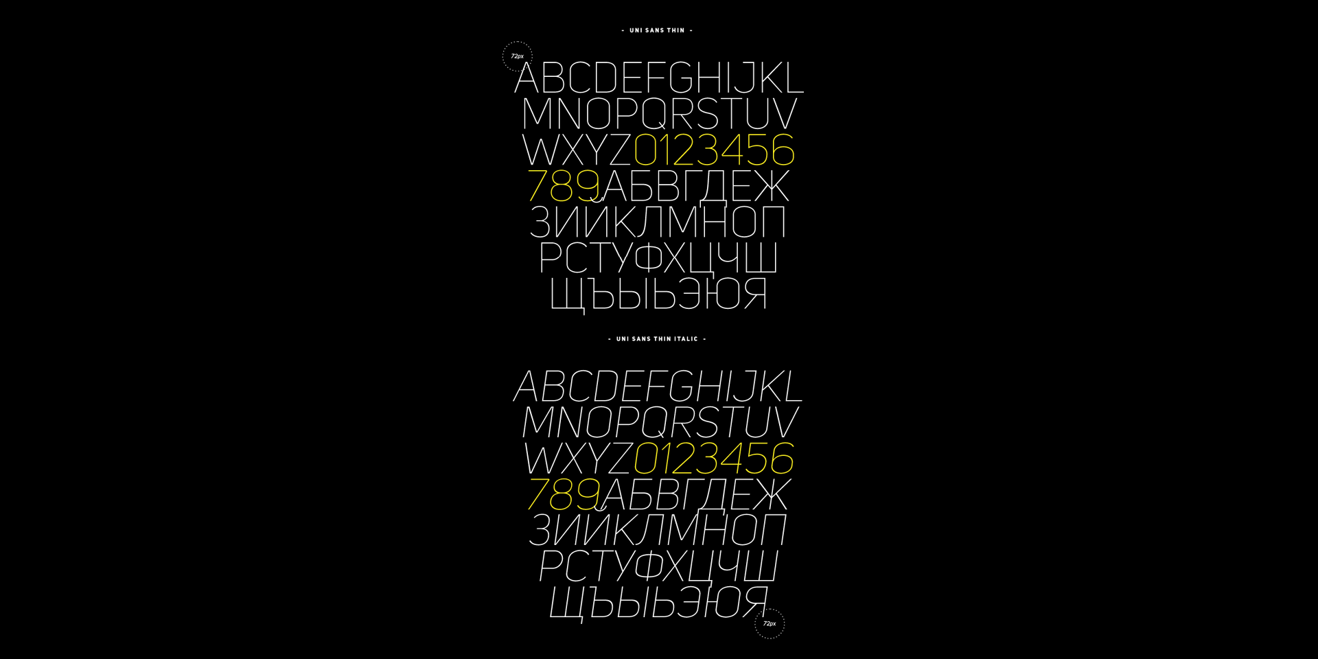
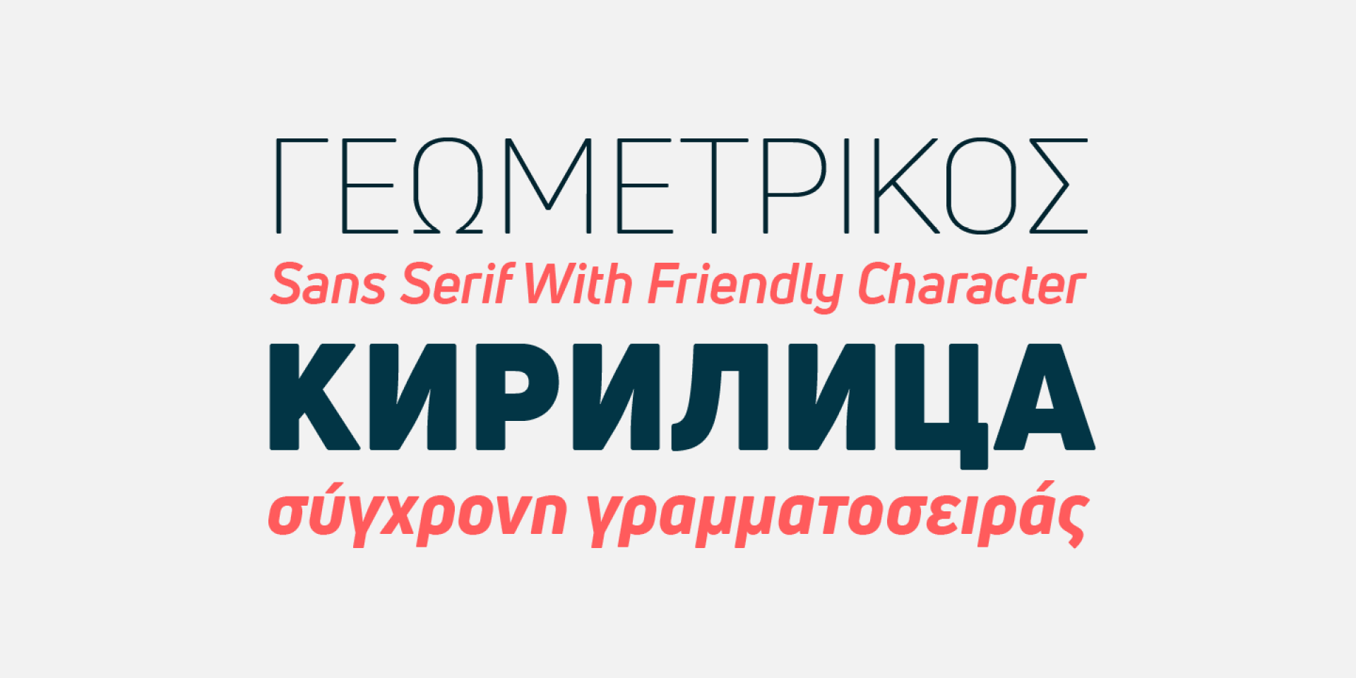
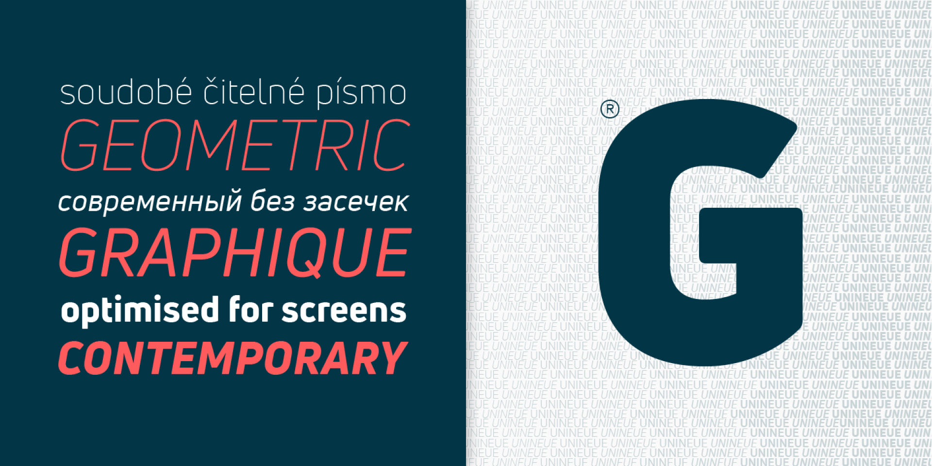
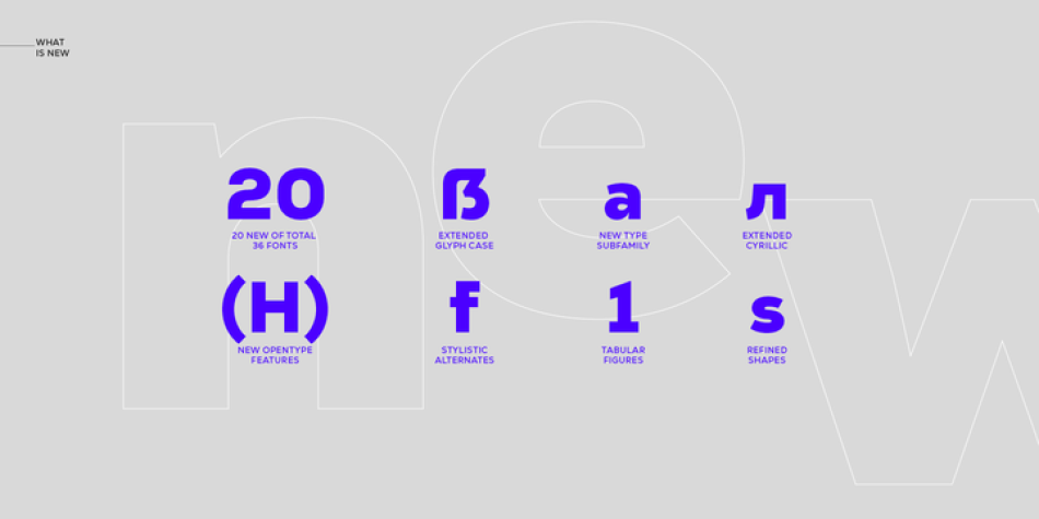
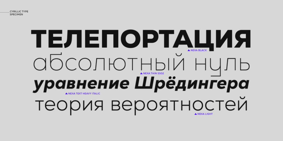
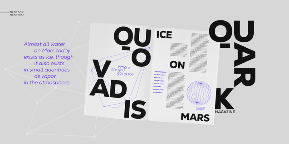
- Cyrillic language support
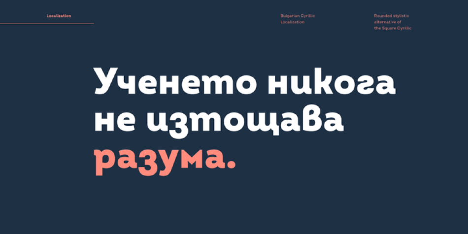
- Bulgarian Localization
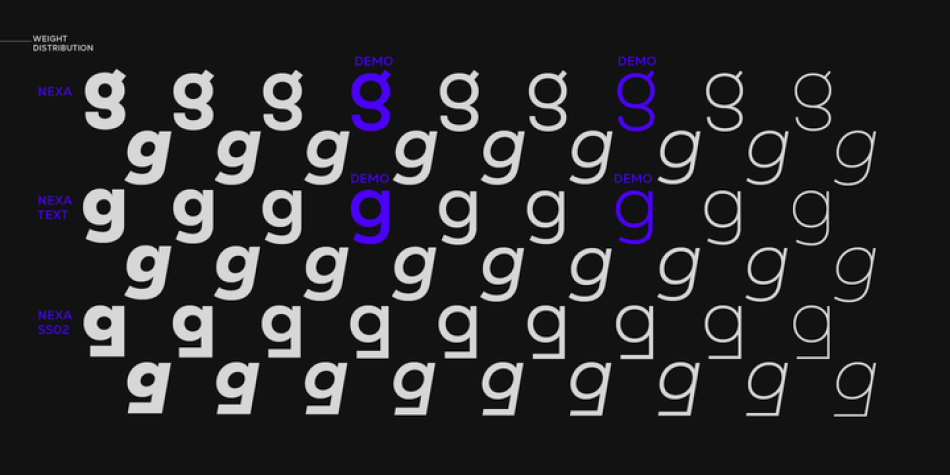
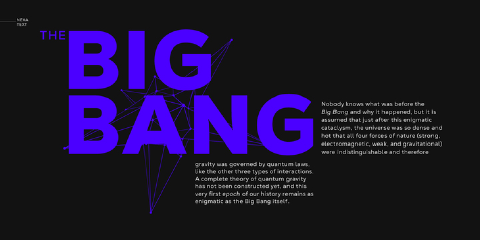
- Completely New Nexa Text subfamily
- New ExtraLight weight with a corresponding italics
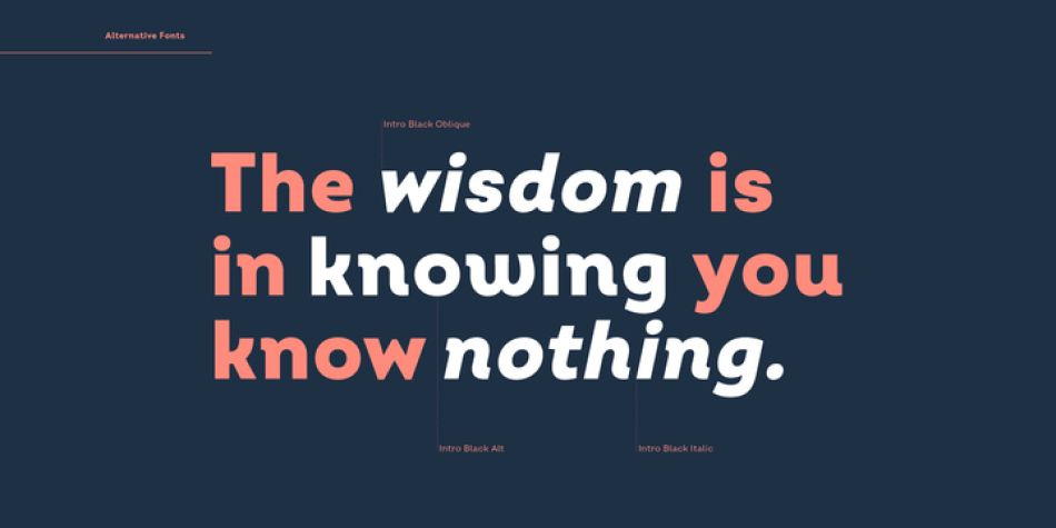
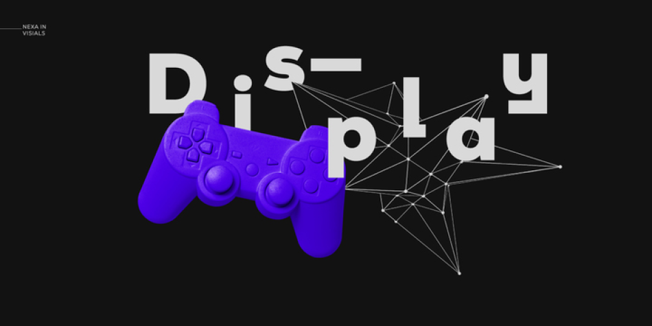
- Stylistic Set suitable for Display purposes – ss02
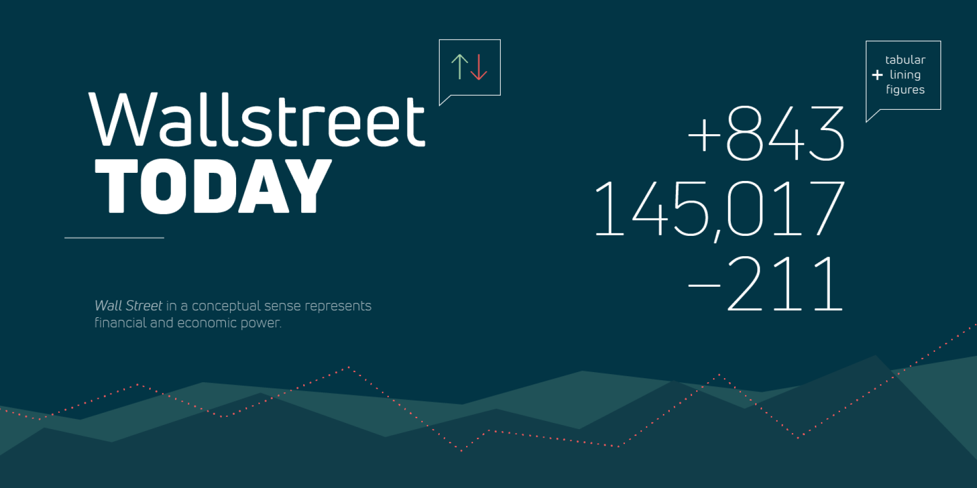
- Tabular Figures
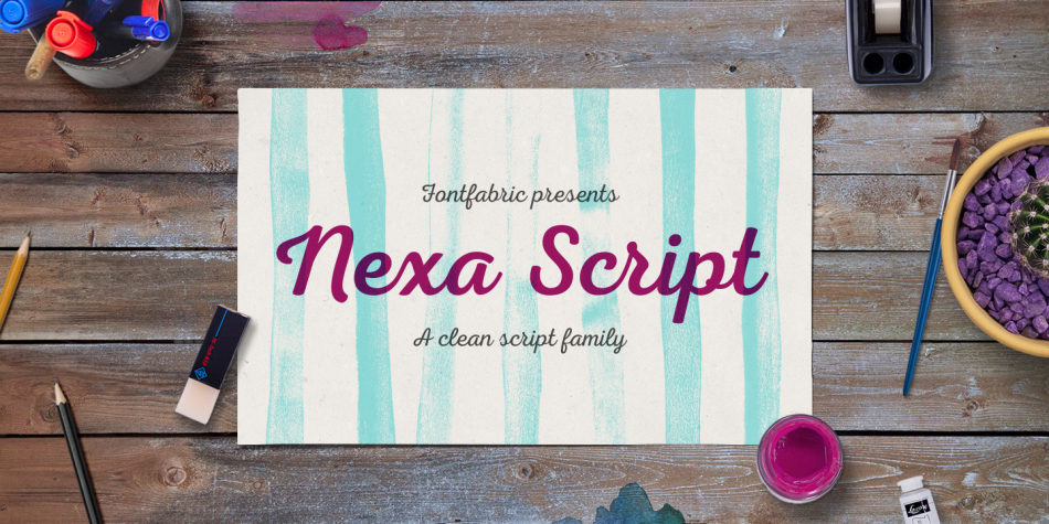
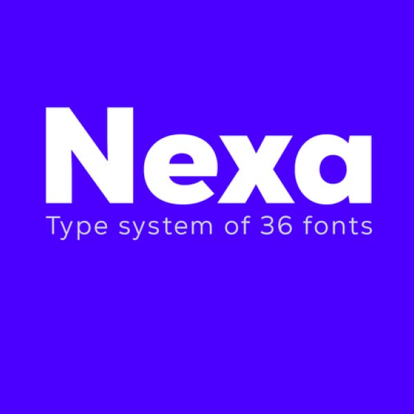
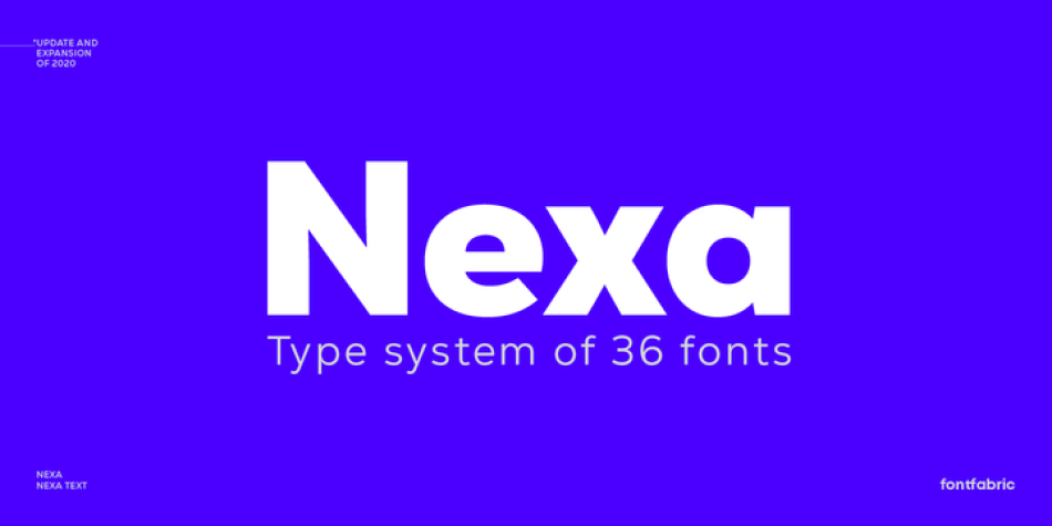
Even the most recognizable typefaces of our time, such as Nexa, should be updated sometimes. We proudly present you with the latest upgraded version of the notorious geometric sans serif.
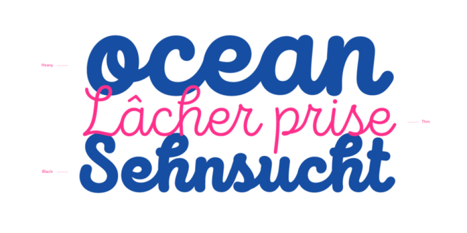
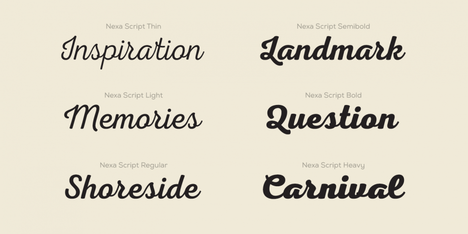
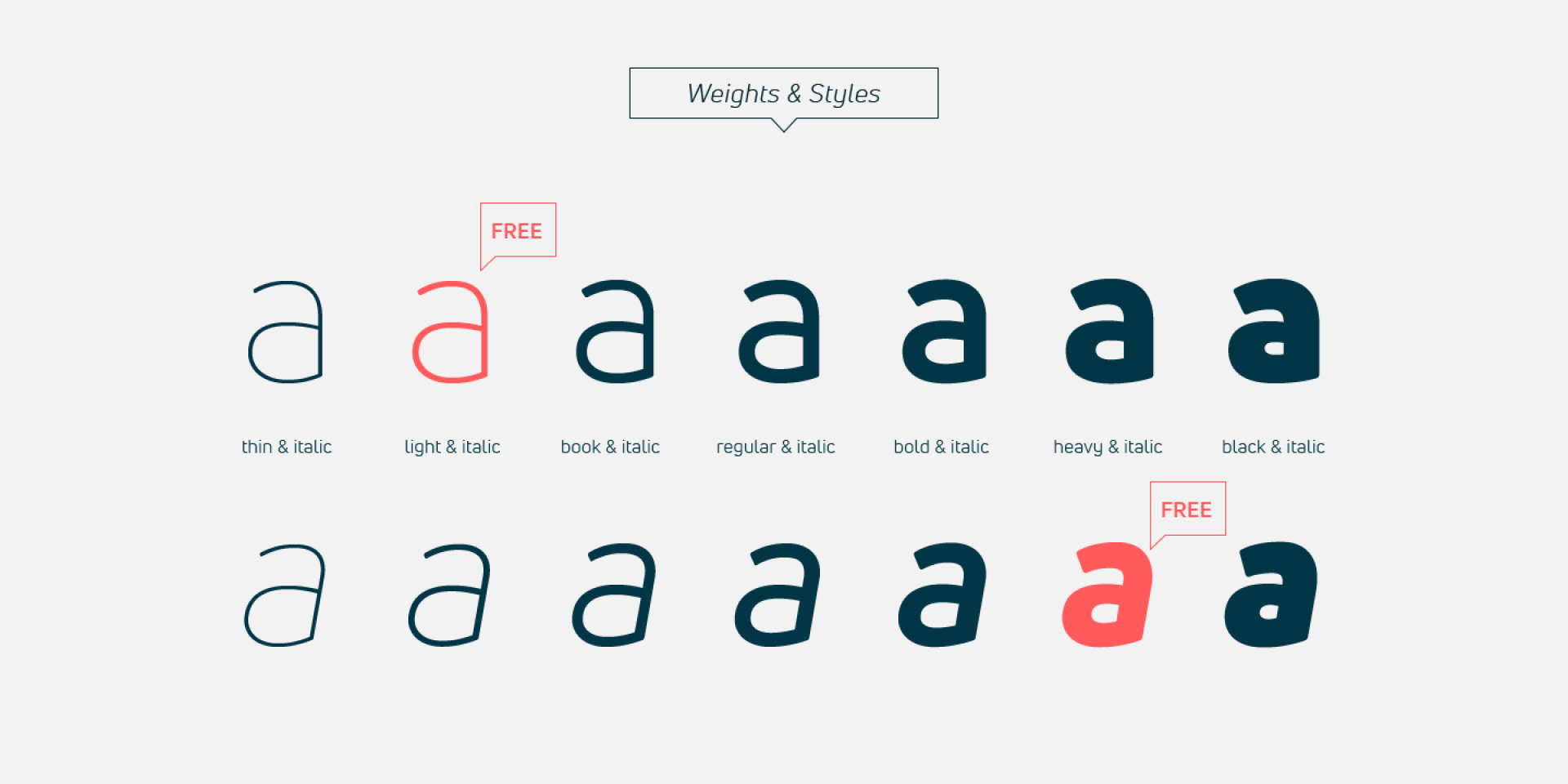
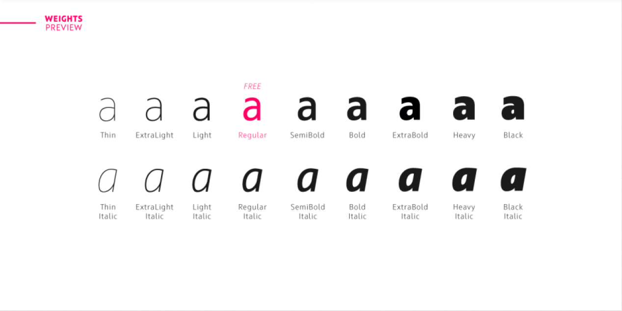
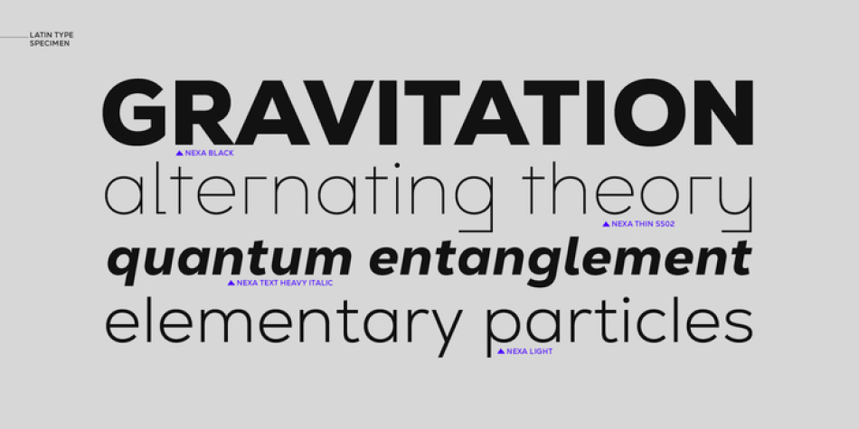
The completely refined family design comes with an addition of one more weight—Extra Light—and its matching italic, alongside an entirely new subfamily—Nexa Text, optimized for longer text, and even a futurist stylistic set of Nexa for an alternative display look. The outcome is altogether 9 weights and 36 fonts!
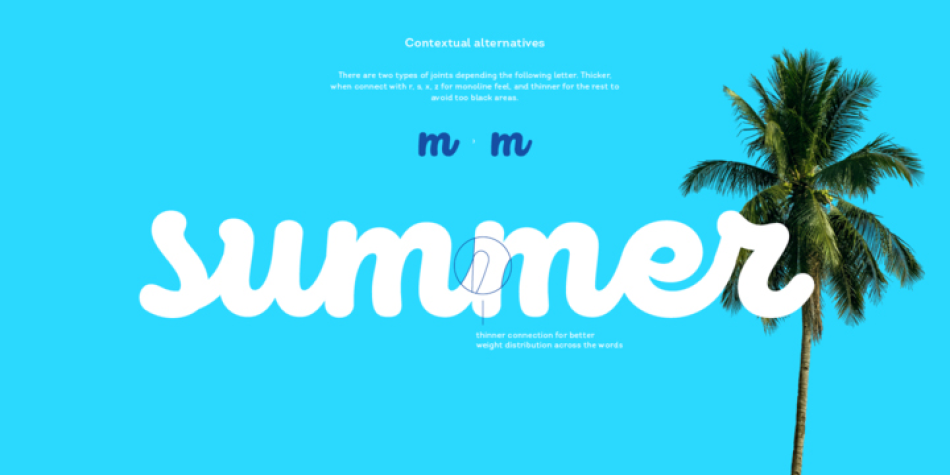
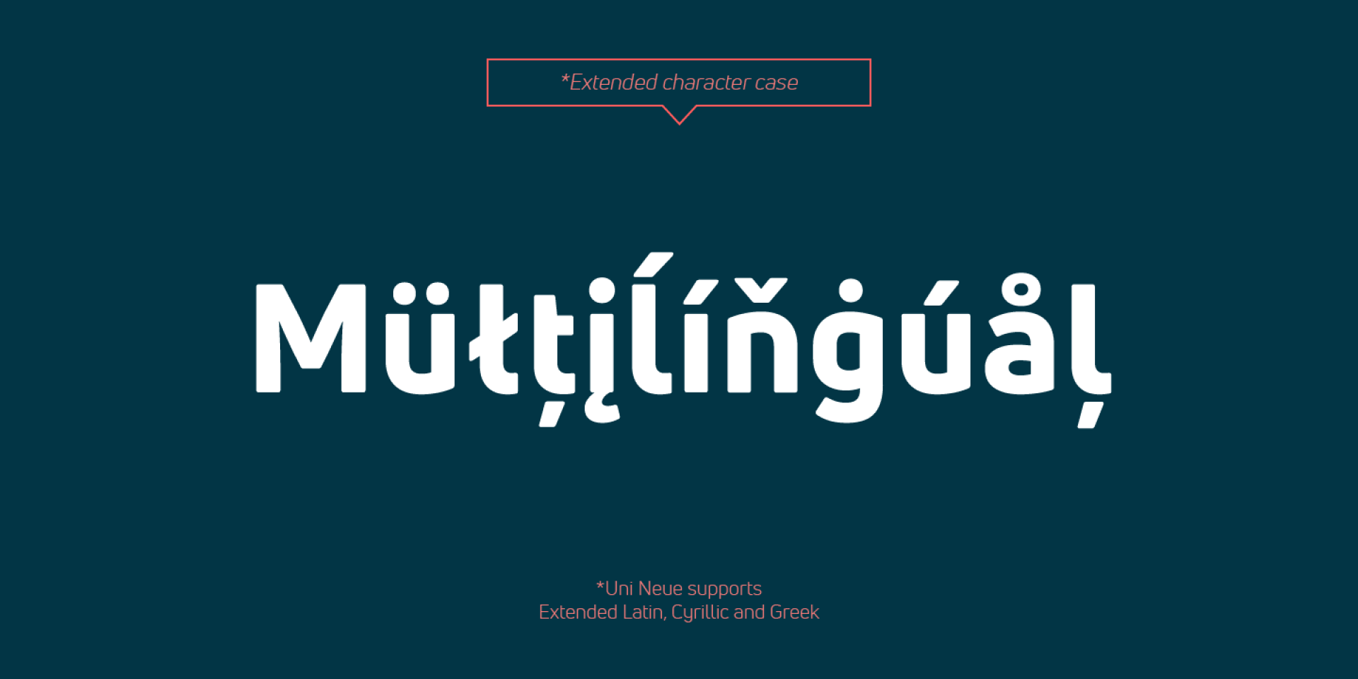
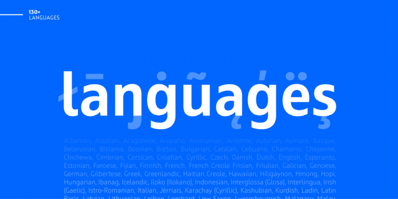
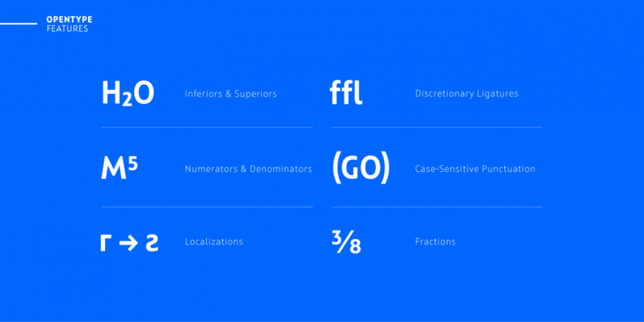
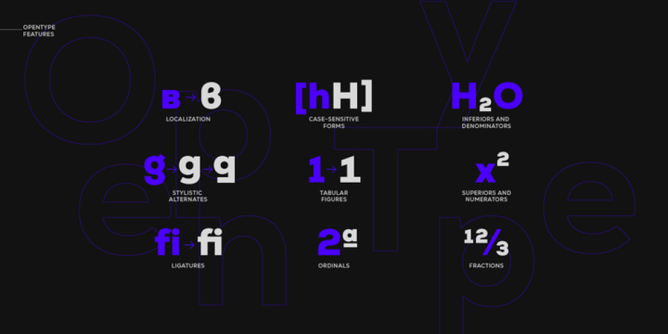
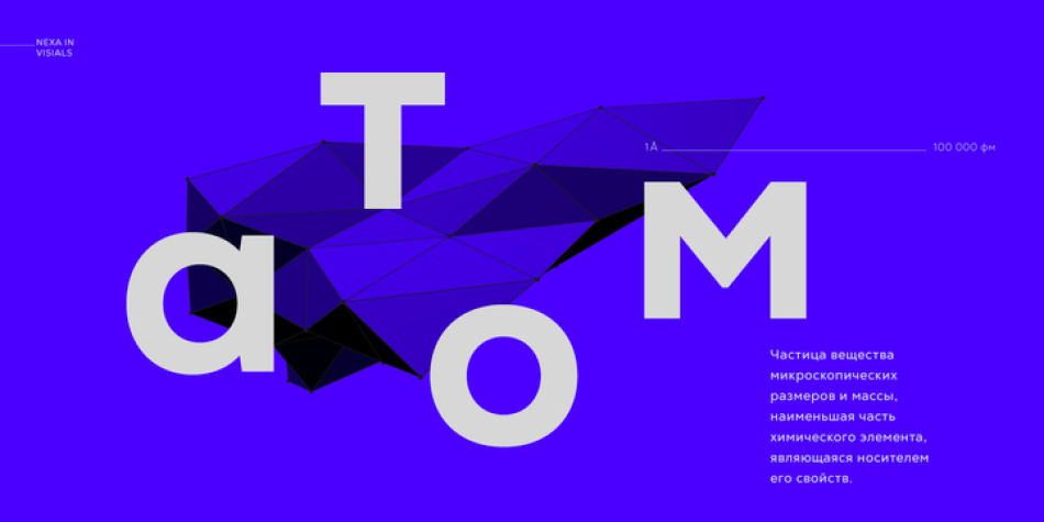
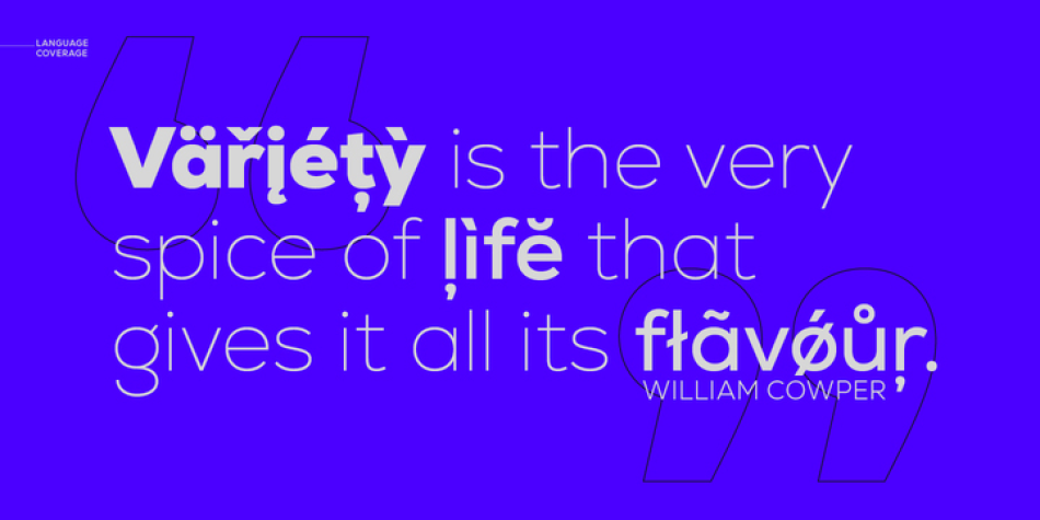
The glyph case now covers not only an improved Extended Latin but a new set of Cyrillic with adequate language localization. The fluent functionality of Nexa is achieved with multiple OpenType features, such as case-sensitive forms, contextual and stylistic alternates. The standard numerals set encompasses tabular figures and symbols, superiors and inferiors, numerators and denominators, plus fractions.
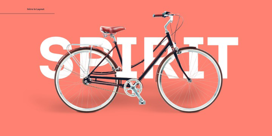
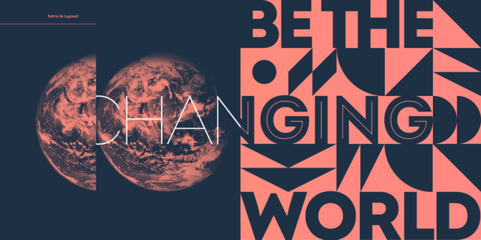
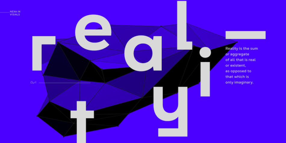
The unique appearance of Nexa combined with rich variety places it beyond the scope of regular geometric typefaces for all kinds of scales and purposes and designs that speak for themselves.
Design, Publisher, Copyright, License
Design: Svetoslav Simov, Plamen Motev, Mirela Belova, Stan Partalev, Nikolay Petroussenko, Ventsislav Dzhokov
Publisher: Fontfabric
Copyright 2012 by Fontfabric. All rights reserved.
License: COMMERCIAL
Svet Simov
![]()
Fontfabric is the foundry of Svetoslav Simov, a visual designer who is located in Sofia, Bulgaria, b. 1984. Highly innovative designer whose creations have lots of style and flair. Many fonts are for both Latin and Cyrillic.
Web:
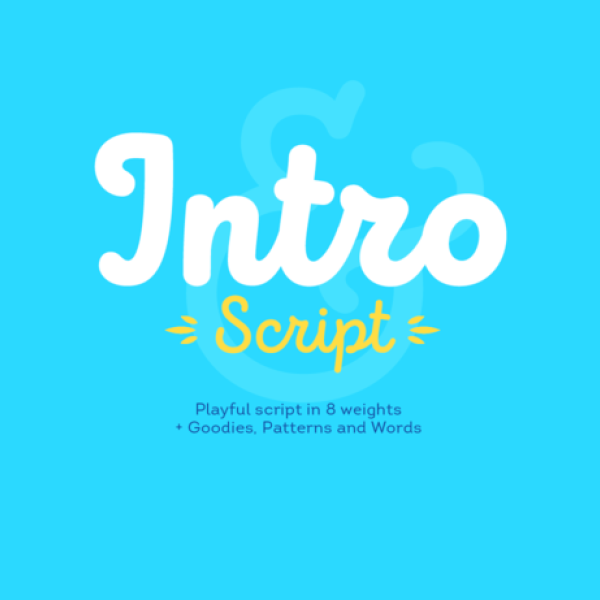
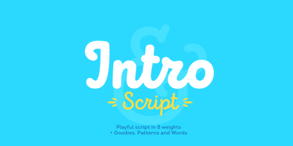
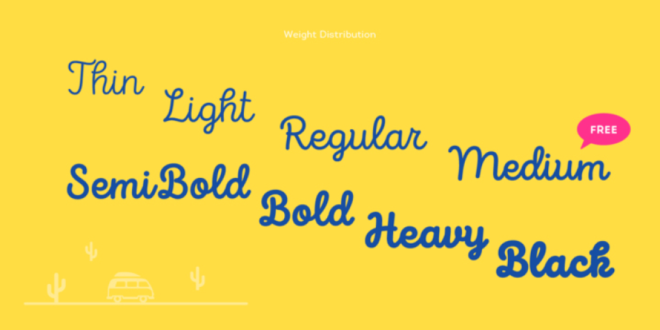
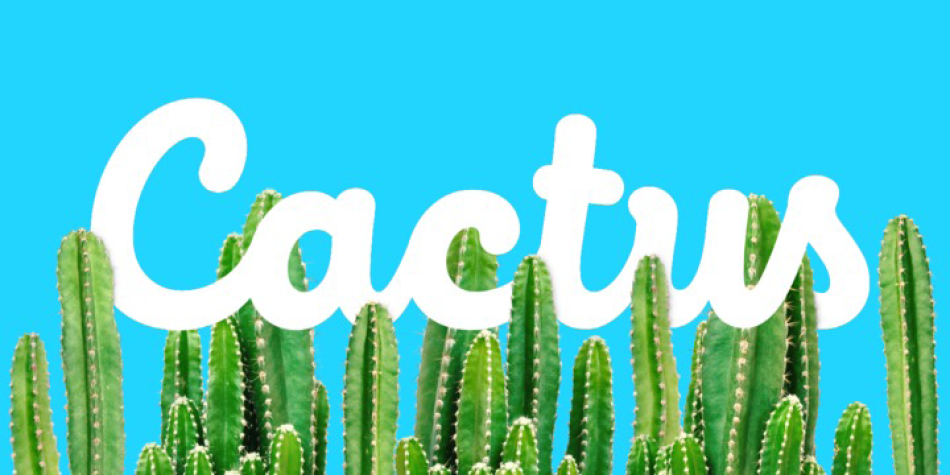
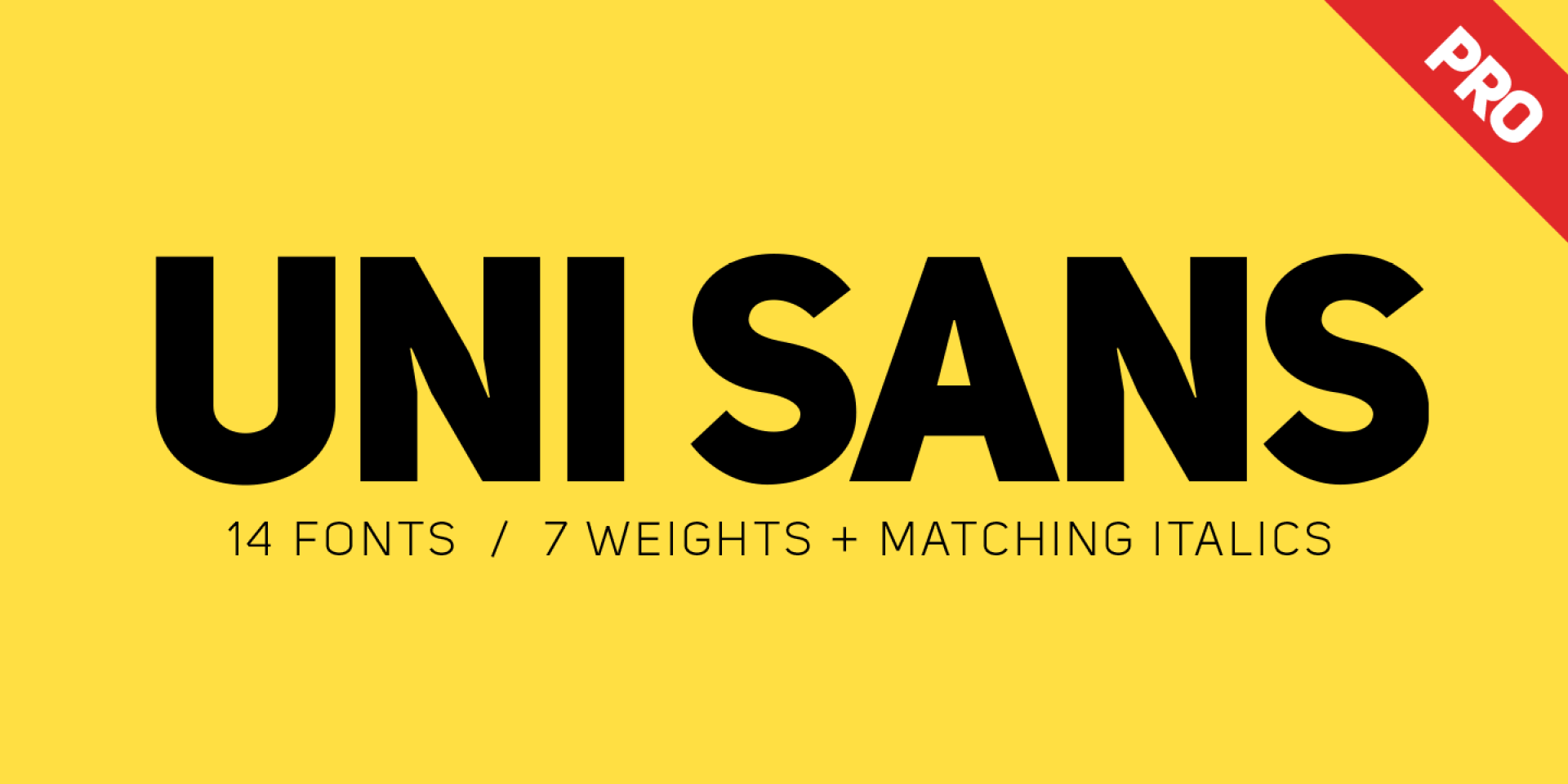
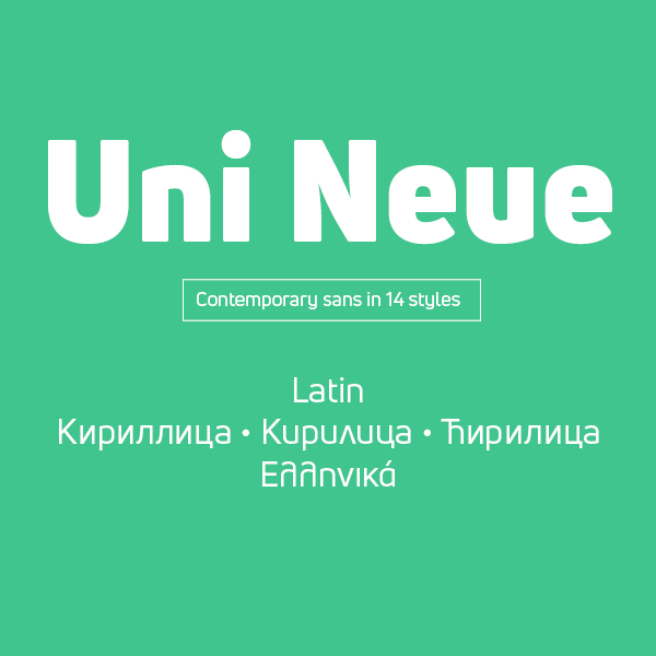
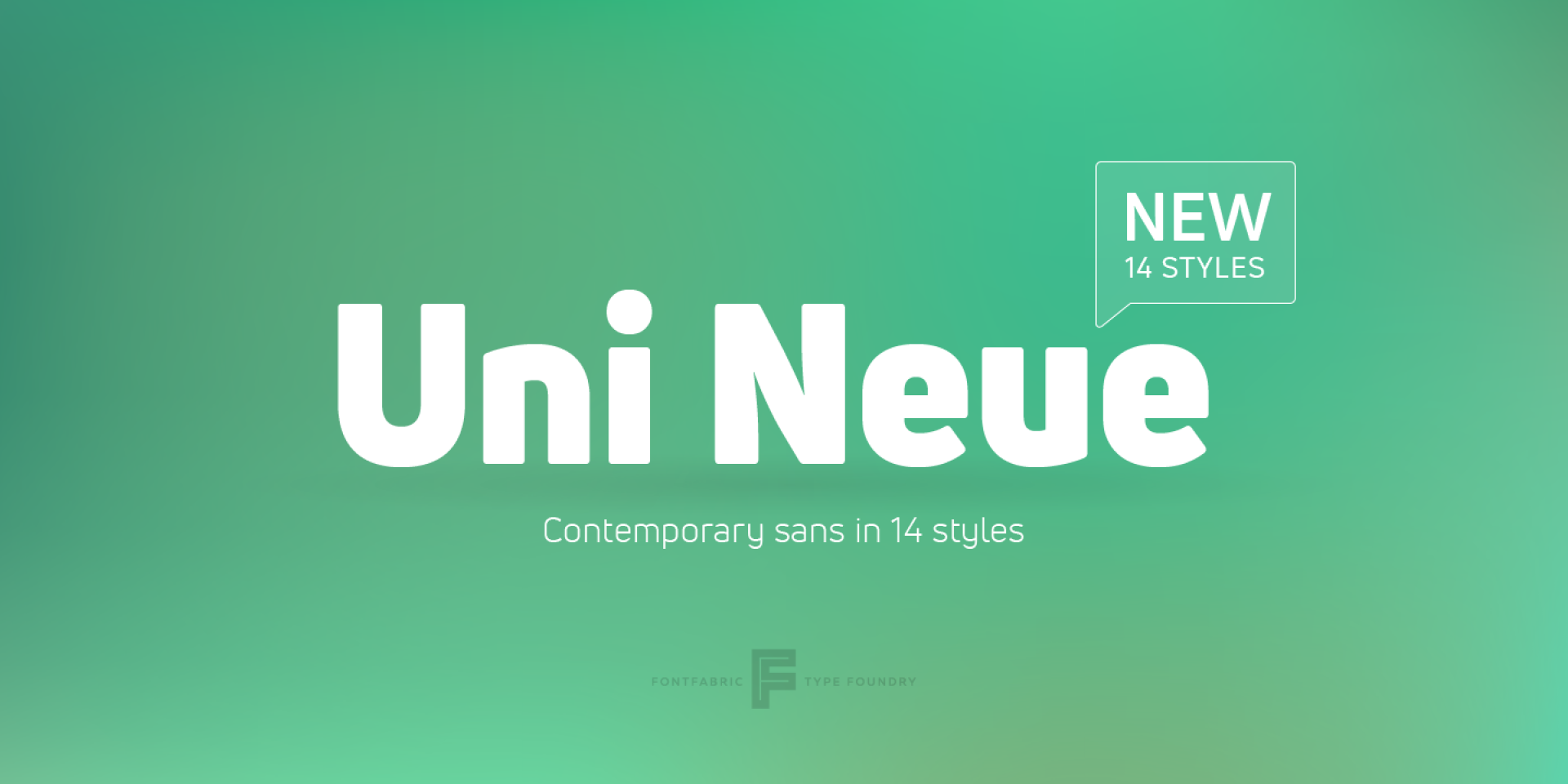
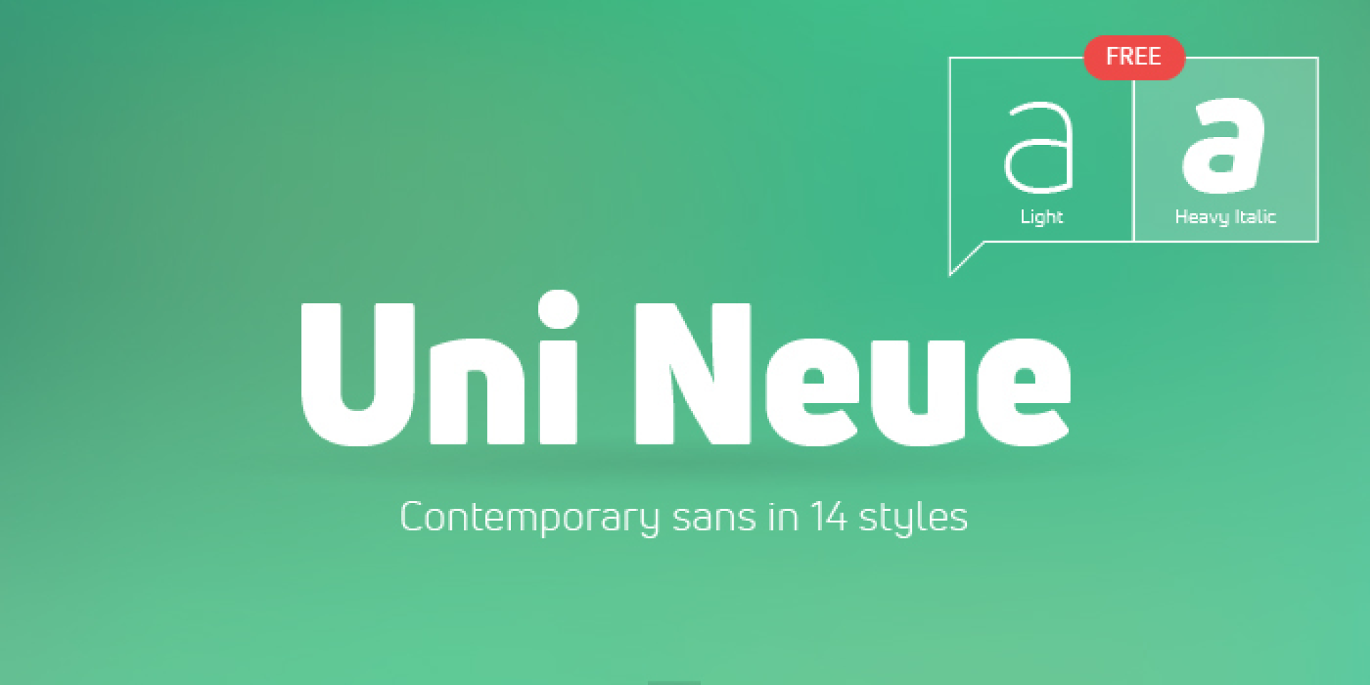
Typefaces: Mozer, Panton, Gilam, Glober, Colo Pro, Squad, Noah, Mont, Mont Blanc, Zing Rust, Intro, Intro Rust Complete, Intro Rust, Head, Script, Intro Script R H2 Base, Intro Head R Base, Rafale RU, Rafale BG, Dan, Uni Neue, Uni Sans, Simbal, Nexa, Code Next, Fester, Gabriel Sans
More… LUC DEVROYE | TYPE DESIGN INFORMATION
Plamen Motev
Type designer based in Sofia, Bulgaria. As a student working with Fontfabric in Sofia, Bulgaria, Plamen Motev designed the free circle-themed slightly condensed retro typeface Phenomena (done together with Radomir Tinkov) and the free 8-style narrow grotesque family Akrobat for Latin and Cyrillic in 2016. In 2017, Plamen Motev and Svetoslav Simov co-designed Uni Neue, a total remake of Fontfabric’s earler typeface Uni Sans (2009). He was part of the Fontfabric team that designed the 521-font family Zing Rust, Zing Sans Rust and Zing Script Rust in 2017. Typefaces from 2018: Gilam (by Ivan Petrov, Plamen Motev and Svetoslav Simov: based on DIN, but more geometric and with obliquely cut terminals).
Mirela Belova
![]()
Type designer in Sofia, Bulgaria, who first studied mathematics and then graphic design (at New Bulgarian University). During her studies, Mirela Belova created the Latin / Cyrillic blackboard bold typeface Cheque (2017), which is free at Fontfabric. She was part of the Fontfabric team that designed the 521-font family Zing Rust, Zing Sans Rust and Zing Script Rust in 2017. In 2018, Mirela Belova and Svetoslav Simov co-designed the 20-style geometric sans typeface family Mont.
Stan Partalev
![]()
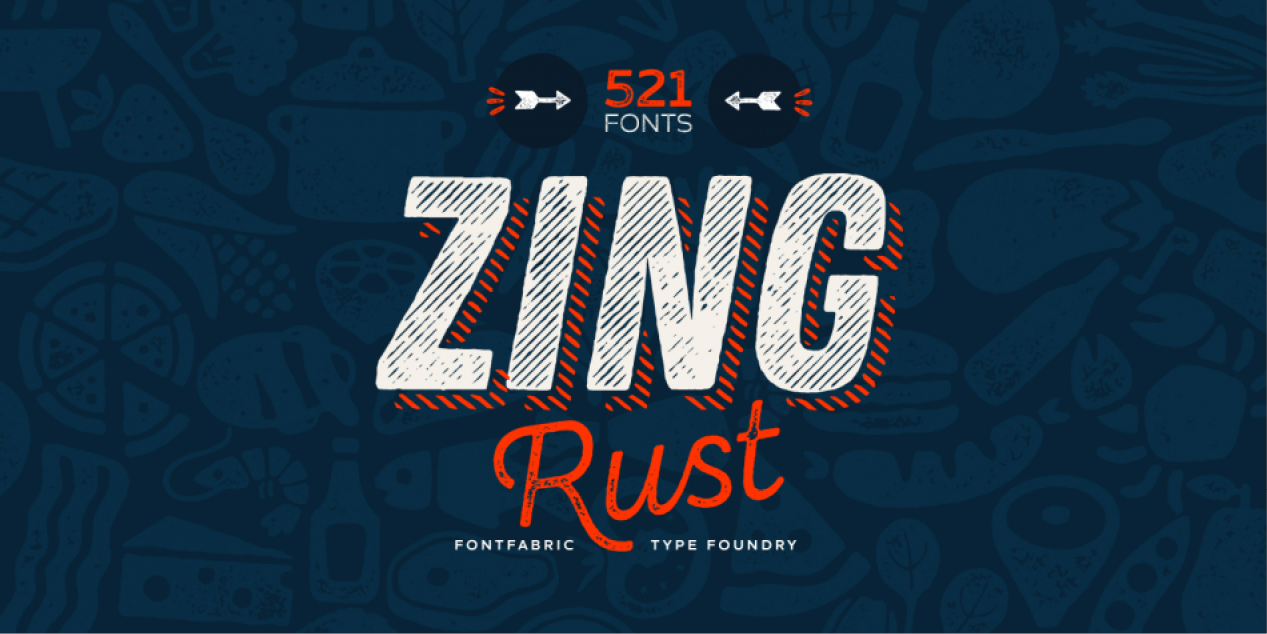
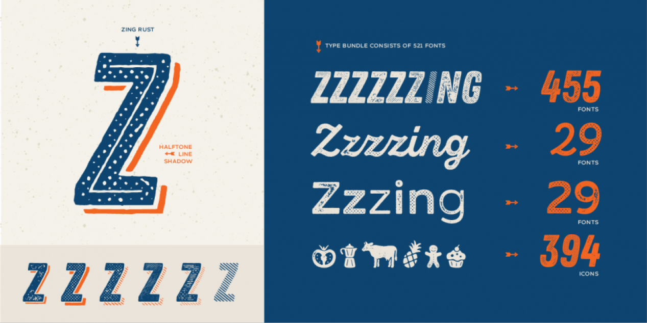
Type designer at Fontfabric in Sofia, Bulgaria. He was part of the Fontfabric team that designed the 521-font family Zing Rust, Zing Sans Rust and Zing Script Rust in 2017. In 2018, he published the free all caps lapidary typeface Colus at Fontfabric. In 2019, Svet Simov, Radomir Tinkov and Stan Partalev designed the 72-strong Noah family of geometric sans typefaces, which is partitioned into four groups by x-height from small (Noah Grotesque) to medium (Noah and Noah Text) to large (Noah Head).
Nikolay Petrousenko
![]()
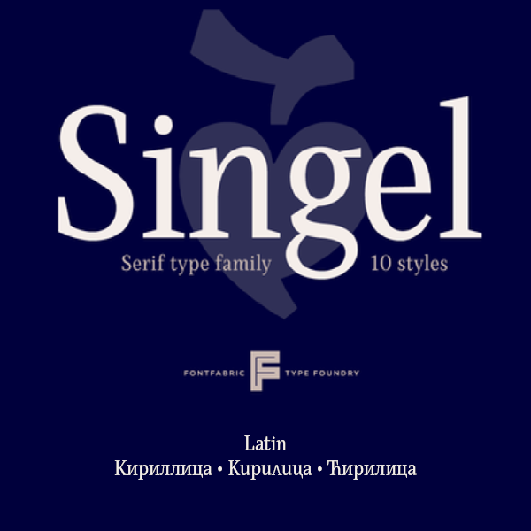
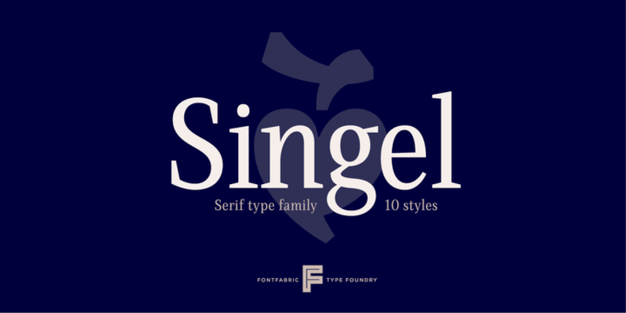
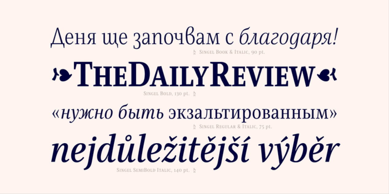
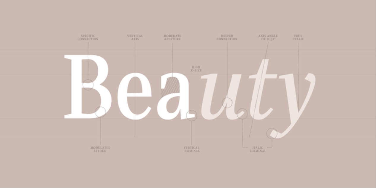
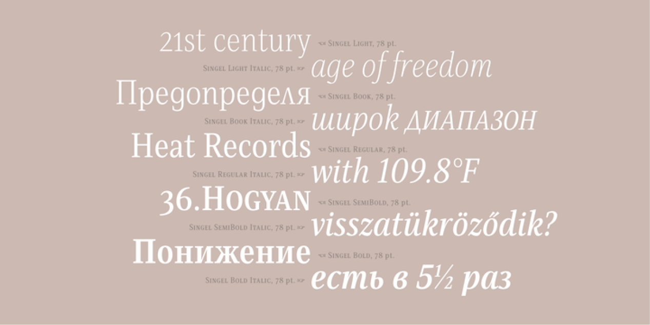
Nikolay Petroussenko is a type designer and artist based in Sofia, Bulgaria. He graduated from the National Academy of Art, Sofia. He worked in Poststudio, a studio for visual communication and later at DecoType in Amsterdam. Currently he is part of Fontfabric in Sofia. Designer of the transitional text typeface Sapienza (2016). He was part of the Fontfabric team that designed the 521-font family Zing Rust, Zing Sans Rust and Zing Script Rust in 2017. In 2018, Jacklina Jekova and Nikolay Petroussenko co-designed Singel at Fontfabric. Singel is a neoclassical serif with semi-condensed proportions for Latin and Cyrillic. Its ten roman weights are complemented with ten quite different italic weights. Codesigner of Mozer (2019, by Svetoslav Simov, Ani Petrova, Mirela Belova and Nikolay Petrousenko: a condensed headline sans family that covers Latin, Greek and Cyrillic; Mozer SemiBold is free).
Ventsislav Dzhokov
![]()
Ventsislav joined the type community in search of a dynamic, developing sector that would fit his personality, and he hasn’t looked back since. Inspired by the interaction of letters and forms within a word or a sentence, he tends to focus on diversity and a strong underlying concept when working on a project.