Description
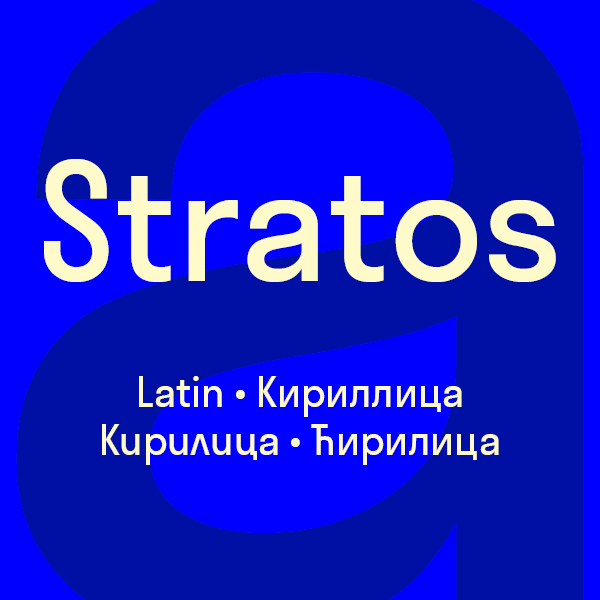
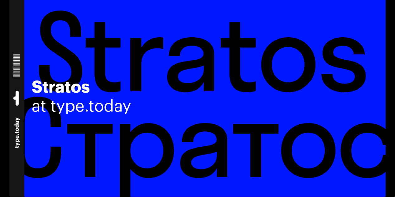
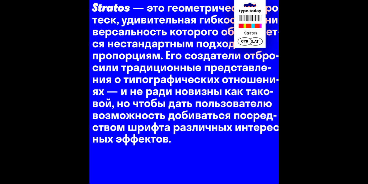
A family that rethinks concepts of weight and width, spanning multiple hierarchies within a single style. Stratos is a geometric grotesque whose peculiar utility is derived from unusual ideas about proportion. It eschews conventional notions of typographic relationships — not just for novel effect, but to empower the user to do more interesting things with type.
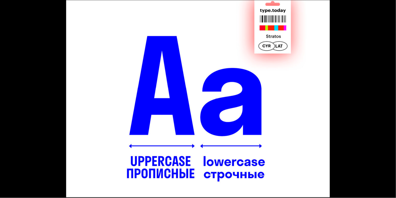
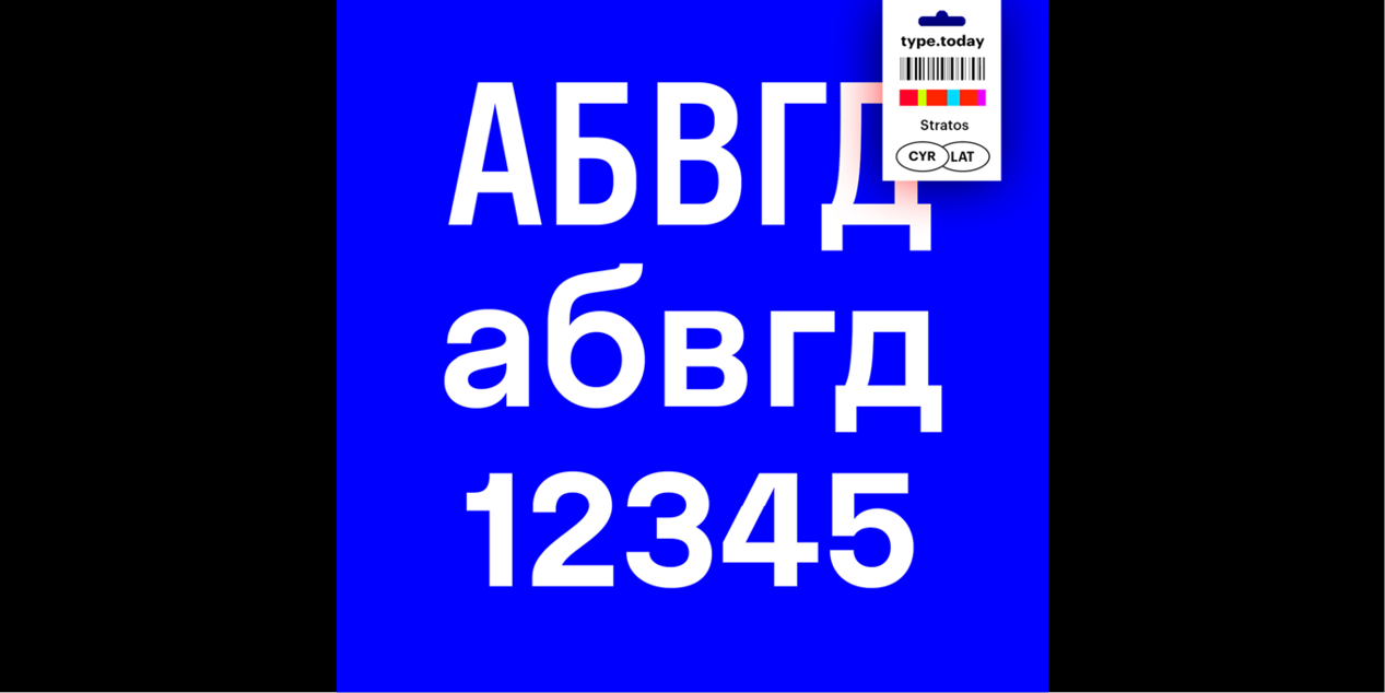
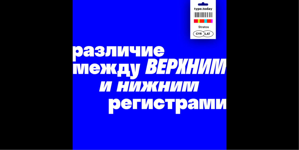
The first and most obvious of these surprises can be seen in the difference between its upper- and lowercase. The caps are condensed, inspired by gothic wood type of the 20th century, while the minuscules are akin to certain classic geometric sans serifs, with circular rounds (o, d, b, p, q) and horizontal terminals (a, c, e, g, s). This contradiction presents intriguing possibilities. Used separately, the two designs exude individual personalities: the compact caps fill a page with the impact of a Victorian-era poster; the lowercase conveys an austere modernity. When employed together, the look is unexpected but surprisingly functional, thanks to carefully balanced spacing and weight.
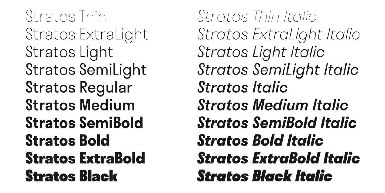
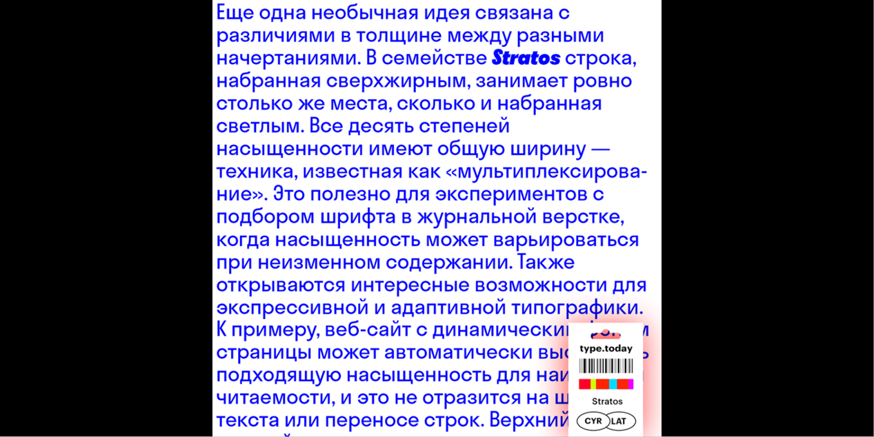
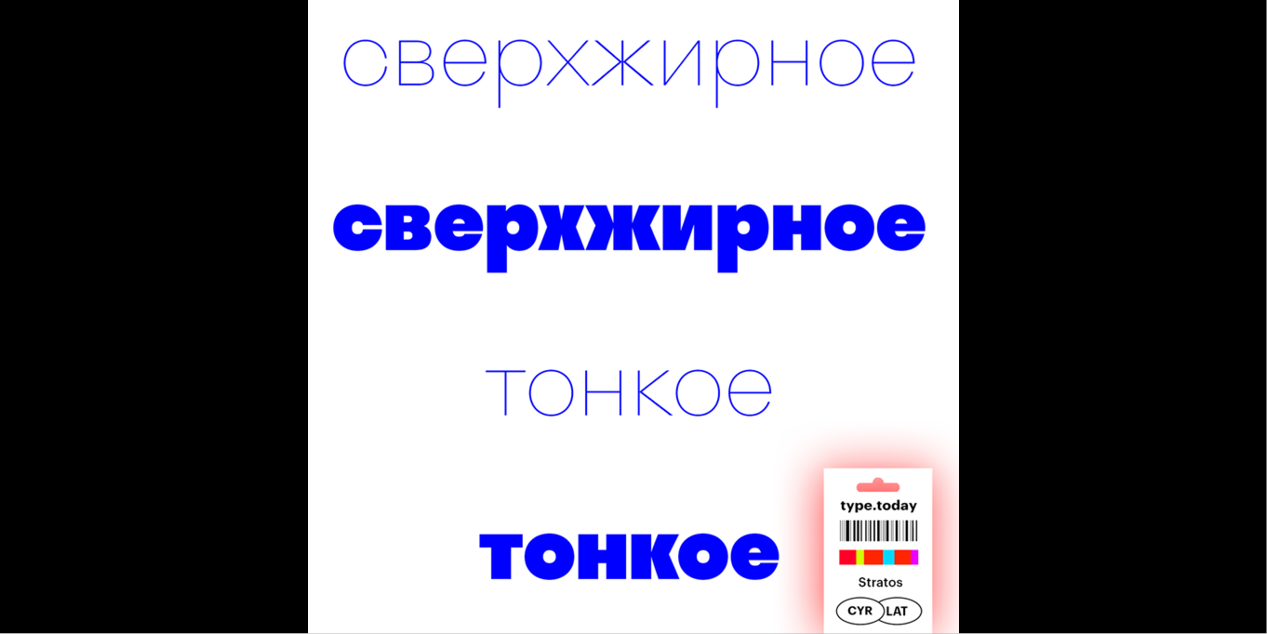
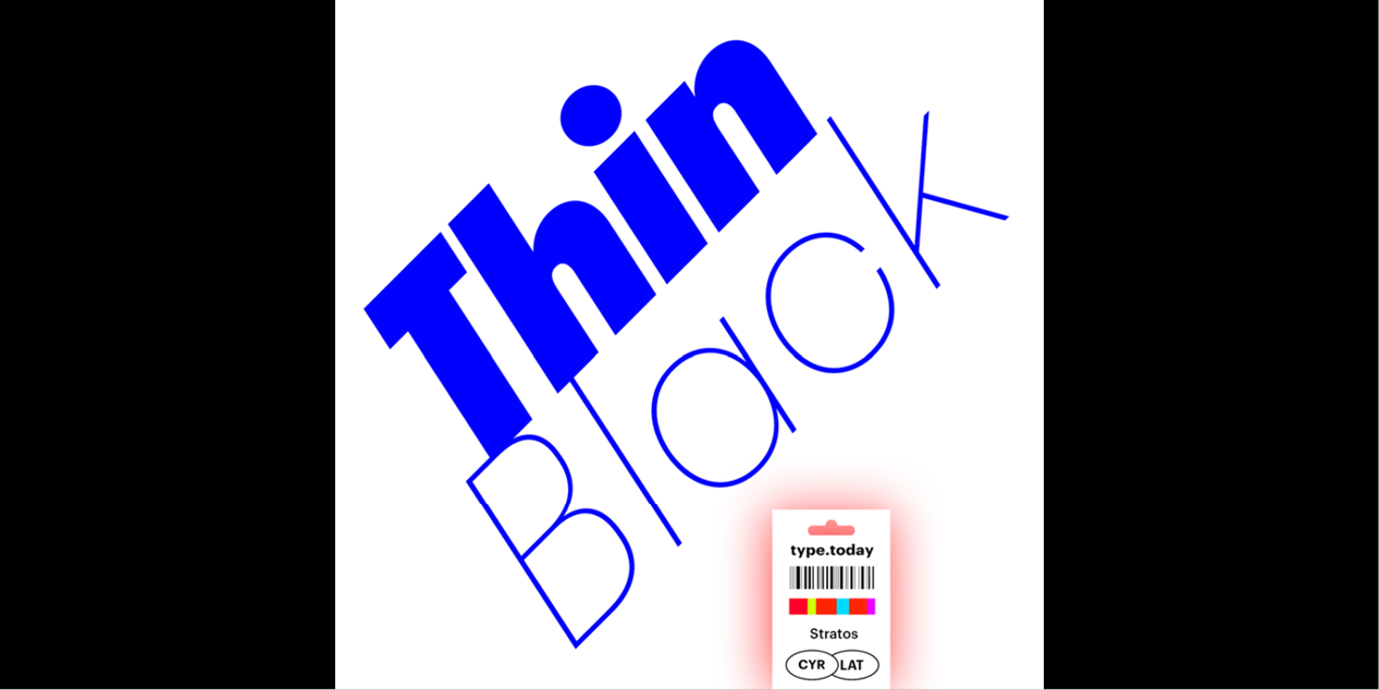
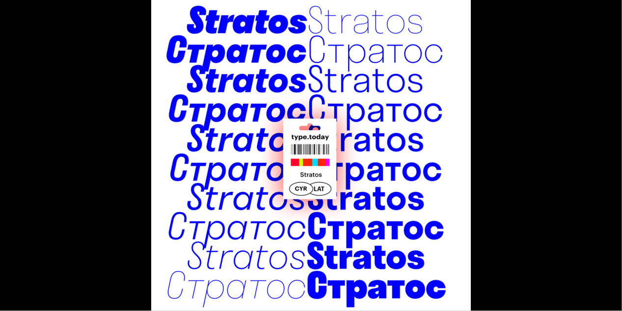
The other uncommon concept has to do with the widths between weights. In Stratos, a line set in Black occupies no more space than one set in Thin. Each of the family’s ten weights share a common width — a technique known as multiplexing. This is useful for experimenting with font choice in magazine layouts, where content can remain constant while weight is adjusted. It also presents interesting opportunities for expressive and responsive typography. A website with dynamic backgrounds, for example, can serve the appropriate weight for optimal legibility without effecting the width of the text or the wrapping of lines. The upper- and lowercase letters are multiplexed as well, offering even more design flexibility.
Awards & distinctions
Type Directors Club New York Certificate of excellence 2017
Typographica’s favourite of 2016
Design, Publisher, Copyright, License
Design: Jean-Baptiste Levée, Yoann Minet (Production Type)
Cyrillic design: Ilya Ruderman, Yury Ostromentsky
Publisher: Production Type
Copyright 2016 by Production Type. All rights reserved.
Specimen: Stratos (PDF)
Jean-Baptiste Levée
Jean-Baptiste Levée is a French type designer based in Paris. He is a co-founder of the Bureau des Affaires Typographiques, and teaches typeface design at ESAD Amiens (and before that, at the Caen-Cherbourg school of Arts & Media and at the University of Corte). His latest work is mostly published at Production Type which he manages.
Web:
Typefaces: Stratos, Proto Grotesk, Spectral
More… TYPE DESIGN INFORMATION | Jean-Baptiste Levée
Yoann Minet
Yoann Minet (b. 1988, Tulle), graduate of Ecole Estienne in Paris, who lives in Paris, where is the lead designer at Production Type.
Ilya Ruderman
Ilya Ruderman, a type and graphic designer and teacher, lives and works in Moscow. He is a graduate of the Moscow State University of the Printing Arts (2002), where his graduation project was done under the supervision of Alexander Tarbeev. He has a MA degree in type design from the Type & Media program at the Royal Academy of Art in the Hague (2005). After completing the program, he returned to Moscow. Since 2007 he has supervised the curriculum in type and typography at the British Higher School of Art and Design in Moscow. He has been very active as a consultant on Cyrillic since 2008. In 2014 he founded CSTM Fonts with Yury Ostromentsky.
Web:
Typefaces: BigCity Grotesque Pro, Austin, Graphik, Marlene, Druk, Druk Text, Druk Text Wide, Druk Wide, Druk Condensed, Thema, Proto Grotesk, Dala Floda, Stag Sans, Stag, Kazimir & Kazimir Text, Navigo, Stratos, Parmigiano Text Pro, Parmigiano Piccolo Pro, Parmigiano Caption Pro, Parmigiano Headline Pro, Giorgio Sans, Lava, Styrene A, Styrene B, Proto Grotesk, Atlas Grotesk, Permian, Moscow Sans, Typonine Sans
More… TYPE.TODAY
Yury Ostromentsky
Yury Ostromentsky is a type and graphic designer. He is a graduate of the Moscow State University of the Printing Arts (2002), where his graduation project was done under the supervision of Alexander Tarbeev. He has worked as a designer and art director for publishers and design studios. From 2004 to 2012, he served as art director of the magazine Bolshoi Gorod (Big City), for which he created several display typefaces as well as several original typefaces and Cyrillic versions of Latin fonts in collaboration with Ilya Ruderman. His typefaces were honored at the Contemporary Cyrillic 2009 and 2014 competitions. In 2004 he and Ruderman, Dmitri Yakovlev and Darya Yarzhambek created DailyType, a website. In March 2014, again with Ruderman, he founded CSTM Fonts.
Web:
Typefaces: BigCity Grotesque Pro, Navigo, Kazimir & Kazimir Text, Druk, Druk Condensed, Druk Text, Druk Text Wide, Druk Wide, Stratos, Proto Grotesk
More… TYPE.TODAY



Reviews
There are no reviews yet.