Description
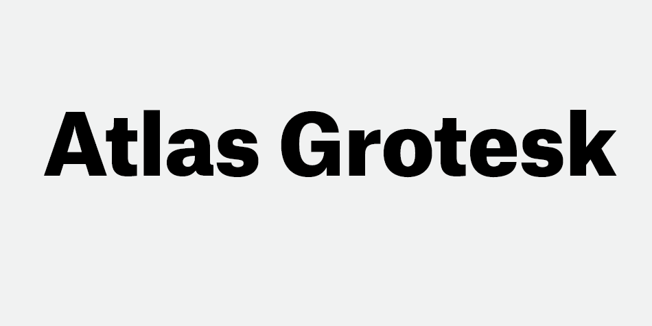
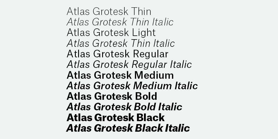
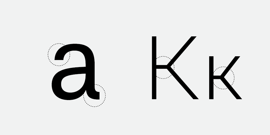
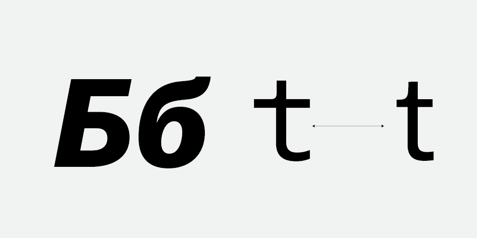
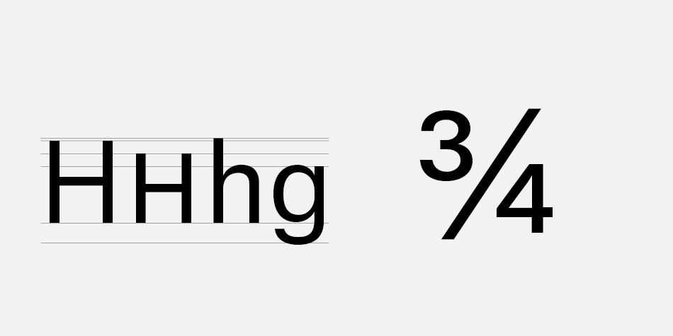
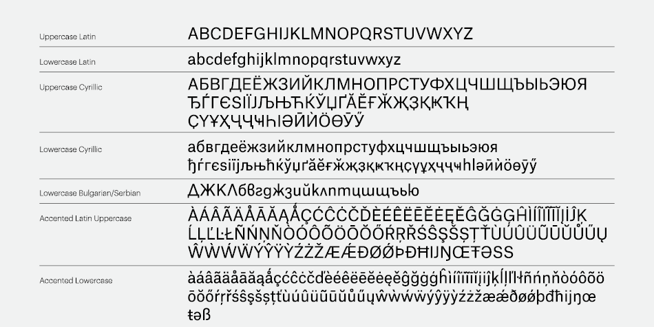
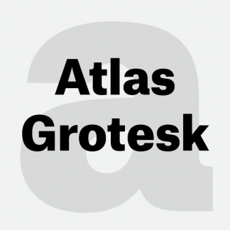
Atlas was originally designed as a corporate typeface for Munich Re, one of the world’s largest reinsurance companies. This typeface deliberately avoided contemporary trends in corporate type design in favor of the clear, optimistic tone of Dutch Modernism. The client produces hundreds of publications, reports, and other documents each year. They required a new typeface capable of maintaining clarity in often complicated typographical situations with a suitably well-considered range of weights. The new typeface also had to be economic in setting, saving space over the previous corporate face and saving significant amounts of paper in the process.
Design, Publisher, Copyright, License
Design: Susana Carvalho, Kai Bernau, Christian Schwartz, Ilya Ruderman
Publisher: Commercial Type
Copyright 2013-2020 by Commercial Type. All rights reserved.
License: COMMERCIAL
Susana Carvalho
Portuguese designer (b. 1979), who studied communication design at the Faculty of Fine Arts at the University of Lisbon (FBAUL), and obtained her Master’s degree at the Royal Academy of Fine Arts (2004) and still lives in Den Haag.
Kai Bernau
Kai Bernau (Letterlabor) is a German type designer (b. 1978) who studied graphic design at the University of Applied Sciences Schwäbisch Gmünd. He created “The neutral typeface” (2005), a sans family, as his thesis project at the KABK in Den Haag. The typeface was born as a mathematical average of ten sans typefaces: AG Buch, Neue Helvetica, Univers, Grotesque, Franklin Gothic, Frutiger, Trade Gothic, Documenta Sans, The Sans and Syntax. He graduated there in 2006 with a masters degree. Together with his wife Susana Carvalho, they formed Atelier Carvalho Bernau, a practice that designs printed matter (mainly books), bespoke and retail typefaces, and identity programs.
Christian Schwartz
Christian Schwartz, a type designer and one of the founders of the type foundry Commercial Type, lives and works in New York. A graduate of Carnegie Mellon University in Pittsburgh, Pa., he worked for a time at MetaDesign in Berlin. After returning to the United States, he worked at type studio Font Bureau, going independent in 2001. In 2007, he and London designer Paul Barnes founded Commercial Type. The studio’s projects include typefaces for The Guardian, Esquire, T (The New York Times Style Magazine), the Empire State Building and Sprint. Also in 2007 Schwartz was awarded the prestigious Prix Charles Peignot, given to designers under 35 years of age for “outstanding contributions to type design.” He has been on the short list of the Museum of Design, in London, as Designer of the Year and was rated among the top 40 most influential designers under 40 years of age by Wallpaper* and on Time’s list of top 100 designers.
Typefaces: Giorgio Sans, Graphik, Stag, Stag Sans, Atlas Grotesk, FF Bau, Farnham, Guardian, Neue Haas Grotesk, Kommissar, Neutraface, Produkt
More… TYPE.TODAY | Christian Schwartz
Ilya Ruderman
Ilya Ruderman, a type and graphic designer and teacher, lives and works in Moscow. He is a graduate of the Moscow State University of the Printing Arts (2002), where his graduation project was done under the supervision of Alexander Tarbeev. He has a MA degree in type design from the Type & Media program at the Royal Academy of Art in the Hague (2005). After completing the program, he returned to Moscow. Since 2007 he has supervised the curriculum in type and typography at the British Higher School of Art and Design in Moscow. He has been very active as a consultant on Cyrillic since 2008. In 2014 he founded CSTM Fonts with Yury Ostromentsky.
Web:
Typefaces: BigCity Grotesque Pro, Austin, Graphik, Marlene, Druk, Druk Text, Druk Text Wide, Druk Wide, Druk Condensed, Thema, Proto Grotesk, Dala Floda, Stag Sans, Stag, Kazimir & Kazimir Text, Navigo, Stratos, Parmigiano Text Pro, Parmigiano Piccolo Pro, Parmigiano Caption Pro, Parmigiano Headline Pro, Giorgio Sans, Lava, Styrene A, Styrene B, Proto Grotesk, Atlas Grotesk, Permian, Moscow Sans, Typonine Sans
More… TYPE.TODAY



Reviews
There are no reviews yet.