Description
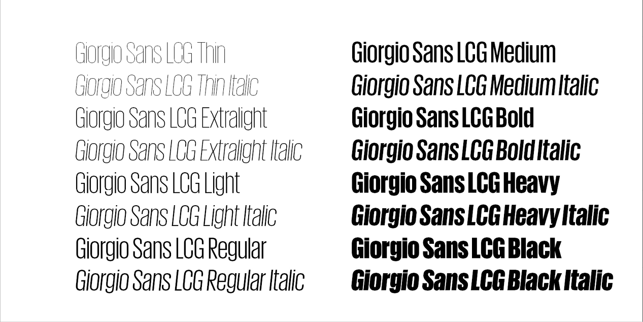
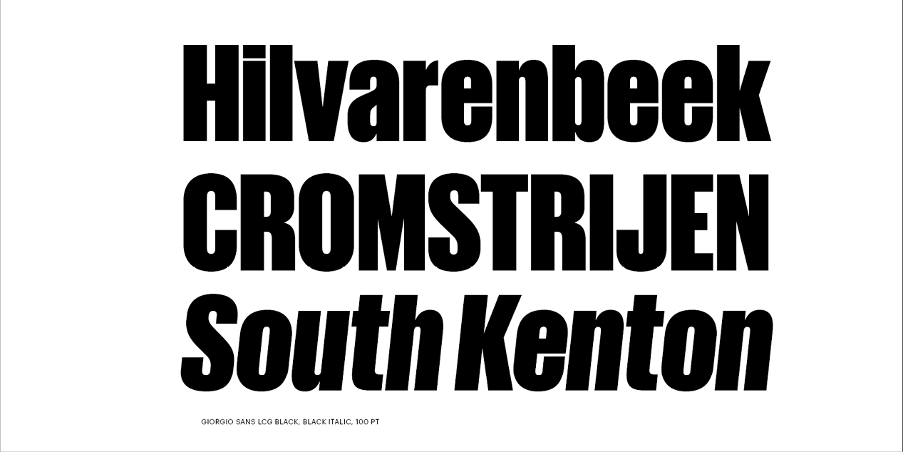
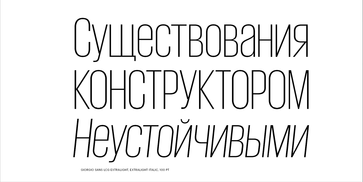
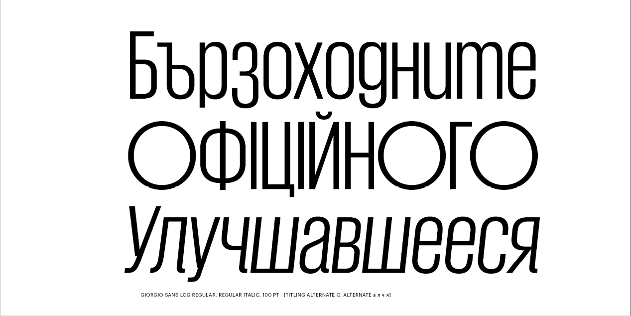
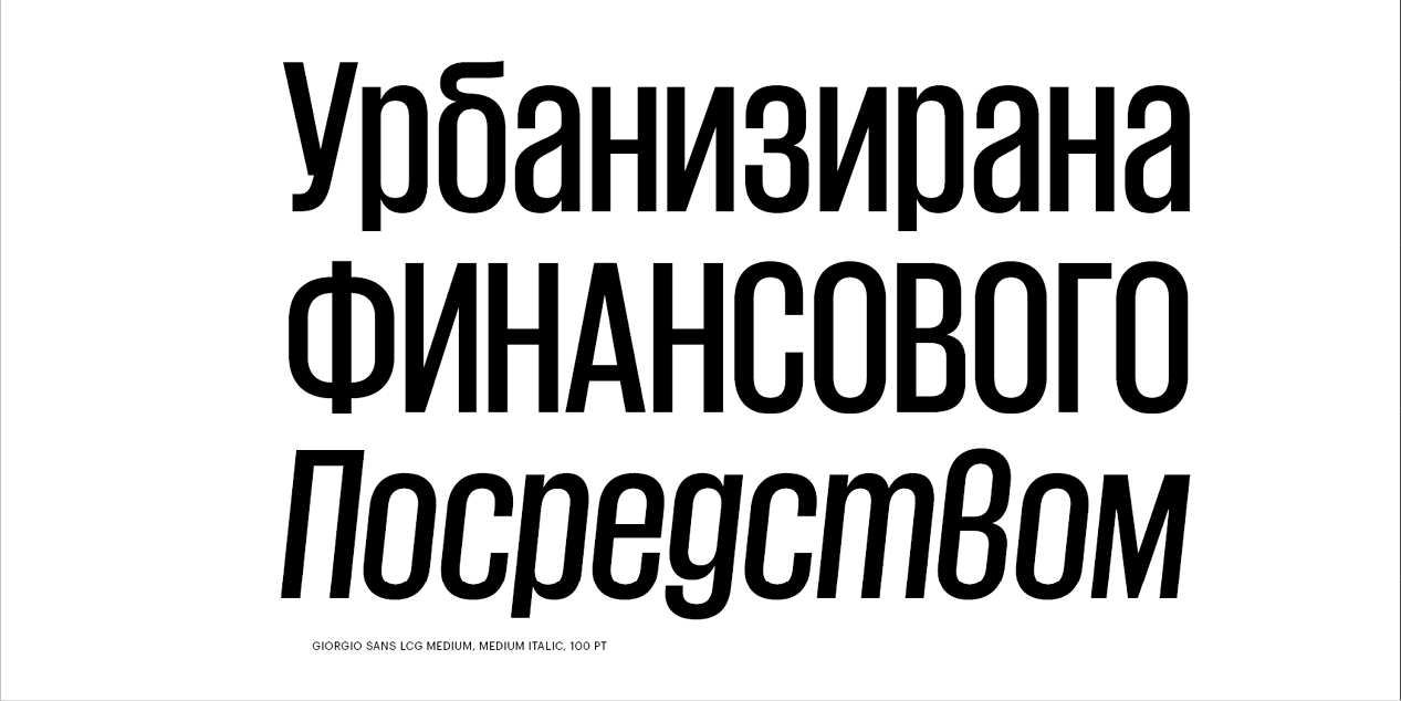
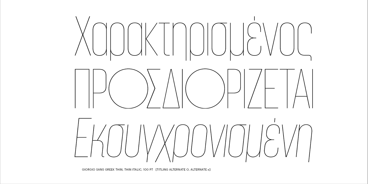
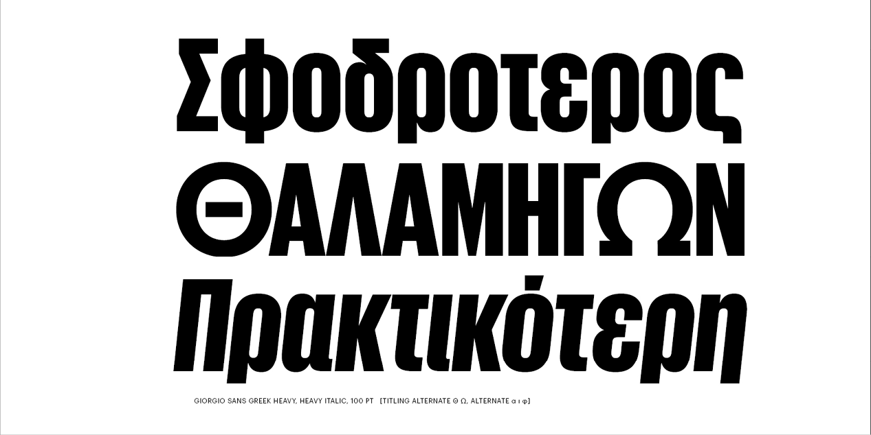
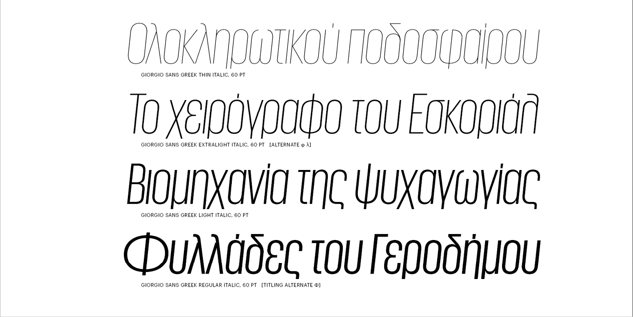
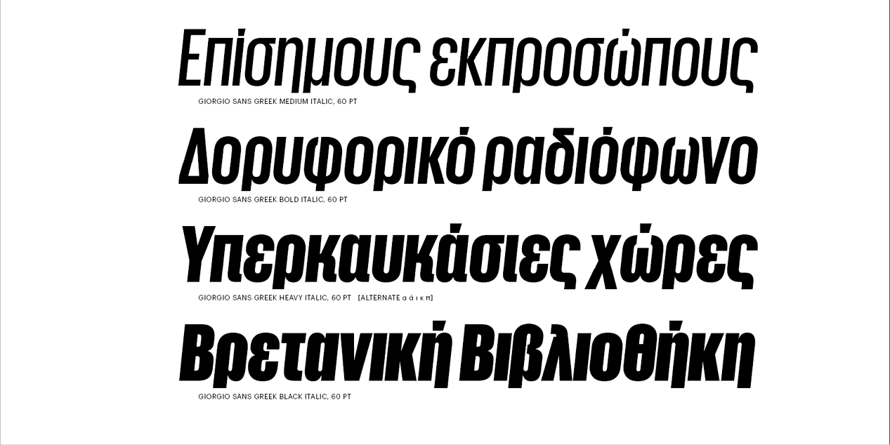
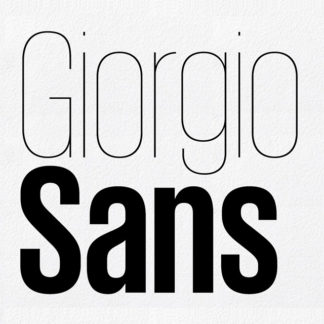
Giorgio and its matching sans serif were originally designed in 2007 and 2008 for Chris Martinez, the art director at T, The New York Times Style Magazine, with the idea of bringing runway proportions, and the graphic style of the 1920s & ’30s to the page.
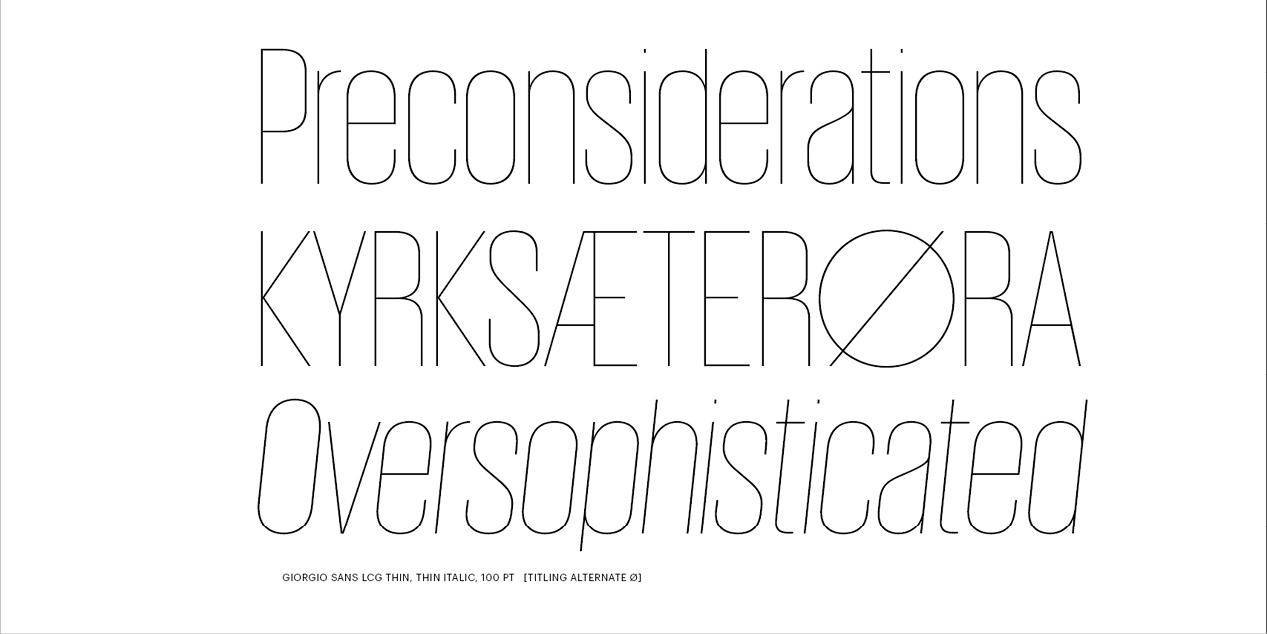
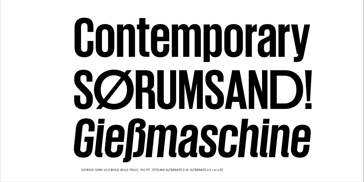
Giorgio has been drawn in four optical sizes, to avoid the compromises demanded by its extreme contrast between thick & thin. With a single optical size, it would have been necessary to reduce the contrast or limit its use to 150 point, or more. The wide variety of alternate characters make Giorgio an inspired choice both for headlines and logotypes.
Giorgio takes many of its cues from Imre Reiner’s late 1930s typeface Corvinus, but its mix of extremely high contrast, hard geometry, & strange, pretty details give it a distinctive character of its own, and an extensive set of alternates gives the face additional flexibility for fine-tuning a logotype or headline.
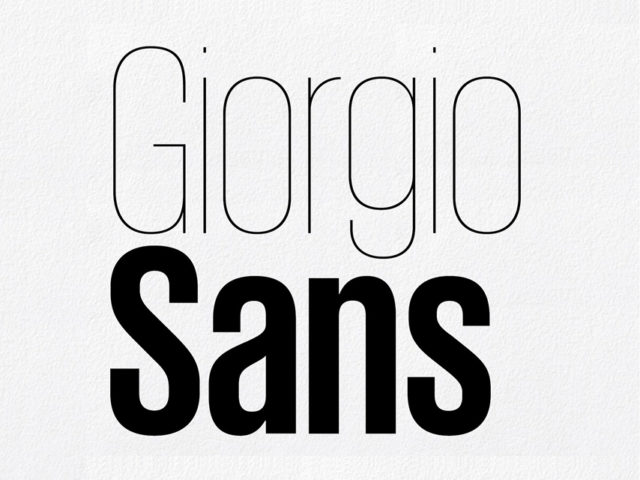
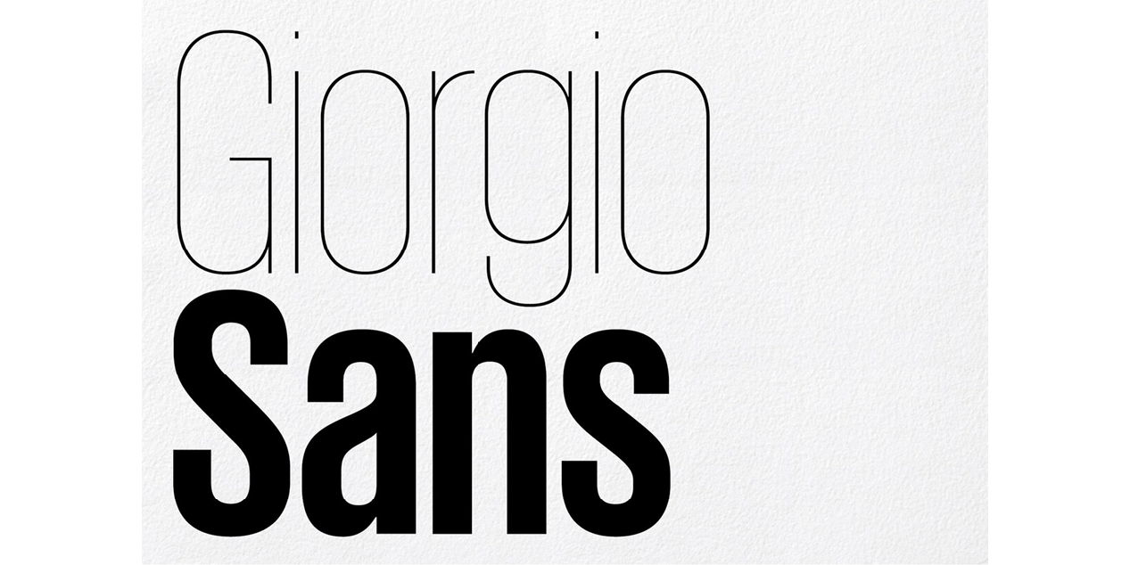
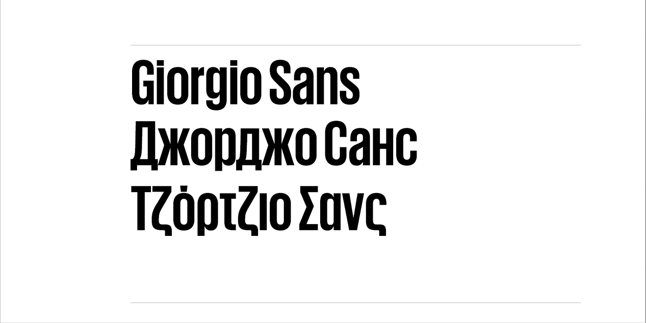
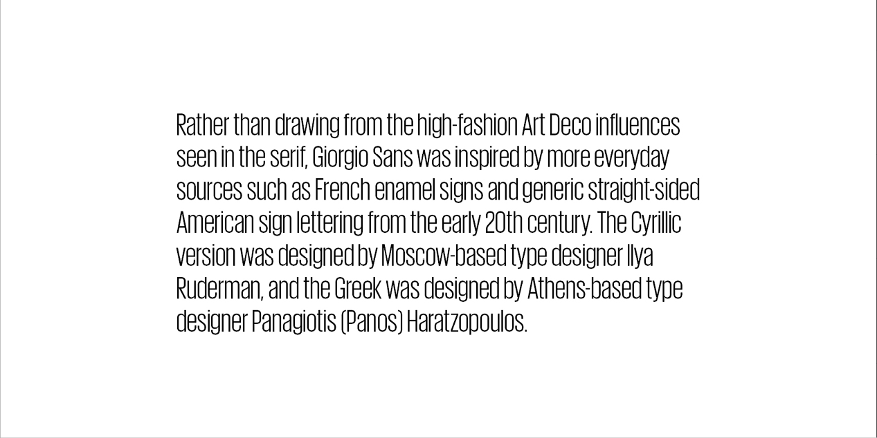
Rather than drawing from the high-fashion Art Deco influences seen in the serif, Giorgio Sans was inspired by more everyday sources such as French enamel signs & generic straight-sided American sign lettering from the early 20th century.
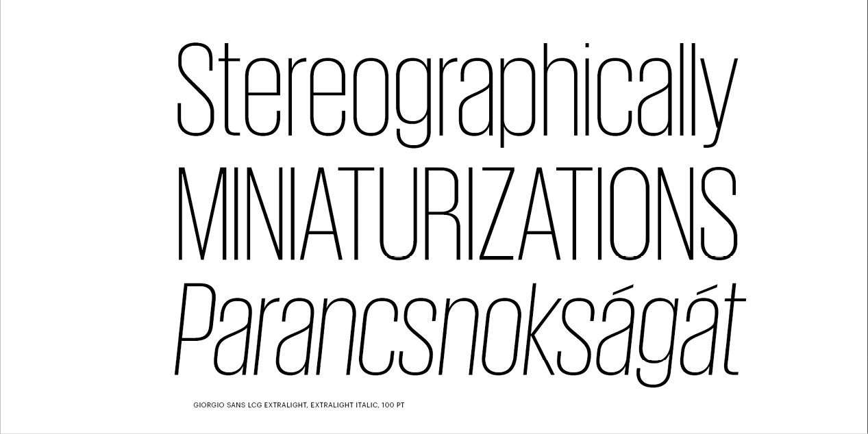
The extreme x-height helps to differentiate Giorgio Sans from other straight-sided sans serifs; this and the straight-sided bowls connect the sans back to its serif companion. In addition to the structural & proportional similarities, some of the distinctive details from Giorgio were brought into Giorgio Sans in order to allow the two faces to be mixed in interesting ways. One example is the alternate italic lowercase with more traditional cursive tails, echoing the more extreme tails in the serif.
Design, Publisher, Copyright, License
Design: Commercial Type, Christian Schwartz, Vincent Chan, Ilya Ruderman
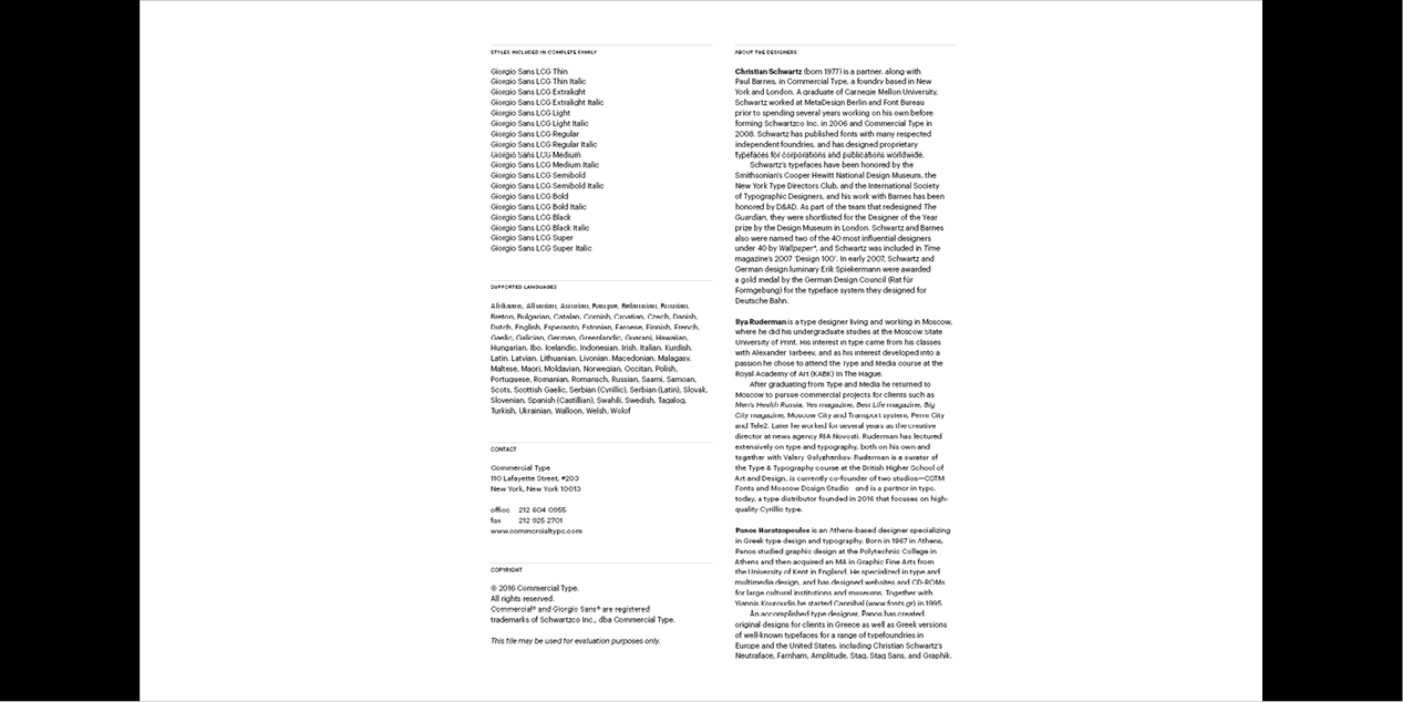
Publisher: Commercial Type Copyright 2016 by Commercial Type. All rights reserved. Specimen: Giorgio Sans (PDF, 509 KB) Christian Schwartz Christian Schwartz, a type designer and one of the founders of the type foundry Commercial Type, lives and works in New York. A graduate of Carnegie Mellon University in Pittsburgh, Pa., he worked for a time at MetaDesign in Berlin. After returning to the United States, he worked at type studio Font Bureau, going independent in 2001. In 2007, he and London designer Paul Barnes founded Commercial Type. The studio’s projects include typefaces for The Guardian, Esquire, T (The New York Times Style Magazine), the Empire State Building and Sprint. Also in 2007 Schwartz was awarded the prestigious Prix Charles Peignot, given to designers under 35 years of age for “outstanding contributions to type design.” He has been on the short list of the Museum of Design, in London, as Designer of the Year and was rated among the top 40 most influential designers under 40 years of age by Wallpaper* and on Time’s list of top 100 designers. Vincent Chan Vincent Chan is a type designer and teacher. He studied graphic design at Australia’s Monash University in Melbourne, from which he has an advanced degree. In 2012–2014, he worked as a type designer for Commercial Type in New York. Currently, he teaches design at Monash University Faculty of Art Design & Architecture. Ilya Ruderman Ilya Ruderman, a type and graphic designer and teacher, lives and works in Moscow. He is a graduate of the Moscow State University of the Printing Arts (2002), where his graduation project was done under the supervision of Alexander Tarbeev. He has a MA degree in type design from the Type & Media program at the Royal Academy of Art in the Hague (2005). After completing the program, he returned to Moscow. Since 2007 he has supervised the curriculum in type and typography at the British Higher School of Art and Design in Moscow. He has been very active as a consultant on Cyrillic since 2008. In 2014 he founded CSTM Fonts with Yury Ostromentsky. Commercial License Buy at: COMMERCIALTYPE
More… TYPE.TODAY | Christian Schwartz
Typefaces: BigCity Grotesque Pro, Austin, Graphik, Marlene, Druk, Druk Text, Druk Text Wide, Druk Wide, Druk Condensed, Thema, Proto Grotesk, Dala Floda, Stag Sans, Stag, Kazimir & Kazimir Text, Navigo, Stratos, Parmigiano Text Pro, Parmigiano Piccolo Pro, Parmigiano Caption Pro, Parmigiano Headline Pro, Giorgio Sans, Lava, Styrene A, Styrene B, Proto Grotesk, Atlas Grotesk, Permian, Moscow Sans, Typonine Sans
More… TYPE.TODAY


Reviews
There are no reviews yet.