Description
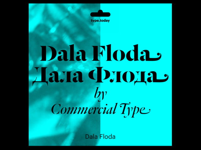
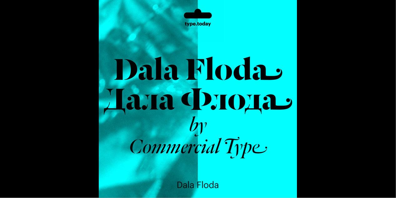
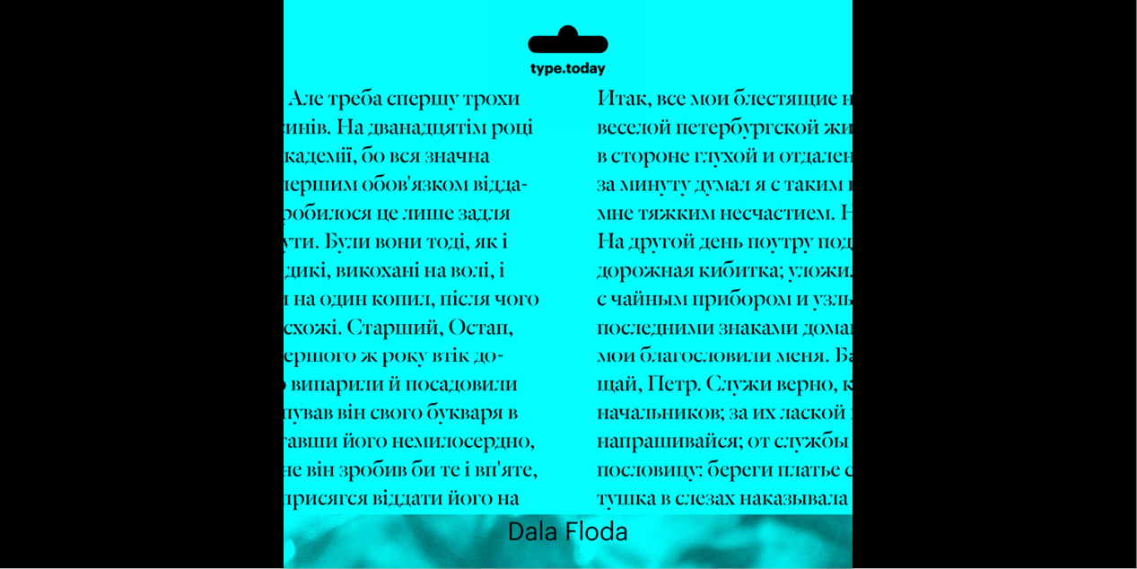
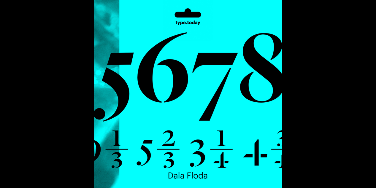
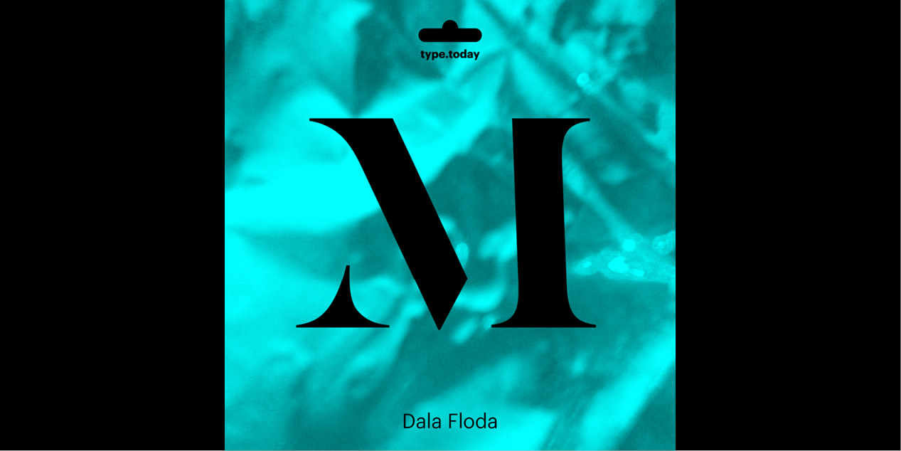
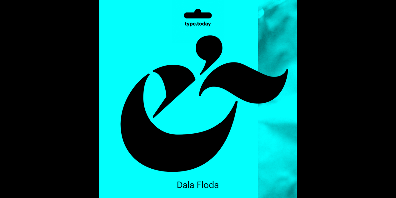
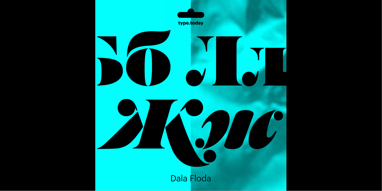
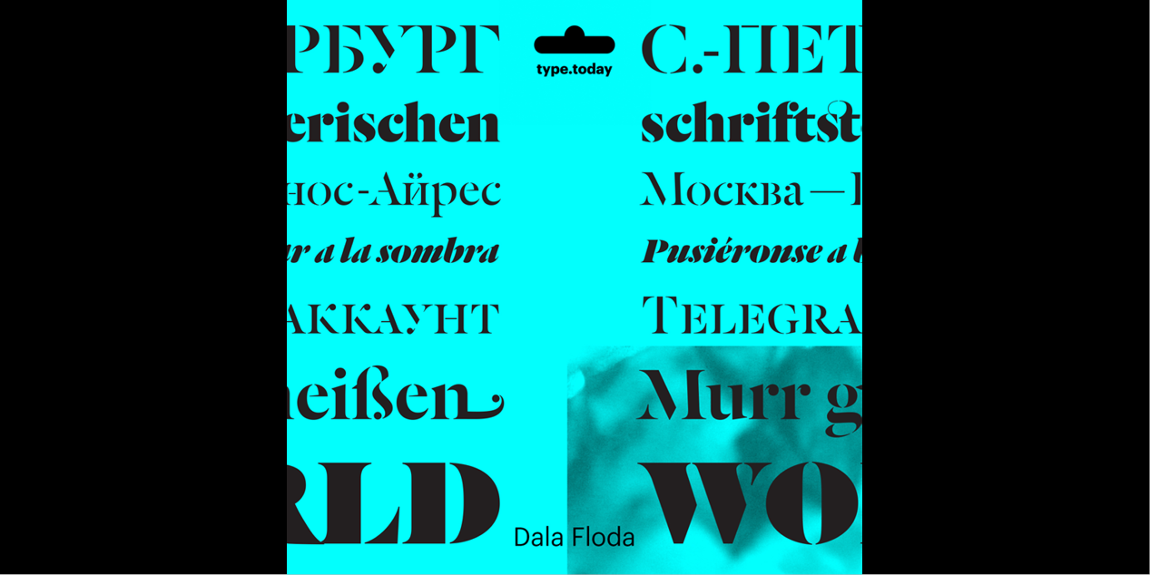
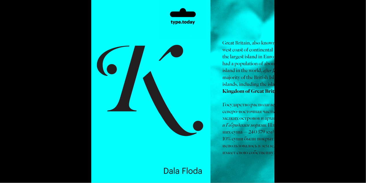
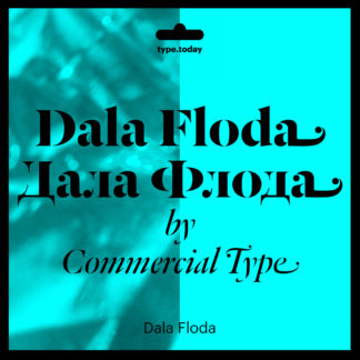
Dala Floda has its roots in the typefaces of the Renaissance but adds the twist of being a stencil letterform. Originally inspired by worn gravestone lettering and lettering on shipping crates, the elegance of the forms belies their everyday origins. First designed in 1997 for a logotype, Dala Floda eventually became the headline typeface for the art magazine Frieze in 2005.
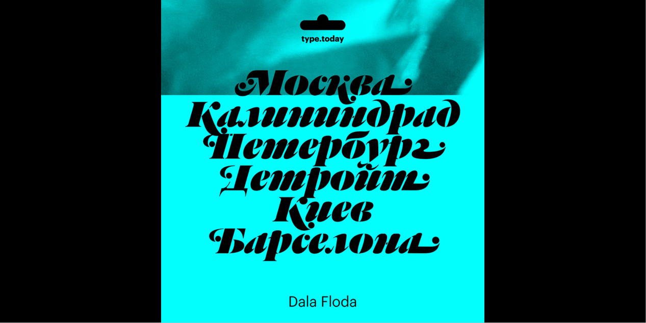
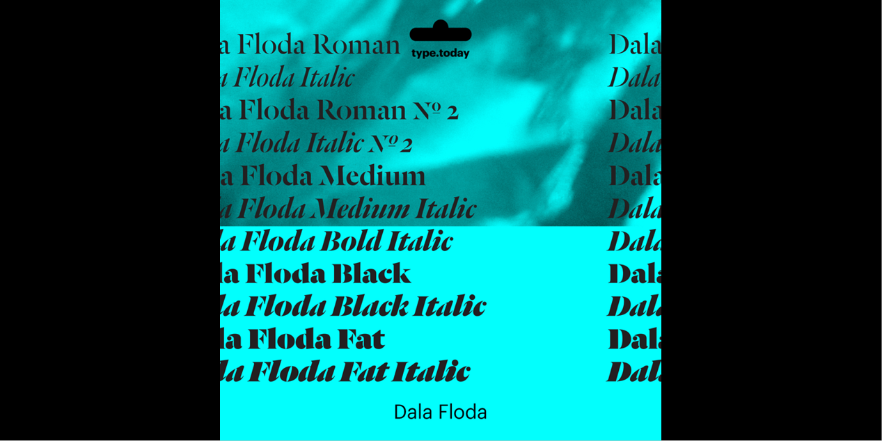
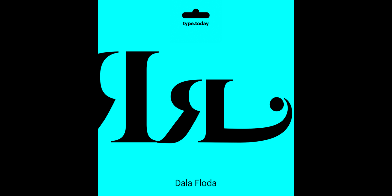
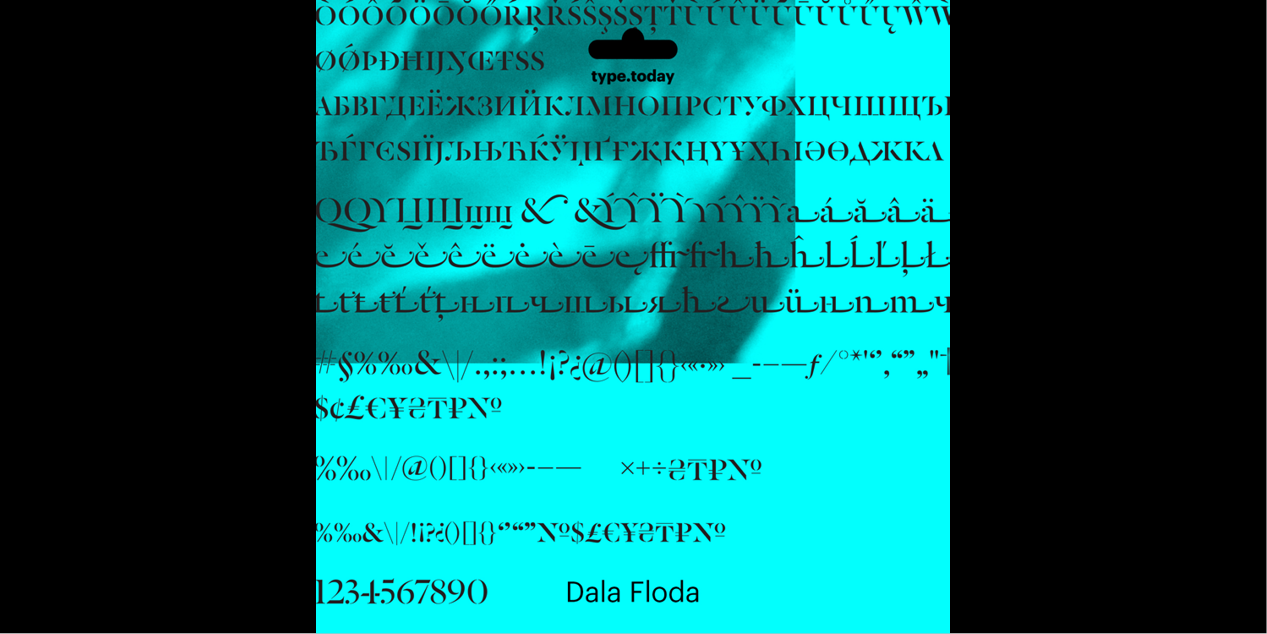
Since then the family has grown considerably with the addition of an italic and a range of heavier weights, all the way up to a fat weight. Its stencil form makes it well suited for headline use and especially for logotypes. The swashes are particularly noteworthy, bringing something unique and unexpected to the stencil category.
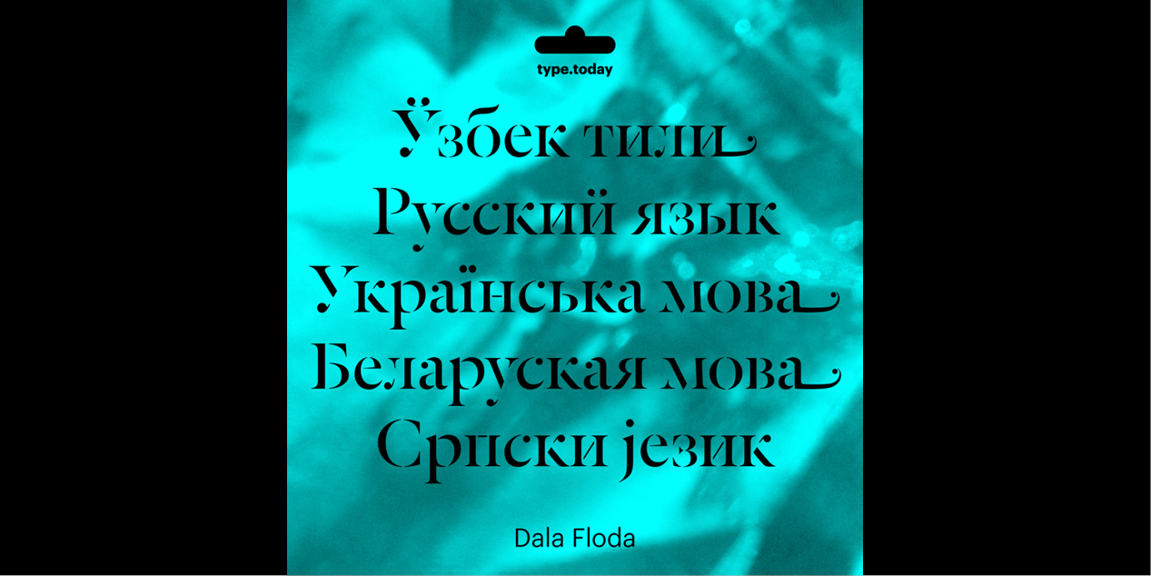
The Cyrillic version of Dala Floda was designed by Ilya Ruderman (CTSM Fonts) in 2016.
Design, Publisher, Copyright, License
Design: Paul Barnes (Commercial Type)
Design Cyrillic: Ilya Ruderman (CSTM Fonts)
Copyright 2013 by Commercial Type. All Rights Reserved. Dala Floda™ is a trademark of Schwartzco Inc., dba Commercial Type.
License: COMMERCIAL
Specimen: Dala Floda (PDF)
Paul Barnes
Paul Barnes (born 1970, Harlow, England) is a graphic designer and typographer. He has designed several new typefaces. After an education at the University of Reading, in 1992 he emigrated to the United States to work with Roger Black. In 1995 he left Roger Black and began work as a freelance designer in London. He has worked with many large corporations, making logos for such well known companies as Givenchy, ABC television and the English bands New Order, Electronic and Joy Division. He has designed the very large Guardian Egyptian family typefaces for The Guardian newspaper (with Christian Schwartz). In April 2007 he designed the logo for Kate Moss with Saville. In September 2006 he was named one of the 40 most influential designers under 40 in Wallpaper and in September 2007 The Guardian named him one of the top 50 designers in Britain.
Ilya Ruderman
Ilya Ruderman, a type and graphic designer and teacher, lives and works in Moscow. He is a graduate of the Moscow State University of the Printing Arts (2002), where his graduation project was done under the supervision of Alexander Tarbeev. He has a MA degree in type design from the Type & Media program at the Royal Academy of Art in the Hague (2005). After completing the program, he returned to Moscow. Since 2007 he has supervised the curriculum in type and typography at the British Higher School of Art and Design in Moscow. He has been very active as a consultant on Cyrillic since 2008. In 2014 he founded CSTM Fonts with Yury Ostromentsky.
Web:
Typefaces: BigCity Grotesque Pro, Austin, Graphik, Marlene, Druk, Druk Text, Druk Text Wide, Druk Wide, Druk Condensed, Thema, Proto Grotesk, Dala Floda, Stag Sans, Stag, Kazimir & Kazimir Text, Navigo, Stratos, Parmigiano Text Pro, Parmigiano Piccolo Pro, Parmigiano Caption Pro, Parmigiano Headline Pro, Giorgio Sans, Lava, Styrene A, Styrene B, Proto Grotesk, Atlas Grotesk, Permian, Moscow Sans, Typonine Sans
More… TYPE.TODAY
Commercial License
Buy at: TYPE.TODAY



Reviews
There are no reviews yet.