Description
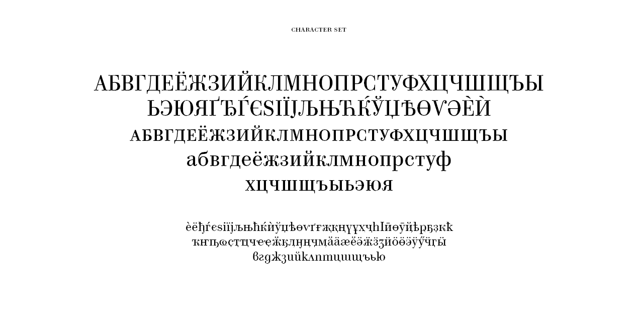
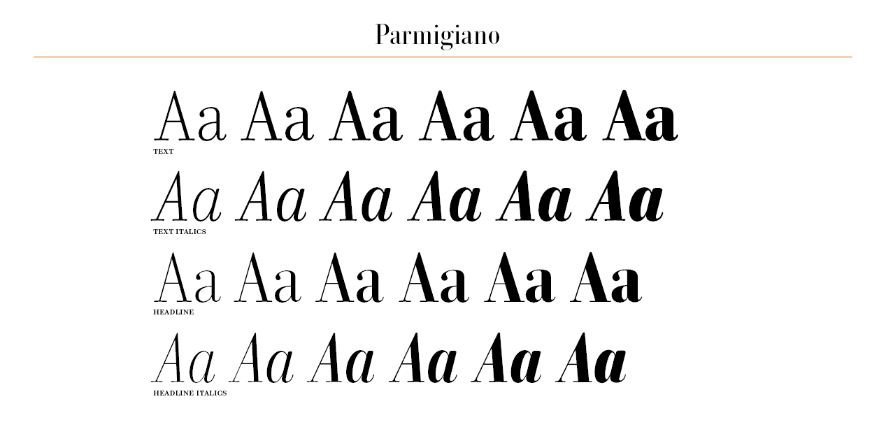
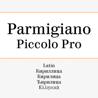
Parmigiano Typographic System (named after Parma, the city where Bodoni established his printing house) has the stated ambition to be the most extensive family of fonts ever to have been inspired by Giambattista Bodoni.
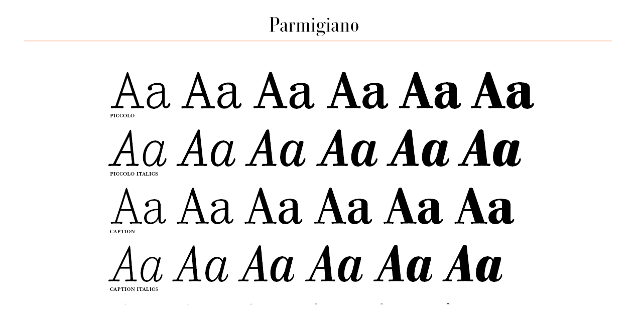
Parmigiano Piccolo may at first seem utterly foreign to Bodoni’s design principles, and its thick-set, ungraceful design would seem to belong to another family. Although it shares the same structure as the other cuts of the system, Parmigiano Piccolo is closer to the Scotch Roman models of the early 1800s, with their reduced contrast, shorter ascenders and descenders, and rather narrow proportions. And just as the Scotch Romans were the outcome of commercial considerations, Parmigiano Piccolo focuses on practicality and legibility. Although its features set it apart from the elegant refinement of the rest of the Parmigiano family, it is the one to trust in critical conditions. Thanks to its reduced contrast and strong serifs, it is the perfect choice when the texture of the paper or the quality of printing threaten your text, or when you are looking for a deliberate touch of roughness.
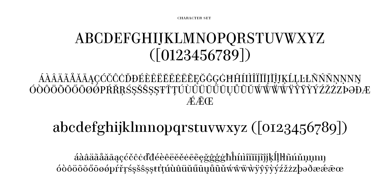
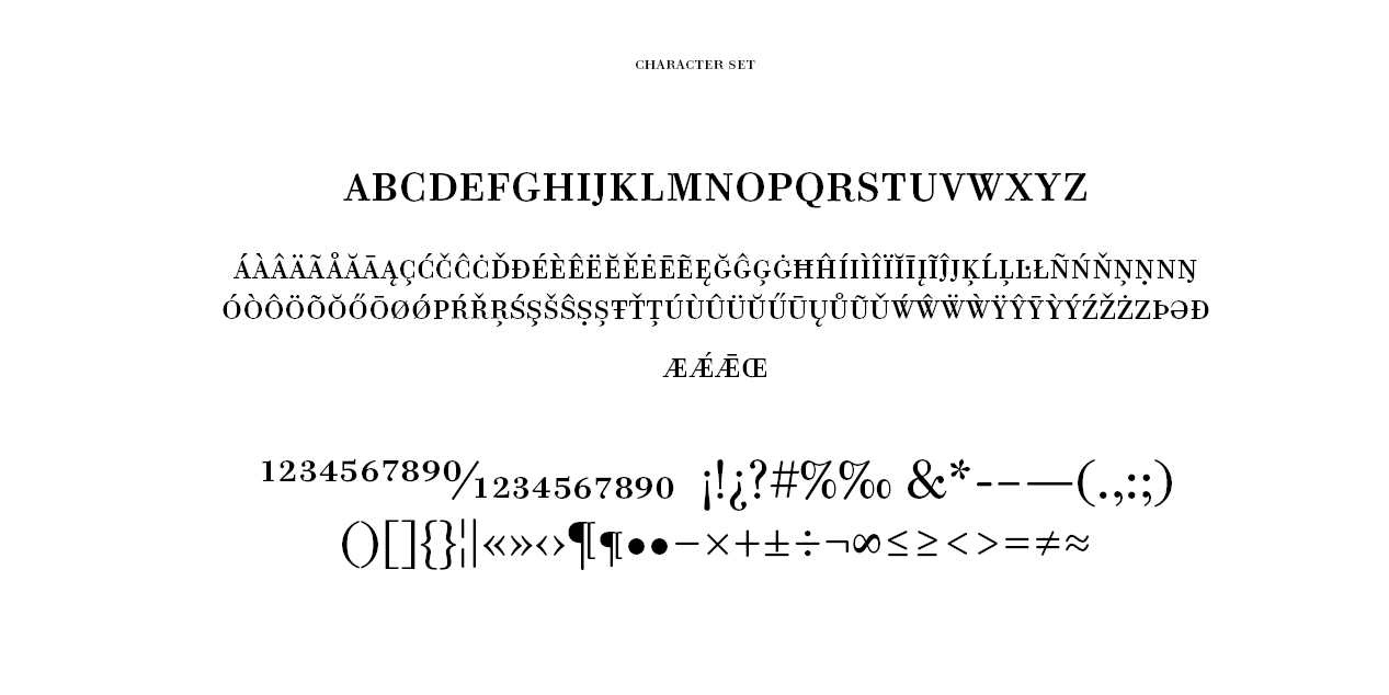
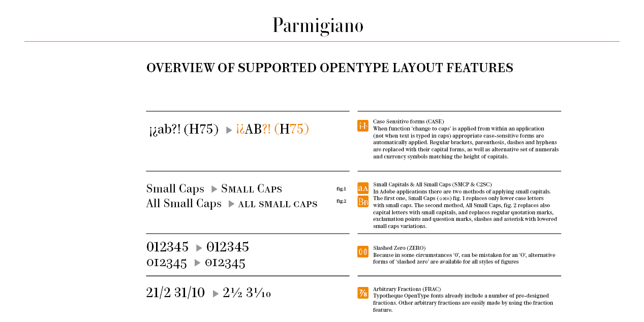
Like all Typotheque fonts, Parmigiano includes Small Caps in all styles. Additionally, Parmigiano includes a wealth of other advanced OpenType features. For more information please see the PDF instructions, or the Features section.
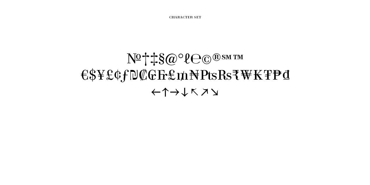
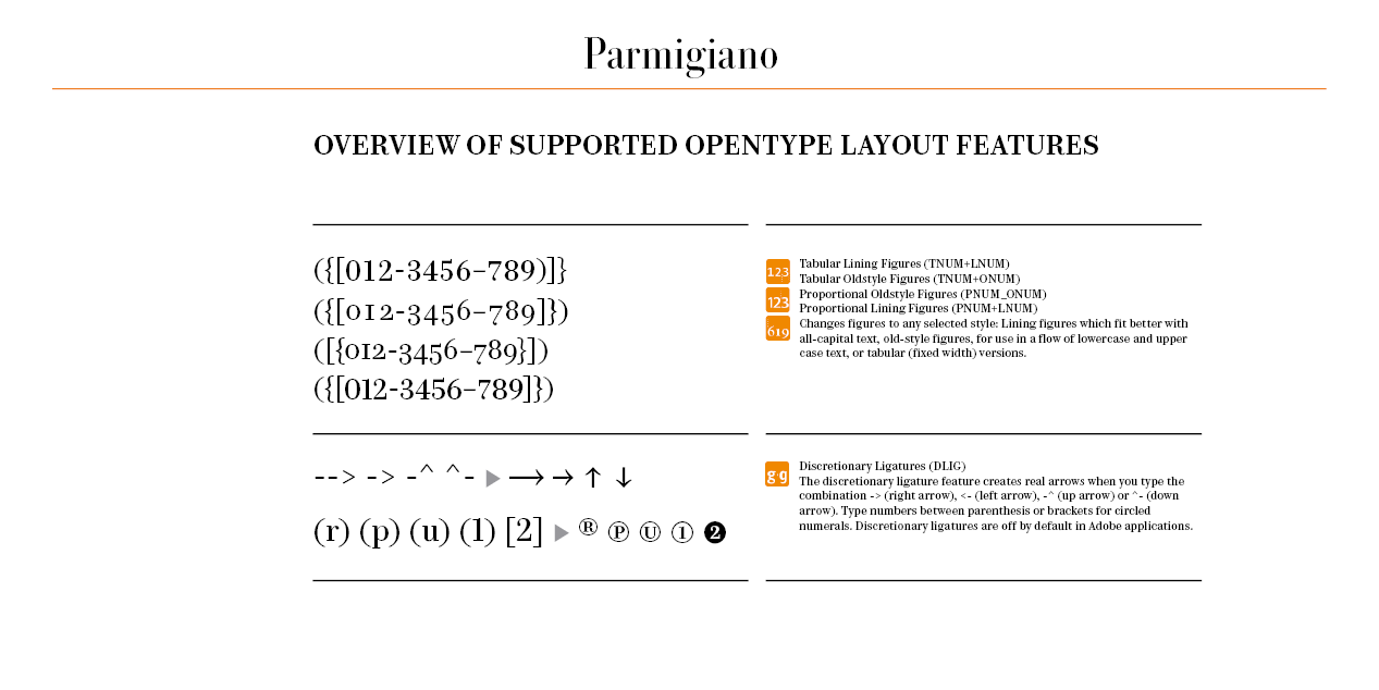
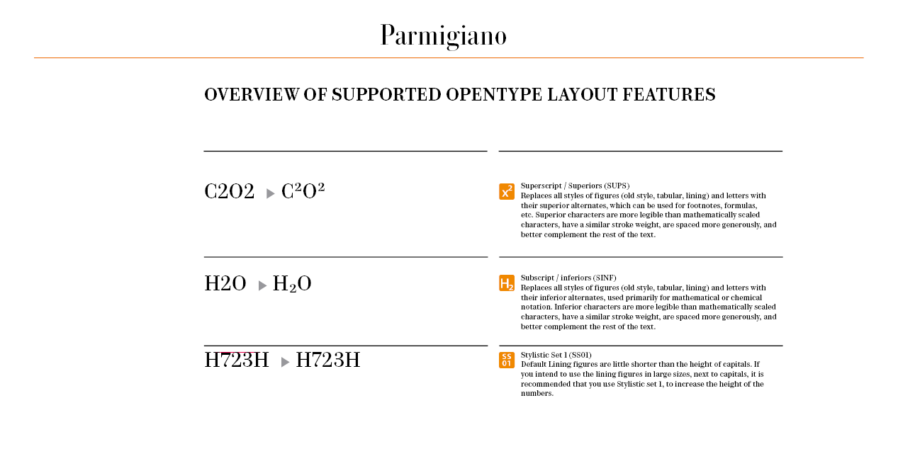
All weights of Parmigiano include nine different kinds of numerals. Proportional Lining figures come as default figures in Parmigiano. It also, however, includes Old-style figures, Tabular numerals (both lining and OsF), Small Caps figures, superior, inferior, circled and circled inverted numerals (selectable via OpenType features), and slighly taller Lining figures that match the heigh of Capitals.
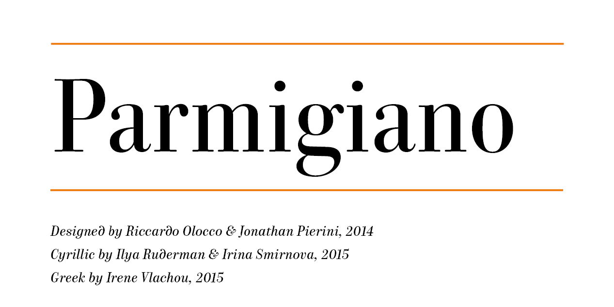
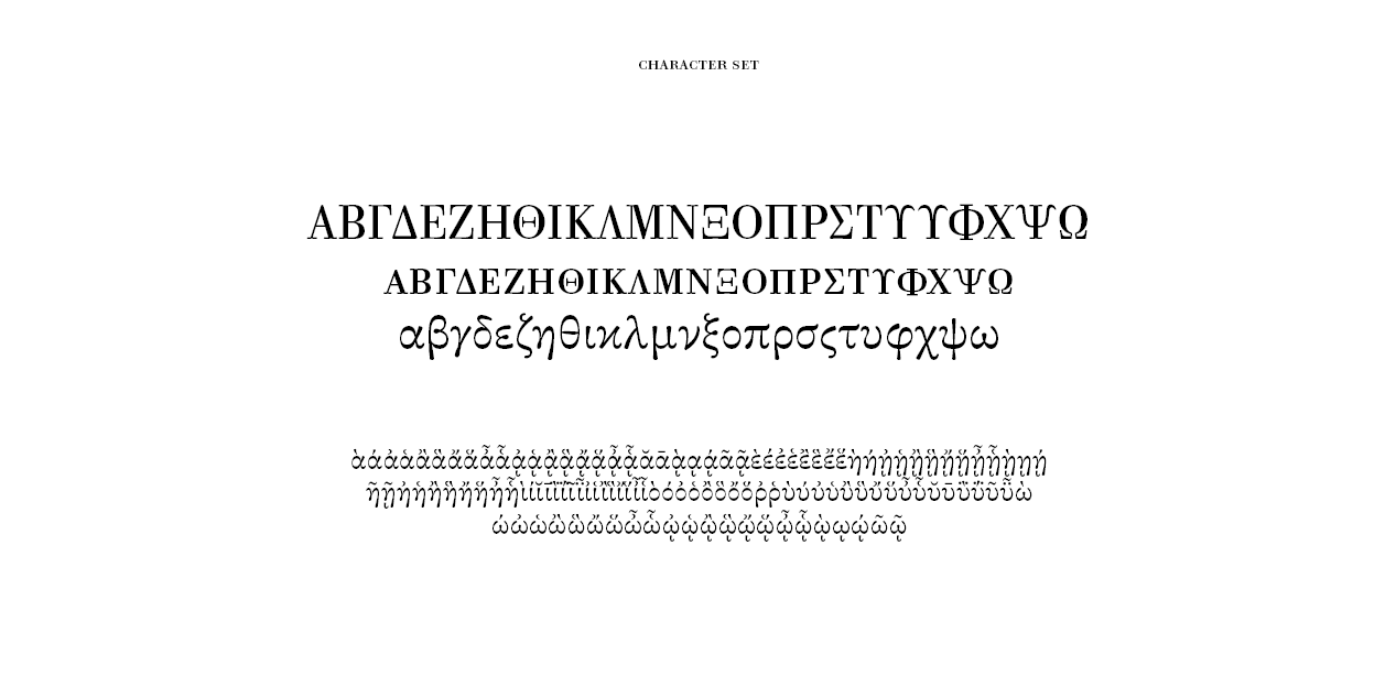
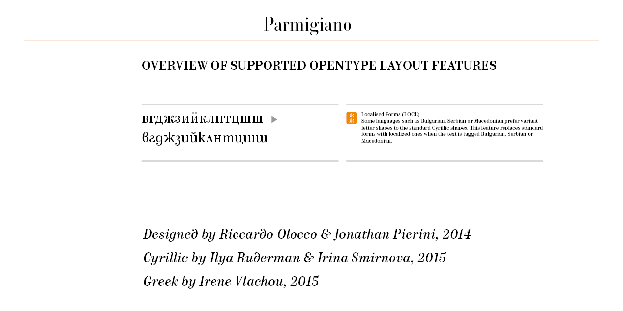
The Parmigiano Type Family family was published in 2014, designed by Riccardo Olocco and Jonathan Pierini. The Cyrillic version was designed by Ilya Ruderman and Irina Smirnova. The Greek version was designed by Irene Vlachou, in 2015.
Design, Publisher, Copyright, License
Design: Riccardo Olocco
Design: Jonathan Pierini
Cyrillic Design: Ilya Ruderman
Cyrillic Design: Irina Smirnova
Greek Design: Irene Vlachou
Publisher: Typotheque
Copyright 2015 by Typotheque. All rights reserved.
Specimen: Parmigiano (PDF)
Riccardo Olocco
Prior to a four-year stint as a lecturer in typography at the faculty of design and Art of the free University of Bolzano (2009-2013), Italian type designer Riccardo Olocco freelanced as a graphic designer in Milan and elsewhere in Italy. He graduated in 2014 from the MATD program at the University of Reading, UK. In 2018, he was a Ph.D. student at Reading’s Faculty of Typography and Graphic Design. His research focuses on 15th-century Venetian roman types, combining use of bibliographical knowledge and analysis of letterforms.
Jonathan Pierini
Jonathan Pierini is a type designer and graphic designer. He holds a BA in graphic design and visual communication from the ISIA Urbino and a MA in Type and Media from the Royal Academy of Arts of The Hague, The Netherlands. After some experiences working for graphic design offices and collaborating with the ISIA Urbino and the Università per Stranieri di Perugia, Jonathan moves to London to work at Dalton Maag Ltd type design office (2010/2011), getting involved in projects for clients such as Nokia and Vodafone. He is currently working at the Free University of Bolzano Bozen – Faculty of Design and Art as Researcher and Lecturer in Graphic Design. He is a PhD candidate at the Department of Typography and Graphic Communication of the University of Reading. His interest goes for projects which ask the designer to be involved from the very first steps of the design process. His projects are based on thorough research and passionate experimentation. Jonathan is currently investigating the relationship between texts and places and the possibility to design textual places in order to contribute to a dense narrative space. Since 2013 he is part of the research project EDDES– Educating through/with Design. Illustration by Eszter Zetelaki.
Ilya Ruderman
Ilya Ruderman, a type and graphic designer and teacher, lives and works in Moscow. He is a graduate of the Moscow State University of the Printing Arts (2002), where his graduation project was done under the supervision of Alexander Tarbeev. He has a MA degree in type design from the Type & Media program at the Royal Academy of Art in the Hague (2005). After completing the program, he returned to Moscow. Since 2007 he has supervised the curriculum in type and typography at the British Higher School of Art and Design in Moscow. He has been very active as a consultant on Cyrillic since 2008. In 2014 he founded CSTM Fonts with Yury Ostromentsky.
Web:
Typefaces: BigCity Grotesque Pro, Austin, Graphik, Marlene, Druk, Druk Text, Druk Text Wide, Druk Wide, Druk Condensed, Thema, Proto Grotesk, Dala Floda, Stag Sans, Stag, Kazimir & Kazimir Text, Navigo, Stratos, Parmigiano Text Pro, Parmigiano Piccolo Pro, Parmigiano Caption Pro, Parmigiano Headline Pro, Giorgio Sans, Lava, Styrene A, Styrene B, Proto Grotesk, Atlas Grotesk, Permian, Moscow Sans, Typonine Sans
More… TYPE.TODAY
Irina Smirnova
Graduate of the Masters program in type design at KABK, 2010. Before that, she studied type design at the Moscow State University of Printing Arts and graduated in 2001. She worked as free-lance designer for ParaType Inc under Tagir Safayev. During 2002-2006 she taught courses on type design and lettering at the Institute of Modern Art in Moscow. She was also affiliated with the British Higher School of Design (2008-2011) in Moscow. Irina worked as type designer at Laterica and Art Lebedev Studio (until 2008). Currently she is a freelance designer in Moscow, whee she teaches calligraphy.
Irene Vlachou
Irene Vlachou or Eirini Vlachou. Graduate of of Vakalo School of Art & Design in Athens and the University of Reading, where she earned the nickname Miss Fontlab. Type designer at POPtype in Athens. In 2013, she joined Type Together as a senior type designer.




Reviews
There are no reviews yet.